-
Notifications
You must be signed in to change notification settings - Fork 0
/
Copy pathapp_bar.dart
1319 lines (1210 loc) · 47.6 KB
/
app_bar.dart
1
2
3
4
5
6
7
8
9
10
11
12
13
14
15
16
17
18
19
20
21
22
23
24
25
26
27
28
29
30
31
32
33
34
35
36
37
38
39
40
41
42
43
44
45
46
47
48
49
50
51
52
53
54
55
56
57
58
59
60
61
62
63
64
65
66
67
68
69
70
71
72
73
74
75
76
77
78
79
80
81
82
83
84
85
86
87
88
89
90
91
92
93
94
95
96
97
98
99
100
101
102
103
104
105
106
107
108
109
110
111
112
113
114
115
116
117
118
119
120
121
122
123
124
125
126
127
128
129
130
131
132
133
134
135
136
137
138
139
140
141
142
143
144
145
146
147
148
149
150
151
152
153
154
155
156
157
158
159
160
161
162
163
164
165
166
167
168
169
170
171
172
173
174
175
176
177
178
179
180
181
182
183
184
185
186
187
188
189
190
191
192
193
194
195
196
197
198
199
200
201
202
203
204
205
206
207
208
209
210
211
212
213
214
215
216
217
218
219
220
221
222
223
224
225
226
227
228
229
230
231
232
233
234
235
236
237
238
239
240
241
242
243
244
245
246
247
248
249
250
251
252
253
254
255
256
257
258
259
260
261
262
263
264
265
266
267
268
269
270
271
272
273
274
275
276
277
278
279
280
281
282
283
284
285
286
287
288
289
290
291
292
293
294
295
296
297
298
299
300
301
302
303
304
305
306
307
308
309
310
311
312
313
314
315
316
317
318
319
320
321
322
323
324
325
326
327
328
329
330
331
332
333
334
335
336
337
338
339
340
341
342
343
344
345
346
347
348
349
350
351
352
353
354
355
356
357
358
359
360
361
362
363
364
365
366
367
368
369
370
371
372
373
374
375
376
377
378
379
380
381
382
383
384
385
386
387
388
389
390
391
392
393
394
395
396
397
398
399
400
401
402
403
404
405
406
407
408
409
410
411
412
413
414
415
416
417
418
419
420
421
422
423
424
425
426
427
428
429
430
431
432
433
434
435
436
437
438
439
440
441
442
443
444
445
446
447
448
449
450
451
452
453
454
455
456
457
458
459
460
461
462
463
464
465
466
467
468
469
470
471
472
473
474
475
476
477
478
479
480
481
482
483
484
485
486
487
488
489
490
491
492
493
494
495
496
497
498
499
500
501
502
503
504
505
506
507
508
509
510
511
512
513
514
515
516
517
518
519
520
521
522
523
524
525
526
527
528
529
530
531
532
533
534
535
536
537
538
539
540
541
542
543
544
545
546
547
548
549
550
551
552
553
554
555
556
557
558
559
560
561
562
563
564
565
566
567
568
569
570
571
572
573
574
575
576
577
578
579
580
581
582
583
584
585
586
587
588
589
590
591
592
593
594
595
596
597
598
599
600
601
602
603
604
605
606
607
608
609
610
611
612
613
614
615
616
617
618
619
620
621
622
623
624
625
626
627
628
629
630
631
632
633
634
635
636
637
638
639
640
641
642
643
644
645
646
647
648
649
650
651
652
653
654
655
656
657
658
659
660
661
662
663
664
665
666
667
668
669
670
671
672
673
674
675
676
677
678
679
680
681
682
683
684
685
686
687
688
689
690
691
692
693
694
695
696
697
698
699
700
701
702
703
704
705
706
707
708
709
710
711
712
713
714
715
716
717
718
719
720
721
722
723
724
725
726
727
728
729
730
731
732
733
734
735
736
737
738
739
740
741
742
743
744
745
746
747
748
749
750
751
752
753
754
755
756
757
758
759
760
761
762
763
764
765
766
767
768
769
770
771
772
773
774
775
776
777
778
779
780
781
782
783
784
785
786
787
788
789
790
791
792
793
794
795
796
797
798
799
800
801
802
803
804
805
806
807
808
809
810
811
812
813
814
815
816
817
818
819
820
821
822
823
824
825
826
827
828
829
830
831
832
833
834
835
836
837
838
839
840
841
842
843
844
845
846
847
848
849
850
851
852
853
854
855
856
857
858
859
860
861
862
863
864
865
866
867
868
869
870
871
872
873
874
875
876
877
878
879
880
881
882
883
884
885
886
887
888
889
890
891
892
893
894
895
896
897
898
899
900
901
902
903
904
905
906
907
908
909
910
911
912
913
914
915
916
917
918
919
920
921
922
923
924
925
926
927
928
929
930
931
932
933
934
935
936
937
938
939
940
941
942
943
944
945
946
947
948
949
950
951
952
953
954
955
956
957
958
959
960
961
962
963
964
965
966
967
968
969
970
971
972
973
974
975
976
977
978
979
980
981
982
983
984
985
986
987
988
989
990
991
992
993
994
995
996
997
998
999
1000
// Copyright 2014 The Flutter Authors. All rights reserved.
// Use of this source code is governed by a BSD-style license that can be
// found in the LICENSE file.
import 'dart:math' as math;
import 'package:flutter/foundation.dart';
import 'package:flutter/rendering.dart';
import 'package:flutter/services.dart';
import 'package:flutter/widgets.dart';
import 'app_bar_theme.dart';
import 'back_button.dart';
import 'constants.dart';
import 'debug.dart';
import 'flexible_space_bar.dart';
import 'icon_button.dart';
import 'icons.dart';
import 'material.dart';
import 'material_localizations.dart';
import 'scaffold.dart';
import 'tabs.dart';
import 'text_theme.dart';
import 'theme.dart';
const double _kLeadingWidth = kToolbarHeight; // So the leading button is square.
// Bottom justify the kToolbarHeight child which may overflow the top.
class _ToolbarContainerLayout extends SingleChildLayoutDelegate {
const _ToolbarContainerLayout();
@override
BoxConstraints getConstraintsForChild(BoxConstraints constraints) {
return constraints.tighten(height: kToolbarHeight);
}
@override
Size getSize(BoxConstraints constraints) {
return Size(constraints.maxWidth, kToolbarHeight);
}
@override
Offset getPositionForChild(Size size, Size childSize) {
return Offset(0.0, size.height - childSize.height);
}
@override
bool shouldRelayout(_ToolbarContainerLayout oldDelegate) => false;
}
// TODO(eseidel): Toolbar needs to change size based on orientation:
// https://material.io/design/components/app-bars-top.html#specs
// Mobile Landscape: 48dp
// Mobile Portrait: 56dp
// Tablet/Desktop: 64dp
/// A material design app bar.
///
/// An app bar consists of a toolbar and potentially other widgets, such as a
/// [TabBar] and a [FlexibleSpaceBar]. App bars typically expose one or more
/// common [actions] with [IconButton]s which are optionally followed by a
/// [PopupMenuButton] for less common operations (sometimes called the "overflow
/// menu").
///
/// App bars are typically used in the [Scaffold.appBar] property, which places
/// the app bar as a fixed-height widget at the top of the screen. For a scrollable
/// app bar, see [SliverAppBar], which embeds an [AppBar] in a sliver for use in
/// a [CustomScrollView].
///
/// When not used as [Scaffold.appBar], or when wrapped in a [Hero], place the app
/// bar in a [MediaQuery] to take care of the padding around the content of the
/// app bar if needed, as the padding will not be handled by [Scaffold].
///
/// The AppBar displays the toolbar widgets, [leading], [title], and [actions],
/// above the [bottom] (if any). The [bottom] is usually used for a [TabBar]. If
/// a [flexibleSpace] widget is specified then it is stacked behind the toolbar
/// and the bottom widget. The following diagram shows where each of these slots
/// appears in the toolbar when the writing language is left-to-right (e.g.
/// English):
///
/// 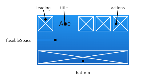
///
/// If the [leading] widget is omitted, but the [AppBar] is in a [Scaffold] with
/// a [Drawer], then a button will be inserted to open the drawer. Otherwise, if
/// the nearest [Navigator] has any previous routes, a [BackButton] is inserted
/// instead. This behavior can be turned off by setting the [automaticallyImplyLeading]
/// to false. In that case a null leading widget will result in the middle/title widget
/// stretching to start.
///
/// {@tool dartpad --template=stateless_widget_material}
///
/// This sample shows an [AppBar] with two simple actions. The first action
/// opens a [SnackBar], while the second action navigates to a new page.
///
/// ```dart preamble
/// final GlobalKey<ScaffoldState> scaffoldKey = GlobalKey<ScaffoldState>();
/// final SnackBar snackBar = const SnackBar(content: Text('Showing Snackbar'));
///
/// void openPage(BuildContext context) {
/// Navigator.push(context, MaterialPageRoute(
/// builder: (BuildContext context) {
/// return Scaffold(
/// appBar: AppBar(
/// title: const Text('Next page'),
/// ),
/// body: const Center(
/// child: Text(
/// 'This is the next page',
/// style: TextStyle(fontSize: 24),
/// ),
/// ),
/// );
/// },
/// ));
/// }
/// ```
///
/// ```dart
/// Widget build(BuildContext context) {
/// return Scaffold(
/// key: scaffoldKey,
/// appBar: AppBar(
/// title: const Text('AppBar Demo'),
/// actions: <Widget>[
/// IconButton(
/// icon: const Icon(Icons.add_alert),
/// tooltip: 'Show Snackbar',
/// onPressed: () {
/// scaffoldKey.currentState.showSnackBar(snackBar);
/// },
/// ),
/// IconButton(
/// icon: const Icon(Icons.navigate_next),
/// tooltip: 'Next page',
/// onPressed: () {
/// openPage(context);
/// },
/// ),
/// ],
/// ),
/// body: const Center(
/// child: Text(
/// 'This is the home page',
/// style: TextStyle(fontSize: 24),
/// ),
/// ),
/// );
/// }
/// ```
/// {@end-tool}
///
/// See also:
///
/// * [Scaffold], which displays the [AppBar] in its [Scaffold.appBar] slot.
/// * [SliverAppBar], which uses [AppBar] to provide a flexible app bar that
/// can be used in a [CustomScrollView].
/// * [TabBar], which is typically placed in the [bottom] slot of the [AppBar]
/// if the screen has multiple pages arranged in tabs.
/// * [IconButton], which is used with [actions] to show buttons on the app bar.
/// * [PopupMenuButton], to show a popup menu on the app bar, via [actions].
/// * [FlexibleSpaceBar], which is used with [flexibleSpace] when the app bar
/// can expand and collapse.
/// * <https://material.io/design/components/app-bars-top.html>
class AppBar extends StatefulWidget implements PreferredSizeWidget {
/// Creates a material design app bar.
///
/// The arguments [primary], [toolbarOpacity], [bottomOpacity]
/// and [automaticallyImplyLeading] must not be null. Additionally, if
/// [elevation] is specified, it must be non-negative.
///
/// If [backgroundColor], [elevation], [brightness], [iconTheme],
/// [actionsIconTheme], or [textTheme] are null, then their [AppBarTheme]
/// values will be used. If the corresponding [AppBarTheme] property is null,
/// then the default specified in the property's documentation will be used.
///
/// Typically used in the [Scaffold.appBar] property.
AppBar({
Key key,
this.leading,
this.automaticallyImplyLeading = true,
this.title,
this.actions,
this.flexibleSpace,
this.bottom,
this.elevation,
this.shape,
this.backgroundColor,
this.brightness,
this.iconTheme,
this.actionsIconTheme,
this.textTheme,
this.primary = true,
this.centerTitle,
this.titleSpacing = NavigationToolbar.kMiddleSpacing,
this.toolbarOpacity = 1.0,
this.bottomOpacity = 1.0,
}) : assert(automaticallyImplyLeading != null),
assert(elevation == null || elevation >= 0.0),
assert(primary != null),
assert(titleSpacing != null),
assert(toolbarOpacity != null),
assert(bottomOpacity != null),
preferredSize = Size.fromHeight(kToolbarHeight + (bottom?.preferredSize?.height ?? 0.0)),
super(key: key);
/// A widget to display before the [title].
///
/// If this is null and [automaticallyImplyLeading] is set to true, the
/// [AppBar] will imply an appropriate widget. For example, if the [AppBar] is
/// in a [Scaffold] that also has a [Drawer], the [Scaffold] will fill this
/// widget with an [IconButton] that opens the drawer (using [Icons.menu]). If
/// there's no [Drawer] and the parent [Navigator] can go back, the [AppBar]
/// will use a [BackButton] that calls [Navigator.maybePop].
///
/// {@tool snippet}
///
/// The following code shows how the drawer button could be manually specified
/// instead of relying on [automaticallyImplyLeading]:
///
/// ```dart
/// AppBar(
/// leading: Builder(
/// builder: (BuildContext context) {
/// return IconButton(
/// icon: const Icon(Icons.menu),
/// onPressed: () { Scaffold.of(context).openDrawer(); },
/// tooltip: MaterialLocalizations.of(context).openAppDrawerTooltip,
/// );
/// },
/// ),
/// )
/// ```
/// {@end-tool}
///
/// The [Builder] is used in this example to ensure that the `context` refers
/// to that part of the subtree. That way this code snippet can be used even
/// inside the very code that is creating the [Scaffold] (in which case,
/// without the [Builder], the `context` wouldn't be able to see the
/// [Scaffold], since it would refer to an ancestor of that widget).
///
/// See also:
///
/// * [Scaffold.appBar], in which an [AppBar] is usually placed.
/// * [Scaffold.drawer], in which the [Drawer] is usually placed.
final Widget leading;
/// Controls whether we should try to imply the leading widget if null.
///
/// If true and [leading] is null, automatically try to deduce what the leading
/// widget should be. If false and [leading] is null, leading space is given to [title].
/// If leading widget is not null, this parameter has no effect.
final bool automaticallyImplyLeading;
/// The primary widget displayed in the app bar.
///
/// Typically a [Text] widget containing a description of the current contents
/// of the app.
final Widget title;
/// Widgets to display after the [title] widget.
///
/// Typically these widgets are [IconButton]s representing common operations.
/// For less common operations, consider using a [PopupMenuButton] as the
/// last action.
final List<Widget> actions;
/// This widget is stacked behind the toolbar and the tab bar. It's height will
/// be the same as the app bar's overall height.
///
/// A flexible space isn't actually flexible unless the [AppBar]'s container
/// changes the [AppBar]'s size. A [SliverAppBar] in a [CustomScrollView]
/// changes the [AppBar]'s height when scrolled.
///
/// Typically a [FlexibleSpaceBar]. See [FlexibleSpaceBar] for details.
final Widget flexibleSpace;
/// This widget appears across the bottom of the app bar.
///
/// Typically a [TabBar]. Only widgets that implement [PreferredSizeWidget] can
/// be used at the bottom of an app bar.
///
/// See also:
///
/// * [PreferredSize], which can be used to give an arbitrary widget a preferred size.
final PreferredSizeWidget bottom;
/// The z-coordinate at which to place this app bar relative to its parent.
///
/// This controls the size of the shadow below the app bar.
///
/// The value is non-negative.
///
/// If this property is null, then [ThemeData.appBarTheme.elevation] is used,
/// if that is also null, the default value is 4, the appropriate elevation
/// for app bars.
final double elevation;
/// The material's shape as well its shadow.
///
/// A shadow is only displayed if the [elevation] is greater than
/// zero.
final ShapeBorder shape;
/// The color to use for the app bar's material. Typically this should be set
/// along with [brightness], [iconTheme], [textTheme].
///
/// If this property is null, then [ThemeData.appBarTheme.color] is used,
/// if that is also null, then [ThemeData.primaryColor] is used.
final Color backgroundColor;
/// The brightness of the app bar's material. Typically this is set along
/// with [backgroundColor], [iconTheme], [textTheme].
///
/// If this property is null, then [ThemeData.appBarTheme.brightness] is used,
/// if that is also null, then [ThemeData.primaryColorBrightness] is used.
final Brightness brightness;
/// The color, opacity, and size to use for app bar icons. Typically this
/// is set along with [backgroundColor], [brightness], [textTheme].
///
/// If this property is null, then [ThemeData.appBarTheme.iconTheme] is used,
/// if that is also null, then [ThemeData.primaryIconTheme] is used.
final IconThemeData iconTheme;
/// The color, opacity, and size to use for the icons that appear in the app
/// bar's [actions]. This should only be used when the [actions] should be
/// themed differently than the icon that appears in the app bar's [leading]
/// widget.
///
/// If this property is null, then [ThemeData.appBarTheme.actionsIconTheme] is
/// used, if that is also null, then this falls back to [iconTheme].
final IconThemeData actionsIconTheme;
/// The typographic styles to use for text in the app bar. Typically this is
/// set along with [brightness] [backgroundColor], [iconTheme].
///
/// If this property is null, then [ThemeData.appBarTheme.textTheme] is used,
/// if that is also null, then [ThemeData.primaryTextTheme] is used.
final TextTheme textTheme;
/// Whether this app bar is being displayed at the top of the screen.
///
/// If true, the app bar's toolbar elements and [bottom] widget will be
/// padded on top by the height of the system status bar. The layout
/// of the [flexibleSpace] is not affected by the [primary] property.
final bool primary;
/// Whether the title should be centered.
///
/// Defaults to being adapted to the current [TargetPlatform].
final bool centerTitle;
/// The spacing around [title] content on the horizontal axis. This spacing is
/// applied even if there is no [leading] content or [actions]. If you want
/// [title] to take all the space available, set this value to 0.0.
///
/// Defaults to [NavigationToolbar.kMiddleSpacing].
final double titleSpacing;
/// How opaque the toolbar part of the app bar is.
///
/// A value of 1.0 is fully opaque, and a value of 0.0 is fully transparent.
///
/// Typically, this value is not changed from its default value (1.0). It is
/// used by [SliverAppBar] to animate the opacity of the toolbar when the app
/// bar is scrolled.
final double toolbarOpacity;
/// How opaque the bottom part of the app bar is.
///
/// A value of 1.0 is fully opaque, and a value of 0.0 is fully transparent.
///
/// Typically, this value is not changed from its default value (1.0). It is
/// used by [SliverAppBar] to animate the opacity of the toolbar when the app
/// bar is scrolled.
final double bottomOpacity;
/// A size whose height is the sum of [kToolbarHeight] and the [bottom] widget's
/// preferred height.
///
/// [Scaffold] uses this size to set its app bar's height.
@override
final Size preferredSize;
bool _getEffectiveCenterTitle(ThemeData theme) {
if (centerTitle != null)
return centerTitle;
assert(theme.platform != null);
switch (theme.platform) {
case TargetPlatform.android:
case TargetPlatform.fuchsia:
return false;
case TargetPlatform.iOS:
case TargetPlatform.macOS:
return actions == null || actions.length < 2;
}
return null;
}
@override
_AppBarState createState() => _AppBarState();
}
class _AppBarState extends State<AppBar> {
static const double _defaultElevation = 4.0;
void _handleDrawerButton() {
Scaffold.of(context).openDrawer();
}
void _handleDrawerButtonEnd() {
Scaffold.of(context).openEndDrawer();
}
@override
Widget build(BuildContext context) {
assert(!widget.primary || debugCheckHasMediaQuery(context));
assert(debugCheckHasMaterialLocalizations(context));
final ThemeData theme = Theme.of(context);
final AppBarTheme appBarTheme = AppBarTheme.of(context);
final ScaffoldState scaffold = Scaffold.of(context, nullOk: true);
final ModalRoute<dynamic> parentRoute = ModalRoute.of(context);
final bool hasDrawer = scaffold?.hasDrawer ?? false;
final bool hasEndDrawer = scaffold?.hasEndDrawer ?? false;
final bool canPop = parentRoute?.canPop ?? false;
final bool useCloseButton = parentRoute is PageRoute<dynamic> && parentRoute.fullscreenDialog;
IconThemeData overallIconTheme = widget.iconTheme
?? appBarTheme.iconTheme
?? theme.primaryIconTheme;
IconThemeData actionsIconTheme = widget.actionsIconTheme
?? appBarTheme.actionsIconTheme
?? overallIconTheme;
TextStyle centerStyle = widget.textTheme?.headline6
?? appBarTheme.textTheme?.headline6
?? theme.primaryTextTheme.headline6;
TextStyle sideStyle = widget.textTheme?.bodyText2
?? appBarTheme.textTheme?.bodyText2
?? theme.primaryTextTheme.bodyText2;
if (widget.toolbarOpacity != 1.0) {
final double opacity = const Interval(0.25, 1.0, curve: Curves.fastOutSlowIn).transform(widget.toolbarOpacity);
if (centerStyle?.color != null)
centerStyle = centerStyle.copyWith(color: centerStyle.color.withOpacity(opacity));
if (sideStyle?.color != null)
sideStyle = sideStyle.copyWith(color: sideStyle.color.withOpacity(opacity));
overallIconTheme = overallIconTheme.copyWith(
opacity: opacity * (overallIconTheme.opacity ?? 1.0)
);
actionsIconTheme = actionsIconTheme.copyWith(
opacity: opacity * (actionsIconTheme.opacity ?? 1.0)
);
}
Widget leading = widget.leading;
if (leading == null && widget.automaticallyImplyLeading) {
if (hasDrawer) {
leading = IconButton(
icon: const Icon(Icons.menu),
onPressed: _handleDrawerButton,
tooltip: MaterialLocalizations.of(context).openAppDrawerTooltip,
);
} else {
if (canPop)
leading = useCloseButton ? const CloseButton() : const BackButton();
}
}
if (leading != null) {
leading = ConstrainedBox(
constraints: const BoxConstraints.tightFor(width: _kLeadingWidth),
child: leading,
);
}
Widget title = widget.title;
if (title != null) {
bool namesRoute;
switch (theme.platform) {
case TargetPlatform.android:
case TargetPlatform.fuchsia:
namesRoute = true;
break;
case TargetPlatform.iOS:
case TargetPlatform.macOS:
break;
}
title = DefaultTextStyle(
style: centerStyle,
softWrap: false,
overflow: TextOverflow.ellipsis,
child: Semantics(
namesRoute: namesRoute,
child: _AppBarTitleBox(child: title),
header: true,
),
);
}
Widget actions;
if (widget.actions != null && widget.actions.isNotEmpty) {
actions = Row(
mainAxisSize: MainAxisSize.min,
crossAxisAlignment: CrossAxisAlignment.stretch,
children: widget.actions,
);
} else if (hasEndDrawer) {
actions = IconButton(
icon: const Icon(Icons.menu),
onPressed: _handleDrawerButtonEnd,
tooltip: MaterialLocalizations.of(context).openAppDrawerTooltip,
);
}
// Allow the trailing actions to have their own theme if necessary.
if (actions != null) {
actions = IconTheme.merge(
data: actionsIconTheme,
child: actions,
);
}
final Widget toolbar = NavigationToolbar(
leading: leading,
middle: title,
trailing: actions,
centerMiddle: widget._getEffectiveCenterTitle(theme),
middleSpacing: widget.titleSpacing,
);
// If the toolbar is allocated less than kToolbarHeight make it
// appear to scroll upwards within its shrinking container.
Widget appBar = ClipRect(
child: CustomSingleChildLayout(
delegate: const _ToolbarContainerLayout(),
child: IconTheme.merge(
data: overallIconTheme,
child: DefaultTextStyle(
style: sideStyle,
child: toolbar,
),
),
),
);
if (widget.bottom != null) {
appBar = Column(
mainAxisAlignment: MainAxisAlignment.spaceBetween,
children: <Widget>[
Flexible(
child: ConstrainedBox(
constraints: const BoxConstraints(maxHeight: kToolbarHeight),
child: appBar,
),
),
if (widget.bottomOpacity == 1.0)
widget.bottom
else
Opacity(
opacity: const Interval(0.25, 1.0, curve: Curves.fastOutSlowIn).transform(widget.bottomOpacity),
child: widget.bottom,
),
],
);
}
// The padding applies to the toolbar and tabbar, not the flexible space.
if (widget.primary) {
appBar = SafeArea(
top: true,
child: appBar,
);
}
appBar = Align(
alignment: Alignment.topCenter,
child: appBar,
);
if (widget.flexibleSpace != null) {
appBar = Stack(
fit: StackFit.passthrough,
children: <Widget>[
widget.flexibleSpace,
appBar,
],
);
}
final Brightness brightness = widget.brightness
?? appBarTheme.brightness
?? theme.primaryColorBrightness;
final SystemUiOverlayStyle overlayStyle = brightness == Brightness.dark
? SystemUiOverlayStyle.light
: SystemUiOverlayStyle.dark;
return Semantics(
container: true,
child: AnnotatedRegion<SystemUiOverlayStyle>(
value: overlayStyle,
child: Material(
color: widget.backgroundColor
?? appBarTheme.color
?? theme.primaryColor,
elevation: widget.elevation
?? appBarTheme.elevation
?? _defaultElevation,
shape: widget.shape,
child: Semantics(
explicitChildNodes: true,
child: appBar,
),
),
),
);
}
}
class _FloatingAppBar extends StatefulWidget {
const _FloatingAppBar({ Key key, this.child }) : super(key: key);
final Widget child;
@override
_FloatingAppBarState createState() => _FloatingAppBarState();
}
// A wrapper for the widget created by _SliverAppBarDelegate that starts and
// stops the floating app bar's snap-into-view or snap-out-of-view animation.
class _FloatingAppBarState extends State<_FloatingAppBar> {
ScrollPosition _position;
@override
void didChangeDependencies() {
super.didChangeDependencies();
if (_position != null)
_position.isScrollingNotifier.removeListener(_isScrollingListener);
_position = Scrollable.of(context)?.position;
if (_position != null)
_position.isScrollingNotifier.addListener(_isScrollingListener);
}
@override
void dispose() {
if (_position != null)
_position.isScrollingNotifier.removeListener(_isScrollingListener);
super.dispose();
}
RenderSliverFloatingPersistentHeader _headerRenderer() {
return context.findAncestorRenderObjectOfType<RenderSliverFloatingPersistentHeader>();
}
void _isScrollingListener() {
if (_position == null)
return;
// When a scroll stops, then maybe snap the appbar into view.
// Similarly, when a scroll starts, then maybe stop the snap animation.
final RenderSliverFloatingPersistentHeader header = _headerRenderer();
if (_position.isScrollingNotifier.value)
header?.maybeStopSnapAnimation(_position.userScrollDirection);
else
header?.maybeStartSnapAnimation(_position.userScrollDirection);
}
@override
Widget build(BuildContext context) => widget.child;
}
class _SliverAppBarDelegate extends SliverPersistentHeaderDelegate {
_SliverAppBarDelegate({
@required this.leading,
@required this.automaticallyImplyLeading,
@required this.title,
@required this.actions,
@required this.flexibleSpace,
@required this.bottom,
@required this.elevation,
@required this.forceElevated,
@required this.backgroundColor,
@required this.brightness,
@required this.iconTheme,
@required this.actionsIconTheme,
@required this.textTheme,
@required this.primary,
@required this.centerTitle,
@required this.titleSpacing,
@required this.expandedHeight,
@required this.collapsedHeight,
@required this.topPadding,
@required this.floating,
@required this.pinned,
@required this.snapConfiguration,
@required this.stretchConfiguration,
@required this.shape,
}) : assert(primary || topPadding == 0.0),
_bottomHeight = bottom?.preferredSize?.height ?? 0.0;
final Widget leading;
final bool automaticallyImplyLeading;
final Widget title;
final List<Widget> actions;
final Widget flexibleSpace;
final PreferredSizeWidget bottom;
final double elevation;
final bool forceElevated;
final Color backgroundColor;
final Brightness brightness;
final IconThemeData iconTheme;
final IconThemeData actionsIconTheme;
final TextTheme textTheme;
final bool primary;
final bool centerTitle;
final double titleSpacing;
final double expandedHeight;
final double collapsedHeight;
final double topPadding;
final bool floating;
final bool pinned;
final ShapeBorder shape;
final double _bottomHeight;
@override
double get minExtent => collapsedHeight ?? (topPadding + kToolbarHeight + _bottomHeight);
@override
double get maxExtent => math.max(topPadding + (expandedHeight ?? kToolbarHeight + _bottomHeight), minExtent);
@override
final FloatingHeaderSnapConfiguration snapConfiguration;
@override
final OverScrollHeaderStretchConfiguration stretchConfiguration;
@override
Widget build(BuildContext context, double shrinkOffset, bool overlapsContent) {
final double visibleMainHeight = maxExtent - shrinkOffset - topPadding;
// Truth table for `toolbarOpacity`:
// pinned | floating | bottom != null || opacity
// ----------------------------------------------
// 0 | 0 | 0 || fade
// 0 | 0 | 1 || fade
// 0 | 1 | 0 || fade
// 0 | 1 | 1 || fade
// 1 | 0 | 0 || 1.0
// 1 | 0 | 1 || 1.0
// 1 | 1 | 0 || 1.0
// 1 | 1 | 1 || fade
final double toolbarOpacity = !pinned || (floating && bottom != null)
? ((visibleMainHeight - _bottomHeight) / kToolbarHeight).clamp(0.0, 1.0) as double
: 1.0;
final Widget appBar = FlexibleSpaceBar.createSettings(
minExtent: minExtent,
maxExtent: maxExtent,
currentExtent: math.max(minExtent, maxExtent - shrinkOffset),
toolbarOpacity: toolbarOpacity,
child: AppBar(
leading: leading,
automaticallyImplyLeading: automaticallyImplyLeading,
title: title,
actions: actions,
flexibleSpace: (title == null && flexibleSpace != null)
? Semantics(child: flexibleSpace, header: true)
: flexibleSpace,
bottom: bottom,
elevation: forceElevated || overlapsContent || (pinned && shrinkOffset > maxExtent - minExtent) ? elevation ?? 4.0 : 0.0,
backgroundColor: backgroundColor,
brightness: brightness,
iconTheme: iconTheme,
actionsIconTheme: actionsIconTheme,
textTheme: textTheme,
primary: primary,
centerTitle: centerTitle,
titleSpacing: titleSpacing,
shape: shape,
toolbarOpacity: toolbarOpacity,
bottomOpacity: pinned ? 1.0 : ((visibleMainHeight / _bottomHeight).clamp(0.0, 1.0) as double),
),
);
return floating ? _FloatingAppBar(child: appBar) : appBar;
}
@override
bool shouldRebuild(covariant _SliverAppBarDelegate oldDelegate) {
return leading != oldDelegate.leading
|| automaticallyImplyLeading != oldDelegate.automaticallyImplyLeading
|| title != oldDelegate.title
|| actions != oldDelegate.actions
|| flexibleSpace != oldDelegate.flexibleSpace
|| bottom != oldDelegate.bottom
|| _bottomHeight != oldDelegate._bottomHeight
|| elevation != oldDelegate.elevation
|| backgroundColor != oldDelegate.backgroundColor
|| brightness != oldDelegate.brightness
|| iconTheme != oldDelegate.iconTheme
|| actionsIconTheme != oldDelegate.actionsIconTheme
|| textTheme != oldDelegate.textTheme
|| primary != oldDelegate.primary
|| centerTitle != oldDelegate.centerTitle
|| titleSpacing != oldDelegate.titleSpacing
|| expandedHeight != oldDelegate.expandedHeight
|| topPadding != oldDelegate.topPadding
|| pinned != oldDelegate.pinned
|| floating != oldDelegate.floating
|| snapConfiguration != oldDelegate.snapConfiguration
|| stretchConfiguration != oldDelegate.stretchConfiguration;
}
@override
String toString() {
return '${describeIdentity(this)}(topPadding: ${topPadding.toStringAsFixed(1)}, bottomHeight: ${_bottomHeight.toStringAsFixed(1)}, ...)';
}
}
/// A material design app bar that integrates with a [CustomScrollView].
///
/// An app bar consists of a toolbar and potentially other widgets, such as a
/// [TabBar] and a [FlexibleSpaceBar]. App bars typically expose one or more
/// common actions with [IconButton]s which are optionally followed by a
/// [PopupMenuButton] for less common operations.
///
/// {@youtube 560 315 https://www.youtube.com/watch?v=R9C5KMJKluE}
///
/// Sliver app bars are typically used as the first child of a
/// [CustomScrollView], which lets the app bar integrate with the scroll view so
/// that it can vary in height according to the scroll offset or float above the
/// other content in the scroll view. For a fixed-height app bar at the top of
/// the screen see [AppBar], which is used in the [Scaffold.appBar] slot.
///
/// The AppBar displays the toolbar widgets, [leading], [title], and
/// [actions], above the [bottom] (if any). If a [flexibleSpace] widget is
/// specified then it is stacked behind the toolbar and the bottom widget.
///
/// {@tool snippet}
///
/// This is an example that could be included in a [CustomScrollView]'s
/// [CustomScrollView.slivers] list:
///
/// ```dart
/// SliverAppBar(
/// expandedHeight: 150.0,
/// flexibleSpace: const FlexibleSpaceBar(
/// title: Text('Available seats'),
/// ),
/// actions: <Widget>[
/// IconButton(
/// icon: const Icon(Icons.add_circle),
/// tooltip: 'Add new entry',
/// onPressed: () { /* ... */ },
/// ),
/// ]
/// )
/// ```
/// {@end-tool}
///
/// ## Animated Examples
///
/// The following animations show how app bars with different configurations
/// behave when a user scrolls up and then down again.
///
/// * App bar with [floating]: false, [pinned]: false, [snap]: false:
/// {@animation 476 400 https://flutter.github.io/assets-for-api-docs/assets/material/app_bar.mp4}
///
/// * App bar with [floating]: true, [pinned]: false, [snap]: false:
/// {@animation 476 400 https://flutter.github.io/assets-for-api-docs/assets/material/app_bar_floating.mp4}
///
/// * App bar with [floating]: true, [pinned]: false, [snap]: true:
/// {@animation 476 400 https://flutter.github.io/assets-for-api-docs/assets/material/app_bar_floating_snap.mp4}
///
/// * App bar with [floating]: true, [pinned]: true, [snap]: false:
/// {@animation 476 400 https://flutter.github.io/assets-for-api-docs/assets/material/app_bar_pinned_floating.mp4}
///
/// * App bar with [floating]: true, [pinned]: true, [snap]: true:
/// {@animation 476 400 https://flutter.github.io/assets-for-api-docs/assets/material/app_bar_pinned_floating_snap.mp4}
///
/// * App bar with [floating]: false, [pinned]: true, [snap]: false:
/// {@animation 476 400 https://flutter.github.io/assets-for-api-docs/assets/material/app_bar_pinned.mp4}
///
/// The property [snap] can only be set to true if [floating] is also true.
///
/// See also:
///
/// * [CustomScrollView], which integrates the [SliverAppBar] into its
/// scrolling.
/// * [AppBar], which is a fixed-height app bar for use in [Scaffold.appBar].
/// * [TabBar], which is typically placed in the [bottom] slot of the [AppBar]
/// if the screen has multiple pages arranged in tabs.
/// * [IconButton], which is used with [actions] to show buttons on the app bar.
/// * [PopupMenuButton], to show a popup menu on the app bar, via [actions].
/// * [FlexibleSpaceBar], which is used with [flexibleSpace] when the app bar
/// can expand and collapse.
/// * <https://material.io/design/components/app-bars-top.html>
class SliverAppBar extends StatefulWidget {
/// Creates a material design app bar that can be placed in a [CustomScrollView].
///
/// The arguments [forceElevated], [primary], [floating], [pinned], [snap]
/// and [automaticallyImplyLeading] must not be null.
const SliverAppBar({
Key key,
this.leading,
this.automaticallyImplyLeading = true,
this.title,
this.actions,
this.flexibleSpace,
this.bottom,
this.elevation,
this.forceElevated = false,
this.backgroundColor,
this.brightness,
this.iconTheme,
this.actionsIconTheme,
this.textTheme,
this.primary = true,
this.centerTitle,
this.titleSpacing = NavigationToolbar.kMiddleSpacing,
this.expandedHeight,
this.floating = false,
this.pinned = false,
this.snap = false,
this.stretch = false,
this.stretchTriggerOffset = 100.0,
this.onStretchTrigger,
this.shape,
}) : assert(automaticallyImplyLeading != null),
assert(forceElevated != null),
assert(primary != null),
assert(titleSpacing != null),
assert(floating != null),
assert(pinned != null),
assert(snap != null),
assert(stretch != null),
assert(floating || !snap, 'The "snap" argument only makes sense for floating app bars.'),
assert(stretchTriggerOffset > 0.0),
super(key: key);
/// A widget to display before the [title].
///
/// If this is null and [automaticallyImplyLeading] is set to true, the [AppBar] will
/// imply an appropriate widget. For example, if the [AppBar] is in a [Scaffold]
/// that also has a [Drawer], the [Scaffold] will fill this widget with an
/// [IconButton] that opens the drawer. If there's no [Drawer] and the parent
/// [Navigator] can go back, the [AppBar] will use a [BackButton] that calls
/// [Navigator.maybePop].
final Widget leading;
/// Controls whether we should try to imply the leading widget if null.
///
/// If true and [leading] is null, automatically try to deduce what the leading
/// widget should be. If false and [leading] is null, leading space is given to [title].
/// If leading widget is not null, this parameter has no effect.
final bool automaticallyImplyLeading;
/// The primary widget displayed in the app bar.
///
/// Typically a [Text] widget containing a description of the current contents
/// of the app.
final Widget title;
/// Widgets to display after the [title] widget.
///
/// Typically these widgets are [IconButton]s representing common operations.
/// For less common operations, consider using a [PopupMenuButton] as the
/// last action.
///
/// {@tool snippet}
///
/// ```dart
/// Scaffold(
/// body: CustomScrollView(
/// primary: true,
/// slivers: <Widget>[
/// SliverAppBar(
/// title: Text('Hello World'),
/// actions: <Widget>[
/// IconButton(
/// icon: Icon(Icons.shopping_cart),
/// tooltip: 'Open shopping cart',
/// onPressed: () {
/// // handle the press
/// },
/// ),
/// ],
/// ),
/// // ...rest of body...
/// ],
/// ),
/// )
/// ```
/// {@end-tool}
final List<Widget> actions;
/// This widget is stacked behind the toolbar and the tab bar. It's height will
/// be the same as the app bar's overall height.
///
/// Typically a [FlexibleSpaceBar]. See [FlexibleSpaceBar] for details.
final Widget flexibleSpace;