-
Notifications
You must be signed in to change notification settings - Fork 0
/
Copy pathcard.dart
207 lines (193 loc) · 6.53 KB
/
card.dart
1
2
3
4
5
6
7
8
9
10
11
12
13
14
15
16
17
18
19
20
21
22
23
24
25
26
27
28
29
30
31
32
33
34
35
36
37
38
39
40
41
42
43
44
45
46
47
48
49
50
51
52
53
54
55
56
57
58
59
60
61
62
63
64
65
66
67
68
69
70
71
72
73
74
75
76
77
78
79
80
81
82
83
84
85
86
87
88
89
90
91
92
93
94
95
96
97
98
99
100
101
102
103
104
105
106
107
108
109
110
111
112
113
114
115
116
117
118
119
120
121
122
123
124
125
126
127
128
129
130
131
132
133
134
135
136
137
138
139
140
141
142
143
144
145
146
147
148
149
150
151
152
153
154
155
156
157
158
159
160
161
162
163
164
165
166
167
168
169
170
171
172
173
174
175
176
177
178
179
180
181
182
183
184
185
186
187
188
189
190
191
192
193
194
195
196
197
198
199
200
201
202
203
204
205
206
207
// Copyright 2014 The Flutter Authors. All rights reserved.
// Use of this source code is governed by a BSD-style license that can be
// found in the LICENSE file.
import 'package:flutter/widgets.dart';
import 'card_theme.dart';
import 'material.dart';
import 'theme.dart';
/// A material design card. A card has slightly rounded corners and a shadow.
///
/// A card is a sheet of [Material] used to represent some related information,
/// for example an album, a geographical location, a meal, contact details, etc.
///
/// This is what it looks like when run:
///
/// 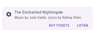
///
/// {@tool sample --template=stateless_widget_scaffold}
///
/// This sample shows creation of a [Card] widget that shows album information
/// and two actions.
///
/// ```dart
/// Widget build(BuildContext context) {
/// return Center(
/// child: Card(
/// child: Column(
/// mainAxisSize: MainAxisSize.min,
/// children: <Widget>[
/// const ListTile(
/// leading: Icon(Icons.album),
/// title: Text('The Enchanted Nightingale'),
/// subtitle: Text('Music by Julie Gable. Lyrics by Sidney Stein.'),
/// ),
/// ButtonBar(
/// children: <Widget>[
/// FlatButton(
/// child: const Text('BUY TICKETS'),
/// onPressed: () { /* ... */ },
/// ),
/// FlatButton(
/// child: const Text('LISTEN'),
/// onPressed: () { /* ... */ },
/// ),
/// ],
/// ),
/// ],
/// ),
/// ),
/// );
/// }
/// ```
/// {@end-tool}
///
/// Sometimes the primary action area of a card is the card itself. Cards can be
/// one large touch target that shows a detail screen when tapped.
///
/// {@tool sample --template=stateless_widget_scaffold}
///
/// This sample shows creation of a [Card] widget that can be tapped. When
/// tapped this [Card]'s [InkWell] displays an "ink splash" that fills the
/// entire card.
///
/// ```dart
/// Widget build(BuildContext context) {
/// return Center(
/// child: Card(
/// child: InkWell(
/// splashColor: Colors.blue.withAlpha(30),
/// onTap: () {
/// print('Card tapped.');
/// },
/// child: Container(
/// width: 300,
/// height: 100,
/// child: Text('A card that can be tapped'),
/// ),
/// ),
/// ),
/// );
/// }
/// ```
///
/// {@end-tool}
///
/// See also:
///
/// * [ListTile], to display icons and text in a card.
/// * [ButtonBar], to display buttons at the bottom of a card.
/// * [showDialog], to display a modal card.
/// * <https://material.io/design/components/cards.html>
class Card extends StatelessWidget {
/// Creates a material design card.
///
/// The [elevation] must be null or non-negative. The [borderOnForeground]
/// must not be null.
const Card({
Key key,
this.color,
this.elevation,
this.shape,
this.borderOnForeground = true,
this.margin,
this.clipBehavior,
this.child,
this.semanticContainer = true,
}) : assert(elevation == null || elevation >= 0.0),
assert(borderOnForeground != null),
super(key: key);
/// The card's background color.
///
/// Defines the card's [Material.color].
///
/// If this property is null then [ThemeData.cardTheme.color] is used,
/// if that's null then [ThemeData.cardColor] is used.
final Color color;
/// The z-coordinate at which to place this card. This controls the size of
/// the shadow below the card.
///
/// Defines the card's [Material.elevation].
///
/// If this property is null then [ThemeData.cardTheme.elevation] is used,
/// if that's null, the default value is 1.0.
final double elevation;
/// The shape of the card's [Material].
///
/// Defines the card's [Material.shape].
///
/// If this property is null then [ThemeData.cardTheme.shape] is used.
/// If that's null then the shape will be a [RoundedRectangleBorder] with a
/// circular corner radius of 4.0.
final ShapeBorder shape;
/// Whether to paint the [shape] border in front of the [child].
///
/// The default value is true.
/// If false, the border will be painted behind the [child].
final bool borderOnForeground;
/// {@macro flutter.widgets.Clip}
///
/// If this property is null then [ThemeData.cardTheme.clipBehavior] is used.
/// If that's null then the behavior will be [Clip.none].
final Clip clipBehavior;
/// The empty space that surrounds the card.
///
/// Defines the card's outer [Container.margin].
///
/// If this property is null then [ThemeData.cardTheme.margin] is used,
/// if that's null, the default margin is 4.0 logical pixels on all sides:
/// `EdgeInsets.all(4.0)`.
final EdgeInsetsGeometry margin;
/// Whether this widget represents a single semantic container, or if false
/// a collection of individual semantic nodes.
///
/// Defaults to true.
///
/// Setting this flag to true will attempt to merge all child semantics into
/// this node. Setting this flag to false will force all child semantic nodes
/// to be explicit.
///
/// This flag should be false if the card contains multiple different types
/// of content.
final bool semanticContainer;
/// The widget below this widget in the tree.
///
/// {@macro flutter.widgets.child}
final Widget child;
static const double _defaultElevation = 1.0;
@override
Widget build(BuildContext context) {
final CardTheme cardTheme = CardTheme.of(context);
return Semantics(
container: semanticContainer,
child: Container(
margin: margin ?? cardTheme.margin ?? const EdgeInsets.all(4.0),
child: Material(
type: MaterialType.card,
color: color ?? cardTheme.color ?? Theme.of(context).cardColor,
elevation: elevation ?? cardTheme.elevation ?? _defaultElevation,
shape: shape ?? cardTheme.shape ?? const RoundedRectangleBorder(
borderRadius: BorderRadius.all(Radius.circular(4.0)),
),
borderOnForeground: borderOnForeground,
clipBehavior: clipBehavior ?? cardTheme.clipBehavior ?? Clip.none,
child: Semantics(
explicitChildNodes: !semanticContainer,
child: child,
),
),
),
);
}
}