-
Notifications
You must be signed in to change notification settings - Fork 0
/
Copy pathfloating_action_button.dart
596 lines (549 loc) · 21.7 KB
/
floating_action_button.dart
1
2
3
4
5
6
7
8
9
10
11
12
13
14
15
16
17
18
19
20
21
22
23
24
25
26
27
28
29
30
31
32
33
34
35
36
37
38
39
40
41
42
43
44
45
46
47
48
49
50
51
52
53
54
55
56
57
58
59
60
61
62
63
64
65
66
67
68
69
70
71
72
73
74
75
76
77
78
79
80
81
82
83
84
85
86
87
88
89
90
91
92
93
94
95
96
97
98
99
100
101
102
103
104
105
106
107
108
109
110
111
112
113
114
115
116
117
118
119
120
121
122
123
124
125
126
127
128
129
130
131
132
133
134
135
136
137
138
139
140
141
142
143
144
145
146
147
148
149
150
151
152
153
154
155
156
157
158
159
160
161
162
163
164
165
166
167
168
169
170
171
172
173
174
175
176
177
178
179
180
181
182
183
184
185
186
187
188
189
190
191
192
193
194
195
196
197
198
199
200
201
202
203
204
205
206
207
208
209
210
211
212
213
214
215
216
217
218
219
220
221
222
223
224
225
226
227
228
229
230
231
232
233
234
235
236
237
238
239
240
241
242
243
244
245
246
247
248
249
250
251
252
253
254
255
256
257
258
259
260
261
262
263
264
265
266
267
268
269
270
271
272
273
274
275
276
277
278
279
280
281
282
283
284
285
286
287
288
289
290
291
292
293
294
295
296
297
298
299
300
301
302
303
304
305
306
307
308
309
310
311
312
313
314
315
316
317
318
319
320
321
322
323
324
325
326
327
328
329
330
331
332
333
334
335
336
337
338
339
340
341
342
343
344
345
346
347
348
349
350
351
352
353
354
355
356
357
358
359
360
361
362
363
364
365
366
367
368
369
370
371
372
373
374
375
376
377
378
379
380
381
382
383
384
385
386
387
388
389
390
391
392
393
394
395
396
397
398
399
400
401
402
403
404
405
406
407
408
409
410
411
412
413
414
415
416
417
418
419
420
421
422
423
424
425
426
427
428
429
430
431
432
433
434
435
436
437
438
439
440
441
442
443
444
445
446
447
448
449
450
451
452
453
454
455
456
457
458
459
460
461
462
463
464
465
466
467
468
469
470
471
472
473
474
475
476
477
478
479
480
481
482
483
484
485
486
487
488
489
490
491
492
493
494
495
496
497
498
499
500
501
502
503
504
505
506
507
508
509
510
511
512
513
514
515
516
517
518
519
520
521
522
523
524
525
526
527
528
529
530
531
532
533
534
535
536
537
538
539
540
541
542
543
544
545
546
547
548
549
550
551
552
553
554
555
556
557
558
559
560
561
562
563
564
565
566
567
568
569
570
571
572
573
574
575
576
577
578
579
580
581
582
583
584
585
586
587
588
589
590
591
592
593
594
595
596
// Copyright 2014 The Flutter Authors. All rights reserved.
// Use of this source code is governed by a BSD-style license that can be
// found in the LICENSE file.
import 'dart:math' as math;
import 'package:flutter/foundation.dart';
import 'package:flutter/painting.dart';
import 'package:flutter/rendering.dart';
import 'package:flutter/widgets.dart';
import 'button.dart';
import 'colors.dart';
import 'floating_action_button_theme.dart';
import 'scaffold.dart';
import 'theme.dart';
import 'theme_data.dart';
import 'tooltip.dart';
const BoxConstraints _kSizeConstraints = BoxConstraints.tightFor(
width: 56.0,
height: 56.0,
);
const BoxConstraints _kMiniSizeConstraints = BoxConstraints.tightFor(
width: 40.0,
height: 40.0,
);
const BoxConstraints _kExtendedSizeConstraints = BoxConstraints(
minHeight: 48.0,
maxHeight: 48.0,
);
class _DefaultHeroTag {
const _DefaultHeroTag();
@override
String toString() => '<default FloatingActionButton tag>';
}
/// A material design floating action button.
///
/// A floating action button is a circular icon button that hovers over content
/// to promote a primary action in the application. Floating action buttons are
/// most commonly used in the [Scaffold.floatingActionButton] field.
///
/// {@youtube 560 315 https://www.youtube.com/watch?v=2uaoEDOgk_I}
///
/// Use at most a single floating action button per screen. Floating action
/// buttons should be used for positive actions such as "create", "share", or
/// "navigate". (If more than one floating action button is used within a
/// [Route], then make sure that each button has a unique [heroTag], otherwise
/// an exception will be thrown.)
///
/// If the [onPressed] callback is null, then the button will be disabled and
/// will not react to touch. It is highly discouraged to disable a floating
/// action button as there is no indication to the user that the button is
/// disabled. Consider changing the [backgroundColor] if disabling the floating
/// action button.
///
/// {@tool sample --template=stateless_widget_material}
/// This example shows how to display a [FloatingActionButton] in a
/// [Scaffold], with a pink [backgroundColor] and a thumbs up [Icon].
///
/// 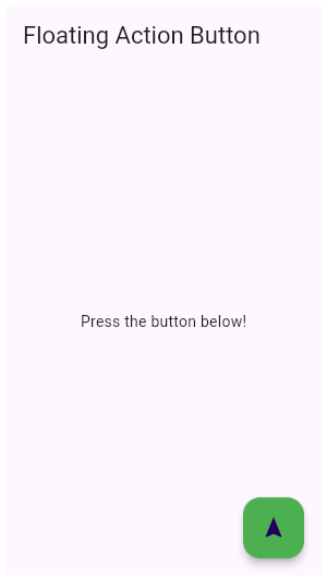
///
/// ```dart
/// Widget build(BuildContext context) {
/// return Scaffold(
/// appBar: AppBar(
/// title: const Text('Floating Action Button'),
/// ),
/// body: Center(
/// child: const Text('Press the button below!')
/// ),
/// floatingActionButton: FloatingActionButton(
/// onPressed: () {
/// // Add your onPressed code here!
/// },
/// child: Icon(Icons.navigation),
/// backgroundColor: Colors.green,
/// ),
/// );
/// }
/// ```
/// {@end-tool}
///
/// {@tool sample --template=stateless_widget_material}
/// This example shows how to make an extended [FloatingActionButton] in a
/// [Scaffold], with a pink [backgroundColor], a thumbs up [Icon] and a
/// [Text] label that reads "Approve".
///
/// 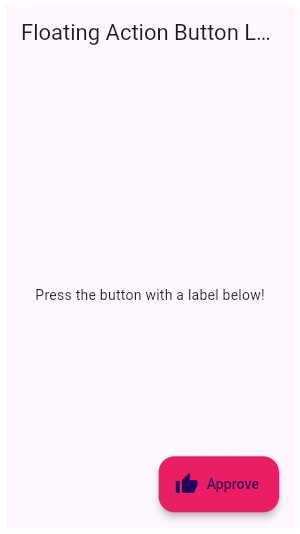
///
/// ```dart
/// Widget build(BuildContext context) {
/// return Scaffold(
/// appBar: AppBar(
/// title: const Text('Floating Action Button Label'),
/// ),
/// body: Center(
/// child: const Text('Press the button with a label below!'),
/// ),
/// floatingActionButton: FloatingActionButton.extended(
/// onPressed: () {
/// // Add your onPressed code here!
/// },
/// label: Text('Approve'),
/// icon: Icon(Icons.thumb_up),
/// backgroundColor: Colors.pink,
/// ),
/// );
/// }
/// ```
/// {@end-tool}
///
/// See also:
///
/// * [Scaffold], in which floating action buttons typically live.
/// * [RaisedButton], another kind of button that appears to float above the
/// content.
/// * <https://material.io/design/components/buttons-floating-action-button.html>
class FloatingActionButton extends StatelessWidget {
/// Creates a circular floating action button.
///
/// The [mini] and [clipBehavior] arguments must not be null. Additionally,
/// [elevation], [highlightElevation], and [disabledElevation] (if specified)
/// must be non-negative.
const FloatingActionButton({
Key key,
this.child,
this.tooltip,
this.foregroundColor,
this.backgroundColor,
this.focusColor,
this.hoverColor,
this.splashColor,
this.heroTag = const _DefaultHeroTag(),
this.elevation,
this.focusElevation,
this.hoverElevation,
this.highlightElevation,
this.disabledElevation,
@required this.onPressed,
this.mini = false,
this.shape,
this.clipBehavior = Clip.none,
this.focusNode,
this.autofocus = false,
this.materialTapTargetSize,
this.isExtended = false,
}) : assert(elevation == null || elevation >= 0.0),
assert(focusElevation == null || focusElevation >= 0.0),
assert(hoverElevation == null || hoverElevation >= 0.0),
assert(highlightElevation == null || highlightElevation >= 0.0),
assert(disabledElevation == null || disabledElevation >= 0.0),
assert(mini != null),
assert(clipBehavior != null),
assert(isExtended != null),
assert(autofocus != null),
_sizeConstraints = mini ? _kMiniSizeConstraints : _kSizeConstraints,
super(key: key);
/// Creates a wider [StadiumBorder]-shaped floating action button with
/// an optional [icon] and a [label].
///
/// The [label], [autofocus], and [clipBehavior] arguments must not be null.
/// Additionally, [elevation], [highlightElevation], and [disabledElevation]
/// (if specified) must be non-negative.
FloatingActionButton.extended({
Key key,
this.tooltip,
this.foregroundColor,
this.backgroundColor,
this.focusColor,
this.hoverColor,
this.heroTag = const _DefaultHeroTag(),
this.elevation,
this.focusElevation,
this.hoverElevation,
this.splashColor,
this.highlightElevation,
this.disabledElevation,
@required this.onPressed,
this.shape,
this.isExtended = true,
this.materialTapTargetSize,
this.clipBehavior = Clip.none,
this.focusNode,
this.autofocus = false,
Widget icon,
@required Widget label,
}) : assert(elevation == null || elevation >= 0.0),
assert(focusElevation == null || focusElevation >= 0.0),
assert(hoverElevation == null || hoverElevation >= 0.0),
assert(highlightElevation == null || highlightElevation >= 0.0),
assert(disabledElevation == null || disabledElevation >= 0.0),
assert(isExtended != null),
assert(clipBehavior != null),
assert(autofocus != null),
_sizeConstraints = _kExtendedSizeConstraints,
mini = false,
child = _ChildOverflowBox(
child: Row(
mainAxisSize: MainAxisSize.min,
children: icon == null
? <Widget>[
const SizedBox(width: 20.0),
label,
const SizedBox(width: 20.0),
]
: <Widget>[
const SizedBox(width: 16.0),
icon,
const SizedBox(width: 8.0),
label,
const SizedBox(width: 20.0),
],
),
),
super(key: key);
/// The widget below this widget in the tree.
///
/// Typically an [Icon].
final Widget child;
/// Text that describes the action that will occur when the button is pressed.
///
/// This text is displayed when the user long-presses on the button and is
/// used for accessibility.
final String tooltip;
/// The default foreground color for icons and text within the button.
///
/// If this property is null, then the [Theme]'s
/// [ThemeData.floatingActionButtonTheme.foregroundColor] is used. If that
/// property is also null, then the [Theme]'s
/// [ThemeData.colorScheme.onSecondary] color is used.
///
/// Although the color of theme's `accentIconTheme` currently provides a
/// default that supercedes the `onSecondary` color, this dependency
/// has been deprecated: https://flutter.dev/go/remove-fab-accent-theme-dependency.
/// It will be removed in the future.
final Color foregroundColor;
/// The button's background color.
///
/// If this property is null, then the [Theme]'s
/// [ThemeData.floatingActionButtonTheme.backgroundColor] is used. If that
/// property is also null, then the [Theme]'s
/// [ThemeData.colorScheme.secondary] color is used.
final Color backgroundColor;
/// The color to use for filling the button when the button has input focus.
///
/// Defaults to [ThemeData.focusColor] for the current theme.
final Color focusColor;
/// The color to use for filling the button when the button has a pointer
/// hovering over it.
///
/// Defaults to [ThemeData.hoverColor] for the current theme.
final Color hoverColor;
/// The splash color for this [FloatingActionButton]'s [InkWell].
///
/// If null, [FloatingActionButtonThemeData.splashColor] is used, if that is
/// null, [ThemeData.splashColor] is used.
final Color splashColor;
/// The tag to apply to the button's [Hero] widget.
///
/// Defaults to a tag that matches other floating action buttons.
///
/// Set this to null explicitly if you don't want the floating action button to
/// have a hero tag.
///
/// If this is not explicitly set, then there can only be one
/// [FloatingActionButton] per route (that is, per screen), since otherwise
/// there would be a tag conflict (multiple heroes on one route can't have the
/// same tag). The material design specification recommends only using one
/// floating action button per screen.
final Object heroTag;
/// The callback that is called when the button is tapped or otherwise activated.
///
/// If this is set to null, the button will be disabled.
final VoidCallback onPressed;
/// The z-coordinate at which to place this button relative to its parent.
///
/// This controls the size of the shadow below the floating action button.
///
/// Defaults to 6, the appropriate elevation for floating action buttons. The
/// value is always non-negative.
///
/// See also:
///
/// * [highlightElevation], the elevation when the button is pressed.
/// * [disabledElevation], the elevation when the button is disabled.
final double elevation;
/// The z-coordinate at which to place this button relative to its parent when
/// the button has the input focus.
///
/// This controls the size of the shadow below the floating action button.
///
/// Defaults to 8, the appropriate elevation for floating action buttons
/// while they have focus. The value is always non-negative.
///
/// See also:
///
/// * [elevation], the default elevation.
/// * [highlightElevation], the elevation when the button is pressed.
/// * [disabledElevation], the elevation when the button is disabled.
final double focusElevation;
/// The z-coordinate at which to place this button relative to its parent when
/// the button is enabled and has a pointer hovering over it.
///
/// This controls the size of the shadow below the floating action button.
///
/// Defaults to 8, the appropriate elevation for floating action buttons while
/// they have a pointer hovering over them. The value is always non-negative.
///
/// See also:
///
/// * [elevation], the default elevation.
/// * [highlightElevation], the elevation when the button is pressed.
/// * [disabledElevation], the elevation when the button is disabled.
final double hoverElevation;
/// The z-coordinate at which to place this button relative to its parent when
/// the user is touching the button.
///
/// This controls the size of the shadow below the floating action button.
///
/// Defaults to 12, the appropriate elevation for floating action buttons
/// while they are being touched. The value is always non-negative.
///
/// See also:
///
/// * [elevation], the default elevation.
final double highlightElevation;
/// The z-coordinate at which to place this button when the button is disabled
/// ([onPressed] is null).
///
/// This controls the size of the shadow below the floating action button.
///
/// Defaults to the same value as [elevation]. Setting this to zero makes the
/// floating action button work similar to a [RaisedButton] but the titular
/// "floating" effect is lost. The value is always non-negative.
///
/// See also:
///
/// * [elevation], the default elevation.
/// * [highlightElevation], the elevation when the button is pressed.
final double disabledElevation;
/// Controls the size of this button.
///
/// By default, floating action buttons are non-mini and have a height and
/// width of 56.0 logical pixels. Mini floating action buttons have a height
/// and width of 40.0 logical pixels with a layout width and height of 48.0
/// logical pixels. (The extra 4 pixels of padding on each side are added as a
/// result of the floating action button having [MaterialTapTargetSize.padded]
/// set on the underlying [RawMaterialButton.materialTapTargetSize].)
final bool mini;
/// The shape of the button's [Material].
///
/// The button's highlight and splash are clipped to this shape. If the
/// button has an elevation, then its drop shadow is defined by this
/// shape as well.
final ShapeBorder shape;
/// {@macro flutter.widgets.Clip}
///
/// Defaults to [Clip.none], and must not be null.
final Clip clipBehavior;
/// True if this is an "extended" floating action button.
///
/// Typically [extended] buttons have a [StadiumBorder] [shape]
/// and have been created with the [FloatingActionButton.extended]
/// constructor.
///
/// The [Scaffold] animates the appearance of ordinary floating
/// action buttons with scale and rotation transitions. Extended
/// floating action buttons are scaled and faded in.
final bool isExtended;
/// {@macro flutter.widgets.Focus.focusNode}
final FocusNode focusNode;
/// {@macro flutter.widgets.Focus.autofocus}
final bool autofocus;
/// Configures the minimum size of the tap target.
///
/// Defaults to [ThemeData.materialTapTargetSize].
///
/// See also:
///
/// * [MaterialTapTargetSize], for a description of how this affects tap targets.
final MaterialTapTargetSize materialTapTargetSize;
final BoxConstraints _sizeConstraints;
static const double _defaultElevation = 6;
// TODO(gspencer): verify focus and hover elevation values are correct
// according to spec.
static const double _defaultFocusElevation = 8;
static const double _defaultHoverElevation = 10;
static const double _defaultHighlightElevation = 12;
static const ShapeBorder _defaultShape = CircleBorder();
static const ShapeBorder _defaultExtendedShape = StadiumBorder();
@override
Widget build(BuildContext context) {
final ThemeData theme = Theme.of(context);
final FloatingActionButtonThemeData floatingActionButtonTheme = theme.floatingActionButtonTheme;
// Applications should no longer use accentIconTheme's color to configure
// the foreground color of floating action buttons. For more information, see
// https://flutter.dev/go/remove-fab-accent-theme-dependency.
if (this.foregroundColor == null && floatingActionButtonTheme.foregroundColor == null) {
final bool accentIsDark = theme.accentColorBrightness == Brightness.dark;
final Color defaultAccentIconThemeColor = accentIsDark ? Colors.white : Colors.black;
if (theme.accentIconTheme.color != defaultAccentIconThemeColor) {
debugPrint(
'Warning: '
'The support for configuring the foreground color of '
'FloatingActionButtons using ThemeData.accentIconTheme '
'has been deprecated. Please use ThemeData.floatingActionButtonTheme '
'instead. See '
'https://flutter.dev/docs/release/breaking-changes/fab_accent_dependency. '
'This feature was deprecated after v1.13.2.'
);
}
}
final Color foregroundColor = this.foregroundColor
?? floatingActionButtonTheme.foregroundColor
?? theme.colorScheme.onSecondary;
final Color backgroundColor = this.backgroundColor
?? floatingActionButtonTheme.backgroundColor
?? theme.colorScheme.secondary;
final Color focusColor = this.focusColor
?? floatingActionButtonTheme.focusColor
?? theme.focusColor;
final Color hoverColor = this.hoverColor
?? floatingActionButtonTheme.hoverColor
?? theme.hoverColor;
final Color splashColor = this.splashColor
?? floatingActionButtonTheme.splashColor
?? theme.splashColor;
final double elevation = this.elevation
?? floatingActionButtonTheme.elevation
?? _defaultElevation;
final double focusElevation = this.focusElevation
?? floatingActionButtonTheme.focusElevation
?? _defaultFocusElevation;
final double hoverElevation = this.hoverElevation
?? floatingActionButtonTheme.hoverElevation
?? _defaultHoverElevation;
final double disabledElevation = this.disabledElevation
?? floatingActionButtonTheme.disabledElevation
?? elevation;
final double highlightElevation = this.highlightElevation
?? floatingActionButtonTheme.highlightElevation
?? _defaultHighlightElevation;
final MaterialTapTargetSize materialTapTargetSize = this.materialTapTargetSize
?? theme.materialTapTargetSize;
final TextStyle textStyle = theme.textTheme.button.copyWith(
color: foregroundColor,
letterSpacing: 1.2,
);
final ShapeBorder shape = this.shape
?? floatingActionButtonTheme.shape
?? (isExtended ? _defaultExtendedShape : _defaultShape);
Widget result = RawMaterialButton(
onPressed: onPressed,
elevation: elevation,
focusElevation: focusElevation,
hoverElevation: hoverElevation,
highlightElevation: highlightElevation,
disabledElevation: disabledElevation,
constraints: _sizeConstraints,
materialTapTargetSize: materialTapTargetSize,
fillColor: backgroundColor,
focusColor: focusColor,
hoverColor: hoverColor,
splashColor: splashColor,
textStyle: textStyle,
shape: shape,
clipBehavior: clipBehavior,
focusNode: focusNode,
autofocus: autofocus,
child: child,
);
if (tooltip != null) {
result = Tooltip(
message: tooltip,
child: result,
);
}
if (heroTag != null) {
result = Hero(
tag: heroTag,
child: result,
);
}
return MergeSemantics(child: result);
}
@override
void debugFillProperties(DiagnosticPropertiesBuilder properties) {
super.debugFillProperties(properties);
properties.add(ObjectFlagProperty<VoidCallback>('onPressed', onPressed, ifNull: 'disabled'));
properties.add(StringProperty('tooltip', tooltip, defaultValue: null));
properties.add(ColorProperty('foregroundColor', foregroundColor, defaultValue: null));
properties.add(ColorProperty('backgroundColor', backgroundColor, defaultValue: null));
properties.add(ColorProperty('focusColor', focusColor, defaultValue: null));
properties.add(ColorProperty('hoverColor', hoverColor, defaultValue: null));
properties.add(ColorProperty('splashColor', splashColor, defaultValue: null));
properties.add(ObjectFlagProperty<Object>('heroTag', heroTag, ifPresent: 'hero'));
properties.add(DoubleProperty('elevation', elevation, defaultValue: null));
properties.add(DoubleProperty('focusElevation', focusElevation, defaultValue: null));
properties.add(DoubleProperty('hoverElevation', hoverElevation, defaultValue: null));
properties.add(DoubleProperty('highlightElevation', highlightElevation, defaultValue: null));
properties.add(DoubleProperty('disabledElevation', disabledElevation, defaultValue: null));
properties.add(DiagnosticsProperty<ShapeBorder>('shape', shape, defaultValue: null));
properties.add(DiagnosticsProperty<FocusNode>('focusNode', focusNode, defaultValue: null));
properties.add(FlagProperty('isExtended', value: isExtended, ifTrue: 'extended'));
properties.add(DiagnosticsProperty<MaterialTapTargetSize>('materialTapTargetSize', materialTapTargetSize, defaultValue: null));
}
}
// This widget's size matches its child's size unless its constraints
// force it to be larger or smaller. The child is centered.
//
// Used to encapsulate extended FABs whose size is fixed, using Row
// and MainAxisSize.min, to be as wide as their label and icon.
class _ChildOverflowBox extends SingleChildRenderObjectWidget {
const _ChildOverflowBox({
Key key,
Widget child,
}) : super(key: key, child: child);
@override
_RenderChildOverflowBox createRenderObject(BuildContext context) {
return _RenderChildOverflowBox(
textDirection: Directionality.of(context),
);
}
@override
void updateRenderObject(BuildContext context, _RenderChildOverflowBox renderObject) {
renderObject
..textDirection = Directionality.of(context);
}
}
class _RenderChildOverflowBox extends RenderAligningShiftedBox {
_RenderChildOverflowBox({
RenderBox child,
TextDirection textDirection,
}) : super(child: child, alignment: Alignment.center, textDirection: textDirection);
@override
double computeMinIntrinsicWidth(double height) => 0.0;
@override
double computeMinIntrinsicHeight(double width) => 0.0;
@override
void performLayout() {
if (child != null) {
child.layout(const BoxConstraints(), parentUsesSize: true);
size = Size(
math.max(constraints.minWidth, math.min(constraints.maxWidth, child.size.width)),
math.max(constraints.minHeight, math.min(constraints.maxHeight, child.size.height)),
);
alignChild();
} else {
size = constraints.biggest;
}
}
}