-
Notifications
You must be signed in to change notification settings - Fork 0
/
Copy pathlist_tile.dart
1497 lines (1376 loc) · 46.6 KB
/
list_tile.dart
1
2
3
4
5
6
7
8
9
10
11
12
13
14
15
16
17
18
19
20
21
22
23
24
25
26
27
28
29
30
31
32
33
34
35
36
37
38
39
40
41
42
43
44
45
46
47
48
49
50
51
52
53
54
55
56
57
58
59
60
61
62
63
64
65
66
67
68
69
70
71
72
73
74
75
76
77
78
79
80
81
82
83
84
85
86
87
88
89
90
91
92
93
94
95
96
97
98
99
100
101
102
103
104
105
106
107
108
109
110
111
112
113
114
115
116
117
118
119
120
121
122
123
124
125
126
127
128
129
130
131
132
133
134
135
136
137
138
139
140
141
142
143
144
145
146
147
148
149
150
151
152
153
154
155
156
157
158
159
160
161
162
163
164
165
166
167
168
169
170
171
172
173
174
175
176
177
178
179
180
181
182
183
184
185
186
187
188
189
190
191
192
193
194
195
196
197
198
199
200
201
202
203
204
205
206
207
208
209
210
211
212
213
214
215
216
217
218
219
220
221
222
223
224
225
226
227
228
229
230
231
232
233
234
235
236
237
238
239
240
241
242
243
244
245
246
247
248
249
250
251
252
253
254
255
256
257
258
259
260
261
262
263
264
265
266
267
268
269
270
271
272
273
274
275
276
277
278
279
280
281
282
283
284
285
286
287
288
289
290
291
292
293
294
295
296
297
298
299
300
301
302
303
304
305
306
307
308
309
310
311
312
313
314
315
316
317
318
319
320
321
322
323
324
325
326
327
328
329
330
331
332
333
334
335
336
337
338
339
340
341
342
343
344
345
346
347
348
349
350
351
352
353
354
355
356
357
358
359
360
361
362
363
364
365
366
367
368
369
370
371
372
373
374
375
376
377
378
379
380
381
382
383
384
385
386
387
388
389
390
391
392
393
394
395
396
397
398
399
400
401
402
403
404
405
406
407
408
409
410
411
412
413
414
415
416
417
418
419
420
421
422
423
424
425
426
427
428
429
430
431
432
433
434
435
436
437
438
439
440
441
442
443
444
445
446
447
448
449
450
451
452
453
454
455
456
457
458
459
460
461
462
463
464
465
466
467
468
469
470
471
472
473
474
475
476
477
478
479
480
481
482
483
484
485
486
487
488
489
490
491
492
493
494
495
496
497
498
499
500
501
502
503
504
505
506
507
508
509
510
511
512
513
514
515
516
517
518
519
520
521
522
523
524
525
526
527
528
529
530
531
532
533
534
535
536
537
538
539
540
541
542
543
544
545
546
547
548
549
550
551
552
553
554
555
556
557
558
559
560
561
562
563
564
565
566
567
568
569
570
571
572
573
574
575
576
577
578
579
580
581
582
583
584
585
586
587
588
589
590
591
592
593
594
595
596
597
598
599
600
601
602
603
604
605
606
607
608
609
610
611
612
613
614
615
616
617
618
619
620
621
622
623
624
625
626
627
628
629
630
631
632
633
634
635
636
637
638
639
640
641
642
643
644
645
646
647
648
649
650
651
652
653
654
655
656
657
658
659
660
661
662
663
664
665
666
667
668
669
670
671
672
673
674
675
676
677
678
679
680
681
682
683
684
685
686
687
688
689
690
691
692
693
694
695
696
697
698
699
700
701
702
703
704
705
706
707
708
709
710
711
712
713
714
715
716
717
718
719
720
721
722
723
724
725
726
727
728
729
730
731
732
733
734
735
736
737
738
739
740
741
742
743
744
745
746
747
748
749
750
751
752
753
754
755
756
757
758
759
760
761
762
763
764
765
766
767
768
769
770
771
772
773
774
775
776
777
778
779
780
781
782
783
784
785
786
787
788
789
790
791
792
793
794
795
796
797
798
799
800
801
802
803
804
805
806
807
808
809
810
811
812
813
814
815
816
817
818
819
820
821
822
823
824
825
826
827
828
829
830
831
832
833
834
835
836
837
838
839
840
841
842
843
844
845
846
847
848
849
850
851
852
853
854
855
856
857
858
859
860
861
862
863
864
865
866
867
868
869
870
871
872
873
874
875
876
877
878
879
880
881
882
883
884
885
886
887
888
889
890
891
892
893
894
895
896
897
898
899
900
901
902
903
904
905
906
907
908
909
910
911
912
913
914
915
916
917
918
919
920
921
922
923
924
925
926
927
928
929
930
931
932
933
934
935
936
937
938
939
940
941
942
943
944
945
946
947
948
949
950
951
952
953
954
955
956
957
958
959
960
961
962
963
964
965
966
967
968
969
970
971
972
973
974
975
976
977
978
979
980
981
982
983
984
985
986
987
988
989
990
991
992
993
994
995
996
997
998
999
1000
// Copyright 2014 The Flutter Authors. All rights reserved.
// Use of this source code is governed by a BSD-style license that can be
// found in the LICENSE file.
import 'dart:math' as math;
import 'package:flutter/widgets.dart';
import 'package:flutter/foundation.dart';
import 'package:flutter/rendering.dart';
import 'colors.dart';
import 'constants.dart';
import 'debug.dart';
import 'divider.dart';
import 'ink_well.dart';
import 'theme.dart';
/// Defines the title font used for [ListTile] descendants of a [ListTileTheme].
///
/// List tiles that appear in a [Drawer] use the theme's [TextTheme.bodyText1]
/// text style, which is a little smaller than the theme's [TextTheme.subtitle1]
/// text style, which is used by default.
enum ListTileStyle {
/// Use a title font that's appropriate for a [ListTile] in a list.
list,
/// Use a title font that's appropriate for a [ListTile] that appears in a [Drawer].
drawer,
}
/// An inherited widget that defines color and style parameters for [ListTile]s
/// in this widget's subtree.
///
/// Values specified here are used for [ListTile] properties that are not given
/// an explicit non-null value.
///
/// The [Drawer] widget specifies a tile theme for its children which sets
/// [style] to [ListTileStyle.drawer].
class ListTileTheme extends InheritedTheme {
/// Creates a list tile theme that controls the color and style parameters for
/// [ListTile]s.
const ListTileTheme({
Key key,
this.dense = false,
this.style = ListTileStyle.list,
this.selectedColor,
this.iconColor,
this.textColor,
this.contentPadding,
Widget child,
}) : super(key: key, child: child);
/// Creates a list tile theme that controls the color and style parameters for
/// [ListTile]s, and merges in the current list tile theme, if any.
///
/// The [child] argument must not be null.
static Widget merge({
Key key,
bool dense,
ListTileStyle style,
Color selectedColor,
Color iconColor,
Color textColor,
EdgeInsetsGeometry contentPadding,
@required Widget child,
}) {
assert(child != null);
return Builder(
builder: (BuildContext context) {
final ListTileTheme parent = ListTileTheme.of(context);
return ListTileTheme(
key: key,
dense: dense ?? parent.dense,
style: style ?? parent.style,
selectedColor: selectedColor ?? parent.selectedColor,
iconColor: iconColor ?? parent.iconColor,
textColor: textColor ?? parent.textColor,
contentPadding: contentPadding ?? parent.contentPadding,
child: child,
);
},
);
}
/// If true then [ListTile]s will have the vertically dense layout.
final bool dense;
/// If specified, [style] defines the font used for [ListTile] titles.
final ListTileStyle style;
/// If specified, the color used for icons and text when a [ListTile] is selected.
final Color selectedColor;
/// If specified, the icon color used for enabled [ListTile]s that are not selected.
final Color iconColor;
/// If specified, the text color used for enabled [ListTile]s that are not selected.
final Color textColor;
/// The tile's internal padding.
///
/// Insets a [ListTile]'s contents: its [leading], [title], [subtitle],
/// and [trailing] widgets.
final EdgeInsetsGeometry contentPadding;
/// The closest instance of this class that encloses the given context.
///
/// Typical usage is as follows:
///
/// ```dart
/// ListTileTheme theme = ListTileTheme.of(context);
/// ```
static ListTileTheme of(BuildContext context) {
final ListTileTheme result = context.dependOnInheritedWidgetOfExactType<ListTileTheme>();
return result ?? const ListTileTheme();
}
@override
Widget wrap(BuildContext context, Widget child) {
final ListTileTheme ancestorTheme = context.findAncestorWidgetOfExactType<ListTileTheme>();
return identical(this, ancestorTheme) ? child : ListTileTheme(
dense: dense,
style: style,
selectedColor: selectedColor,
iconColor: iconColor,
textColor: textColor,
contentPadding: contentPadding,
child: child,
);
}
@override
bool updateShouldNotify(ListTileTheme oldWidget) {
return dense != oldWidget.dense
|| style != oldWidget.style
|| selectedColor != oldWidget.selectedColor
|| iconColor != oldWidget.iconColor
|| textColor != oldWidget.textColor
|| contentPadding != oldWidget.contentPadding;
}
}
/// Where to place the control in widgets that use [ListTile] to position a
/// control next to a label.
///
/// See also:
///
/// * [CheckboxListTile], which combines a [ListTile] with a [Checkbox].
/// * [RadioListTile], which combines a [ListTile] with a [Radio] button.
enum ListTileControlAffinity {
/// Position the control on the leading edge, and the secondary widget, if
/// any, on the trailing edge.
leading,
/// Position the control on the trailing edge, and the secondary widget, if
/// any, on the leading edge.
trailing,
/// Position the control relative to the text in the fashion that is typical
/// for the current platform, and place the secondary widget on the opposite
/// side.
platform,
}
/// A single fixed-height row that typically contains some text as well as
/// a leading or trailing icon.
///
/// {@youtube 560 315 https://www.youtube.com/watch?v=l8dj0yPBvgQ}
///
/// A list tile contains one to three lines of text optionally flanked by icons or
/// other widgets, such as check boxes. The icons (or other widgets) for the
/// tile are defined with the [leading] and [trailing] parameters. The first
/// line of text is not optional and is specified with [title]. The value of
/// [subtitle], which _is_ optional, will occupy the space allocated for an
/// additional line of text, or two lines if [isThreeLine] is true. If [dense]
/// is true then the overall height of this tile and the size of the
/// [DefaultTextStyle]s that wrap the [title] and [subtitle] widget are reduced.
///
/// It is the responsibility of the caller to ensure that [title] does not wrap,
/// and to ensure that [subtitle] doesn't wrap (if [isThreeLine] is false) or
/// wraps to two lines (if it is true).
///
/// The heights of the [leading] and [trailing] widgets are constrained
/// according to the
/// [Material spec](https://material.io/design/components/lists.html).
/// An exception is made for one-line ListTiles for accessibility. Please
/// see the example below to see how to adhere to both Material spec and
/// accessibility requirements.
///
/// Note that [leading] and [trailing] widgets can expand as far as they wish
/// horizontally, so ensure that they are properly constrained.
///
/// List tiles are typically used in [ListView]s, or arranged in [Column]s in
/// [Drawer]s and [Card]s.
///
/// Requires one of its ancestors to be a [Material] widget.
///
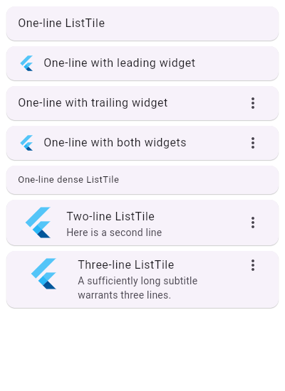
/// {@tool snippet}
///
/// This example uses a [ListView] to demonstrate different configurations of
/// [ListTile]s in [Card]s.
///
/// 
///
/// ```dart
/// ListView(
/// children: const <Widget>[
/// Card(child: ListTile(title: Text('One-line ListTile'))),
/// Card(
/// child: ListTile(
/// leading: FlutterLogo(),
/// title: Text('One-line with leading widget'),
/// ),
/// ),
/// Card(
/// child: ListTile(
/// title: Text('One-line with trailing widget'),
/// trailing: Icon(Icons.more_vert),
/// ),
/// ),
/// Card(
/// child: ListTile(
/// leading: FlutterLogo(),
/// title: Text('One-line with both widgets'),
/// trailing: Icon(Icons.more_vert),
/// ),
/// ),
/// Card(
/// child: ListTile(
/// title: Text('One-line dense ListTile'),
/// dense: true,
/// ),
/// ),
/// Card(
/// child: ListTile(
/// leading: FlutterLogo(size: 56.0),
/// title: Text('Two-line ListTile'),
/// subtitle: Text('Here is a second line'),
/// trailing: Icon(Icons.more_vert),
/// ),
/// ),
/// Card(
/// child: ListTile(
/// leading: FlutterLogo(size: 72.0),
/// title: Text('Three-line ListTile'),
/// subtitle: Text(
/// 'A sufficiently long subtitle warrants three lines.'
/// ),
/// trailing: Icon(Icons.more_vert),
/// isThreeLine: true,
/// ),
/// ),
/// ],
/// )
/// ```
/// {@end-tool}
/// {@tool snippet}
///
/// Tiles can be much more elaborate. Here is a tile which can be tapped, but
/// which is disabled when the `_act` variable is not 2. When the tile is
/// tapped, the whole row has an ink splash effect (see [InkWell]).
///
/// ```dart
/// int _act = 1;
/// // ...
/// ListTile(
/// leading: const Icon(Icons.flight_land),
/// title: const Text('Trix\'s airplane'),
/// subtitle: _act != 2 ? const Text('The airplane is only in Act II.') : null,
/// enabled: _act == 2,
/// onTap: () { /* react to the tile being tapped */ }
/// )
/// ```
/// {@end-tool}
///
/// To be accessible, tappable [leading] and [trailing] widgets have to
/// be at least 48x48 in size. However, to adhere to the Material spec,
/// [trailing] and [leading] widgets in one-line ListTiles should visually be
/// at most 32 ([dense]: true) or 40 ([dense]: false) in height, which may
/// conflict with the accessibility requirement.
///
/// For this reason, a one-line ListTile allows the height of [leading]
/// and [trailing] widgets to be constrained by the height of the ListTile.
/// This allows for the creation of tappable [leading] and [trailing] widgets
/// that are large enough, but it is up to the developer to ensure that
/// their widgets follow the Material spec.
///
/// {@tool snippet}
///
/// Here is an example of a one-line, non-[dense] ListTile with a
/// tappable leading widget that adheres to accessibility requirements and
/// the Material spec. To adjust the use case below for a one-line, [dense]
/// ListTile, adjust the vertical padding to 8.0.
///
/// ```dart
/// ListTile(
/// leading: GestureDetector(
/// behavior: HitTestBehavior.translucent,
/// onTap: () {},
/// child: Container(
/// width: 48,
/// height: 48,
/// padding: EdgeInsets.symmetric(vertical: 4.0),
/// alignment: Alignment.center,
/// child: CircleAvatar(),
/// ),
/// ),
/// title: Text('title'),
/// dense: false,
/// ),
/// ```
/// {@end-tool}
///
/// ## The ListTile layout isn't exactly what I want
///
/// If the way ListTile pads and positions its elements isn't quite what
/// you're looking for, it's easy to create custom list items with a
/// combination of other widgets, such as [Row]s and [Column]s.
///
/// {@tool sample --template=stateless_widget_scaffold}
///
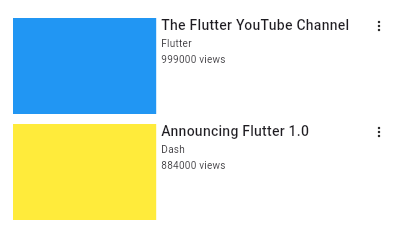
/// Here is an example of a custom list item that resembles a Youtube related
/// video list item created with [Expanded] and [Container] widgets.
///
/// 
///
/// ```dart preamble
/// class CustomListItem extends StatelessWidget {
/// const CustomListItem({
/// this.thumbnail,
/// this.title,
/// this.user,
/// this.viewCount,
/// });
///
/// final Widget thumbnail;
/// final String title;
/// final String user;
/// final int viewCount;
///
/// @override
/// Widget build(BuildContext context) {
/// return Padding(
/// padding: const EdgeInsets.symmetric(vertical: 5.0),
/// child: Row(
/// crossAxisAlignment: CrossAxisAlignment.start,
/// children: <Widget>[
/// Expanded(
/// flex: 2,
/// child: thumbnail,
/// ),
/// Expanded(
/// flex: 3,
/// child: _VideoDescription(
/// title: title,
/// user: user,
/// viewCount: viewCount,
/// ),
/// ),
/// const Icon(
/// Icons.more_vert,
/// size: 16.0,
/// ),
/// ],
/// ),
/// );
/// }
/// }
///
/// class _VideoDescription extends StatelessWidget {
/// const _VideoDescription({
/// Key key,
/// this.title,
/// this.user,
/// this.viewCount,
/// }) : super(key: key);
///
/// final String title;
/// final String user;
/// final int viewCount;
///
/// @override
/// Widget build(BuildContext context) {
/// return Padding(
/// padding: const EdgeInsets.fromLTRB(5.0, 0.0, 0.0, 0.0),
/// child: Column(
/// crossAxisAlignment: CrossAxisAlignment.start,
/// children: <Widget>[
/// Text(
/// title,
/// style: const TextStyle(
/// fontWeight: FontWeight.w500,
/// fontSize: 14.0,
/// ),
/// ),
/// const Padding(padding: EdgeInsets.symmetric(vertical: 2.0)),
/// Text(
/// user,
/// style: const TextStyle(fontSize: 10.0),
/// ),
/// const Padding(padding: EdgeInsets.symmetric(vertical: 1.0)),
/// Text(
/// '$viewCount views',
/// style: const TextStyle(fontSize: 10.0),
/// ),
/// ],
/// ),
/// );
/// }
/// }
/// ```
///
/// ```dart
/// Widget build(BuildContext context) {
/// return ListView(
/// padding: const EdgeInsets.all(8.0),
/// itemExtent: 106.0,
/// children: <CustomListItem>[
/// CustomListItem(
/// user: 'Flutter',
/// viewCount: 999000,
/// thumbnail: Container(
/// decoration: const BoxDecoration(color: Colors.blue),
/// ),
/// title: 'The Flutter YouTube Channel',
/// ),
/// CustomListItem(
/// user: 'Dash',
/// viewCount: 884000,
/// thumbnail: Container(
/// decoration: const BoxDecoration(color: Colors.yellow),
/// ),
/// title: 'Announcing Flutter 1.0',
/// ),
/// ],
/// );
/// }
/// ```
/// {@end-tool}
///
/// {@tool sample --template=stateless_widget_scaffold}
///
/// Here is an example of an article list item with multiline titles and
/// subtitles. It utilizes [Row]s and [Column]s, as well as [Expanded] and
/// [AspectRatio] widgets to organize its layout.
///
/// 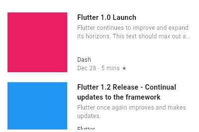
///
/// ```dart preamble
/// class _ArticleDescription extends StatelessWidget {
/// _ArticleDescription({
/// Key key,
/// this.title,
/// this.subtitle,
/// this.author,
/// this.publishDate,
/// this.readDuration,
/// }) : super(key: key);
///
/// final String title;
/// final String subtitle;
/// final String author;
/// final String publishDate;
/// final String readDuration;
///
/// @override
/// Widget build(BuildContext context) {
/// return Column(
/// crossAxisAlignment: CrossAxisAlignment.start,
/// children: <Widget>[
/// Expanded(
/// flex: 2,
/// child: Column(
/// crossAxisAlignment: CrossAxisAlignment.start,
/// children: <Widget>[
/// Text(
/// '$title',
/// maxLines: 2,
/// overflow: TextOverflow.ellipsis,
/// style: const TextStyle(
/// fontWeight: FontWeight.bold,
/// ),
/// ),
/// const Padding(padding: EdgeInsets.only(bottom: 2.0)),
/// Text(
/// '$subtitle',
/// maxLines: 2,
/// overflow: TextOverflow.ellipsis,
/// style: const TextStyle(
/// fontSize: 12.0,
/// color: Colors.black54,
/// ),
/// ),
/// ],
/// ),
/// ),
/// Expanded(
/// flex: 1,
/// child: Column(
/// crossAxisAlignment: CrossAxisAlignment.start,
/// mainAxisAlignment: MainAxisAlignment.end,
/// children: <Widget>[
/// Text(
/// '$author',
/// style: const TextStyle(
/// fontSize: 12.0,
/// color: Colors.black87,
/// ),
/// ),
/// Text(
/// '$publishDate · $readDuration ★',
/// style: const TextStyle(
/// fontSize: 12.0,
/// color: Colors.black54,
/// ),
/// ),
/// ],
/// ),
/// ),
/// ],
/// );
/// }
/// }
///
/// class CustomListItemTwo extends StatelessWidget {
/// CustomListItemTwo({
/// Key key,
/// this.thumbnail,
/// this.title,
/// this.subtitle,
/// this.author,
/// this.publishDate,
/// this.readDuration,
/// }) : super(key: key);
///
/// final Widget thumbnail;
/// final String title;
/// final String subtitle;
/// final String author;
/// final String publishDate;
/// final String readDuration;
///
/// @override
/// Widget build(BuildContext context) {
/// return Padding(
/// padding: const EdgeInsets.symmetric(vertical: 10.0),
/// child: SizedBox(
/// height: 100,
/// child: Row(
/// crossAxisAlignment: CrossAxisAlignment.start,
/// children: <Widget>[
/// AspectRatio(
/// aspectRatio: 1.0,
/// child: thumbnail,
/// ),
/// Expanded(
/// child: Padding(
/// padding: const EdgeInsets.fromLTRB(20.0, 0.0, 2.0, 0.0),
/// child: _ArticleDescription(
/// title: title,
/// subtitle: subtitle,
/// author: author,
/// publishDate: publishDate,
/// readDuration: readDuration,
/// ),
/// ),
/// )
/// ],
/// ),
/// ),
/// );
/// }
/// }
/// ```
///
/// ```dart
/// Widget build(BuildContext context) {
/// return ListView(
/// padding: const EdgeInsets.all(10.0),
/// children: <Widget>[
/// CustomListItemTwo(
/// thumbnail: Container(
/// decoration: const BoxDecoration(color: Colors.pink),
/// ),
/// title: 'Flutter 1.0 Launch',
/// subtitle:
/// 'Flutter continues to improve and expand its horizons.'
/// 'This text should max out at two lines and clip',
/// author: 'Dash',
/// publishDate: 'Dec 28',
/// readDuration: '5 mins',
/// ),
/// CustomListItemTwo(
/// thumbnail: Container(
/// decoration: const BoxDecoration(color: Colors.blue),
/// ),
/// title: 'Flutter 1.2 Release - Continual updates to the framework',
/// subtitle: 'Flutter once again improves and makes updates.',
/// author: 'Flutter',
/// publishDate: 'Feb 26',
/// readDuration: '12 mins',
/// ),
/// ],
/// );
/// }
/// ```
/// {@end-tool}
///
/// See also:
///
/// * [ListTileTheme], which defines visual properties for [ListTile]s.
/// * [ListView], which can display an arbitrary number of [ListTile]s
/// in a scrolling list.
/// * [CircleAvatar], which shows an icon representing a person and is often
/// used as the [leading] element of a ListTile.
/// * [Card], which can be used with [Column] to show a few [ListTile]s.
/// * [Divider], which can be used to separate [ListTile]s.
/// * [ListTile.divideTiles], a utility for inserting [Divider]s in between [ListTile]s.
/// * [CheckboxListTile], [RadioListTile], and [SwitchListTile], widgets
/// that combine [ListTile] with other controls.
/// * <https://material.io/design/components/lists.html>
class ListTile extends StatelessWidget {
/// Creates a list tile.
///
/// If [isThreeLine] is true, then [subtitle] must not be null.
///
/// Requires one of its ancestors to be a [Material] widget.
const ListTile({
Key key,
this.leading,
this.title,
this.subtitle,
this.trailing,
this.isThreeLine = false,
this.dense,
this.contentPadding,
this.enabled = true,
this.onTap,
this.onLongPress,
this.selected = false,
}) : assert(isThreeLine != null),
assert(enabled != null),
assert(selected != null),
assert(!isThreeLine || subtitle != null),
super(key: key);
/// A widget to display before the title.
///
/// Typically an [Icon] or a [CircleAvatar] widget.
final Widget leading;
/// The primary content of the list tile.
///
/// Typically a [Text] widget.
///
/// This should not wrap.
final Widget title;
/// Additional content displayed below the title.
///
/// Typically a [Text] widget.
///
/// If [isThreeLine] is false, this should not wrap.
///
/// If [isThreeLine] is true, this should be configured to take a maximum of
/// two lines.
final Widget subtitle;
/// A widget to display after the title.
///
/// Typically an [Icon] widget.
///
/// To show right-aligned metadata (assuming left-to-right reading order;
/// left-aligned for right-to-left reading order), consider using a [Row] with
/// [MainAxisAlign.baseline] alignment whose first item is [Expanded] and
/// whose second child is the metadata text, instead of using the [trailing]
/// property.
final Widget trailing;
/// Whether this list tile is intended to display three lines of text.
///
/// If true, then [subtitle] must be non-null (since it is expected to give
/// the second and third lines of text).
///
/// If false, the list tile is treated as having one line if the subtitle is
/// null and treated as having two lines if the subtitle is non-null.
final bool isThreeLine;
/// Whether this list tile is part of a vertically dense list.
///
/// If this property is null then its value is based on [ListTileTheme.dense].
///
/// Dense list tiles default to a smaller height.
final bool dense;
/// The tile's internal padding.
///
/// Insets a [ListTile]'s contents: its [leading], [title], [subtitle],
/// and [trailing] widgets.
///
/// If null, `EdgeInsets.symmetric(horizontal: 16.0)` is used.
final EdgeInsetsGeometry contentPadding;
/// Whether this list tile is interactive.
///
/// If false, this list tile is styled with the disabled color from the
/// current [Theme] and the [onTap] and [onLongPress] callbacks are
/// inoperative.
final bool enabled;
/// Called when the user taps this list tile.
///
/// Inoperative if [enabled] is false.
final GestureTapCallback onTap;
/// Called when the user long-presses on this list tile.
///
/// Inoperative if [enabled] is false.
final GestureLongPressCallback onLongPress;
/// If this tile is also [enabled] then icons and text are rendered with the same color.
///
/// By default the selected color is the theme's primary color. The selected color
/// can be overridden with a [ListTileTheme].
final bool selected;
/// Add a one pixel border in between each tile. If color isn't specified the
/// [ThemeData.dividerColor] of the context's [Theme] is used.
///
/// See also:
///
/// * [Divider], which you can use to obtain this effect manually.
static Iterable<Widget> divideTiles({ BuildContext context, @required Iterable<Widget> tiles, Color color }) sync* {
assert(tiles != null);
assert(color != null || context != null);
final Iterator<Widget> iterator = tiles.iterator;
final bool isNotEmpty = iterator.moveNext();
final Decoration decoration = BoxDecoration(
border: Border(
bottom: Divider.createBorderSide(context, color: color),
),
);
Widget tile = iterator.current;
while (iterator.moveNext()) {
yield DecoratedBox(
position: DecorationPosition.foreground,
decoration: decoration,
child: tile,
);
tile = iterator.current;
}
if (isNotEmpty)
yield tile;
}
Color _iconColor(ThemeData theme, ListTileTheme tileTheme) {
if (!enabled)
return theme.disabledColor;
if (selected && tileTheme?.selectedColor != null)
return tileTheme.selectedColor;
if (!selected && tileTheme?.iconColor != null)
return tileTheme.iconColor;
switch (theme.brightness) {
case Brightness.light:
return selected ? theme.primaryColor : Colors.black45;
case Brightness.dark:
return selected ? theme.accentColor : null; // null - use current icon theme color
}
assert(theme.brightness != null);
return null;
}
Color _textColor(ThemeData theme, ListTileTheme tileTheme, Color defaultColor) {
if (!enabled)
return theme.disabledColor;
if (selected && tileTheme?.selectedColor != null)
return tileTheme.selectedColor;
if (!selected && tileTheme?.textColor != null)
return tileTheme.textColor;
if (selected) {
switch (theme.brightness) {
case Brightness.light:
return theme.primaryColor;
case Brightness.dark:
return theme.accentColor;
}
}
return defaultColor;
}
bool _isDenseLayout(ListTileTheme tileTheme) {
return dense ?? tileTheme?.dense ?? false;
}
TextStyle _titleTextStyle(ThemeData theme, ListTileTheme tileTheme) {
TextStyle style;
if (tileTheme != null) {
switch (tileTheme.style) {
case ListTileStyle.drawer:
style = theme.textTheme.bodyText1;
break;
case ListTileStyle.list:
style = theme.textTheme.subtitle1;
break;
}
} else {
style = theme.textTheme.subtitle1;
}
final Color color = _textColor(theme, tileTheme, style.color);
return _isDenseLayout(tileTheme)
? style.copyWith(fontSize: 13.0, color: color)
: style.copyWith(color: color);
}
TextStyle _subtitleTextStyle(ThemeData theme, ListTileTheme tileTheme) {
final TextStyle style = theme.textTheme.bodyText2;
final Color color = _textColor(theme, tileTheme, theme.textTheme.caption.color);
return _isDenseLayout(tileTheme)
? style.copyWith(color: color, fontSize: 12.0)
: style.copyWith(color: color);
}
@override
Widget build(BuildContext context) {
assert(debugCheckHasMaterial(context));
final ThemeData theme = Theme.of(context);
final ListTileTheme tileTheme = ListTileTheme.of(context);
IconThemeData iconThemeData;
if (leading != null || trailing != null)
iconThemeData = IconThemeData(color: _iconColor(theme, tileTheme));
Widget leadingIcon;
if (leading != null) {
leadingIcon = IconTheme.merge(
data: iconThemeData,
child: leading,
);
}
final TextStyle titleStyle = _titleTextStyle(theme, tileTheme);
final Widget titleText = AnimatedDefaultTextStyle(
style: titleStyle,
duration: kThemeChangeDuration,
child: title ?? const SizedBox(),
);
Widget subtitleText;
TextStyle subtitleStyle;
if (subtitle != null) {
subtitleStyle = _subtitleTextStyle(theme, tileTheme);
subtitleText = AnimatedDefaultTextStyle(
style: subtitleStyle,
duration: kThemeChangeDuration,
child: subtitle,
);
}
Widget trailingIcon;
if (trailing != null) {
trailingIcon = IconTheme.merge(
data: iconThemeData,
child: trailing,
);
}
const EdgeInsets _defaultContentPadding = EdgeInsets.symmetric(horizontal: 16.0);
final TextDirection textDirection = Directionality.of(context);
final EdgeInsets resolvedContentPadding = contentPadding?.resolve(textDirection)
?? tileTheme?.contentPadding?.resolve(textDirection)
?? _defaultContentPadding;
return InkWell(
onTap: enabled ? onTap : null,
onLongPress: enabled ? onLongPress : null,
canRequestFocus: enabled,
child: Semantics(
selected: selected,
enabled: enabled,
child: SafeArea(
top: false,
bottom: false,
minimum: resolvedContentPadding,
child: _ListTile(
leading: leadingIcon,
title: titleText,
subtitle: subtitleText,
trailing: trailingIcon,
isDense: _isDenseLayout(tileTheme),
isThreeLine: isThreeLine,
textDirection: textDirection,
titleBaselineType: titleStyle.textBaseline,
subtitleBaselineType: subtitleStyle?.textBaseline,
),
),
),
);
}
}
// Identifies the children of a _ListTileElement.
enum _ListTileSlot {
leading,
title,
subtitle,
trailing,
}
class _ListTile extends RenderObjectWidget {
const _ListTile({
Key key,
this.leading,
this.title,
this.subtitle,
this.trailing,
@required this.isThreeLine,
@required this.isDense,
@required this.textDirection,
@required this.titleBaselineType,
this.subtitleBaselineType,
}) : assert(isThreeLine != null),
assert(isDense != null),
assert(textDirection != null),
assert(titleBaselineType != null),
super(key: key);
final Widget leading;
final Widget title;
final Widget subtitle;
final Widget trailing;
final bool isThreeLine;
final bool isDense;
final TextDirection textDirection;
final TextBaseline titleBaselineType;
final TextBaseline subtitleBaselineType;
@override
_ListTileElement createElement() => _ListTileElement(this);
@override
_RenderListTile createRenderObject(BuildContext context) {
return _RenderListTile(
isThreeLine: isThreeLine,
isDense: isDense,
textDirection: textDirection,
titleBaselineType: titleBaselineType,
subtitleBaselineType: subtitleBaselineType,
);
}
@override
void updateRenderObject(BuildContext context, _RenderListTile renderObject) {
renderObject
..isThreeLine = isThreeLine
..isDense = isDense
..textDirection = textDirection
..titleBaselineType = titleBaselineType
..subtitleBaselineType = subtitleBaselineType;
}
}
class _ListTileElement extends RenderObjectElement {
_ListTileElement(_ListTile widget) : super(widget);
final Map<_ListTileSlot, Element> slotToChild = <_ListTileSlot, Element>{};
final Map<Element, _ListTileSlot> childToSlot = <Element, _ListTileSlot>{};
@override
_ListTile get widget => super.widget as _ListTile;
@override
_RenderListTile get renderObject => super.renderObject as _RenderListTile;
@override
void visitChildren(ElementVisitor visitor) {
slotToChild.values.forEach(visitor);
}
@override
void forgetChild(Element child) {
assert(slotToChild.values.contains(child));
assert(childToSlot.keys.contains(child));
final _ListTileSlot slot = childToSlot[child];
childToSlot.remove(child);
slotToChild.remove(slot);
}
void _mountChild(Widget widget, _ListTileSlot slot) {
final Element oldChild = slotToChild[slot];
final Element newChild = updateChild(oldChild, widget, slot);
if (oldChild != null) {