Utilities for creating VisUI widgets using Kotlin type-safe builders.
While libGDX layout managers are simple enough to use directly in Kotlin or Java, their usage usually leads to overly verbose code. GUI layouts presented in HTML, XML and other readable markup languages are easier to reason about than cluttered Java code. Fortunately, Kotlin type-safe builders allow writing a DSL that is both as readable as a markup language and as powerful as a programming language.
This module extends ktx-scene2d, providing additional factory methods for the following VisUI widgets:
- Root actors:
visDialogvisWindowtoastTable
- Parent actors:
- Designed to store actors and control their layout:
visTablevisTreegridGroupfloatingGroupflowGroupdragPanevisScrollPanevisSplitPanemultiSplitPanecollapsiblehorizontalCollapsible
- Can store actors due to type hierarchy:
visTextButtonvisImageButtonvisImageTextButtonvisCheckBoxvisRadioButtonbasicColorPickerextendedColorPickerspinner
- Designed to store actors and control their layout:
- Child actors:
visLabellinkLabelvisImagevisList,visListOfvisProgressBarvisSelectBox,visSelectBoxOfvisSlidervisTextAreahighlightTextAreascrollableTextAreavisTextFieldvisValidatableTextFieldbusyBarseparator
- Other widget managers:
buttonBarlistViewtabbedPane
Please refer to ktx-scene2d documentation for general info about GUI builders.
Before using the VisUI widgets, make sure that the VisUI skin is initiated and set as the default skin used by the DSL factory methods:
VisUI.load()
Scene2DSkin.defaultSkin = VisUI.getSkin()
See the VisUI documentation for the skin loading options.
ktx-vis provides extension methods for creating VisUI tooltips:
import ktx.scene2d.scene2d
import ktx.scene2d.vis.*

val myLabel = scene2d.visLabel("Label with tooltip") {
  visTextTooltip("Tooltip text")
}
These methods include:
visTextTooltip- adds simple text tooltip.visTooltip- adds tooltip with fully customized content.
Menu and PopupMenu instances are created in very similar way to UI layouts.
import com.badlogic.gdx.scenes.scene2d.Stage
import ktx.scene2d.scene2d
import ktx.scene2d.vis.*

fun createMenu(stage: Stage) {
  val menu = scene2d.popupMenu {
    menuItem("First Item")
    menuItem("Second Item")
    menuItem("Third Item") {
      subMenu {
        menuItem("SubMenu Item")
      }
    }
  }
  menu.showMenu(stage, 0f, 0f)
}
See examples section for MenuBar usage.
validatoris an inlined function that allows to create and customize a VisUIFormValidator. See usage examples for further details.
Before using ktx-vis, make sure that the VisUI skin is loaded and set as the default skin:
import com.kotcrab.vis.ui.VisUI
import ktx.scene2d.Scene2DSkin

fun create() {
  VisUI.load()
  Scene2DSkin.defaultSkin = VisUI.getSkin()
}
Creating a VisWindow, immediately added to a Stage:
import com.badlogic.gdx.scenes.scene2d.Stage
import ktx.scene2d.actors
import ktx.scene2d.vis.*

fun createWindow(stage: Stage) {
  stage.actors {
    visWindow("Title") {
      isModal = true
      visLabel("Hello world!")
    }
  }
}
Creating a MenuBar:
import com.badlogic.gdx.Input
import com.badlogic.gdx.scenes.scene2d.Stage
import ktx.scene2d.actors
import ktx.scene2d.vis.*

fun createMenuBar(stage: Stage) {
  stage.actors {
    visTable {
      menuBar { cell ->
        cell.top().growX().expandY().row()
        menu("File") {
          menuItem("New") {
            subMenu {
              menuItem("Project")
              menuItem("Module")
              menuItem("File")
            }
          }
          menuItem("Open") { /**/ }
        }
        menu ("Edit") {
          menuItem("Undo") {
            setShortcut(Input.Keys.CONTROL_LEFT, Input.Keys.Z)
          }
          menuItem("Redo") { /**/ }
        }
      }
      setFillParent(true)
    }
  }
}
Creating a ButtonGroup with VisRadioButton instances:
import ktx.scene2d.buttonGroup
import ktx.scene2d.scene2d
import ktx.scene2d.vis.*

fun createMenuBar() =
  scene2d.buttonGroup(minCheckedCount = 1, maxCheckedCount = 2) {
    visRadioButton("First")
    visRadioButton("Second")
    visRadioButton("Third")
  }
Creating a ButtonBar:
import com.kotcrab.vis.ui.widget.ButtonBar.ButtonType
import ktx.scene2d.scene2d
import ktx.scene2d.vis.*

fun createButtonBar() =
  scene2d.buttonBar {
    setButton(ButtonType.APPLY, scene2d.visTextButton("Accept"))
    setButton(ButtonType.CANCEL, scene2d.visTextButton("Cancel"))
  }
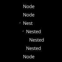
Creating Tree of Label instances:
import ktx.scene2d.scene2d
import ktx.scene2d.vis.*

fun createTree() =
  scene2d.visTree {
    visLabel("Node")
    visLabel("Node")
    visLabel("Nest") { node ->
      node {
        visLabel("Nested") { node ->
          node.visLabel("Nested")
        }
        visLabel("Nested")
      }
    }
    visLabel("Node")
  }
Creating a TabbedPane with multiple tabs:
import ktx.scene2d.scene2d
import ktx.scene2d.vis.*

fun createTabbedPane() =
  scene2d.visTable {
    val pane = tabbedPane("vertical") { cell ->
      cell.growY()
      tab("Tab1") {
        visLabel("Inside tab 1")
      }
      tab("Tab2") {
        visLabel("Inside tab 2")
      }
      tab("Tab3") {
        visLabel("Inside tab 3")
      }
    }
    val container = visTable().cell(grow = true)
    pane.addTabContentsTo(container)
    pane.switchTab(0)

    setFillParent(true)
  }
Creating a form using FormValidator:
import com.badlogic.gdx.utils.Align
import ktx.scene2d.scene2d
import ktx.scene2d.vis.*

fun createValidator() =
  scene2d.visTable(defaultSpacing = true) {
    validator {
      defaults().left()

      visLabel("Name: ")
      notEmpty(visValidatableTextField().cell(grow = true), "Name can't be empty")
      row()

      visLabel("Age: ")
      val ageField = visValidatableTextField().cell(grow = true)
      notEmpty(ageField, "Age can't be empty")
      integerNumber(ageField, "Age must be number")
      valueGreaterThan(ageField, "You must be at least 18 years old", 18f, true)
      row()

      checked(visCheckBox("Accept terms").cell(colspan = 2), "You must accept terms")
      row()

      setMessageLabel(visLabel("").cell(minWidth = 200f))
      addDisableTarget(visTextButton("Accept").cell(align = Align.right))
    }
    pack()
  }
Creating a ListView:
import com.badlogic.gdx.utils.Array as GdxArray
import com.kotcrab.vis.ui.util.adapter.AbstractListAdapter.SelectionMode
import com.kotcrab.vis.ui.util.adapter.SimpleListAdapter
import ktx.scene2d.scene2d
import ktx.scene2d.vis.*

fun createValidator() =
  scene2d.visTable(defaultSpacing = true) {
    val osList = GdxArray<String>()
    osList.add("Windows")
    osList.add("Linux")
    osList.add("Mac")

    val adapter = SimpleListAdapter(osList)
    adapter.selectionMode = SelectionMode.SINGLE
    listView(adapter) {
      header = visLabel("ListView header")
      footer = visLabel("ListView footer")
    }

    pack()
}Consider using ktx-actors module to improve event handling with lambda-friendly extension methods like
onChange and onClick, as well as other general Scene2D extensions.
ktx-assets might help with UI resources management.
ktx-vis-style adds DSL for defining custom VisUI widget styles.
Since 1.9.10-b6, ktx-vis extends the ktx-scene2d module. If you are migrating from a previous
ktx-vis version, see the ktx-scene2d migration guide first.
Additionally to changes that apply to ktx-scene2d, ktx-vis was rewritten to match the ktx-scene2d API.
Notable changes include:
- All factory methods for VisUI widgets are now inlined.
visprefix was added to the names of some VisUI widget factory methods to avoid clashes with Scene2D and better reflect the widget class names. A complete list is available in the change log.- Parental actors including
collapsible,dragPane,horizontalCollapsible,visScrollPane,visSplitPaneandmultiSplitPanenow do not require passing widgets to their factory methods. Instead, widgets are either automatically created or can be defined as nested children with the same DSL. DEFAULT_STYLEconstant is removed in favor ofdefaultStylefromktx-scene2d.styleNameparameters in factory methods were renamed tostylefor consistency withktx-scene2d.@VisDslDSL marker is replaced with@Scene2dDslmarker fromktx-scene2d.
Since ktx-vis required a complete rewrite and had to match ktx-scene2d API, there is no intermediate version with
deprecated methods. All legacy APIs were removed in 1.9.10-b6. Please refer to the change log
for a complete list of changes.
On top of that, HorizontalFlowGroup and VerticalFlowGroup are now deprecated in VisUI. While ktx-vis still
provides factory methods for these, they are deprecated - flowGroup with appropriate settings should be used instead.
- Creating layouts with VisUI directly in Kotlin or Java.
- LML allows building
Scene2Dviews using HTML-like syntax. It also features a VisUI extension. However, it lacks first-class Kotlin support and the flexibility of a programming language.


