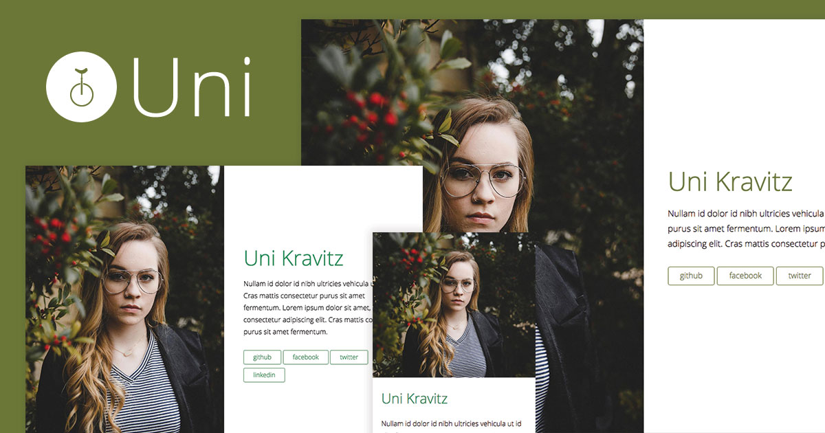
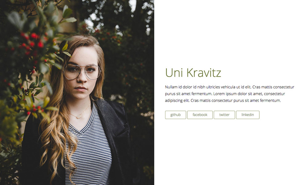
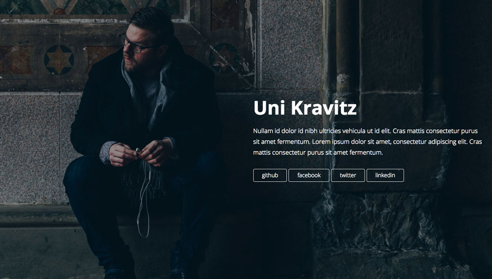
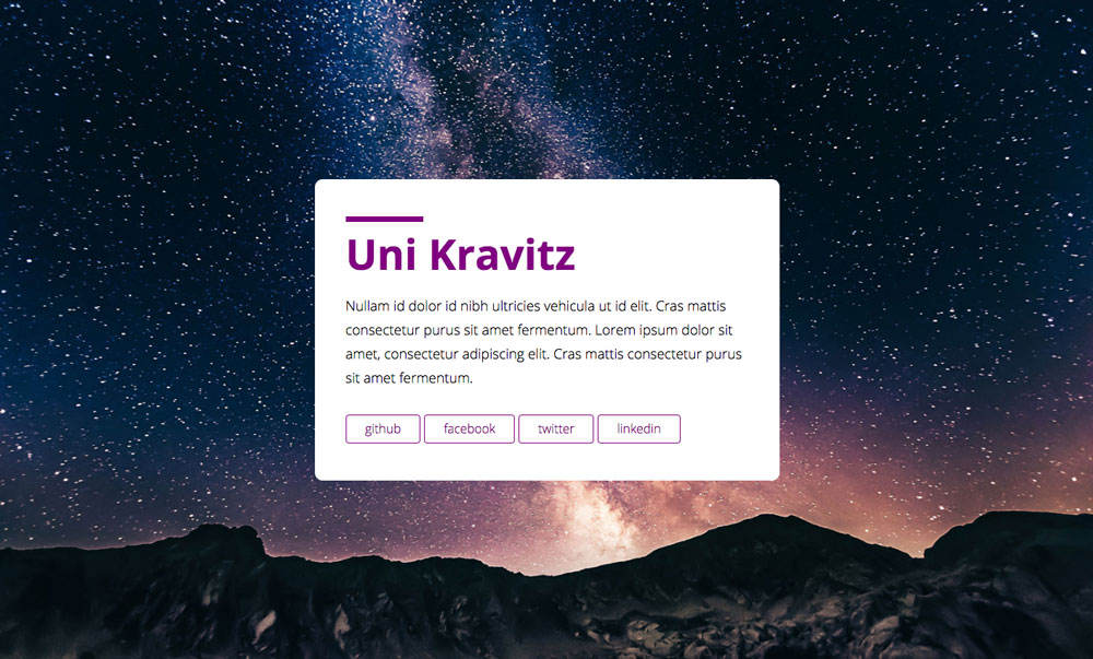
View Half Demo | View Full Demo | View Card Demo
- Minimal, One-Page Design
- Fast and responsive
- Flexible
- Built using new technologies including
- GULP
- SASS
- BROWSERSYNC
- AUTOPREFIXER
- A modular, type scale
- 3 different layouts with additional options
- Responsive Images for performance
- Social Meta Tags
This theme will look great and work in most newer browsers. If you see an issue please feel free to contact me.
- Install Jekyll
- Install Bundler
- Run
bundle install - Install gulp dependencies by running
npm install - Run Jekyll and watch files by running
bundle exec gulp
Please note that any changes made to the config.yml will require that you stop gulp and start it again.
The main settings can be found inside the _config.yml file:
- title: you or your company's name
- description: description of your site that will be used when your site is shared or posted on social media
- sharing_image: name of your image (example.jpg). This image should be placed in the
assets/img/folder - content: a brief blurb about yourself
- url: your url
- social diverse social media usernames (optional)
- platform: display name for social media or external link
- url: destination for the link
- google_analytics Google Analytics key (optional)
- half_side: which side of the page your content is on [left or right]
- full_text_position: where on the page the text will appear [left, center, or right]
The background image and other style customizations can be changed in assets/scss/layouts/_card.scss
By default, Uni is set to use the half layout. To change the layout change the front matter in index.html
For example, the layout below is using the full layout. The other options are half and card
---
layout: full
title: Uni – A one-page Jekyll theme
---
While running bundle exec gulp modify any of the files in the assets/scss/ folder and watch the changes happen.
The layouts all have their own stylesheets found in assets/scss/layouts/. This is where images for each of the three layouts can be found. In addition, this is where you can change text color, layout, etc.
The one color this theme makes use of is the $primary-color. It can be changed in the assets/scss/base/_config.scss file. This color is used for headings, accents, and buttons.
Add content in config.yml or alter index.html and change {{ content }} to be whatever you want.
As stated above, the images are set in the respective stylesheets found in assets/scss/layouts/.
We are using responsive images that require three different images. This allows the browser to serve the appropriate image based on the screen size. Recommended image widths are:
To replace the image replace the image names in the responsivebackground mixin as shown below:
@include responsivebackground("half-sm.jpg", "half-md.jpg", "half-lg.jpg");
When uploading image please keep file size in mind. For optimizing images we recommend using TinyPNG and TinyJPG
To add your own favicon, replace the image found at assets/img/favicon.png.


