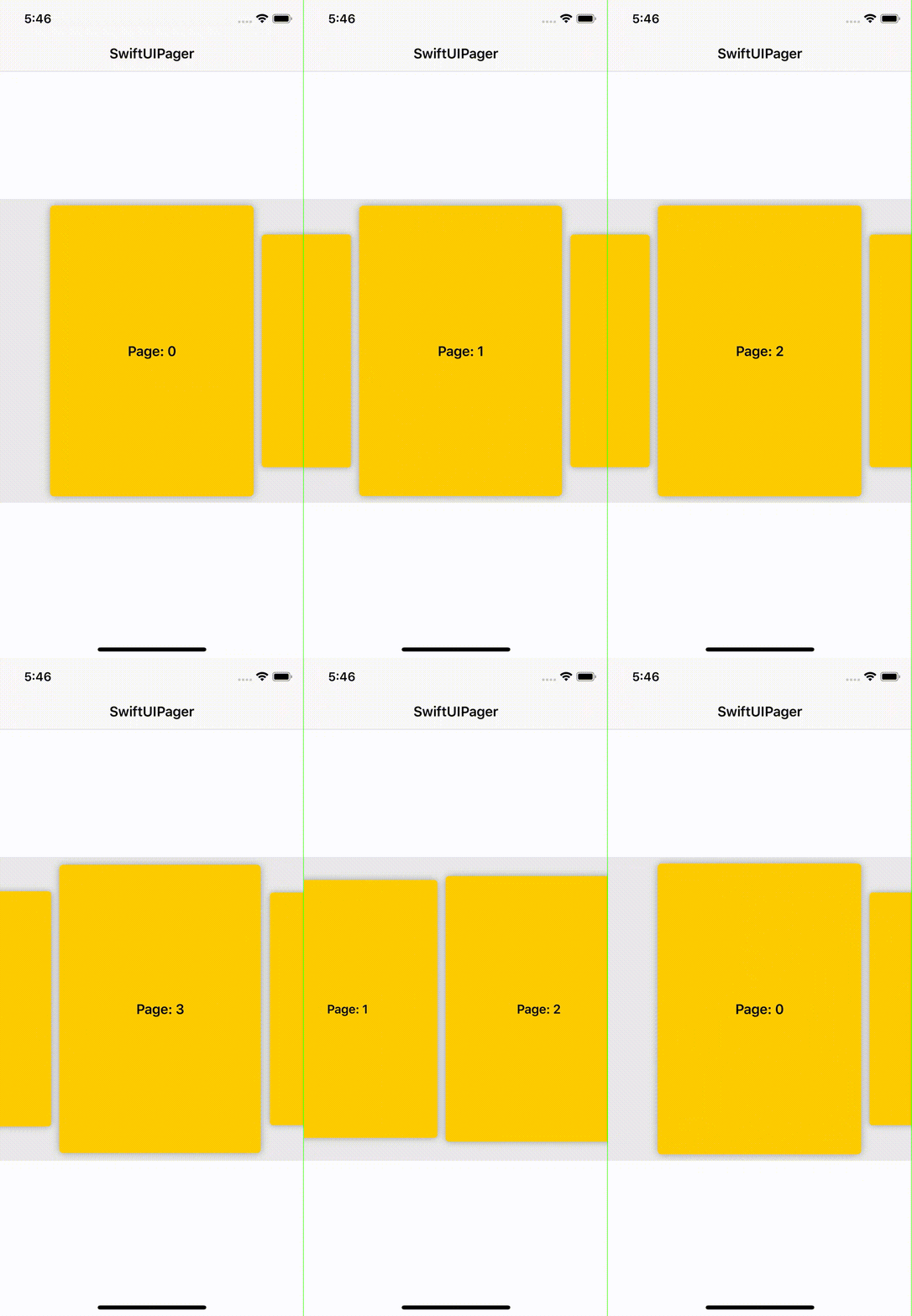
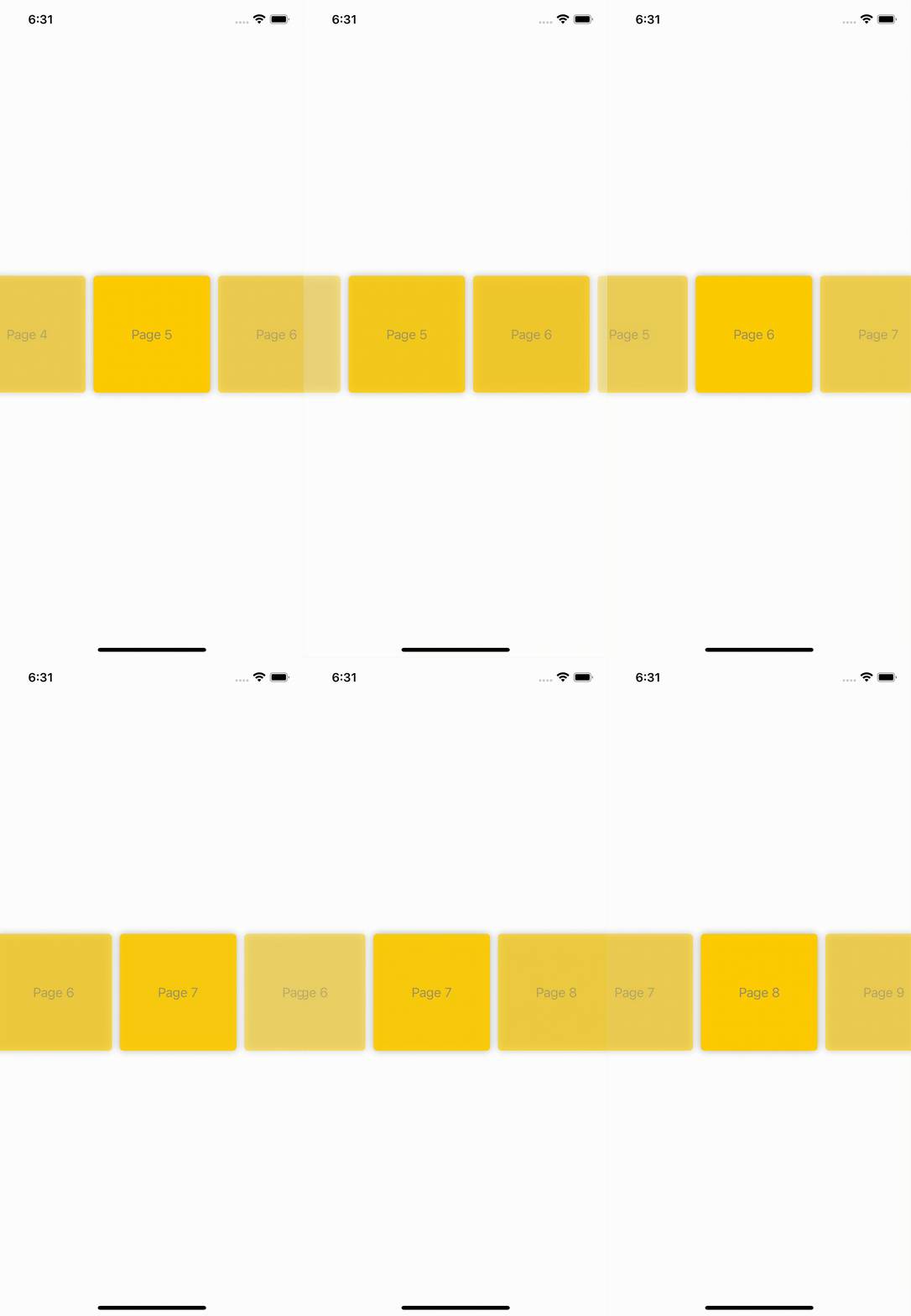
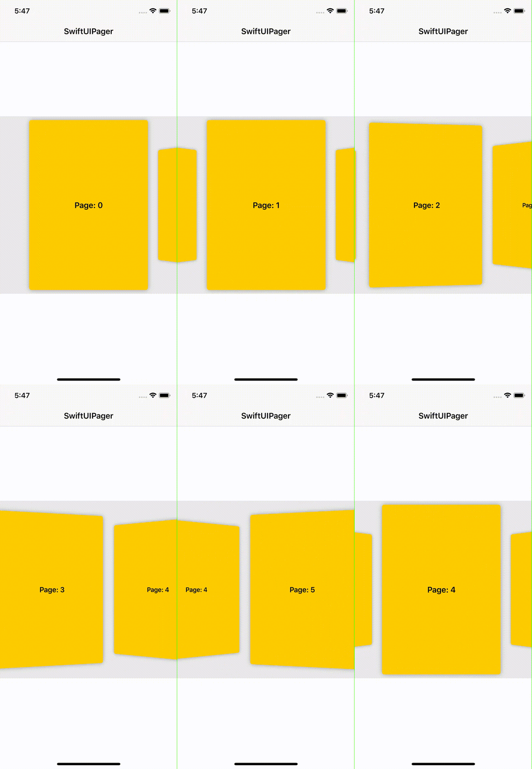
Creating a Pager is very simple. You just need to pass:
Pagewith the current indexArrayof itemsKeyPathto an identifierViewBuilderfactory method to create each page
@StateObject var page: Page = .first()
// @ObservedObject var page: Page = .first()
var items = Array(0..<10)

var body: some View {
    Pager(page: page,
          data: items,
          id: \.identifier,
          content: { index in
              // create a page based on the data passed
              Text("Page: \(index)")
     })
 }
To create a Page use one of the convenience methods firstPage() or withIndex(_:). Make sure that you wrap it into a StateObject or ObservedObject.
Note: All examples require
import SwiftUIPagerat the top of the source file.
Pager is easily customizable through a number of view-modifier functions. You can change the orientation, the direction of the scroll, the alignment, the space between items or the page aspect ratio, among others:
By default, Pager is configured as:
- Horizontal, left to right direction.
- Items have center alignment inside
Pagerand take all the space available - Current page is centered in the scroll
- Only the page is hittable and reacts to swipes
- Finite, that is, it doesn't loop the pages
- Single pagination, one page per swipe.
Note
Pagerhas no intrinsic size. This means that its size depends on the available space or the extrinsic size specified withframemodifier.If you're using the legacy support, you'll need to wrap any reference to
Pagerwithif #available(iOS 13, *)or any other platform and version you may require.
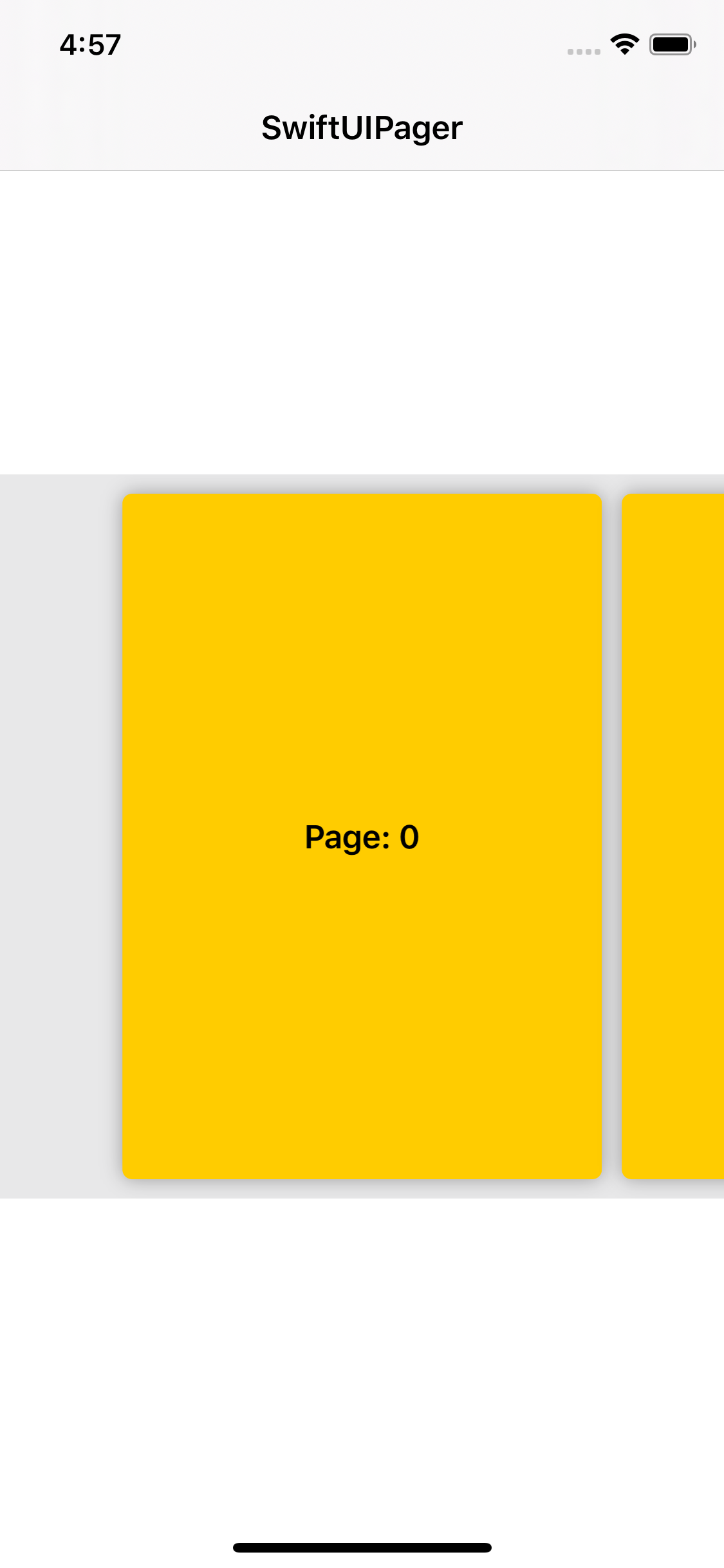
There are two ways to achieve this. You can use preferredItemSize to let Pager know which size your items should have. The framework will automatically calculate the itemAspectRatio and the necessary padding for you. You can also use itemAspectRatio to change the look of the page. Pass a value lower than 1 to make the page look like a card:
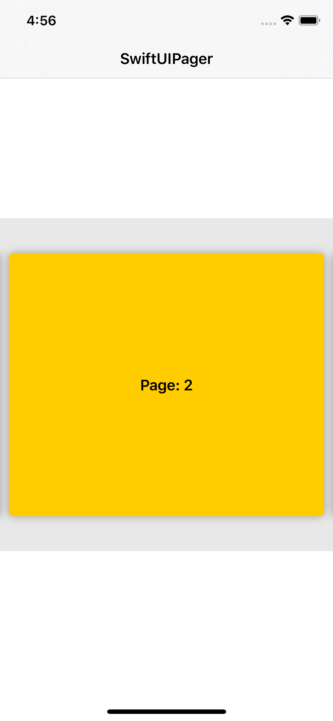
whereas a value greater than one will make it look like a box:
By default, Pager will increase/decrease the current page if this shift is greather than 50% of its relative size. If you wish to make this transition easier or, on the contrary, make it harder to happen, use sensitivity to modify this relative value. For instance, to make transitions easier:
Pager(...)
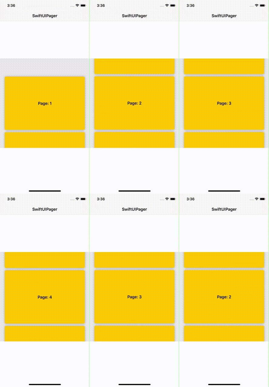
.sensitivity(.high)By default, Pager will create a horizontal container. Use vertical to create a vertical pager:
Pager(...)
    .vertical()
Pass a direction to horizontal or vertical to change the scroll direction. For instance, you can have a horizontal Pager that scrolls end-to-start:
Pager(...)
    .itemSpacing(10)
    .alignment(.start)
    .horizontal(.endToStart)
.itemAspectRatio(0.6)It is possible to force Pager to scroll forwards only. This can be done by using dragForwardOnly modifier:
Pager(...)
.dragForwardOnly()Pass a position to itemAspectRatio or preferredItemSize to specify the alignment along the vertical / horizontal axis for a horizontal / vertical Pager. Change its position along the horizontal / vertical axis of a horizontal / vertical Pager by using alignment:
Pager(...)
     .itemSpacing(10)
     .horizontal()
     .padding(8)
     .itemAspectRatio(1.5, alignment: .end)    // will move the items to the bottom of the container
.alignment(.center) // will align the first item to the leading of the containerBy default, Pager will reveal the neighbor items completely (100% of their relative size). If you wish to limit this reveal ratio, you can use singlePatination(ratio:sensitivity) to modify this ratio:
Pager(...)
    .singlePagination(0.33, sensitivity: .custom(0.2))
    .preferredItemSize(CGSize(width: 300, height: 400))
    .itemSpacing(10)
    .background(Color.gray.opacity(0.2))
For more information about sensitivity, check out Pagination sensitivity.
It's possible for Pager to swipe more than one page at a time. This is especially useful if your page size is small. Use multiplePagination.
Pager(...)
    .preferredItemSize(CGSize(width: 300, height: 300)
    .multiplePagination()
Be aware that this modifier will change the loading policy. See Content Loading Policy for more information.
| Modifier | Description |
|---|---|
allowsDragging |
whether or not dragging is allowed |
disableDragging |
disables dragging |
bounces |
whether or not Pager should bounce |
delaysTouches |
whether or not touches shoulf be delayed. Useful if nested in ScrollView |
pageOffset |
allows manual scroll |
expandPageToEdges |
modifies itemAspectRatio so that the use up all the space available |
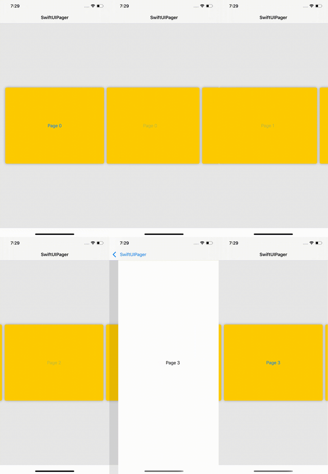
For complex pages where a Gesture might be used, or any other View that internally holds a Gesture like Button or NavigationLink, you might come across issues when trying to swipe on top of certain areas within the page. For these scenarios, use pagingPriority to select the option that best suits your purpose. For instance, a page containing a NavigationLink won't be scrollable over the link area unless pagingPrioriry(.simultaneous) is added:
var body: some View {
    NavigationView {
        Pager(page: self.$page2,
              data: self.data2,
              id: \.self) {
                self.pageView($0)
        }
        .pagingPriority(.simultaneous)
        .itemSpacing(10)
        .padding(20)
        .itemAspectRatio(1.3)
        .background(Color.gray.opacity(0.2))
        .navigationBarTitle("SwiftUIPager", displayMode: .inline)
    }
    .navigationViewStyle(StackNavigationViewStyle())
}

func pageView(_ page: Int) -> some View {
    ZStack {
        Rectangle()
            .fill(Color.yellow)
        NavigationLink(destination: Text("Page \(page)")) {
            Text("Page \(page)")
        }
    }
    .cornerRadius(5)
    .shadow(radius: 5)
}Use interactive(scale:) to add a scale animation effect to those pages that are unfocused, that is, those elements whose index is different from pageIndex:
Pager(...)
.interactive(scale: 0.8)Get a interactive fading effect on your items by using interactive(opacity:):
Pager(...)
    .interactive(opacity: 0.4)
    .preferredItemSize(CGSize(width: 150, height: 150))
.itemSpacing(10)You can also use interactive(rotation:) to add a rotation effect to your pages:
Pager(...)
    .itemSpacing(10)
    .interactive(rotation: true)
.interactive(scale: 0.7)Transform your Pager into an endless sroll by using loopPages:
Note: You'll need a minimum number of elements to use this modifier based on the page size. If you need more items, use loopPages(repeating:) to let Pager know elements should be repeated in batches.
Use draggingAnimation(onChange:, onEnded:) to customize the animations applied while dragging items and/or transitioning to the next element.
Pager(...)
    .draggingAnimation(.interactive)
By default, draggingAnimation is set to .easeOut.
Use onPageWillChange or onPageChanged to react to changes on the page index:
Pager(...)
     .onPageChanged({ (newIndex) in
         // do something
     })
You can also use onDraggingBegan, onDraggingChanged and onDraggingEnded to keep track of the dragging.
You can use onPageChanged to add new items on demand whenever the user is getting to the last page:
@StateObject var page: Page = .first()
// @ObservedObject var page: Page = .first()
@State var data = Array(0..<5)

var body: some View {
    Pager(...)
        .onPageChanged({ pageIndex in
            guard pageIndex == self.data.count - 2 else { return }
            guard let last = self.data.last else { return }
            let newData = (1...5).map { last + $0 }
            withAnimation {
                self.data.append(contentsOf: newData)
            }
        })
}
At the same time, items can be added at the start. Notice you'll need to update the page yourself (as you're inserting new elements) to keep Pager focused on the right element:
@StateObject var page: Page = .first()
// @ObservedObject var page: Page = .first()
@State var data = Array(0..<5)

var body: some View {
    Pager(page: self.page,
            data: self.data,
            id: \.self) {
        self.pageView($0)
    }
    .onPageChanged({ pageIndex in
        guard pageIndex == 1 else { return }
        let newData = (1...5).map { data1.first! - $0 }.reversed()
        withAnimation {
            page.index += newData.count
            data.insert(contentsOf: newData, at: 0)
        }
    })
}Pager recycles views by default and won't have loaded all pages in memory at once. In some scenarios, this might be counterproductive, for example, if you're trying to manually scroll from the first page to the last. For these scenarios, use .contentLoadingPolicy and choose among the options available.
For more information, please check the sample app. There are included several common use-cases:
- See
InfiniteExampleViewfor more info aboutloopPagesand usingonPageChangedto add items on the fly. - See
ColorsExampleViewfor more info about event-drivenPager. - See
EmbeddedExampleViewfor more info about embeddingPagerinto aScrollView. - See
NestedExampleViewfor more info about nestingPager. - See
BizarreExampleViewfor more info about other features ofPager.
