# knitr configuration
library(knitr)
opts_knit$set(progress=FALSE)
opts_chunk$set(echo=TRUE, message=FALSE, tidy=TRUE, comment=NA,
               fig.path="figure/", fig.keep="high", fig.width=10, fig.height=6,
               fig.align="center")
# load required libs
library(dplyr, quietly=TRUE, warn.conflicts=FALSE)
library(ggplot2, quietly=TRUE, warn.conflicts=FALSE)We read the data set from the file activity.csv inside the zip archive
activity.zip, assigning the appropriate classes to the columns
# read the data
activity <- read.csv(unz("activity.zip", "activity.csv"), colClasses = c("integer",
    "Date", "integer"))
The summary of the data set indicates that it contains son NA values in the
steps column:
summary(activity) steps date interval
Min. : 0.0 Min. :2012-10-01 Min. : 0
1st Qu.: 0.0 1st Qu.:2012-10-16 1st Qu.: 589
Median : 0.0 Median :2012-10-31 Median :1178
Mean : 37.4 Mean :2012-10-31 Mean :1178
3rd Qu.: 12.0 3rd Qu.:2012-11-15 3rd Qu.:1766
Max. :806.0 Max. :2012-11-30 Max. :2355
NA's :2304
Also, it should be noted that for simplicity we read the
interval column as integer, but in reality it represents a the start
of a 5-minute interval within a day, with one or two digits for the hour,
and 2 more digits for the minute part of the time.
We will convert it to the appropriate format (hh:mm), and then consider it as an ordered factor. In this way, we can obtain better labelled plots.
tohhmm <- function(interval) {
    s <- sprintf("%04d", interval)
    s <- paste0(substr(s, 1, 2), ":", substr(s, 3, 4))
    return(s)
}
tmp <- tohhmm(activity$interval)
activity$interval <- factor(tmp, levels = unique(tmp), ordered = TRUE)
In some of the analyses that follow we will need a data set without
missing values, thus we create one (activity2) from which we
remove all the rows with NA:
# remove the NA in steps
activity2 <- activity[!is.na(activity$steps), ]
n1 <- nrow(activity)
n2 <- nrow(activity2)
So, we went from a data set with 17568 rows with missing values, to one with 15264 rows without missing values.
In order to answer that question, we first calculate the total number of
steps taken per day (using dplyr)
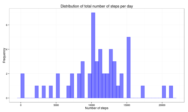
df1 <- activity2 %>% group_by(date) %>% summarise(nsteps = sum(steps))Then we plot a histogram for the total number of steps taken per day during the period under analysis.
ggplot(df1, aes(x = nsteps)) + geom_histogram(col = rgb(0, 0, 1, 0.5), fill = rgb(0,
    0, 1, 0.5), binwidth = 500) + ggtitle("Distribution of total number of steps per day") +
    xlab("Number of steps") + ylab("Frequency") + theme_bw()
Finally, we calculate the mean and the median of the total number of steps taken per day.
dfmean = format(round(mean(df1$nsteps), 2), nsmall = 2)
dfmedian = format(round(median(df1$nsteps), 2), nsmall = 2)- Mean: 10766.19
- Median: 10765.00
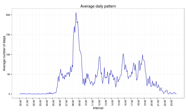
To obtain the daily activity pattern, we will summarise by interval accross all 53 days in the period under analysis.
df2 <- activity2 %>% group_by(interval) %>% summarise(avgsteps = mean(steps))And then make a time series plot of the summarised data:
# prepare some vectors to label the x-axes
intbrk <- as.numeric(df2$interval)
intbrk <- intbrk[seq(1, length(intbrk), 12)]
intlab <- levels(df2$interval)
intlab <- intlab[seq(1, length(intlab), 12)]
# make the plot
ggplot(df2, aes(x = as.numeric(interval), y = avgsteps)) + scale_x_continuous(breaks = intbrk,
    labels = intlab) + geom_line(color = "blue") + ggtitle("Average daily pattern") +
    ylab("Average number of steps") + xlab("Interval") + theme_bw() + theme(axis.text.x = element_text(angle = 90,
    hjust = 1))
Finally, we want to know which 5-minute interval, on average and across all days in the range, contains the maximum number of steps
df2[with(df2, avgsteps == max(avgsteps)), ]$interval[1] 08:35
288 Levels: 00:00 < 00:05 < 00:10 < 00:15 < 00:20 < 00:25 < ... < 23:55
In the original data set, we have missing a number of rows with missing values
sum(is.na(activity$steps))[1] 2304
For this part of the analysis, we will impute those values using the median for each corresponding 5-minute interval, on the assumption that people tend to follow similar routines on a daily basis.
We will proceed as follows:
- Estimate the per interval median using
dplyras a new accessory data set - Add the median column to the activity data set by merging it with the set created in the previous step
- Replace all
NAvalues in thestepscolumn by the corresponding median value - Remove the median column from the final data set.
# step 1
df3 <- activity %>% group_by(interval) %>% summarise(median = median(steps,
    na.rm = TRUE))
# step 2
activity3 <- merge(activity, df3, by = "interval")
# step 3
activity3$steps <- ifelse(is.na(activity3$steps), activity3$median, activity3$steps)
# step 4
activity3$median <- NULL
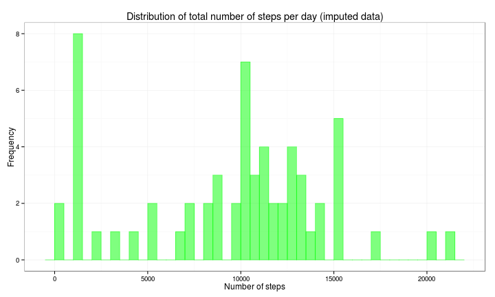
Let's explore the effect of imputing missing values in the distribution of total daily number of steps, and its mean and median
df4 <- activity3 %>% group_by(date) %>% summarise(nsteps = sum(steps))
ggplot(df4, aes(x = nsteps)) + geom_histogram(col = rgb(0, 1, 0, 0.5), fill = rgb(0,
    1, 0, 0.5), binwidth = 500) + ggtitle("Distribution of total number of steps per day (imputed data)") +
    xlab("Number of steps") + ylab("Frequency") + theme_bw()
The most visible effect in the histogram is that now there are days with a total number of steps in the (1000, 1500) range.
The mean and median for this imputed data set are:
dfmean2 = format(round(mean(df4$nsteps), 2), nsmall = 2)
dfmedian2 = format(round(median(df4$nsteps), 2), nsmall = 2)- Mean: 9503.87
- Median: 10395.00
These statistics from the imputed data set are lower than those from the original (in which we ignored the missing data):
kable(data.frame(Statistic = c("Mean", "Median"), Original = c(dfmean, dfmedian),
Imputed = c(dfmean2, dfmedian2)), format = "html", table.attr = "cellpadding='3'")| Statistic | Original | Imputed |
|---|---|---|
| Mean | 10766.19 | 9503.87 |
| Median | 10765.00 | 10395.00 |
To be able to distinguish between working days and weekend days, we
will create a variable (daytype) and use it to label put each day in
one of the two categories.
activity3$daytype <- ifelse(weekdays(activity3$date) %in% c("Saturday", "Sunday"),
    "Weekend", "Weekday")
activity3$daytype <- as.factor(activity3$daytype)
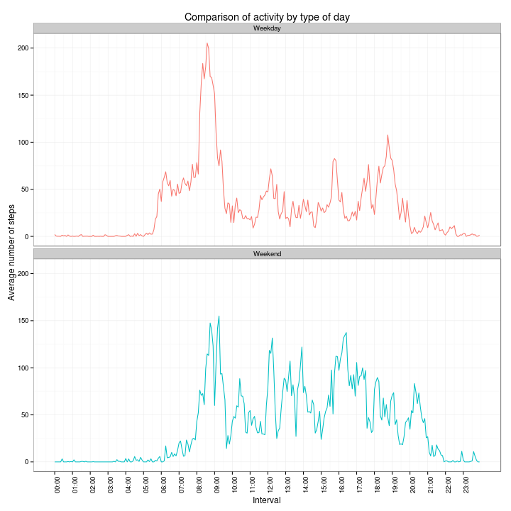
Then we calculate the average number of steps for each interval and type of day.
df5 <- activity3 %>% group_by(daytype, interval) %>% summarise(mean = mean(steps))And plot a comparison of the number of steps per interval for the two types of days:
# prepare a couple of vectors to label de x-axis
intbrk <- unique(as.numeric(df5$interval))
intbrk <- intbrk[seq(1, length(intbrk), 12)]
intlab <- levels(df5$interval)
intlab <- intlab[seq(1, length(intlab), 12)]
# make the plot
ggplot(df5, aes(x = as.numeric(interval), y = mean, color = daytype)) + scale_x_continuous(breaks = intbrk,
    labels = intlab) + geom_line() + facet_wrap(~daytype, ncol = 1) + xlab("Interval") +
    ylab("Average number of steps") + ggtitle("Comparison of activity by type of day") +
    scale_color_discrete(guide = "none") + theme_bw() + theme(axis.text.x = element_text(angle = 90,
    hjust = 1))
The graphs indicate that during weekdays, the activity starts at around 05:30h, peaks at around 08:30h and dies down at around 20:00h; whereas, for weekends, it starts at a bit after 06:00h, peaks a tad after 09:00h and subsides around 22:00h.
Also, it would seem that most of the activity on weekdays is concentrated in the morning hours, whereas there seems to be more activity throughout the day on weekends.
sessionInfo()R version 3.1.1 (2014-07-10)
Platform: x86_64-pc-linux-gnu (64-bit)
locale:
[1] LC_CTYPE=en_US.UTF-8 LC_NUMERIC=C
[3] LC_TIME=en_US.UTF-8 LC_COLLATE=en_US.UTF-8
[5] LC_MONETARY=en_US.UTF-8 LC_MESSAGES=en_US.UTF-8
[7] LC_PAPER=en_US.UTF-8 LC_NAME=C
[9] LC_ADDRESS=C LC_TELEPHONE=C
[11] LC_MEASUREMENT=en_US.UTF-8 LC_IDENTIFICATION=C
attached base packages:
[1] stats graphics grDevices utils datasets methods base
other attached packages:
[1] ggplot2_1.0.0 dplyr_0.2 knitr_1.6
loaded via a namespace (and not attached):
[1] assertthat_0.1 colorspace_1.2-4 digest_0.6.4 evaluate_0.5.5
[5] formatR_0.10 grid_3.1.1 gtable_0.1.2 labeling_0.2
[9] magrittr_1.0.1 MASS_7.3-33 munsell_0.4.2 parallel_3.1.1
[13] plyr_1.8.1 proto_0.3-10 Rcpp_0.11.2 reshape2_1.4
[17] scales_0.2.4 stringr_0.6.2 tools_3.1.1


