Circos is a javascript library to easily build interactive graphs in a circular layout. It's based on d3.js. It aims to be a javascript version of the Circos software.
You should consider using Circos to show:
- relationships between entities
- periodical data
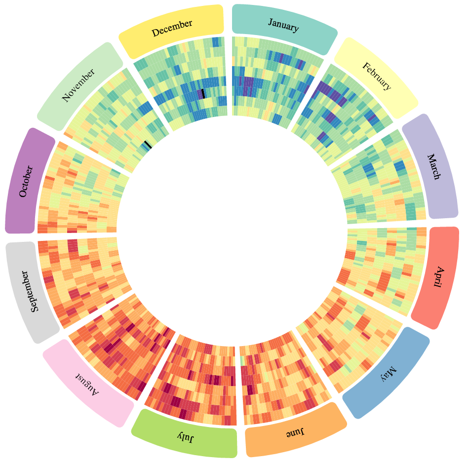
Average temperatures in Paris from 2007 (inner) to 2014 (outer). The circular layout highlights seasonal effect.
If you don't know what is yarn or npm you can skip this step and get started with this canvas. Otherwise:
yarn install circosjs
To instantiate a new circos:
var myCircos = new Circos({
    container: '#chart',
    width: 500,
    height: 500,
});
A circos graph is based on a circular axis layout. Data tracks appear inside and/or outside the circular layout.
In order to place data on the circos graph, you must first specify the layout.
myCircos.layout(configuration, data);The first argument of the layout function is a configuration object that control the format of the layout.
Here are the default parameters for a layout:
var configuration = {
  innerRadius: 250,
  outerRadius: 300,
  cornerRadius: 10,
  gap: 0.04, // in radian
  labels: {
    display: true,
    position: 'center',
    size: '14px',
    color: '#000000',
    radialOffset: 20,
  },
  ticks: {
    display: true,
    color: 'grey',
    spacing: 10000000,
    labels: true,
    labelSpacing: 10,
    labelSuffix: 'Mb',
    labelDenominator: 1000000,
    labelDisplay0: true,
    labelSize: '10px',
    labelColor: '#000000',
    labelFont: 'default',
    majorSpacing: 5,
    size: {
      minor: 2,
      major: 5,
    }
  },
  clickCallback: null
}
The second argument of the layout function is an array of data that describe the layout regions. Each layout region must have an id and a length. You can also specify a color and a label.
var data = [
  { len: 31, color: "#8dd3c7", label: "January", id: "january" },
  { len: 28, color: "#ffffb3", label: "February", id: "february" },
  { len: 31, color: "#bebada", label: "March", id: "march" },
  { len: 30, color: "#fb8072", label: "April", id: "april" },
  { len: 31, color: "#80b1d3", label: "May", id: "may" },
  { len: 30, color: "#fdb462", label: "June", id: "june" },
  { len: 31, color: "#b3de69", label: "July", id: "july" },
  { len: 31, color: "#fccde5", label: "August", id: "august" },
  { len: 30, color: "#d9d9d9", label: "September", id: "september" },
  { len: 31, color: "#bc80bd", label: "October", id: "october" },
  { len: 30, color: "#ccebc5", label: "November", id: "november" },
  { len: 31, color: "#ffed6f", label: "December", id: "december" }
]
The id parameter will be used to place data points on the layout.
To visualize the result:
myCircos.render();A track is a series of data points.
To add a track to your graph you should write something like this:
instance.heatmap(
    'my-heatmap',
    {
        // your heatmap configuration
    },
    data
);
This pattern is similar to all track types:
instance.trackType('track-id', configuration, data);Note: The track name is used as a HTML class name so here are the format limitations.
- Must be unique.
- Should be slug style for simplicity, consistency and compatibility. Example:
heatmap-1 - Lowercase, a-z, can contain digits, 0-9, can contain dash or dot but not start/end with them.
- Consecutive dashes or dots not allowed.
- 50 characters or less.
Chords tracks connect layout regions.
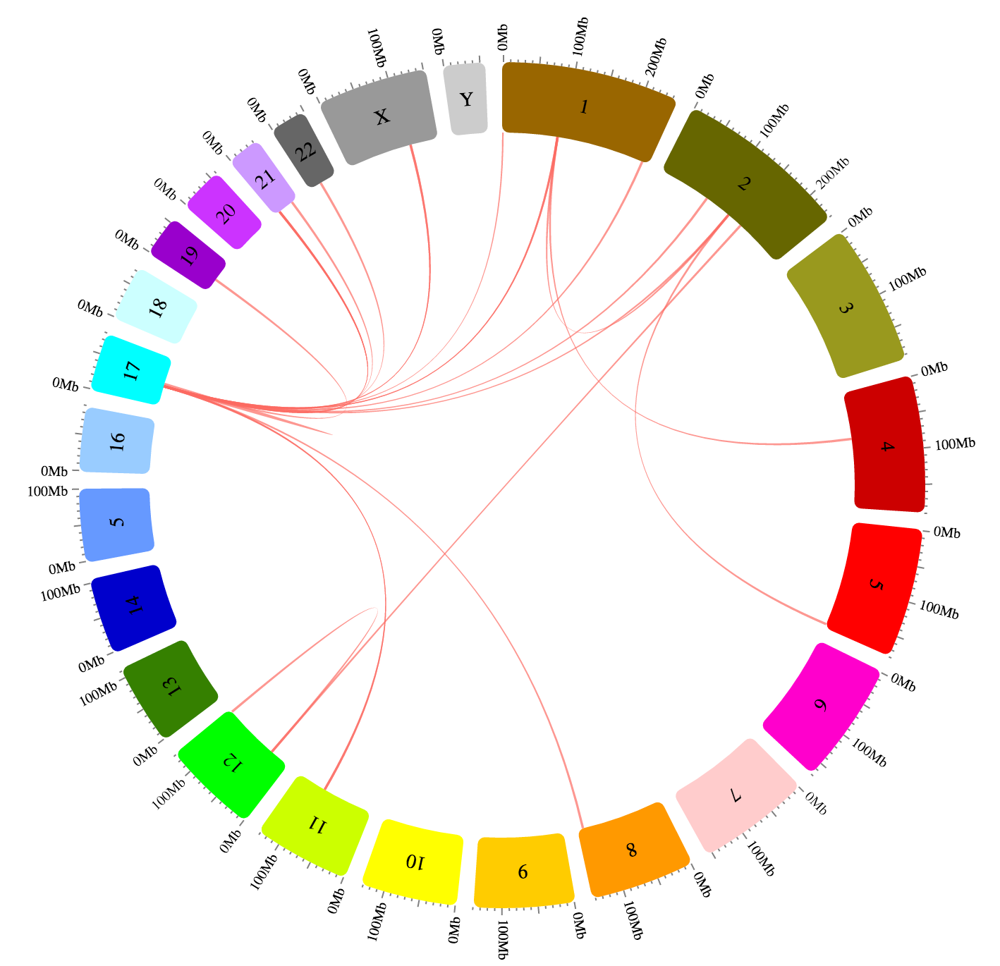
Gene fusions in human karyotype source. See full example
Data should looks like this:
var data = [
    // sourceId, sourceStart, sourceEnd, targetId, targetStart, targetEnd
    ['january', 1, 12, 'april', 18, 20],
    ['february', 20, 28, 'december', 1, 13],
];
Optionally each datum can define a seventh element which can be used to be interpreted as a value to draw colored ribbons with palettes or a color function.
The default configuration is:
{
  color: '#fd6a62',
  opacity: 0.7,
  zIndex: 1,
  tooltipContent: null,
  min: 'smart',
  max: 'smart',
  logScale: false,
  logScaleBase: Math.E,
}You can specify the color of the track in the track configuration:
{
  color: '#d3d3d3'
}
You can specify:
- any css color code e.g
#d3d3d3,blue,rgb(0, 0, 0) - a palette name from the list below (it comes from d3-scale-chromatic). In this case the color will be computed dynamically according to the datum value. If you prefix the palette name with a
-(e.g-BrBG), the palette will be reversed. - a function with this signature:
function(datum, index) { return colorCode}
BrBG:
![]() PRGn:
PRGn:
![]() PiYG:
PiYG:
![]() PuOr:
PuOr:
![]() RdBu:
RdBu:
![]() RdGy:
RdGy:
![]() RdYlBu:
RdYlBu:
![]() RdYlGn:
RdYlGn:
![]() Spectral:
Spectral:
![]() Blues:
Blues:
![]() Greens:
Greens:
![]() Greys:
Greys:
![]() Oranges:
Oranges:
![]() Purples:
Purples:
![]() Reds:
Reds:
![]() BuGn:
BuGn:
![]() BuPu:
BuPu:
![]() GnBu:
GnBu:
![]() OrRd:
OrRd:
![]() PuBuGn:
PuBuGn:
![]() PuBu:
PuBu:
![]() PuRd:
PuRd:
![]() RdPu:
RdPu:
![]() YlGnBu:
YlGnBu:
![]() YlGn:
YlGn:
![]() YlOrBr:
YlOrBr:
![]() YlOrRd:
YlOrRd:
![]()
You can specify the min and max values of the dataset. If 'smart' is used, the minimum and maximum will fit the range of values of the dataset.
Nicolas Girault [email protected]
Your feedbacks are welcome. If you're struggling using the librairy, the best way to ask questions is to use the Github issues so that they are shared with everybody.

