Gramm is a powerful plotting toolbox which allows to quickly create complex, publication-quality figures in Matlab, and is inspired by R's ggplot2 library by Hadley Wickham. As a reference to this inspiration, gramm stands for GRAMmar of graphics for Matlab.
The typical workflow to generate a figure with gramm is the following:
- In a first step, provide gramm with the relevant data for the figure: X and Y variables, but also grouping variables that will determine color, subplot rows/columns, etc.
- In the next steps, add graphical layers to your figure: raw data layers (directly plot data as points, lines...) or statistical layers (plot fits, histograms, densities, summaries with confidence intervals...). One instruction is enough to add each layer, and all layers offer many customization options.
- In the last step, gramm draws the figure, and takes care of all the annoying parts: no need to loop over colors or subplots, colors and legends are generated automatically, axes limits are taken care of, etc.
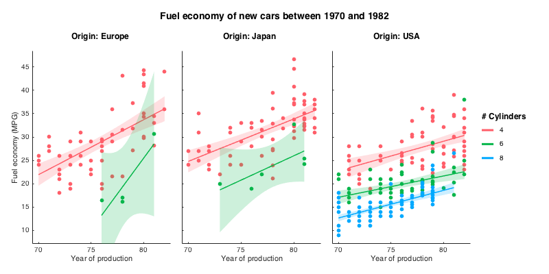
For example, with gramm, 7 lines of code are enough to create the figure below from the carbig dataset. Here the figure represents the evolution of fuel economy of new cars in time, with number of cylinders indicated by color, and regions of origin separated across subplot columns:
load carbig.mat %Load example dataset about cars
origin_region=num2cell(org,2); %Convert origin data to a cellstr

% Create a gramm object, provide x (year of production) and y (fuel economy) data,
% color grouping data (number of cylinders) and select a subset of the data
g=gramm('x',Model_Year,'y',MPG,'color',Cylinders,'subset',Cylinders~=3 & Cylinders~=5)
% Subdivide the data in subplots horizontally by region of origin
g.facet_grid([],origin_region)
% Plot raw data as points
g.geom_point()
% Plot linear fits of the data with associated confidence intervals
g.stat_glm()
% Set appropriate names for legends
g.set_names('column','Origin','x','Year of production','y','Fuel economy (MPG)','color','# Cylinders')
%Set figure title
g.set_title('Fuel economy of new cars between 1970 and 1982')
% Do the actual drawing
g.draw()Add the folder containing gramm.m to your path
Tested under Matlab 2014b+ versions. With pre-2014b versions, gramm forces 'painters', renderer to avoid some graphic bugs, which deactivates transparencies (use non-transparent geoms, for example stat_summary('geom','lines')). The statistics toolbox is required for some methods: stat_glm(), some stat_summary() methods, stat_density(). The curve fitting toolbox is required for stat_fit()</code/>.
Look at the gramm cheat sheet
Type doc gramm to find links to the documentation of each method.
-
Accepts X Y and Z data as arrays, matrices or cells of arrays
-
Accepts grouping data as arrays or cellstr.
-
Multiple ways of separating groups of data:
- Colors, lightness, point markers, line styles, and point/line size (
'color', 'lightness', 'marker', 'linestyle', 'size')
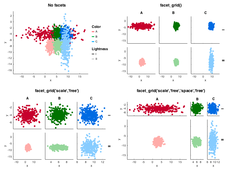
- Subplots by row and/or columns, or wrapping columns (
facet_grid() and facet_wrap()). Multiple options for consistent axis limits across facets, rows, columns, etc. (using 'scale' and 'space')
-
Multiple ways of directly plotting the data:
- scatter plots (
geom_point()) and jittered scatter plot (geom_jitter())
- lines (
geom_line())
- bars plots (
geom_bar())
- raster plots (
geom_raster())
- point counts (
point_count())
-
Multiple ways of plotting statistics on the data:
- y data summarized by x values (uniques or binned) with confidence intervals (
stat_summary())
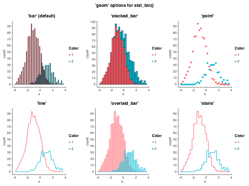
- histograms and density plots of x values (
stat_bin() and stat_density())
- box and whisker plots (
stat_boxplot)
- quantile-quantile plots (
stat_qq()) of x data distribution against theoretical distribution or y data distribution.
- spline-smoothed y data with optional confidence interval (
stat_smooth())
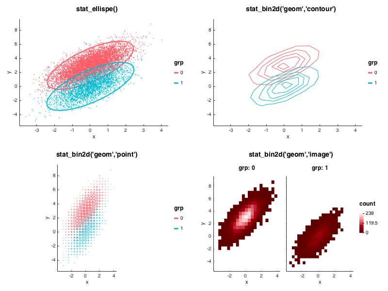
- 2D binning (
stat_bin2d())
- GLM fits (
stat_glm(), requires statistics toolbox)
- Custom fits with user-provided anonymous function (
stat_fit())
- Ellipses of confidence (
stat_ellipse())
-
When Z data is provided in the call to gramm(), geom_point() and geom_line() generate 3D plots
-
Subplots are created without too much empty space in between (and resize properly !)
-
Polar coordinates (set_polar())
-
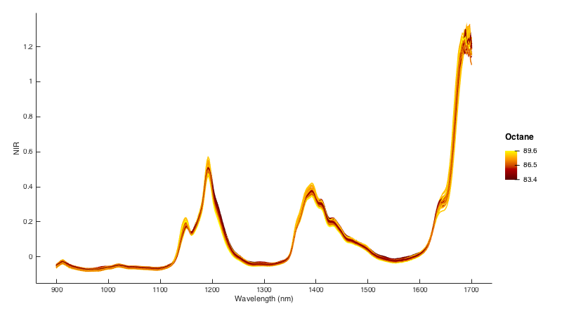
Color data can also be displayed as a continous variable, not as a grouping factor (set_continuous_color())
-
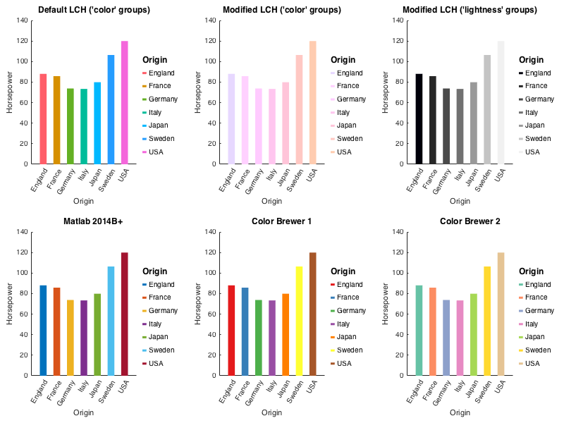
Possibility to customize color generations in the LCH color space, chose alternative colormaps (Matlab's default, colorbrewer2), or provide a custom colormap (set_color_options())
-
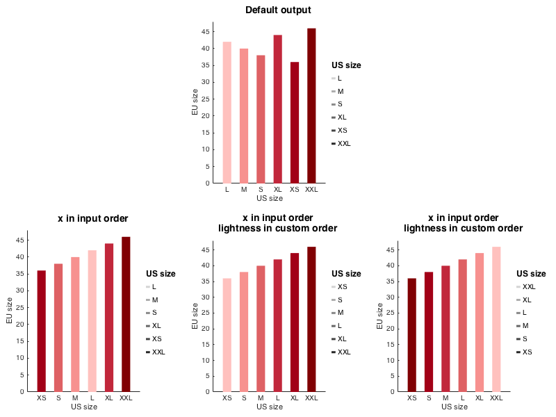
Possibility to change ordering of grouping variables between native, sorted, or custom (set_order_options)
-
Confidence intervals as shaded areas, error bars or thin lines
-
Set the width and dodging of graphical elements in stat_bin(), stat_summary(), and stat_boxplot(), with 'width' and 'dodge' arguments
-
Results of computations from stat_ plots are returned in the member structure results
-
Figure title (set_title())
-
Multiple gramm plots can be combined in the same figure by creating a matrix of gramm objects and calling the draw() method on the whole matrix. An overarching title can be added by calling set_title() on the whole matrix.
-
Matlabs axes properties are acessible through the method axe_property()
-
Custom legend labels with set_names()
-
Plot reference line on the plots with geom_abline(), geom_vline(),geom_hline()
-
Date ticks with set_datetick()
-
Gramm works best with table-like data: separate variables / structure fields / table columns for the variables of interest, with each variable having as many elements as observations.
The code for the following figures and numerous others is in examples.m.
###Relationship between categorical and continuous variables

###Distribution of a continuous variable
Note that we by using Origin as a faceting variable, we visualize exactly the same quantities as in the figure above.

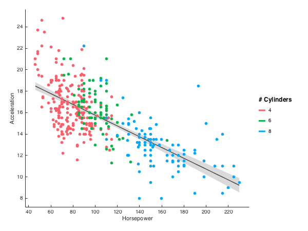
###Relationship between two continous variables

###Repeated trajectories
Here the variable given as Y is a Nx1 cell of 1D arrays containing the individual trajectories. Color is given as a Nx1 cellstr.

###Spike trains
This example highlights the potential use of gramm for neuroscientific data. Here X is a Nx1 cell containing spike trains collected over N trials. Color is given as a Nx1 cellstr.
Using stat_bin() it is possible to construct peristimulus time histograms.

With set_color_options()
###Reordering of categorical variables
With set_order_options()
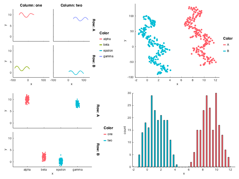
By making the first draw call as draw(false), the same axes can be reused for another gramm plot.
Here this allows to use different groupings for the points and for the glm fit.
gramm was inspired and/or used code from:
- ggplot2
- Panda for color conversion
- subtightplot for subplot creation
- colorbrewer2