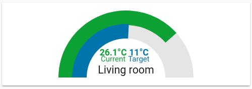
Two gauges in one, built mostly with CSS.
Still WIP but usable.
Heavily inspired by ciotlosm's gauge-card, but completly remimplented.
Why reimplement it? Just for fun with CSS and custom cards 😉
| Name | Type | Default | Description |
|---|---|---|---|
| title | string | Common title | |
| min | int | 0 | minimum value |
| max | int | 100 | maximum value |
| outer | object | config for the outer gauge | |
| inner | object | config for the outer gauge | |
| colors | object | color config (optional) |
Both the gauges have the same attributes:
| Name | Type | Default | Description |
|---|---|---|---|
| entity | string | entity id | |
| attribute | string | use this attribute of the entity instead of its state (optional) | |
| label | string | label for this gauges value (optional) | |
| unit | object | unit to add to the value (optional) | |
| colors | object | color config (optional) |
Colors may be configured for both gauges at once or individualy. You may configure as much colors as you like.
Its a simple list of colors and values where if the gauges value is above the according color is used. Each entry of the color list must consist of a color and a value. When the gauges value is above a value in that list, the corresponding color is used for the gauge. The list is automatically sorted so you don't need to in your config - but I recommend it anyways.
If no color is found, the last color in the list is used as a fallback.
To use a single color for every value just use a single list entry with any value to always trigger the fallback.
The example on the screenshot is configured like this:
- type: custom:dual-gauge-card
  title: Living room
  min: -20
  max: 40
  outer:
    entity: climate.living_room
    attribute: current_temperature
    label: "Current"
    unit: "°C"
   inner:
     entity: climate.living_room
     label: "Target"
     attribute: temperature
     unit: "°C"
   colors:
     - color: "var(--label-badge-red)"
       value: 27.5
     - color: "var(--label-badge-green)"
       value: 25
     - color: "var(--label-badge-yellow)"
       value: 18
     - color: "var(--label-badge-blue)"
       value: 0
     - color: "var(--paper-blue-400)"
       value: -40
