Gramm allows to easily plot grouped data in Matlab, and is inspired by R's ggplot2 library by Hadley Wickham
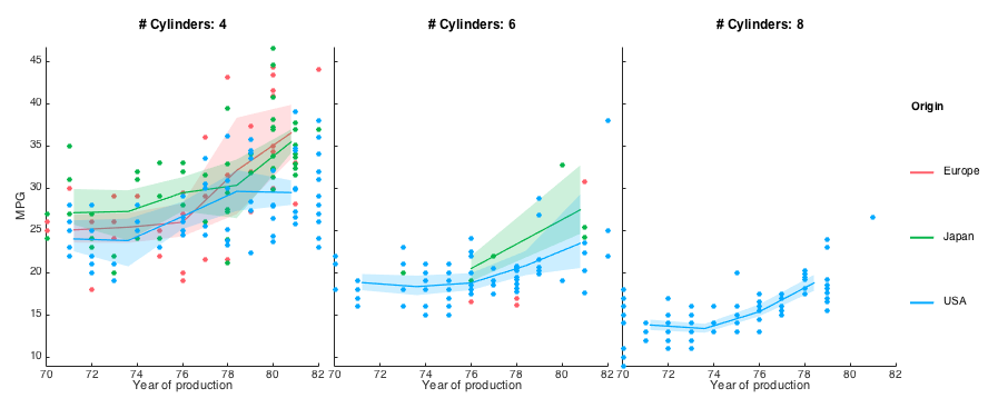
With gramm, 6 lines of code are enough to create such a figure:

load carbig.mat %Load example dataset about cars
origin_region=num2cell(org,2); %Convert origin data to a cellstr
%Create a gramm object, provide x (year) and y (mpg) data
%color data (region of origin) and select a subset of the data
g=gramm('x',Model_Year,'y',MPG,'color',origin_region,'subset',Cylinders~=3 & Cylinders~=5,'size',5)
%Set appropriate names for legends
g.set_names('color','Origin','x','Year of production','y','MPG','column','# Cylinders')
%Subdivide the data in subplots horizontally by number of cylinders
g.facet_grid([],Cylinders)
%Plot raw data points
g.geom_point()
%Plot summarized data: 5 bins over x are created and for each
%bin the mean and confidence interval is displayed as a shaded area
g.stat_summary('geom','area','type','bootci','bin_in',5)
g.draw() %Draw method- Accepts x and y data as arrays, matrices or cells of arrays
- Accepts grouping data as arrays or cellstr
- Multiple ways of separating data by groups:
- Color, point size and line type
- Subplots by row and/or columns, or wrapping columns (
facet_grid()andfacet_wrap())
- Multiple ways of directly plotting the data:
- scatter plots (
geom_point()) and jittered scatter plot (geom_jitter()) - lines (
geom_line()) - bars plots (
geom_bar()) - raster plots (
geom_raster())
- scatter plots (
- Multiple ways of plotting transformed data:
- y data summarized by unique x values with confidence intervals (
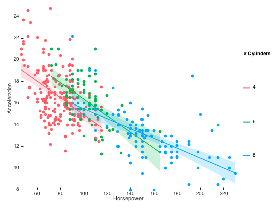
stat_summary()) - spline-smoothed y data with optional confidence interval (
stat_smooth()) - histograms and density plots of x values (
stat_bin()andstat_density()) - 2D binning (
stat_bin2d()) - GLM fits (
stat_glm(), requires statistics toolbox)
- y data summarized by unique x values with confidence intervals (
- Subplots are created without too much empty space in between (and resize properly !)
- Polar plots (
set_polar()) - Confidence intervals as shaded areas, error bars or thin lines
- Multiple gramm plots can be combined in the same figure by creatin a matrix of gramm objects and calling the
draw()method on the whole matrix. - Matlabs axes properties are acessible through the method
axe_property() - Custom legend labels with
set_names()
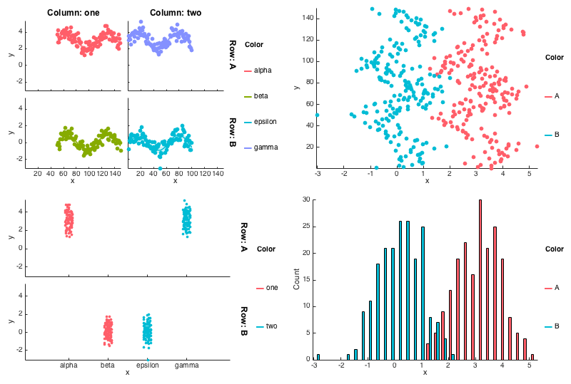
Also shows histograms, categorical x values

gramm was inspired and/or used code from:
- ggplot2
- Panda for color conversion
- subtightplot for subplot creation

