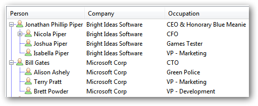
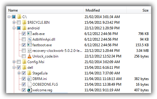
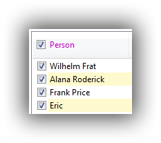
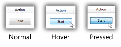
FluentListView is a C# wrapper around a .NET ListView, supporting model-bound lists, in-place item editing, drag and drop, icons, themes, trees & data grids, and much more. This is a fork of ObjectListView with a focus on performance.
All credits go to Phillip Piper for creating the original project ObjectListView.
FluentListView is designed to view a list of strongly-typed objects. You don't need to create ListItem objects, you just feed it your list and everything is handled internally.
For example, let's define an object to hold the metadata of a file.
// define our list item class
public class FileObject {
	public string Name;
	public string Path;
	public DateTime DateCreated;
	public DateTime DateModified;
}
We can then use FluentListView to display these file objects. We'll also allow users to drag-and-drop files from Explorer into the list.
using Fluent;
using System.Windows.Forms;
using System.Drawing;


// create a list and add it into the form
var list = new FluentListView();
form.Controls.Add(list);


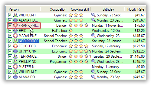
// set basic visual properties
list.Size = new Size(800, 200);
list.Theme = OLVTheme.VistaExplorer;
list.ItemFont = new Font("Segoe UI", 9.75F, FontStyle.Regular, GraphicsUnit.Point, 0);


// display the the file name as the list item label
list.Properties.Name = "Name";


// display some more properties from our objects as columns
list.ShowColumns = true;
list.Properties.Columns = new List<string>     { "DateCreated",  "DateModified",  "FullPath"  };
list.Properties.ColumnNames = new List<string> { "Date Created", "Date Modified", "Full Path" };


// set the default items
list.Items = new List<FileObject>();


// enable drag-and-drop files from Explorer
list.EnableDropFiles = true;
list.EnableDropOnLocations = DropTargetLocation.Background | DropTargetLocation.Item;
list.OnDroppedFiles = delegate (List<string> paths) {
	paths.ForEach(p => {

		// add the file to the list
		var item = new FileObject {
			Name = Path.GetFileName(path),
			Path = path,
			DateCreated = File.GetCreationTime(path),
			DateModified = File.GetLastWriteTime(path),
		};

		// quickly add the list item to the view
		list.AddItem(item);
	});
};


// get the currently displayed items
var currentItems = ((List<FileObject>)list.Items);


// get the currently selected items
var selectedItems = list.SelectedItems.ToList<FileObject>();-
list.Properties - You need to set these to configure which properties of your objects display as the Name, Icon and Description. You can optionally add a list of Columns, to have those properties show as additional columns in the list.
-
list.Items - The items that are bound to this list. Set this to your list of objects. You only need to set this once. When adding and removing a single item, please call
AddItemandRemoveIteminstead of modifying this list directly. -
list.Theme - Which visual theme to use to render items.
-
list.ItemFont - The font used to display list items. Affects row height.
-
list.InnerList - Gets the underlying AdvancedListView or FastListView UI control.
-
list.SelectedItem - Gets or sets the selected item.
-
list.SelectedItems - Gets or sets the selected items.
-
list.EnableDragDropItems - Whether the list will use a SimpleDragSource to initiate drags.
-
list.EnableDrop - Whether the list will use a SimpleDropSink to accept dropping items from other sources.
-
list.EnableDropFiles - Whether the list will accept dropping of files from Explorer. You need to handle
OnDroppedFiles. -
list.EnableDropOnLocations - You need to set this if you are using drag or drag-drop.
-
list.OnCanDrop - You need to set this if you are using EnableDragDropItems or EnableDrop, but not if you are using EnableDropFiles.
-
list.OnDropped - You need to set this if you are using EnableDragDropItems or EnableDrop, but not if you are using EnableDropFiles.
-
list.OnDroppedFiles - You need to set this if you are using EnableDropFiles.
-
list.ShowColumns - Used to control if additional columns are displayed based on
list.Properties.Columns. -
list.ColumnWidth - The width of additional columns.
This is the underlying component used in FluentListView.
The following readme is copyrighted © 2006-2019 by Phillip Piper.
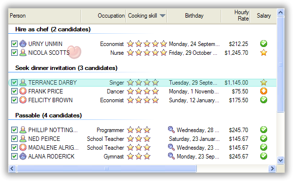
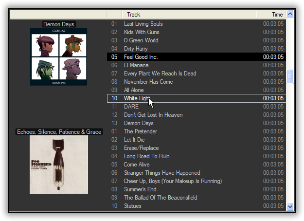
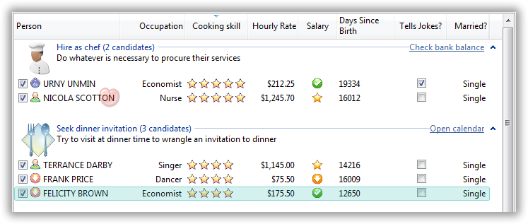
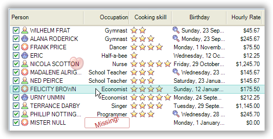
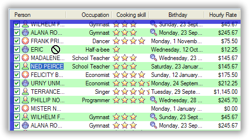
Here is an example of what your ListView can look like with a few callbacks in place:
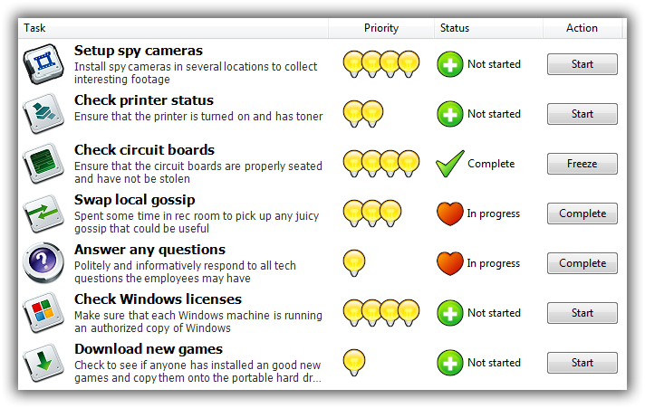
Put pretty graphics, buttons and descriptions on your list, to make your users love your application:
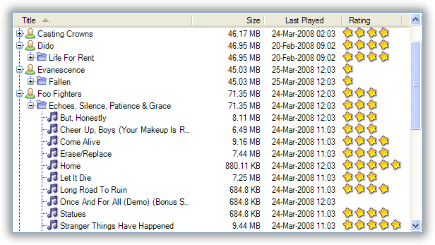
The TreeListView similarly make a tree structure look beautiful:
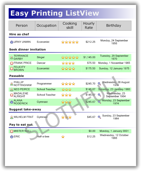
Need to print a report? ListViewPrinter effortlessly produces reports from a FluentListView:
With a little work, you can even pretend to live in the halls of cool with something like this:
OK, here’s the bullet point feature list:
- Automatically transforms a list of model objects into a fully functional ListView, including automatically sorting and grouping rows.
- Easily edit cell values.
- Easily use drag and drop.
- Supports all ListView views (report, list, large and small icons).
- Supports owner drawing, including rendering animated graphics and images stored in a database.
- Supports automatic grouping.
- Supports sophisticated group formatting, including collapsible groups (Vista and later only).
- Columns can be fixed-width, have a minimum and/or maximum width, or be space-filling (Column Widths)
- Displays a “list is empty” message when the list is empty (obviously).
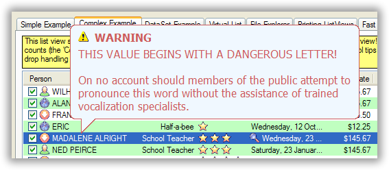
- Supports fancy tooltips for cells and for headers.
- Supports buttons in cells.
- Supports checkboxes in any column as well as tri-state checkboxes.
- Supports hierarchical checkboxes in TreeListView.
- Supports alternate rows background colors.
- Supports custom formatting of rows.
- Supports searching (by typing) on any column.
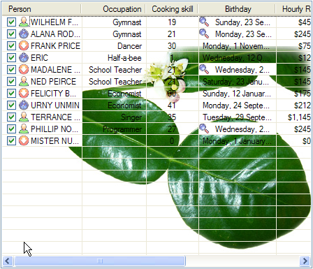
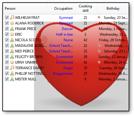
- Supports image and text overlays as well as arbitrary decorations.
- Supports hyperlinks.
- Supports hot tracking with text font/color changes and with decorations.
- Supports column header formatting including checkboxes, word wrapping and vertical text.
- Supports groups on virtual lists (Vista and later only).
- Supports transluscent hot item and selection like Vista even on XP.
- Supports filtering, including the very common iTunes-like text filtering.
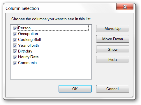
- Supports column selection through right-click on header.
- Supports Excel-like column filtering.
- Supports native background images with all their inherent limitations.
- Supports disabled rows
- Supports automatic updates via standard INotifyPropertyChanged.
There are several flavours of FluentListView:
- FastFluentListView can build a list of 10,000 objects in less than 0.1 seconds.
- TreeListView control combines an expandable tree structure with the columns of a ListView.
- There are data binding versions of each flavour.
Seriously, after using a FluentListView, you will never go back to using a plain ListView.
OK, I’m interested. What do I do next?
I often find that I have a collection of objects which I want to present to the user in some sort of tabular format. It could be the list of clients for a business, a list of known FTP servers or even something as mundane as a list of files in a directory. User interface-wise, the ListView is the perfect control for these situations. However, I find myself groaning at the thought of using the ListView and secretly hoping that I can use a ListBox instead.
The reason for wanting to avoid the ListView is all the boilerplate code it needs to work: make the ListViewItems, add all the SubItems, catch the header click events and sort the items depending on the data type. When the user right clicks on the list, I have to figure out which rows are selected, and then maps those rows back into the model objects I am interested in. None of these tasks are obvious if you don’t already know the tricks, and even when you do, it is annoying to have to code them again for each ListView. If you want to support grouping, there’s an even bigger chunk of boilerplate code to copy and then modify slightly.
The FluentListView was designed to take away all these repetitive tasks and so make a ListView much easier – even fun – to use.
Use the FluentListView project
- In your project, add a reference to the FluentListView NuGet Package.
- Adding the NuGet Package does not automatically add any new components into your toolbox. You will need to add them manually after you have added the NuGet Package to your project.
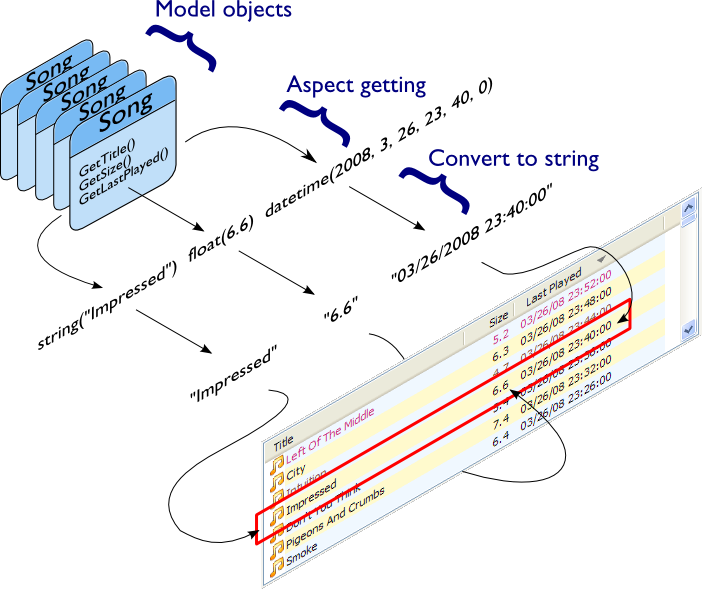
If you are a visual person, the process I’m about to explain is this:
You give the FluentListView a list of model objects. It extracts aspects from those objects, converts those aspects to strings, and then builds the control with those strings.
Keep this image in mind when reading the following text.
Note! This is important. You need to understand this.
Before you start trying to use a FluentListView, you should understand that the process of using one is different to the process of using a normal ListView. A normal ListView is essentially passive: it sits there, and you poke and prod it and eventually it looks like you want. A FluentListView is much more active. You tell it what you want done and the FluentListView does it for you.
A FluentListView is used declaratively: you state what you want the FluentListView to do (via its configuration), then you give it your collection of model objects, and the FluentListView does the work of building the ListView for you.
This is a different approach to using a ListView. You must get your mind around this, especially if you have done any ListView programming before (See Unlearn you must).
The crucial part of using a FluentListView is configuring it. Most of this configuration can be done within the IDE by setting properties on the FluentListView itself or on the columns that are used within the list. Some configuration cannot be done through properties: these more complex configurations are done by installing delegates (more on this later).
Once the columns and control are configured, putting it into action is simple. You give it the list of model objects you want it to display, and the FluentListView will build the ListView for you:
this.myFirstOlv.SetObjects(myListOfSongs);
What’s this “model” you keep talking about?
Your model objects are the data used by your application. They are the part that stays the same when you decide make your desktop application available as a web app, or vice versa. The view is the part that presents your model objects to the user. The view changes completely when you move your application to the web.
For more detailed discussion, see here or any other of the thousand sites that discuss this.
For those who are familiar with using a ListView.
This section is for those who are familiar with using a ListView, either from .NET or (shudder) from Petzold-style windows. Complete novices can skip this section.
For those of you who have struggled with a ListView before, you must unlearn. A FluentListView is not a drop in replacement for a ListView. If you have an existing project, you cannot simply create a FluentListView instead of creating a ListView. A FluentListView needs a different mindset. If you can perform the mind-mangling step of changing your thinking, FluentListView will be your best friend.
Beware of ListViewItems. You never need to add ListViewItems to a FluentListView. If you find yourself adding things to the Items collection, creating ListViewItems, or adding sub-items to anything, then you need to stop – you are being seduced to the dark side. A FluentListView does all that work for you. It owns the ListViewItems and will destroy and recreate them as needed. Your job is to tell the FluentListView what information you want the ListViewItems to contain, and then to give it the list of objects to show.
Resist the temptation to add, edit, remove, or otherwise mess with ListViewItems – it will not work.
There is also no need to hide information in a ListViewItem. Old style ListView programming often required attaching a key of some sort to each ListViewItem, so that when the user did something with a row, the programmer would know which model object that row was related to. This attaching was often done by creating one or more zero-width columns, or by setting the Tag property on the ListViewItem.
With a FluentListView, you do not need to do this. The FluentListView already knows which model object is behind each row. In many cases, the programmer simply uses the SelectedObjects property to find out which model objects the user wants to do something to.
For the purposes of this introduction, we’ll imagine that you are writing an application to manage a music library. One of your central model object might be Song, which could looks something like this:
class Song {
    public Song () {
    }
    public string Title {
        get { ... };
        set{ ... };
    }
    public DateTime LastPlayed {
        get { ... };
        set{ ... };
    }
    public float GetSizeInMb {
        ...
    }
    public int Rating {
        get { ... };
        set{ ... };
    }
        ...
}
The first configuration step is to tell each column which bit (called an “aspect”) of your model object it is going to display. You do this through a Columns properties. You can edit the Columns of a FluentListView by either:
- Finding the Columns property of the FluentListView and clicking the ellipsis (...) button next to it;
- Or by showing the quick commands for the FluentListView (press on the small arrow at the top right of the control) and clicking “Edit Columns.”
You should now see a dialog entitled “OLVColumn Collection Editor.” Click “Add” to add a new column to the FluentListView. Once you have a column selected, all its properties are presented on the right hand side (I find it helpful to resize the dialog so I can see all the properties at once).
At the top of the list of properties is a property AspectName. This is the property that tells the column which aspect of the model object it should display. The AspectName will hold the name of the property, method or field that will be shown in this column.
To show the Song’s title in the first column, you set the first column’s AspectName to “Title”.
OK, we’ve told our first column which bit of data it should display. For the Title, this is all that is necessary. But for our second column which will show LastPlayed, there is another configuration we should consider: converting our bit of data to a string.
A ListView control can only display strings. Everything else - booleans, integers, dates, whatever - has to be converted to a string before it can be given to the ListView. By default, the FluentListView converts data to strings like this:
stringForDisplay = String.Format("{0}", aspectValue);
You can use a different format string (instead of the default “{0}”) by setting the AspectToStringFormat property. If the AspectToStringFormat property isn’t empty, its value will be used as the format string instead of “{0}”. See String.Format() documentation to understand its abilities. Some useful format strings are “{0:d}” to show a short date from a DateTime value, and “{0:C}” for currency values.
So, we would configure our second column like this: AspectName: “LastPlayed”, AspectToStringFormat: “{0:d}”.
Our third column is to display the GetSizeInMb aspect. We’d like this to put commas into its string representation, so we would configure it like this: AspectName: “GetSizeInMb”, AspectToStringFormat: “{0:#,##0.0}”.
Our fourth column is to display the Rating aspect. It does not need a special AspectToStringFormat, so it would simply be configured with AspectName: “Rating”.
Having finished our IDE configuration, we set the whole thing into action with our one line of code:
this.olvSongs.SetObjects(listOfSongs);
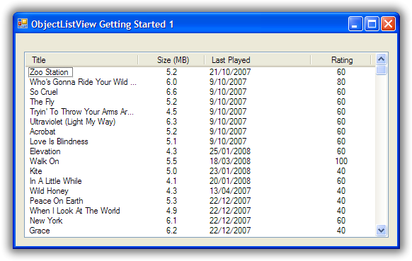
And we should get something like this:
Underwhelmed? Admittedly, it’s not much to look at, but be patient. Also, consider how much work you had to do to make it happen: some IDE configuration and one line of code. It doesn’t look so bad now, does it?
With those column definitions, we have a ListView that shows the title, date last played, size (in megabytes) and rating of various tracks in your music library. But, actually, we have quite a bit more than that. Without any extra work, sorting, grouping, search by typing and column selection all work:
- Clicking on the column headers will sort and reverse sort the rows. The sort is accurate for the data type: when sorting by size, a song of 35 megabytes will come after a song of 9 megabytes.
- If you enable groups on the ListView (set ShowGroups to True), the ListView will group the rows according to the column clicked.
- If you type a couple of letters, the row that matches the typed letters will be selected. The rows are matched on the sort column values, not the first column values.
- If you right click on the column headers, a menu will popup which allows you to select which columns are visible.
OK, that’s good, but any real ListView needs to be able to put little icons next to the text. That is our next task.
Deciding which icon to put in a column cannot be done in the IDE. Very often the icon used depends on the model object being displayed. To decide on an icon, we need a more complex type of configuration: installing a delegate.
A delegate is basically a piece of code that you give to a FluentListView saying, “When you need to do this, call this piece of code” where this can be any of several tasks. In this case, we install an ImageGetter delegate, which tells the FluentListView, “When you need to figure out the image for this model object, call this piece of code.”
If the word “delegate” worries you, think of them as function pointers where the parameter and return types can be verified. If that makes no sense to you, just keep reading. It will (possibly) become clear with some examples.
First, you need a method that matches the ImageGetterDelegate signature: it must accept a single object parameter and returns an object. A completely frivolous example might be like this, which displays a star image if the song has a rating 80 or higher and a normal song icon otherwise:
public object SongImageGetter(object rowObject) {
    Song s = (Song)rowObject;
    if (s.Rating \>= 80)
        return "star";
    else
        return "song";
};
You install this delegate by assigning it to the ImageGetter property on the first column:
this.titleColumn.ImageGetter = new ImageGetterDelegate(this.SongImageGetter);
The delegate is passed a parameter of type object. The FluentListView doesn’t know anything about your model objects, not even their class. It only ever deals with them as object. In your delegates, casting rowObject to an instance of your model will almost always be the first step (but see TypedFluentListView for an alternative).
The value returned from the ImageGetter delegate is used as an index into the FluentListView‘s SmallImageList. As such, the ImageGetter can return either a string or an int. (If the FluentListView is owner-drawn, the ImageGetter can return an Image, but that’s a story for another day).
The ImageGetter delegate is installed on the column, since each column can have its own image.
.NET 2.0 added the convenience of anonymous delegates (to C# at least – VB users are stuck with using separate methods). In an anonymous delegates, the code for the function is inlined, like this:
this.titleColumn.ImageGetter = delegate (object rowObject) {
    Song s = (Song)rowObject;
    if (s.Rating \>= 80)
        return "star";
    else
        return "song";
};
For small methods, anonymous delegate are much more convenient.
Another useful delegate that you can install is the AspectToStringConverter delegate. Sometimes, converting a bit of the model (the Aspect) to a string can be more than String.Format() can handle. AspectToStringConverter takes over when String.Format() is not enough.
In our Song class, the actual size of the song is stored as long SizeInBytes. It would be nice if we could show the size as “360 bytes”, “901 KB”, or “1.1 GB” which ever was more appropriate.
To do something smarter like this, we would change the AspectName of our third column to be “SizeInBytes” and install a AspectToStringConverter delegate, like this:
this.sizeColumn.AspectToStringConverter = delegate(object x) {
    long size = (long)x;
    int[] limits = new int[] { 1024 * 1024 * 1024, 1024 * 1024, 1024 };
    string[] units = new string[] { "GB", "MB", "KB" };

    for (int i = 0; i < limits.Length; i++) {
        if (size \>= limits[i])
            return String.Format("{0:#,##0.##} " + units[i], ((double)size / limits[i]));
    }

    return String.Format("{0} bytes", size); ;
};
Just a couple more things to configure. You need to make an ImageList, give it the images you want, and then assign it to the SmallImageList property of the FluentListView. And finally, we will set the UseAlternatingBackColors property to true.
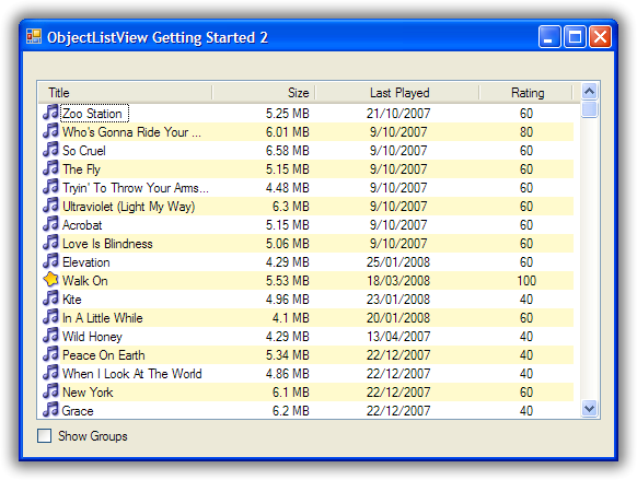
Putting all these bits together, we now have something that looks like this:
Hey! That’s starting to not look too bad.
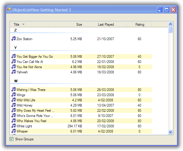
The last part of our getting started project will be to improve how the FluentListView displays groups.
If you turn on the ShowGroups property on the FluentListView, you will see that it automatically supports grouping. Normally, the first column groups rows that have the same initial letter. You can give other columns this same behaviour by setting the UseInitialLetterForGroup property to true.
Quite a lot happens under the hood when grouping is enabled. When the FluentListView is rebuilt:
- A group “key” is calculated for each model object.
- All model objects that return the same “key” are placed in the same group.
- That group “key” is then converted to a string. This string becomes the label for the group.
- Each group of model objects is then sorted
- The sorted objects added beneath their group’s label.
The crucial part to understand is that all model objects that have the same “key” are placed in the same group. By default, the “key” is the aspect of the model object as calculated by the grouping column. So when grouping is enabled and the user clicks the “Size” column, the Songs are grouped by their SizeInBytes value, that is, all Songs that have exactly the same number of bytes are placed in the same group.
The default way of calculating the group key works, but it can be improved. You can do your own calculation by (you guessed it) installing a delegate, the GroupKeyGetter delegate.
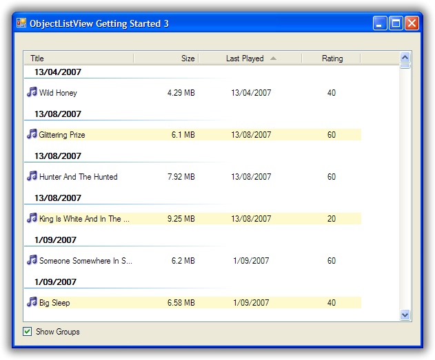
We need to improve the way the “Last Played” column is grouped. The default group key for this column is the value of the LastPlayed property for each Song. This is not very useful - every song ends up in its own group. (If you can explain why, well done! You’re right on the ball). Worse, when the key is converted to a label, only the date part is displayed, so it looks as if your control is broken.
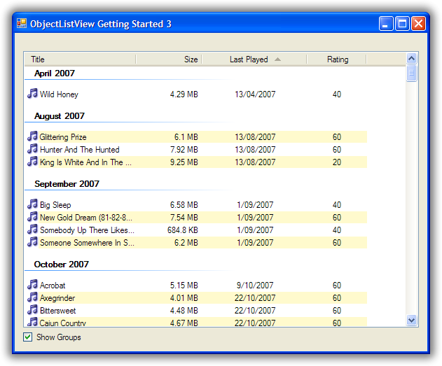
We’ll change the “Last Played” column so that it groups songs by the month they were last played – all the songs last played in July should be in the same group. To do this, we install a GroupKeyGetter on the lastPlayedColumn:
this.lastPlayedColumn.GroupKeyGetter = delegate(object rowObject) {
    Song song = (Song)rowObject;
    return new DateTime(song.LastPlayed.Year, song.LastPlayed.Month, 1);
};
This will group the songs by just their year and month. We also install another delegate that will convert our group key into a string that will be used as the label for the group:
this.lastPlayedColumn.GroupKeyToTitleConverter = delegate(object groupKey) {
    return ((DateTime)groupKey).ToString("MMMM yyyy");
};
With these two simple delegates in place, now grouping by the “Last Played” column looks much better.
Why does FluentListView have these two steps: key getting and key to title? Isn’t it simpler to just group model objects by their group label?
Because we want to be able to sort the groups themselves correctly. To do this we need to have the actual group key, not just the group label. For example, with our LastPlayed column, the group “January 2008” should appear before the group “February 2008.” But that’s not possible if we only have the group labels. So we need the two-step tango.
The “Last Played” column now groups nicely. Let’s see what we can do with the “Rating” column. The Rating is a number between 0 and 100 where 0 means “Should be deleted” and 100 means “Should be played continuously through all available loudspeakers”.
For our example, we’ll group them like this:
Value | Group
<=20 | “Why do you even have these songs?”
21-39 | “Passable I suppose”
40-79 | “Buy more like these”
80-100 | “To be played continuously”
We could do this by installing a GroupKeyGetter and a GroupKeyToTitleConverter, but this is such a common use case, there’s a special function to do it for you: MakeGroupies(). We’ll use this method like this:
this.ratingColumn.MakeGroupies(
    new int[] { 20, 39, 79 },
    new string[] { "Why do you even have these songs?", "Passable I suppose",
                       "Buy more like these", "To be played continuously" }
);
The first array contains the cutoff points. Every group key less than or equal to the first cutoff point goes into one group. Keys greater than the first cutoff but less than or equal to the second cutoff go into another group, and so on. A group key greater than the last cutoff goes into yet another group.
The second array contains the group labels for the matching cutoff point. This array must have one more item than the cutoff point array. This last item is the label for the group whose keys were greater than the last cutoff value.
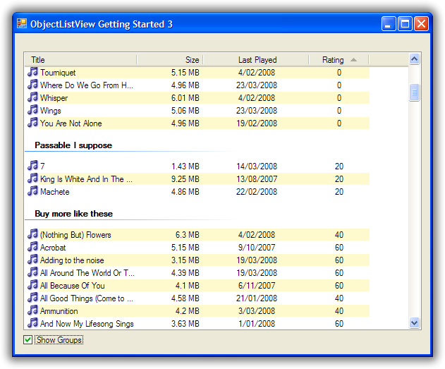
So with our Songs, songs that have a Rating of less than or equal to 20 go into a group labelled “Why do you even have these songs?”. Songs with a Rating between 21 and 39 go into a second group labelled “Passable I suppose”. Songs with a Rating 80 and above fall into the last group labelled “To be played continuously”.
It’s a bit complicated to explain, but it’s quite easy to use.
With the MakeGroupies() in place, grouping by our Rating column, now looks like this:
Well done! You’ve made it to the end of the tutorial. You should by now have a reasonable grasp of some of the things a FluentListView can do, and how to use it in your application.
If you need further help, you can look at the Cookbook and the Forum for those questions that just don’t have answer anywhere else.
Don’t forget: Use The Source Luke! You have all the source code. If you can’t figure something out, read the code and see what is actually happening.
Welcome To The New World of Loving .NET’s ListView
Why take the time to learn how to use a FluentListView? What’s the benefit? The return on investment? This page tries to document the useful features of a FluentListView. Not all features are equally useful, but it’s better to be aware of what’s available so that you can use it when the need arises.
- Animations
- Alternate rows background colors
- Automatic grouping
- Automatic sorting
- Automatically create the ListView from model objects
- Buttons in cells
- Checkboxes in any column
- Cell events
- Collapsible groups
- Copy selected rows to clipboard
- Custom row and cell formatting
- Custom selection colours
- Data binding
- Different flavours of FluentListView for different purposes
- Displays a “list is empty” message
- Drag and drop
- Ease of use
- Editing cell values
- Filtering
- Groups on virtual lists
- Header check boxes
- Header formatting
- Header images
- Header drawn vertically
- Header visible in all views
- Hierarchical checkboxes
- Hot item tracking
- In-place modifications of the list
- INotifyPropertyChanged support
- Model object level operations
- More control over column width
- Owner drawing
- Overlays and decorations
- Row height can be changed
- Save and restore state
- Searching on the sort column
- SelectionChanged event
- Selected Column
- Supports all ListView views
- Tool Tips
- User-selection of visible columns
The major goal of a FluentListView is to make your life easier. All common ListView tasks should be easier – or at least no more difficult – with a FluentListView. For the investment of configuration the Columns, you receive a great deal of convenience and value added functions.
See Getting Started for an introduction to the basics.
The major way in which the FluentListView makes your life easier is by being able to automatically build the ListView from a collection of model objects. Once the columns are defined, a FluentListView is able to build the rows of the ListView without any other help. It only takes a single method call: SetObjects().
If ShowGroups is true, the control will automatically create groups and partition the rows into those groups.
This grouping can be customised in several ways:
- the way a row is assigned to a group can be changed by installing a GroupKeyGetter on the column.
- the name for a groups can be changed by installing a GroupKeyToTitleConverter on the oolumn
For values that form a continous range (like salaries, height, grades), the MakeGroupies utility method can easily create more meaningful groupings.
Groups normally change according to the sort column. You can “lock” the groups to be on a particular column via the AlwaysGroupByColumn property.
See Grouping for more details.
This is the most requested feature ever. Under Vista, groups are now collapsible. This is enabled by default. If you don’t want your groups to be collapsible, set HasCollapsibleGroups to false.
Under XP, groups cannot be collapsed.
Each flavour of control (FluentListView, FastFluentListView, TreeListView) has a data bindable version: DataListView, FastDataListView, DataTreeListView.
Each data bindable version has two additional properties: DataSource and DataMember. These let you control which data set is bound to the control.
Grouping on virtual lists is normally impossible. The SDK says so. But with a little exploring of undocumented features, it can be made to work. Thanks to Geoff Chapell for all his hard work in finding out what is possible.
So, as of v2.3, virtual lists can show groups. FastFluentListViews support grouping without any further effort – simple set ShowGroups to true. If you have a VirtualFluentListView and have done the work of implementing a virtual data source, you will need to implement the IVirtualGroups interface, and then set GroupingStrategy property to an object that implements that interface.
Under Vista and later, groups can now have icons, sub titles, footers and tasks.
See 27. How do I put an image next to a group heading?
FluentListView will automatically sort the rows when the user clicks on a column header. This sorting understands the data type of the column, so sorting is always correct according to the data type. Sorting does not use the string representation.
Sorting can be customised either by listening for the BeforeSorting event or by installing a CustomSorter.
A FluentListView is the plain vanilla version of the control. It accepts a list of model objects, and builds the control from those model objects.
A DataListView is a data bindable version of a FluentListView. Give it a data source, and it automatically keep itself in sync with the data source, propagating changes to and fro. It will even create the columns of the list view for you, if you don’t want to do it yourself.
A FastFluentListView is a faster version of a FluentListView. Typically, it can build a list of 10,000 objects in less than 0.1 seconds.
A VirtualFluentListView does not require a list of model objects. Instead, it asks for model objects as it requires them. In this way, it can support an unlimited number of rows. Most simply, a VirtualFluentListView can be given a RowGetter delegate, which is called when the list needs to display a particular model object. This gives a functional, but limited ListView. It’s better to implement the IVirtualListDataSource interface to give a fully functional virtual ListView.
A TreeListView combines the tree structure of a TreeView with the multi-column display of a ListView.
ListViews normally allow only the primary cell (column 0) to be edited. A FluentListView allows all cells to be edited. This editing knows to use different editors for different data types. It also allows auto-completion based on existing values for that column.
See FluentListView Cell Editing for more details.
Sometimes, you want to show more than just text and an icon in your ListView. FluentListView has extensive support for owner drawing, providing a collection of useful renderers, and making it easy to develop your own renderers.
There is even a renderer provided that draws animations within a cell (if anyone ever actually uses this feature in a real application please let me know).
See Owner drawing a ListView for more information.
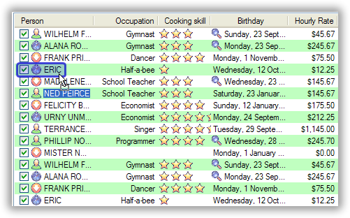
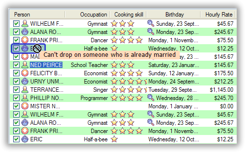
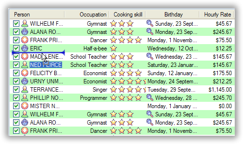
FluentListView supports dragging rows to other places, including other application. It also supports accepting drops from other sources including cross-application drops. Special support is provide for drops from other FluentListViews in the same application.
In many cases, a FluentListView becomes a full drag source by setting IsSimpleDragSource to true.
Similarly, to accept drops, it is usually enough to set IsSimpleDropSink to true, and then handle the CanDrop and Dropped events (or the ModelCanDrop and ModelDropped events, if you only want to handle drops from other FluentListViews in your application).
See FluentListView and Drag & Drop for more information.
A FluentListView supports all views: report, tile, list, large and small icons. All functions should work equally in all views: drag and drop, editing, check state, icons, selection.
You can even owner draw the non-details views (through the ItemRenderer property).
A FluentListView allows the programmer to have control over the width of columns after the ListView is created.
When a column is created, it is normally given a width in pixels. This is the width of the column when the ListView is first shown. After creation, the user can resize that column to be something else.
By using the MinimumWidth and MaximumWidth properties, the programmer can control the lower and upper limits of a column. Combining these two properties can give a fixed width column.
Finally, the programmer can specify that a column should resize automatically to be wider when the ListView is made wider and narrower when the ListView is made narrower. This type of column is a space filling column, and is created by setting IsSpaceFilling to true.
See these recipes:
- 5. How can I stop the user from making a column too narrow or too wide?
- 6. How can I stop the user from resizing a column?
- 7. How can I make a column get bigger when the FluentListView is made bigger?
An empty ListView can be confusing to the user: did something go wrong? Do I need to wait longer and then something will appear?
A FluentListView can show a “this list is empty” message when there is nothing to show in the list, so that the user knows the control is supposed to be empty. You can even apply some fairly customizations to the appearance of the message.
See this recipe: 12. How do I change the message that’s shown when the FluentListView is empty?
A FluentListView can put clickable buttons into cells.
See this recipe for more details: 52. How can I put a button into a cell?.
A FluentListView supports checkboxes on rows. In fact, it supports checkboxes in subitems, if you are really keen. These work even in virtual mode (which a normal ListView cannot do).
See this recipe for more details: 10. How do I use checkboxes in my FluentListView?.
Having subtly different row colours for even and odd rows can make a ListView easier for users to read. FluentListView supports this alternating of background colours. It is enabled by setting UseAlternatingBackColors to true (the default). The background of odd numbered rows will be AlternateRowBackColor.
A FluentListView allows rows and even cells to be formatted with custom colours and fonts. For example, you could draw clients with debts in red, or big spending customers could be given a gold background. See here: 8. How can I change the colours of a row or just a cell?
The FluentListView allows operations at the level that makes most sense to the application: at the level of model objects. Properties like SelectedObjects and CheckedObjects and operations like RefreshObjects() provide a high-level interface to the ListView.
When a user types into a normal ListView, the control tries to find the first row where the value in cell 0 begins with the character that the user typed.
FluentListView extends this idea so that the searching can be done on the column by which the control is sorted (the “sort column”). If your music collection is sorted by “Album” and the user presses “z”, FluentListView will move the selection to the first track of the “Zooropa” album, rather than find the next track whose title starts with “z”.
In many cases, this is behaviour is quite intuitive. iTunes works in this fashion on its string value columns (e.g. Name, Artist, Album, Genre).
It sometimes useful to emphasis the row that the mouse is currently over. This is called “hot tracking.” The normal ListView can underline the text of the hot item. In a FluentListView, the font, font style, text color, and background color can all be set for the hot item.
See this recipe for details: 18. How can I emphasise the row under the mouse?
When one or more rows are selected and the user pressed Ctrl-C, a text representation and a HTML representation of the selected rows is pasted into the clipboard. This allows users to easily copy information from your application into their word processing documents.
If the user makes adjustments to the size, order and selection of columns in one of your ListViews, it would be good manners to make sure those changes are still there when the user runs your application tomorrow. The methods SaveState() and RestoreState() let you do this effortlessly.
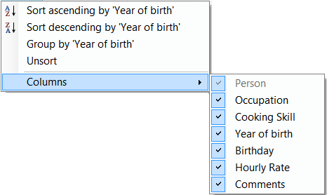
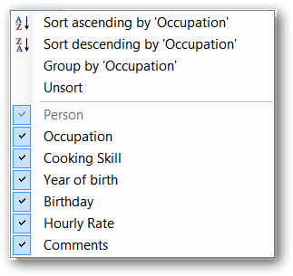
it is sometimes nice to let the user choose which columns they wish to see in a ListView. FluentListView allows you to define many columns for a particular ListView but only have some of them initially visible. The user can right click on the column headers and be presented with a menu of all defined columns from which they can choose which columns they wish to see.
The programmer can also control which columns are visible via the IsVisible property. To hide a column, set IsVisible to false and then call RebuildColumns() to make the change take effect.
With a normal ListView, the SelectedIndexChanged event is the normal way of detecting when the selection has changed. This event is triggered whenever a row is selected or deselected. Although this sounds obvious, it can be quite annoying. If the user selects 100 rows and then clicks on another row, you will received 101 SelectedIndexChanged events: 1 for each row deselected and 1 for the new row selected.
FluentListView has a SelectionChanged event which is triggered once, no matter how many rows are selected or deselected. This is normally far more convenient.
If you set the SelectedColumn property, that column will be lightly tinted to show that it is selected.
If you set the TintSortColumn property, the sort column will automatically be selected.
With a normal ListView, the row height is calculated from a combination of the control font and the SmallImageList height. It cannot be changed. But, a FluentListView has a RowHeight property which allows the height of all rows to be specified.
N.B. Every row has the same height. No variable height rows are allowed. See Can a FluentListView have rows of different heights? to understand why.
The colours used to indicate a selected row are governed by the operating system and cannot be changed. However, if you set UseCustomSelectionColors to true, the FluentListView will use HighlightBackgroundColor and HighlightForegroundColor as the colours for the selected rows.
A standard ListView cannot display tooltips on individual cells (apart from showing truncated cell values when FullRowSelect is true).
But a FluentListView can show arbitrary tool tips for both cells and headers. See 17. How can I show more information in the tooltip when the mouse hovers over a cell? for details.
FluentListView supports AddObjects() and RemoveObjects() method which modify the contents of the list in place. Use the Objects property to fetch the current contents of the list.
Not all flavours of FluentListView support this capacity equally. Plain FluentListViews support it fully, as do FastFluentListViews. VirtualFluentListViews simply hand off these methods to their data source, so whether these methods work depends on the implementor of the data source.
DataListViews do not support these methods since they are controlled by their DataSource.
TreeListViews interpret these operations as modifying the top level item (“roots”) of their list.
FluentListViews can draw images and text over the top of the control. This drawing is normally done transluscently, so that the drawn images/text do not completely obscure the underlying information.
Overlays are drawing over the control itself. Decorations are added to rows and subitems.
See: 19. How can I put an image (or some text) over the top of the ListView? for how to use them; Overlays and Decorations for some gotchas Technical Blog - Overlays for the history of their development.
A normal ListView triggers mouse events for the list as a whole. FluentListView can trigger events for cells: CellClick, CellOver and CellRightClick. These events allow you to easily know what the user clicked (or what the mouse is over), and then react appropriately.
Each column header can show a checkbox. Checking or uncheckeding this checkbox can change the checkedness of all checkboxes in the column.
See 50. How can I put a checkbox in a column header?.
Each column header can be given its own font, text color, background color and border. These can be set per column or on all headers at once using HeaderFormatStyle on the FluentListView itself.
The text of column header can also be word wrapped, rather than truncated.
See 25. How do I change the font or color of the column headers?.
Each column can have an image drawn to the left of the text by setting the HeaderImageKey property.
See 36. How can I put an image in the column header?.
To save horizonal space, a header can be drawn vertically.
See 37. Can I make a header take up even less space? Can it be drawn vertical?.
In Details view, the user can click on a column heading to sort the items according to that column. But in other views, there is no way to specify how to sort the items. To help with this, FluentListView has a ShowHeaderInAllView property, which if set to true, shows the header in all views, not just Details, so that the items can be sorted however the user wants.
FluentListView integrates with the Sparkle library to allow animations on cells, rows, or whole lists.
FluentListViews (in all flavours) support filtering of their contents. This filtering is done by installing ModelFilters (or less often ListFilters) which select which rows will be shown in the list. See 32. Can I filter the contents of the FluentListView?.
FluentListView comes with some standard filters, most usefully a text match filter which includes only rows that contains a certain string in any cell. This can be combined with a special renderer to highlight the text matches. See 33. Is there an easy way to only show rows that contain some text?.
These filters are of course extensible.
Yet more slothful!
If you set UseNotifyPropertyChanged to true, then FluentListView will listen for changes on your model classes, and automatically update the rows when properties on the model classes changed.
Obviously, your model objects have to implement INotifyPropertyChanged.
TreeListView has hierarchical check boxes, which is where the checkedness of the parent summaries the checkedness of the all the subitems. Checking the parent checks all the descendent items. Similarly, unchecking the parent unchecks all the descendent items.
See 48. Can a TreeListView calculate checkboxes based on subitems? and this blog entry: Hierarchy-aware checkboxes
Learning to cook.
(G)-rated techniques for loving the ListView
- What flavour of FluentListView do I want to use?
- How do I let the user edit the values shown in the list?
- How can I do some fancy sorting?
- How can I draw the values in the cell’s myself?
- How can I stop the user from making a column too narrow or too wide?
- How can I stop the user from resizing a column?
- How can I make a column get bigger when the FluentListView is made bigger?
- How can I change the colours of a row or just a cell?
- How can I make my FluentListView into a shiny report?
- How do I use checkboxes in my FluentListView?
- How do change the information that’s displayed in Tile view?
- How do I change the message that’s shown when the FluentListView is empty?
- On the rows of my FluentListView, I want to show images that come from a database. How do I do that?
- Isn’t there are way to get rid of all the casts in the delegates?
- How do I use a TreeListView?
- When the user types, I want to be able to match values in a column other than the first one. How can I do that?
- How can I show more information in the tooltip when the mouse hovers over a cell?
- How can I emphasise the row under the mouse?
- How can I put an image (or some text) over the top of the ListView?
- How can I put an image (or some text) over the top of a row or cell?
- How can I use drag and drop?
- How do I make the sorted column have that slightly different colour?
- How do I make a column that shows just an image?
- How do I show a menu when the user right clicks on the FluentListView?
- How do I change the font or color of the column headers?
- How do I show a hyperlink in a cell?
- How do I put an image next to a group heading?
- How do I use that little clicky thing next to a group header?
- Can I generate the whole FluentListView directly from my model?
- Can the FluentListView use a selection scheme like Vista?
- Can I show groups on a virtual list?
- Can I filter the contents of the FluentListView?
- Is there an easy way to only show rows that contain some text?
- How do I put something animated onto my FluentListView?
- How can I save and restore the state of the FluentListView?
- How can I put an image in the column header?
- Can I make a header take up even less space? Can it be drawn vertical?
- I want to make the cell being edited more obvious
- How can I change the ordering of groups or rows within a group?
- How do I change what happens the user presses Tab or Enter when editing a cell?
- How do I change the way the “Filtering” menu works?
- How can I change the way the user can choose the columns in a FluentListView?
- How can I make checkboxes keep their values when filtering a FluentListView?
- How can I stop the user expanding/collapsing a group?
- How do I put a real background image onto a FluentListView?
- How do I bind a DataSet to a FluentListView?
- Why can’t I data-bind the TreeListView?
- Can a TreeListView calculate checkboxes based on subitems?
- Can rows be disabled?
- How can I put a checkbox in a column header?
- Can I get rid of the RefreshObject() calls?
- How can I put a button into a cell?
- How can I reduce the CPU usage on mouse move?
- How can I put a description under something that looks like a title?
There are four basic flavours of FluentListView. Of those, three have data bound versions.
Stock standard, but still very nice
A normal FluentListView is capable of anything a ListView can do – only in a much easier to use package. Though it will handle a large number of rows, it is better suited for smaller lists, that is, about 1000 rows or less.
If in doubt, start with this flavour. You can always change it to one of the others later on.
Has a slight bitter taste, but makes you capable of anything
When you want to knock your users out with 10 million search results, a VirtualFluentListView is for you. It can handle any number of objects.
But it does so at a cost:
- You have to implement the IVirtualListDataSource interface.
- It cannot use Tile view.
- It cannot display animated GIFs
- It cannot show groups (but if you are running on Vista and don’t mind doing some work, see 31. Can I show groups on a virtual list?)
But for the cost of this “bitterness,” you really can do anything.
Also makes you capable of anything, but without the bitterness
When you want speed, speed, and more speed, but you don’t want the bitterness of the VirtualFluentListView, a FastFluentListView is your weapon of choice. It operates just like a normal FluentListView – only much faster.
It does have a couple of limitations:
- It also cannot use Tile view
- It cannot show animated GIFs
- It cannot show groups on XP
But apart from that it operates just like a normal FluentListView.
Did I mention the speed?
Adds a distinctive flavour
If you have a tree structured data model, and you want to show common information about the branches and the leaves of the structure, a TreeListView is at your disposal.
See 15. How do I use a TreeListView? for more information.
Everything is just smooth and easy
A DataListView is for the ultra-slothful: those who literally do not want to even write one line of code.
A DataListView can be given a DataSource from within the IDE, and it will automatically keep itself sync with that DataSource. Further, if the DataListView is marked as editable, edits will be automatically written into the DataSource.
Fast and easy
A FastDataListView combines speed with ease of use: the speed of a virtual list with the ease of DataListView. On my mid-range laptop, a FastDataListView can easily handle data sets of 100,000 rows or more.
A FastDataListView virtualizes the display of the data set – it does not change the process of loading data into the dataset. If your dataset is a SQL statement that fetches one million rows from a remote database, your program will still have to load all one millions rows. Once loaded, however, FastDataListView will show them almost instantly.
Hierarchy – fast and easy
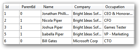
A DataTreeListView makes tree structured data available to the ultra-slothful. Simply tell the DataTreeListView which column holds the row id, and which holds the parent id, and the list will make a fully functional tree listview all by itself.
See 47. Why can’t I data-bind the TreeListView? for more information.
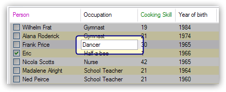
ListViews are normally used for displaying information. The standard ListView allows the value at column 0 (the primary cell) to be edited, but nothing beyond that. FluentListView allows all cells to be edited. Depending on how the data for a cell is sourced, the edited values can be automagically written back into the model object.
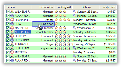
The “editability” of a FluentListView is controlled by the CellEditActivation property. This property can be set to one of the following values:
-
CellEditActivateMode.None
Cell editing is not allowed on the control This is the default.
-
CellEditActivateMode.SingleClick
Single clicking on any subitem cell begins an edit operation on that cell. Single clicking on the primary cell does not start an edit operation. It simply selects the row. Pressing
F2edits the primary cell. -
CellEditActivateMode.SingleClickAlways
Single clicking on any cell begins an edit operation on that cell, even the primary cell (unlike this mode above).
-
CellEditActivateMode.DoubleClick
Double clicking any cell starts an edit operation on that cell, including the primary cell. Pressing
F2edits the primary cell. -
CellEditActivateMode.F2Only
Pressing
F2edits the primary cell.Tab/Shift-Tabcan be used to edit other cells. Clicking does not start any editing.
Individual columns can be marked as editable via the IsEditable property (default value is True), though this only has meaning once the FluentListView itself is editable. If you know that the user should not be allowed to change cells in a particular column, set IsEditable to False. Be aware, though, that this may create some surprises, resulting in user complaints like “How come I can’t edit this value by clicking on it like I can on all the other cells?”.
Once a cell editor is active, the normal editing conventions apply:
EnterorReturnfinishes the edit and commits the new value to the model object.Escapecancels the edit.Tabcommits the current edit, and starts a new edit on the next editable cell.Shift-Tabcommits the current end, and starts a new edit on the previous editable cell.
When a cell is to be edited, we need to decide what sort of editor to use.
There are two ways this decision can be made:
- Registry based decision
In general, editors are created based on the type of value in the cell. Deciding what editor to use based on the type of the value is the responsibility of the EditorRegistry.
Without extra work, the EditorRegistry knows how to edit booleans, integers (signed and unsigned of all sizes), floats, doubles, DateTime, and strings. It also handles all flavours of enums.
If you wish to edit a different type of object (or change the editor for one of the above types), you can do this through EditorRegistry.Register() methods.
For example, there is no standard editor for a Color. To handle the editing of colours, we would need a Control which can edit an instance of Color, and then to register it with the EditorRegistry. Which migh look something like this:
FluentListView.EditorRegistry.Register(type(Color), type(SuperColourEditor));
You can also register a delegate with the registry to give you more flexibility when configuring what exact control to use for a given value:
FluentListView.EditorRegistry.Register(typeof(DateTime), delegate(Object model, OLVColumn column, Object value) {
    DateTimePicker c = new DateTimePicker();
    c.Format = DateTimePickerFormat.Short;
    return c;
});
- Event based decision
If you want something more surgical, you can have complete control over the process by listening for a cell editing starting event, CellEditStarting. Within the handler for this event, the programmer can create and configure any sort of widget they like and then return this widget via the Control property of the event.
See How Can You Customise The Editing for more details.
Once the cell editor has been created, it is given the cell’s value via the controls Value property (if it has one and it is writable). If it doesn’t have a writable Value property, its Text property will be set with a text representation of the cells value.
When the user has finished editing the value in the cell, the new value will be written back into the model object (if possible). To get the modified value, the default processing tries to use the Value property again. It that doesn’t work, the Text property will be used instead.
This use of Value and Text properties applies to custom editor (created by event handlers) as well to the standard ones.
Once the user has entered a new value into a cell and pressed Enter, the FluentListView tries to store the modified value back into the model object. There are three ways this can happen:
- CellEditFinishing Event Handler
You can create an event handler for the CellEditFinishing event (see below). In that handler, you would write the code to get the modified value from the control, put that new value into the model object, and set Cancel to true so that the FluentListView knows that it doesn’t have to do anything else. You will also need to call at least RefreshItem() or RefreshObject(), so that the changes to the model object are shown in the FluentListView.
There are cases where this is necessary, but as a general solution, it doesn’t fit my philosophy of slothfulness.
- AspectPutter Delegate
You can install an AspectPutter delegate on the corresponding OLVColumn. If this delegate is installed, it will be invoked with the model object and the new value that the user entered. This is a neat solution.
- Writable AspectName Property
If the columns AspectName is the name of a writable property, the FluentListView will try to write the new value into that property. This requires no coding and certainly qualifies as the most slothful solution. But it only works if AspectName contains the name of a writable property. If the AspectName is dotted (e.g. “Owner.Address.Postcode”) only the last property needs to be writable.
If none of these three things happen, the user’s edit will be discarded. The user will enter her or his new value into the cell editor, press Enter, and the old value will be still be displayed. If it seems as if the user cannot update a cell, check to make sure that one of the three things above is occurring.
To do something other than the default processing, you can listen for three events: CellEditStarting, CellEditValidating and CellEditFinishing.
The CellEditStarting event is triggered after the user has requested to edit a cell but before the cell editor is placed on the screen. This event passes a CellEditEventArgs object to the event handlers. In the handler for this event, if you set e.Cancel to True , the cell editing operation will not begin. If you don’t cancel the edit operation, you will almost certainly want to play with the Control property of CellEditEventArgs. You can use this to customise the default editor, or to replace it entirely.
For example, if your FluentListView is showing a Color in a cell, there is no default editor to handle a Color. You could make your own ColorCellEditor, set it up correctly, and then set the Control property to be your color cell editor. The FluentListView would then use that control rather than the default one. If you do this, you must fully configure your control, since the FluentListView will not do any further configuration of the editor. So, to listen for the event, you would do something like this:
this.myFluentListView.CellEditStarting += new CellEditEventHandler(this.HandleCellEditStarting);
And your handler method might look something like this:
private void HandleCellEditStarting(object sender, CellEditEventArgs e) {
    if (e.Value is Color) {
        ColorCellEditor cce = new ColorCellEditor();
        cce.Bounds = e.CellBounds;
        cce.Value = e.Value;
        e.Control = cce;
    }
}
With this code in place, your spiffy ColorCellEditor will be shown whenever the user tries to edit a color in your FluentListView.
The CellEditValidating event is triggered when the user tries to leave the cell editor.
When the user wants to finish the edit operation, a CellEditFinishing event is triggered. If the user has cancelled the edit (e.g. by pressing Escape), the Cancel property will already be set to True. In that case, you should simply cleanup without updating any model objects. If the user hasn’t cancelled the edit, you can by setting Cancel to True – this will force the FluentListView to ignore any value that the user has entered into the cell editor.
No prizes for guessing that you can refer to the Control property to extract the value that the user has entered and then use that value to do whatever you want. During this event, you should also undo any event listening that you have setup during the CellEditStarting event.
You can look in the demo at listViewComplex_CellEditStarting(), listViewComplex_CellEditValidating() and listViewComplex_CellEditFinishing() to see an example of handling these events.
There are a couple of ways to change the standard sorting behaviour:
- You can listen for the BeforeSorting event, do whatever sorting you like, and then set Handled to true on the event so that no standard sorting is done. If you want to prevent sorting, you can set Canceled to true.
- If you are using a FluentListView or a DataListView, you can install a CustomSorter delegate.
- If you are using a VirtualFluentListView (or one of its subclasses FastFluentListView or TreeListView), you cannot use the CustomSorter. You have to implement the SortObjects() method of the IVirtualListDataSource.
The CustomSorter delegates needs a little further explanation. This delegate must install a ListViewItemSorter on the FluentListView. This installed item sorter will actually do the work of sorting the ListViewItems. See ColumnComparer in the code for an example of what an item sorter has to do.
NOTE: This delegate does not sort the model objects themselves. Remember this control knows nothing about your model objects, so sorting them makes no difference to the control. You have to install the ListViewItemSorter.
So if you were using a normal FluentListView to show a collection of medical incidents, and you wanted to sort them so that the emergencies were always shown first, you could install a delegate like this:
this.incidentListView.CustomSorter = delegate(OLVColumn column, SortOrder order) {
    this.incidentListView.ListViewItemSorter = new ColumnComparer(
            this.isEmergencyColumn, SortOrder.Descending, column, order);
};
This says, sort the items by the value in the “Is Emergency?” column first, and secondarily by the column that the user just clicked on. Remember that the OLVColumn given to the ColumnComparer does not have to an active column in the control. You can create one just for the custom sorter. So, even if there was no “Is Emergency?” column, you could still sort by the incidents so that emergencies were shown first:
this.incidentListView.CustomSorter = delegate(OLVColumn column, SortOrder order) {
    this.incidentListView.ListViewItemSorter = new ColumnComparer(
            new OLVColumn("ignored", "IsEmergency"), SortOrder.Descending, column, order);
};
And if you were using a VirtualFluentListView to show a collection of 10 million mailing addresses, and you wanted to sort them in some fashion, you would implement the SortObjects() method of the IVirtualListDataSource like this:
class MyMailingAddressesDataSource : AbstractVirtualListDataSource
{
    ...
    override public void SortObjects(OLVColumn column, SortOrder order) {
        SortMailingAddressBy(column.AspectName, order);
    };
};
One incompatibility between v1.x and v2.0 is that FastFluentListViews can no longer have a CustomSorter. In v1.x it was possible, if tricky, to get a CustomSorter to work with a FastFluentListView, but that is no longer possible in v2.0 In v2.0, if you want to custom sort a FastFluentListView, you will have to subclass FastObjectListDataSource and override the SortObjects() method, then install that customized data source into your FastFluentListView:
class MyCustomSortingDataSource : FastVirtualListDataSource
{
    override public void SortObjects(OLVColumn column, SortOrder order) {
        // do some amazing sorting here
        this.RebuildIndexMap(); // you must call this otherwise the control will not work properly
    };
};
...
this.myFastFluentListView.DataSource = new MyCustomSortingDataSource(this.myFastFluentListView);
This needs a page to itself as well: How to owner draw my values?
Columns have both MinimumWidth and MaximumWidth properties. By default, these are -1, which means that no limit is enforced. But if they are set to some other value, the column will be limited to the given minimum or maximum width.
For example, this:
this.titleColumn.MinimumWidth = 30
will stop the “Title” column from becoming less than 30 pixels in width. This is useful for preventing users from shrinking columns to 0 width and then not being about to find them again.
There are some columns just don’t make sense to be resizeable. A column that always shows a 16x16 status icon makes no sense to be resizeable. To make a column be fixed width and unresizable by the user, simply set both MinimumWidth and MaximumWidth to be the same value.
On most columns, the column’s width is static, meaning that it doesn’t change by itself. But sometimes it would be useful if a column would resize itself to show more (or less) of itself when the user changed the size of the ListView. For example, the rightmost column of a personnel list might display “Comments” about that person. When the window was made larger, it would be nice if that column automatically expanded to show more of the comments about that person. You can make this happen by setting the FillsFreeSpace property to true on that column.
A FluentListView can have more than one space filling column, and they generally share the available space equally between them (see the FreeSpaceProportion property to change this).
You should be aware that as the FluentListView becomes smaller, the space filling columns will become smaller too, until they eventually disappear (have zero width). The MinimumWidth and MaximumWidth properties still work for space filling columns. So you can use the MinimumWidth property to make sure that a space filling column doesn’t disappear.
You listen for FormatRow or FormatCell event.
To show customers in red when they owe money, you would set up a handler for the FormatRow event in the IDE, and then do something like this:
private void olv1_FormatRow(object sender, FormatRowEventArgs e) {
    Customer customer = (Customer)e.Model;
    if (customer.Credit < 0)
        e.Item.BackColor = Color.Red;
}
To change the formatting of an individual cell, you need to set UseCellFormatEvents to true and then listen for FormatCell events. To show just the credit balance in red, you could do something like this:
private void olv1_FormatCell(object sender, FormatCellEventArgs e) {
    if (e.ColumnIndex == this.creditBalanceColumn.Index) {
        Customer customer = (Customer)e.Model;
        if (customer.Credit < 0)
            e.SubItem.ForeColor = Color.Red;
    }
}
These events play well with UseAlternatingBackColors. Any formatting you do in these events takes precedence over the alternate back colours.
These events know where the row is going to appear in the control, so the DisplayIndex property of the event can be used for more sophisticated alternate background colour schemes. The DisplayIndex is correct even when the list is showing groups and when the listview is virtual.
To improve performance, FormatCell events are only fired when a handler of the FormatRow event sets UseCellFormatEvents to true. If you want to have a FormatCell event fired for every cell, you can set UseCellFormatEvents on the FluentListView itself.
There are lots of bits that can influence the format of a row or cell, and they can interact in complex fashions.
The various formatting options are applied in this order, with later formatting overriding earlier formatting:
- Disabled
- AlternateBackColors (not applied if row is disabled)
- FormatRow
- FormatCell
- Hyperlinks
- Selection
You make a ListViewReporter object in your IDE, and you set the ListView property to be the FluentListView you want to print.
There is a whole article available on CodeProject explaining in detail how to do this: Turning a ListView into a nice report. Read the article and play with demo to see how it works. However don’t use the code from that article – it is defunct. The ListViewReporter code in FluentListView project is up-to-date.
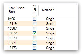
To uses checkboxes with a FluentListView, you must set the FluentListView.CheckBoxes property to true. If you want the user to be able to give check boxes the Indeterminate value, you should set the FluentListView.TriStateCheckBoxes property to true.
Owing to a limitation of the .NET ListView class, you cannot use CheckBoxes in Tile view. It just can’t be done.
The FluentListView.CheckObjects property allows you to get or set the collection of model objects that are currently checked. You can also use FluentListView.CheckAll() and FluentListView.UncheckAll() to (no surprise) check or uncheck all items.
To decide if a particular model is checked, use IsChecked() or IsCheckedIndeterminate().
To changed the “checked-ness” of a model, you should use:
- CheckIndeterminateObject()
- CheckObject(object model)
- ToggleCheckObject()
- UncheckObject()
For sub-item checkboxes, there are the same collection of methods, but they take a OLVColumn parameter to indicate which subitem should be fetched or set.
- CheckSubItem(object model, OLVColumn column)
- CheckIndeterminateSubItem(object model, OLVColumn column)
- IsSubItemChecked(object model, OLVColumn column)
- ToggleSubItem(object model, OLVColumn column)
- UncheckSubItem(object model, OLVColumn column)
Without doing anything else, the check boxes act as a more durable form of selection.
If you want the checkboxes to reflect some actual property in your model, you can bind the checkbox to a property in two ways:
- Use CheckedAspectName
If your model object already has a property that directly matches whether or not a row should be checked, a CheckedAspectName is the simplest approach. Simply set the CheckedAspectName to the name of your property, and the FluentListView will handle everything else, both the getting and the setting of this property’s value. The property must be of type bool (or of type bool? if you want to use tri-state).
- Use CheckStateGetter and CheckStatePutter
If CheckedAspectName is too simple for your needs, you can install CheckStateGetter and CheckStatePutter delegates. The first delegate is used to decide if the checkbox on the row that is showing the given model object should be checked or unchecked. The second is called when the user clicked the check box.
There are two flavour of check state getter/putters: there are CheckStateGetter and CheckStatePutter delegates which deal with CheckStates; and there are BooleanCheckStateGetter and BooleanCheckStatePutter delegates which deal only with booleans. If you are only interested in checkboxes being on or off, the boolean versions are what you want. However, if you want to deal with indeterminate values too, you must use the CheckState versions:
this.fluentListView1.BooleanCheckStateGetter = delegate(Object rowObject) {
    return ((Person)rowObject).IsActive;
};

this.fluentListView1.BooleanCheckStatePutter = delegate(Object rowObject, bool newValue) {
    ((Person)rowObject).IsActive = newValue;
    return newValue; // return the value that you want the control to use
};
Note that the CheckStatePutter returns the value that will actually be used. This doesn’t have to be the same as the value that was given. So your delegate can refuse to accept the checking of a particular model if it wants.
FluentListViews supports checkboxes on subitems. To enable this, FluentListView.UseSubItemCheckBoxes must be set to true.
Subitem checkboxes are always data-bound, i.e. they must be linked to a property on your model objects.
If CheckBoxes is True on a column, the aspect for that column will be interpreted as a boolean value and a check box will be displayed to represent that value. If the FluentListView is owner drawn, the check box will be aligned following the column Alignment, but in standard mode, the check box will always be to the far left.
If TriStateCheckBoxes is True, the user will be able to set the check box to have the Indeterminate value.
If you use tri state checkboxes on subitems, your model must be able to handle the third state. This means your data must be either a bool? or a CheckState. If you have a simple boolean field, setting TriStateCheckBoxes is pointless since your data cannot handle the Indeterminate state (null in this case).
Setting either CheckBoxes or TriStateCheckBoxes on column 0 does nothing since the check box on column 0 is the checkbox for the whole row. It is controlled by settings on the FluentListView itself.
Normal .Net ListViews support checkboxes – but not on virtual lists. If you try to use the standard ListView.CheckIndicies or ListView.CheckedItems properties on, say, a FastFluentListView or a TreeListView, .NET will throw an exception.
FluentListView supports checkboxes on both virtual and non-virtual lists, but to do so, you must use the methods listed above – trying to use the native .NET mechanism will only give you grief.
FluentListView will still trigger the normal ItemCheck and ItemChecked events know when a check box has changed value.
You can still read the Checked property of a ListViewItem to know if that item is checked – but remember that ListViewItems are evil and indicate a lapse into the Dark Side.
To modify the Checked property programmatically, it’s best to use the above listed operations to get and set whether or not an object is checked.
However, if you really have to programmatically set the Checked property on a list view item, you must do so through the OLVListItem.Checked property, NOT through the base class property, ListViewItem.Checked. If you programmatically set ListViewItem.Checked, FluentListView will never know that you have set that value, and strange things will happen (specifically, the checkbox on that row will stop responding to clicks).
So, this code – which tries to toggle the checkedness of the selected rows – will cause problems for your FluentListView:
private void fluentListView1_ItemActivate(object sender, EventArgs e) {
    foreach (ListViewItem lvi in fluentListView1.SelectedItems)
        lvi.Checked = !lvi.Checked;
}
This will work – once! After that, it will not work again. Worse, the check boxes will stop responding to user clicks. To work properly, you treat the items as OLVListItem:
private void fluentListView1_ItemActivate(object sender, EventArgs e) {
    foreach (OLVListItem olvi in fluentListView1.SelectedItems)
        olvi.Checked = !olvi.Checked;
}
This will work as expected. But much better would be to simply use ToggleCheckObject().
The standard .NET ListView cannot have CheckBoxes on virtual lists. However, VirtualFluentListView (and thus FastFluentListView and TreeListView) can support checkboxes. All flavours of FluentListView support checkboxes equally.
The only caveat for using check boxes on virtual lists is that, when a CheckStateGetter (or BooleanCheckStateGetter) is installed, the control has to iterate the entire list when the CheckedObjects property is read. Without a CheckStateGetter, the control assumes that nothing is checked until the user (or the programmer) explicitly checks it. So it knows which objects have been checked and can simply return them as the value of the CheckedObjects property.
But when a CheckStateGetter is installed, the only way the control can know whether an object is checked is by calling the CheckStateGetter delegate for every object in the list. So to return the value of CheckedObjects property, the control must iterate the whole list, asking in turn if this object is checked. This is fine if the list has only 100 or even 1000 objects, but if the list has 10,000,000 objects, your program is going to hang.
Virtual lists persist the “checkedness” of individual objects across calls to SetObjects() (and other list modifying operations). To make the list forget the “checkedness” of all objects, call ClearObjects().
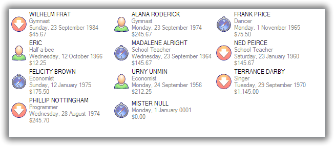
The information that is shown when in Tile view is customisable. The primary column has to appear, but the other “rows” are configurable. In the example below, the Person’s name appears, since that is the primary column, but the “Occupation”, “Birthdate”, and “Hourly Rate” pieces of information are shown as well.
To do this, set IsTileViewColumn to true for those columns that you want to appear in the Tile view. Confusingly, a column in Detail view becomes a “row” in a Tile view.
If you really want to change the information in the Tile view, you can custom draw it! To do this, install an ItemRenderer on the list and set OwnerDraw to true. See BusinessCardRenderer in the demo project for an example implementation. To see that renderer in action, run the demo, switch to the “Complex” tab, click the “Owner Drawn” checkbox, and switch to Tile view.
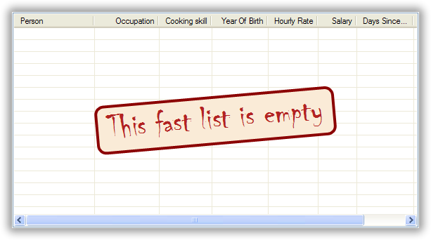
When a FluentListView is empty, it can display a “this list is empty” type message.
The EmptyListMsg is the property that holds the string that appears when a FluentListView is empty. This string is rendered using the EmptyListMsgFont:
this.fluentListView1.EmptyListMsg = "This database has no rows";
this.fluentListView1.EmptyListMsgFont = new Font("Tahoma", 24);
The empty message list is actually implemented as an overlay. You can access that overlay though the EmptyListMsgOverlay property. By default, this is a TextOverlay that you can customise to your hearts content:
TextOverlay textOverlay = this.fluentListView1.EmptyListMsgOverlay as TextOverlay;
textOverlay.TextColor = Color.Firebrick;
textOverlay.BackColor = Color.AntiqueWhite;
textOverlay.BorderColor = Color.DarkRed;
textOverlay.BorderWidth = 4.0f;
textOverlay.Font = new Font("Chiller", 36);
textOverlay.Rotation = \-5;
gives this:
If you really want to, you can set the EmptyListMsgOverlay property to an object that implement the IOverlay interface, and then draw whatever you want to.
On the rows of my FluentListView, I want to show images that come from a database. How do I do that?
Normally, images that are shown on rows come from an ImageList. The ImageGetter delegate simply returns the index of the image that should be drawn against the cell. However, sometimes, the images that should be drawn are not known at compile time. Or they are generated dynamically from some characteristic of the model object being displayed. In such cases, the ImageList cannot be pre- populated with the images to be used. But with a little planning, you can still use your ImageList to manage your images, even when the Images are dynamically retrieved.
First, give your FluentListView an empty SmallImageList and an empty LargeImageList.
Secondly, install an ImageGetter delegate on your primary column that does something like this:
this.mainColumn.ImageGetter = delegate(object row) {
    String key = this.GetImageKey(row);
    if (!this.listView.LargeImageList.Images.ContainsKey(key)) {
        Image smallImage = this.GetSmallImageFromStorage(key);
        Image largeImage = this.GetLargeImageFromStorage(key);
        this.listView.SmallImageList.Images.Add(key, smallImage);
        this.listView.LargeImageList.Images.Add(key, largeImage);
    }
    return key;
};
This dynamically fetches the images if they haven’t been already fetched. You will need to write the GetImageKey(), GetSmallImageFromStorage() and GetLargeImageFromStorage() methods. Their names will probably be different, depending on exactly how you are deciding which image is shown against which model object.
For example, if we were writing a File Explorer look-a-like, we might have something that looks like this:
this.mainColumn.ImageGetter = delegate(object row) {
    File theFile = (File)row;
    String extension = this.GetFileExtension(theFile);
    if (!this.listView.LargeImageList.Images.ContainsKey(extension)) {
        Image smallImage = this.GetSmallIconForFileType(extension);
        Image largeImage = this.GetLargeIconForFileType(extension);
        this.listView.SmallImageList.Images.Add(extension, smallImage);
        this.listView.LargeImageList.Images.Add(extension, largeImage);
    }
    return key;
};
If you only use Details view, you don’t need to maintain the LargeImageList, but if you use any other view, you must keep the SmallImageList and the LargeImageList in sync.
Yes. You can use a TypedFluentListView wrapper.
One annoyance with FluentListView is all the casting that is needed. Because the FluentListView makes no assumptions about what sort of model objects you will be using, it handles all models as objects and it's up to you to cast them to the right type when you need to. This leads to many delegates starting with a cast like this:
this.fluentListView1.SomeDelegate = delegate(object x) {
    MyModelObject model = (MyModelObject)x;
    ...
}
which becomes tiresome after a while. It would be nice if you could tell the FluentListView that it would always be displaying, say, Person objects. Something like:
this.fluentListView1 = new FluentListView<Person\>();
this.fluentListView1.SomeDelegate = delegate(Person model) {
    ...
}
Unfortunately, this is not possible, so we have a TypedFluentListView class instead. This is not another FluentListView subclass, but rather it’s a typed wrapper around an existing FluentListView. To use one, you create a FluentListView within the IDE as normal. When it is time to implement your delegates, you create a TypedFluentListView wrapper around your list view, and declare your delegates against that wrapper. It’s easier to use than it is to explain, so look at this example:
TypedFluentListView<Person\> tlist = new TypedFluentListView<Person\>(this.listViewSimple);
tlist.BooleanCheckStateGetter = delegate(Person x) {
    return x.IsActive;
};
tlist.BooleanCheckStatePutter = delegate(Person x, bool newValue) {
    x.IsActive = newValue;
    return newValue;
};
Look ma! No casts! The delegates are declared against the typed wrapper, which does know what model objects are being used.
You can also use the TypedFluentListView for typed access to the delegates on your columns:
tlist.GetColumn(0).AspectGetter = delegate(Person x) { return x.Name; };
tlist.GetColumn(1).AspectGetter = delegate(Person x) { return x.Occupation; };
If you don’t like referring to columns by their index, you can create TypedColumn objects around a given ColumnHeader object:
TypedColumn<Person\> tcol = new TypedColumn<Person\>(this.columnHeader16);
tcol.AspectGetter = delegate(Person x) { return x.GetRate(); };
tcol.AspectPutter = delegate(Person x, object newValue) { x.SetRate((double)newValue); };
A side benefit of a TypedFluentListView is that it can automatically generate an AspectGetter for a column from its AspectName. So, rather than hand-coding AspectGetters like we have done above, you simply configure the AspectName in the IDE, and then call tlist.GenerateAspectGetters(). This can (should?) handle aspects of arbitrary complexity, like “Parent.HomeAddress.Phone.AreaCode”.
This allows the convenience of reflection, but the speed of hand-written AspectGetters.
A TreeListView shows a tree structure with its nice ability to expand and collapse, but also shows information in columns.
A functioning TreeListView needs three things:
- A list of top level objects (called Roots).
- A way to know if a given model can be expanded.
- A way to know which models should appear as the children of another model.
Like all the other FluentListViews, TreeListView relies on delegates. The two essential delegates for using a TreeListView are:
- CanExpandGetter is used to decide if a given model can be expanded
- ChildrenGetter is used to gather the children that will appear under a given model after it is expanded. This delegate is only called if CanExpandGetter has returned true for that model object.
In the demo, there is an Explorer like example, which navigates the disks on the local computer. The tree list view in that demo is configured so that only directories can be expanded. It looks like this:
this.treeListView.CanExpandGetter = delegate(object x) {
    return (x is DirectoryInfo);
};
The ChildrenGetter delegate gets the contents of a directory when that directory is expanded:
this.treeListView.ChildrenGetter = delegate(object x) {
    DirectoryInfo dir = (DirectoryInfo)x;
    return new ArrayList(dir.GetFileSystemInfos());
};
Remember, ChildrenGetter delegates are only ever called if CanExpandGetter returns true, so this delegate knows that the parameter x must be a DirectoryInfo instance.
Once you have these two delegates installed, you populate the control by setting its Roots property. Roots are the top level branches of the tree. You can use the Roots property to set these top branches, or you can call SetObjects(), which does the same thing. To add or remove these top level branches, you can call AddObjects() and RemoveObjects(), since in a tree view, these operate on the top level branches.
The TreeListView caches the list of children under each branch. This is helpful when the list of children is expensive to calculate. To force the TreeListView to refetch the list of children, call RefreshObject() on the parent.
To see an example of how to use drag and drop on a TreeListView, read this blog.
CanExpandGetter is called often! It must be fast. Don’t do a database lookup, calculate pi, or do linear searches – just return a property value.
When CanExpandGetter and ChildrenGetter are called, the TreeListView is in an unstable state. Do not do anything that will callback into the control.
Both CanExpandGetter and ChildrenGetter must return immediately. If you can’t return immediately, return a dummy value, do whatever calculation you need, and then called RefreshObject() so that the dummy value is replaced [RefreshObject() is thread-safe] Something like this:
this.treeListView.ChildrenGetter = delegate(object x) {
    var model = (MyModelClass)x;
    if (model.HasChildrenAlready)
        return model.Children;
    if (!model.AlreadyStartedSlowFetch) {
        model.AlreadyStartedSlowFetch = true;
        Task.Factory.StartNew(() => {
            model.SlowChildrenFetch();
            this.treeListView.RefreshObject(model);
        });
    }
    return new ArrayList();
};
Do not try to use a TreeListView like a standard TreeView. They are not the same.
A TreeListView does not have TreeNodes that you have to create and then pass to the view. That’s just one more level of unnecessary boiler-plate code – exactly the things that FluentListView was written to avoid.
Instead of creating nodes, think in terms of your data model:
- Can this “thing” be unrolled?
- When it is unrolled, what list of “things” should be shown?
With that mental mode, TreeListView will be much easier to understand and use.
When the user types, I want to be able to match values in a column other than the first one. How can I do that?
I have a list that shows medical incidents. One of the columns is the doctor responsible for that incident. I’d like the users to be able to sort by the “Doctor” column and then type the first few characters of the doctors name and find the cases assigned to that doctor. Is there a way to do that?
Surprisingly, yes! If you set IsSearchOnSortColumn to true (the default), then characters typed into the list will be matched against the values of the sort column, rather than against the values of column 0. iTunes shows this behaviour when you sort by the “Artist” or “Album” columns.
Remember: this searching works on the string representation of the value, rather than on the values themselves.
The ListView default behaviour is to only use tool tips to show truncated cell values (even then only when FullRowSelect is true). But with a FluentListView, you are not so limited.
To show a different tooltip when the mouse is over a cell, you should listen for the CellToolTipShowing event. The parameter block for this event tells where the mouse was, what cell it was over, the model for that row, and the value that is shown in the cell.
Within that event handler, you can set various properties on the parameter block to change the tool tip that will be displayed:
- Text is the string that will be displayed in the tooltip. If this is null or empty, the tool tip will not be shown. Inserting “\r\n” sequences into the string gives a multi-line tool tip.
- Font, ForeColor and BackColor control the font of the text, the text colour and background colour of the tooltip. (NOTE: The colour settings do not work under Vista)
- IsBalloon allows the tooltip to be shown as a balloon style. (NOTE: changing this during an event does not work reliably under Vista. Setting it outside of an event works fine).
- Title and StandardIcon allow a title and icon to be shown above the tool tip text.
With a very little bit of work, you can display tool tips like this:
Example:
this.olv.CellToolTipShowing += new EventHandler<ToolTipShowingEventArgs\>(olv_CellToolTipShowing);
...
void olv_CellToolTipShowing(object sender, ToolTipShowingEventArgs e) {
    // Show a long tooltip over cells only when the control key is down
    if (Control.ModifierKeys == Keys.Control) {
        Song s = (Song)x;
        e.Text = String.Format("{0}\\r\\n{1}\\r\\n{2}", s.Title, s.Artist, s.Album);
    }
};
If you change the properties in the parameter block, those properties will only affect that one showing of a tooltip. If you want to change all tooltips, you would set the properties of FluentListView.CellToolTipControl. So, if you want all tooltips to be shown in Tahoma 14 point, you would do this:
this.olv.CellToolTipControl.Font = new Font("Tahoma", 14);
Similarly, to show a tooltip for a column header, you listen for a HeaderToolTipShowing event.
Previous versions used delegates to provide a subset of this functionality. These delegates – CellToolTipGetter and HeaderToolTipGetter delegates – still function, but the events provide much great scope for customisation.
All of this extra functionality comes with a small cost. This functionality is beyond what a standard .NET ToolTip can provide. Because of this, you cannot assign a standard ToolTip to a FluentListView in the IDE. Well, actually you can (at least until I can figure out how to prevent it) but you shouldn’t. If you do, you will get an assertion error the first time a tooltip tries to show.
This is called “hot tracking”. The normal ListView can underline the text of the row under the mouse. FluentListView can do much more.
Hot tracking is controlled by an instance of HotItemStyle. You create and configure these in the IDE as non-visual components. Once you have created an instance, you can assign it to the HotItemStyle property of the FluentListView. The same style instance can be shared between various FluentListViews, making it easier for your application to behave consistently.
A HotItemStyle can set the text color, background color, font, and/or font style of the row under the cursor. If FullRowSelect is true, these properties will be applied to all cells of the hot row. If FullRowSelect is false, background color will be applied to all cells, but the other properties will only be applied to cell 0.
HotItemStyle also have Decoration and Overlay properties. These allow you easily add a decoration to the hot row, as well as display an overlay while there is a hot item.
For example, this puts a translucent border around the row that the cursor is over:
// Make the decoration
RowBorderDecoration rbd = new RowBorderDecoration();
rbd.BorderPen = new Pen(Color.FromArgb(128, Color.LightSeaGreen), 2);
rbd.BoundsPadding = new Size(1, 1);
rbd.CornerRounding = 4.0f;

// Put the decoration onto the hot item
this.olv1.HotItemStyle = new HotItemStyle();
this.olv1.HotItemStyle.Decoration = rbd;
There is a static property FluentListView.DefaultHotItemStyle. This style is used by default when no specific HotItemStyle is set. This is shared across all FluentListView.
This is called an “overlay.” A normal FluentListView comes pre-equipped with two overlays ready to use: OverlayImage and OverlayText. These can be configured from within the IDE, controlling what image (or text) is displayed, the corner in which the overlay is shown, and its inset from the control edge.
TextOverlays can be further customised, by controlling the color and font of the text, the color of the background, the width and color of the border, and whether the border should have rounded corners. All these properties are controllable from inside the IDE.
If you want to do something other than show a simple image or text, you can implement the IOverlay interface. This interface is very simple:
public interface IOverlay {
    void Draw(FluentListView olv, Graphics g, Rectangle r);
}
Within the Draw() method, your implementation can draw whatever it likes.
Once you have implemented this interface, you add it to a FluentListView via the AddOverlay() method:
MyFantasticOverlay myOverlay = new MyFantasticOverlay();
myOverlay.ConfigureToDoAmazingThings();
this.fluentListView1.AddOverlay(myOverlay);
Overlays are actually quite tricky to implement. If you use your FluentListView in a “normal” way (design your interface through the IDE using normal WinForm controls), they will work flawlessly.
However, if you do “clever” things with your FluentListViews, you may need to read this: Overlays and Decorations. “Clever” in this case means re-parenting the FluentListView after it has been created, or hiding it by rearranging the windows z-ordering. You may also need to read that if the FluentListView is hosted by a non-standard TabControl-like container.
Overlays are purely cosmetic. They do not respond to any user interactions.
Overlays look simple but are quite complex underneath. If they seem to be misbehaving (e.g. if you are seeing GlassPanelForms in placing where you don’t want them), you can completely disable overlays by setting UseOverlays to false.
Decorations are similar to overlays in that they are drawn over the top of the FluentListView, but decoration are different in that they are attached to a row or cell and scroll with it. Here the love heart and the “Missing!” are decorations.
Decorations are normally assigned to a row or cell during a FormatRow or FormatCell event. In the demo, a love heart appears next to someone named “Nicola”:
private void listViewComplex_FormatCell(object sender, FormatCellEventArgs e) {
    Person p = (Person)e.Model;

    // Put a love heart next to Nicola's name :)
    if (e.ColumnIndex == 0) {
        if (p.Name.ToLowerInvariant().StartsWith("nicola")) {
            e.SubItem.Decoration = new ImageDecoration(Resource1.loveheart, 64);
        } else
            e.SubItem.Decoration = null;
    }
}
The “Missing!” decoration is actually a combination of two decorations and is done like this:
if (e.ColumnIndex == 1 && e.SubItem.Text == "") {
    // Add a opaque, rotated text decoration
    TextDecoration decoration = new TextDecoration("Missing!", 255);
    decoration.Alignment = ContentAlignment.MiddleCenter;
    decoration.Font = new Font(this.Font.Name, this.Font.SizeInPoints+2);
    decoration.TextColor = Color.Firebrick;
    decoration.Rotation = \-20;
    e.SubItem.Decoration = decoration; //NB. Sets Decoration

    // Put a border around the cell.
    CellBorderDecoration cbd = new CellBorderDecoration();
    cbd.BorderPen = new Pen(Color.FromArgb(128, Color.Firebrick));
    cbd.FillBrush = null;
    cbd.CornerRounding = 4.0f;
    e.SubItem.Decorations.Add(cbd); // N.B. Adds to Decorations
}
Note that when we put a border around the cell, the code added it to Decorations property. Doing this adds a second decoration to the same cell. If the code set the Decoration property, it would replace the text decoration that had just been given.
Decorations can also be attached to the hot item. Set the Decoration property of the HotItemStyle to something that will be drawn over the hot row/cell. See 18. How can I emphasise the row under the mouse?.
Decorations can also be attached to the selected rows. Set SelectedRowDecoration property of the FluentListView to a decoration, and that decoration will be draw over each selected row. This draws a translucent green border around each selected row:
RowBorderDecoration rbd = new RowBorderDecoration();
rbd.BorderPen = new Pen(Color.FromArgb(128, Color.Green), 2);
rbd.BoundsPadding = new Size(0, \-1);
rbd.CornerRounding = 12.0f;
this.olv1.SelectedRowDecoration = rbd;
Like overlays, decorations are purely cosmetic. They do not respond to any user interactions.
FluentListView has sophisticated support for dragging and dropping. This support makes it easy to support interapplication drag and drop, dragging within your application, and making lists that can be rearranged by dragging.
The simpliest way to use drag and drop in a FluentListView is through the IsSimpleDragSource and IsSimpleDropSink properties (which can be set through the IDE).
Setting these gives a FluentListView that will allow objects to be dragged and dropped on items, like this:
If you set IsSimpleDragSource to true, the FluentListView will be able to initiate drags. It will drag the currently selected items, as well as creating text and HTML versions of those rows that can be dropped onto other programs.
If you set IsSimpleDropSink to true, the FluentListView will be able to receive drops. The normal drop sink does a lot of work for you: figuring out which item is under the mouse, handling auto scrolling, drawing user feedback. However, there are two things that it can’t figure out for itself:
- Are the dragged objects allowed to be dropped at the current point?
- What should happen when the drop occurs?
So, the normal drop sink triggers two events: CanDrop and Dropped. To actually be useful, you need to handle these events. You can set up handlers for these events within the IDE, like normal.
You can alternatively listen for the ModelCanDrop and ModelDropped events. This second pair of events are triggered when the source of the drag is another FluentListView. These events work the same as the CanDrop and Dropped events except that the argument block includes useful information:
- The FluentListView initiated the drag
- The model objects are being dragged
- The model object is current target of the drop
In the CanDrop (or ModelCanDrop) event, the handler has to decide if the currently dragged items can be dropped at the current location. To indicate what operation is allowed, the handler must set the Effect property:
private void listViewSimple_ModelCanDrop(object sender, ModelDropEventArgs e) {
    Person person = e.TargetModel as Person;
    if (person == null) {
        e.Effect = DragDropEffects.None;
    } else {
        if (person.MaritalStatus == MaritalStatus.Married) {
            e.Effect = DragDropEffects.None;
            e.InfoMessage = "Can't drop on someone who is already married";
        } else {
            e.Effect = DragDropEffects.Move;
        }
    }
}
Inside the CanDrop handler, you can set the InfoMessage property to a string. If you do this, the string will be shown to the user while they are dragging. This can be used to tell the user why something cannot be dropped at that particular point, or to explain what will happen if the drop occured there:
This message is displayed by a specialised TextOverlay, which is exposed through the Billboard property of the SimpleDropSink class. You can make changes to the messages appearance through this property.
If the allowed effect was anything other than None, then when the items are dropped, a Dropped (or a ModelDropped) event will be triggered. This is where the actual work of processing the dropped item should occur. A silly example from the demo looks like this:
private void listViewSimple_ModelDropped(object sender, ModelDropEventArgs e) {
    // If they didn't drop on anything, then don't do anything
    if (e.TargetModel == null)
        return;

    // Change the dropped people plus the target person to be married
    ((Person)e.TargetModel).MaritalStatus = MaritalStatus.Married;
    foreach (Person p in e.SourceModels)
        p.MaritalStatus = MaritalStatus.Married;

    // Force them to refresh
    e.RefreshObjects();
}
The ModelDropped event has a convenience method, RefreshObjects(), which refreshes all the objects involved in the operation. This is particularly useful with operations on TreeListViews.
If you want to do more than this, you have to start playing with the objects that actually implement the drag and drop: SimpleDataSource and SimpleDropSink (though calling the latter “simple” is a bit of a misnomer).
The major task of the SimpleDataSource is to setup a DataObject which can be used for dragging and dropping. If you want your FluentListView to support other data formats, you will need subclass SimpleDataSource and add the data formats you want.
SimpleDropSink is a lot more interesting and a lot more configurable.
It can be made to accept drops between items:
myDropSink.CanDropBetween = true;
Or drops on the background:
myDropSink.CanDropbackground = true;
Or drops on individual sub-items:
myDropSink.CanDropOnSubItems = true;
It can also change the color used for the drag drop feedback:
myDropSink.FeedbackColor = Color.IndianRed;
Doing a lot more - Drag and Drop the hard way
It’s not really that hard – just more work than the easy way.
If you want to have complete control of the dragging process, you can implement the IDragSource interface, and then give that implementation to the FluentListView by setting the DragSource property.
Similarly, if you want to have complete control of the dropping process, you can implement the IDropSink interface, and then give that implementation to the FluentListView by setting the DropSink property.
For maximum flexibility, the IDropSink basically just unifies the full suite of Windows drag-drop messages:
public interface IDropSink
{
    FluentListView ListView { get; set; }

    void DrawFeedback(Graphics g, Rectangle bounds);
    void Drop(DragEventArgs args);
    void Enter(DragEventArgs args);
    void GiveFeedback(GiveFeedbackEventArgs args);
    void Leave();
    void Over(DragEventArgs args);
    void QueryContinue(QueryContinueDragEventArgs args);
}
The only new method in this list is the DrawFeedback() method. This is where the DropSink can draw feedback onto the FluentListView to indicate the state of the drop. This drawing is done over the top of the FluentListView and this will normally involve some form of alpha blending.
In almost all cases, you can subclass AbstractDropSink which provides minimal implementations of all these methods.
One common use for drag and drop is to provide a rearrangeable FluentListView. This is so common that there is a prebuild component to do this for you. This is done by installing a RearrangingDropSink:
this.fluentListView1.DragSource = new SimpleDragSource();
this.fluentListView1.DropSink = new RearrangingDropSink(false);
This turns fluentListView1 into a rearrangeble list, where the user can rearrange the rows by dragging them. The false parameter says that this sink will not accept drags from other FluentListViews.
The class is clever but it is not magical. It works even when the FluentListView is sorted or grouped, but it is up to the programmer to decide what rearranging such lists “means”.
Example: if the control is grouping students by academic grade, and the user drags a “Fail” grade student into the “A+” group, it is the responsibility of the programmer to makes the appropriate changes to the model and redraw/rebuild the control so that the users action makes sense.
Similarly, it is up to the programmer to decide what should happen if the user rearranges rows when the list is sorted.
It also cannot work on DataListView, VirtualFluentListView and TreeListViews since the data in those control is outside the control of the FluentListView. For those controls, you will have to use (or subclass) a SimpleDropSink and do the actual rearranging and refreshing yourself.
If you set TintSortColumn property to true, the sort column will be automatically tinted. The color of the tinting is controlled by the SelectedColumnTint property.
You can tint a different column (other than the sort column) by setting the SelectedColumn property, or by installing TintedColumnDecoration for the column that you want to color:
this.fluentListView1.AddDecoration(new TintedColumnDecoration(columnToTint));
This latter option lets you tint more than one column.
I want to show a meetings room’s availability as an icon, without any text. What’s the best way to do that?
To show only an image in a column, do this:
this.meetingColumn.AspectGetter = delegate(object x) {
    return ((MeetingRoom)x).Availability;
};
this.meetingColumn.AspectToStringConverter = delegate(object x) {
    return String.Empty;
};
this.meetingColumn.ImageGetter = delegate(object x) {
    switch (((MeetingRoom)x).Availability) {
        case RoomAvailability.Free: return "free";
        case RoomAvailability.InUse: return "inuse";
        case RoomAvailability.Booked: return "booked";
    }
    return "unexpected";
};
By returning an aspect, sorting and grouping will still work. By forcing AspectToStringConverter to return an empty string, no string will be drawn, only the image.
This works in both owner drawn or non-owner drawn lists.
If you want to show the same menu, regardless of where the user clicks, you can simply assign that menu to the ContextMenuStrip property of the FluentListView (this is standard .NET, nothing specific to a FluentListView).
If you want to show a context menu specific to the object clicked, you can listen for CellRightClick events:
private void olv_CellRightClick(object sender, CellRightClickEventArgs e) {
    e.MenuStrip = this.DecideRightClickMenu(e.Model, e.Column);
}
If MenuStrip is not null, it will be shown where the mouse was clicked.
It’s entirely reasonable for e.Model to be null. That means the user clicked on the list background.
Set FluentListView.HeaderUsesThemes to false and then create a HeaderFormatStyle object (either in code or within the IDE), give it the characteristics you want, and then assign that style to either FluentListView.HeaderFormatStyle (to format all column headers) or OLVColumn.HeaderFormatStyle (to format just one column header).
Each HeaderFormatStyle has a setting for each state of the header:
- Normal controls how the header appears when nothing else is happening to it.
- Hot controls how the header appears when the mouse is over the header. This should be a slight, but still noticeable, shift from the normal state.
- Pressed controls how the header appears when the user has pressed the mouse button on the header, but not yet released the button. This should be a clear visual change from both the normal and hot states.
For each state, the header format allows the font, font color, background color and frame to be specified. If you combine these attributes badly, you can produce some truly dreadful designs, but when well used, the effect can be pleasant.
“I’ve set up the HeaderFormat like you say, but the stupid thing does nothing”
Make sure HeaderUsesThemes is false. If this is true, FluentListView will use the OS’s theme to draw the header, ignoring the HeaderFormatStyle completely.
There is also FluentListView.HeaderWordWrap which when true says to word wrap the text within the header.
To put a hyperlink into a cell, you have to:
- Set UseHyperlinks to true on the FluentListView.
- Set Hyperlink to true on the column that you want.
After these two steps, every non-empty cell in the column will be treated as a hyperlink.
If you only want some of the cells to be hyperlinks, you can listen for the IsHyperlink event. This event is triggered once for every hyperlink cell, and allows the programmer to control the URL that is associated with the link (by default, the text of the cell is regarded as the URL). If the Url property is set to null or empty, then that cell will not be treated as a hyperlink.
If you are already listening for the FormatCell you could also set the URL property of the OLVListSubItem in that event.
Just to be complete, when a hyperlink is clicked, FluentListView triggers a HyperlinkClickd event (no prizes for guessing that). If you listen for and handle this event, set Handled to true so that the default processing is not done. By default, FluentListView will try to open the URL, using System.Diagnostics.Process.Start()
Finally, the appearance of all hyperlinks is controlled by the HyperlinkStyle property. In most cases, the default settings will work fine.
On XP, you can’t. Groups on XP get a header and that is all.
But on Vista and later, to display an image against a group header, you need to set GroupImageList on the FluentListView. This is the image list from which the group header images will be taken. Then on the group itself, you need to set TitleImage to either the index or name of the image to show.
There isn’t a GetGroupTitleImage delegate. Instead, there are two more general manners to handle this:
- You can listen for the AboutToCreateGroups event, which passes in all the groups that are to be created. Within the event handler, you can make changes to the groups, their order and even their presence! You can also add new groups if you so wish.
- The OLVColumn.GroupFormatter delegate is called once for each new group before it is added to the control. Within it, you can change the group formatting, including the title, subtitle, footer and task. These changes overwrite any changes made within the AboutToCreateGroups event.
These mechanisms are more useful than a GetGroupTitleImage delegate, since they allow any or all of the group information to be altered, not just the TitleImage.
That “little clicky thing” is called the group task. You set it through the GroupTask property during the AboutToCreateGroups event or GroupFormatter delegate (see 27. How do I put an image next to a group heading?).
In this snapshot, the “Check bank balance” is the group task.
When the user clicks on the text, FluentListView triggers a GroupTaskClick event. This event contains the group whose task was clicked.
[Once again, this is not possible on XP]
I’m writing software to a merchant bank and time to market is crucial. Is there a way I create a working FluentListView just using my model class?
Funnily enough, yes, you can – I’m glad you asked.
The basic idea is that you give your model class to Generator class and it create columns for the public properties of your model. If you want to have more control over the generated columns, you can decorate your model’s properties with a OLVColumn attribute.
The Generator class looks at the public properties of a class and generates columns for them. So, this line would generate columns in the this.olv1 FluentListView for all the public properties of MyModelClass:
Generator.GenerateColumns(this.olv1, typeof(MyModelClass), true);
There are a couple of flavours of GenerateColumns(). This next one looks at the first member of myListOfObjects, and based on its type, generates the columns of this.olv1:
Generator.GenerateColumns(this.olv1, this.myListOfObjects);
So, if there was a foreign exchange management application, one of its model classes might look like this:
public class ForexTransaction {
    public DateTime When { get; set; }
    public decimal Rate { get; set; }
    public Currency FromCurrency { get; set; }
    public Currency ToCurrency { get; set; }
    public decimal FromValue { get; set; }
    public decimal ToValue { get; set; }
    public string UserId { get; set; }
}
So to generate columns for this class, you would do this:
Generator.GenerateColumns(this.olv1, typeof(ForexTransaction), true);
This would generate reasonable, but boring, columns:
If you want to make the columns more interesting, you can give them an OLVColumn attributes. Most properties of OLVColumn instances can be set through the OLVColumn attributes:
public class ForexTransaction {

 [OLVColumn(Width = 150)]
    public DateTime When { get; set; }

 [OLVColumn(DisplayIndex = 5, Width = 75, TextAlign = HorizontalAlignment.Right)]
    public decimal Rate { get; set; }

 [OLVColumn("From", DisplayIndex=1, Width = 50, TextAlign = HorizontalAlignment.Center)]
    public string FromCurrency { get; set; }

 [OLVColumn("To", DisplayIndex = 3, Width = 50, TextAlign = HorizontalAlignment.Center)]
    public string ToCurrency { get; set; }

 [OLVColumn("Amount", DisplayIndex = 2, AspectToStringFormat = "{0:C}", Width = 75, TextAlign = HorizontalAlignment.Right)]
    public decimal FromValue { get; set; }

 [OLVColumn("Amount", DisplayIndex = 4, AspectToStringFormat = "{0:C}", Width = 75, TextAlign = HorizontalAlignment.Right)]
    public decimal ToValue { get; set; }

 [OLVColumn(IsVisible = false)]
    public string UserId { get; set; }
}
DisplayIndex governs the ordering of the columns.
This gives a slightly more interesting control:
[Thanks to John Kohler for this idea and the original implementation]
There are two ways you can do this:
-
You can set UseTransluscentSelection and UseTranslucentHotItem to true. This will give a selection and hot item mechanism that is similar to that used by Vista. It is not the same, I know. Do not complain.
This works best when the control is owner drawn. When the list is not owner drawn, the native control uses its default selection scheme in addition to those use by these settings. It’s still acceptable, but doesn’t look quite so good.
-
You can set UseExplorerTheme to true. If you absolutely have to look like Vista, this is your property. But it has quite a few limitations (and may mess up other things I haven’t yet discovered):
- It only works on Vista and later.
- It does nothing when OwnerDraw is true. Owner drawn lists are (naturally) controlled by their renderers.
- It does not work well with AlternateRowBackColors.
- It does not play well with HotItemStyles.
- It looks a bit silly when FullRowSelect is false.
If it is on XP or earlier, no. If the program is running on Vista or later, yes – but you may have to do some work.
A FastFluentListView supports groups as it stands. Simple set ShowGroups to true, and it will handle groups just like a normal FluentListView. End of story, case closed.
If you have your own VirtualFluentListView, you have to do a little bit more work to enable groups on your control. You need set the GroupStrategy property to an object which implement the IVirtualGroups interface.
The IVirtualGroups interface looks like this:
public interface IVirtualGroups
{
    // Return the list of groups that should be shown according to the given parameters
    IList<OLVGroup\> GetGroups(GroupingParameters parameters);

    // Return the index of the item that appears at the given position within the given group.
    int GetGroupMember(OLVGroup group, int indexWithinGroup);

    // Return the index of the group to which the given item belongs
    int GetGroup(int itemIndex);

    // Return the index at which the given item is shown in the given group
    int GetIndexWithinGroup(OLVGroup group, int itemIndex);

    // A hint that the given range of items are going to be required
    void CacheHint(int fromGroupIndex, int fromIndex, int toGroupIndex, int toIndex);
}
All members must be fully implemented except CacheHint() which is only a hint.
GetGroups() is the key function. It must return a list of OLVGroup in the order in which they should be created in the listview. Each OLVGroup must have at least Header and VirtualItemCount properties initialized.
Like a virtual list, virtual groups do not keep a list of the items they contain. Instead, each group knows how many items it contains (VirtualItemCount property) and can tell which item is at a given index within it. The GetGroupMember() has that responsibility: for a given group, this method must figure out what item is at the n’th position of that group. It then returns the index of that item in the overall list.
GetGroup() does a semi-inverse operation: given the index of an item in the overall list, return the index of the group to which that item belongs.
GetIndexWithinGroup() does the other half of the inverse operation: once we know what group an item belongs to, this member return its index within that group.
Be aware: GetGroup() and GetGroupMember() are called often. They have to be fast. They cannot do database lookup or queries against DNS. They can do a couple of indexed lookups and that is all!
Even then, the grouping on virtual lists will still hit limits. It works perfectly with 10,000 rows, works acceptably with 50,000, but on my laptop, showing groups on virtual lists with more than 100,000 rows was not usable. It seems that in some situations (for example, while scrolling) the control runs through all the rows (or a good chunk of them), asking which group each row belongs to. It does this quickly, but running through a 100,000 rows still takes some time.
One other problem is caused by the normal behaviour of a grouped listview: when the user clicks a group header, the listview control selects all the members of that group. This is fine if the group has 100 or even 200 rows, but if the group has 20,000 items in it, it will select each one, triggering 20,000 SelectedIndexChanged events – which is a pain!
Implementing this feature required the use of undocumented features. That means there is no guarantee that it will continue working in later versions of Windows (or even on current versions). You have been warned.
This needs a whole page to itself.
In brief, you must set UseFiltering to true, and then set either the ModelFilter property or the ListFilter property to an appropriate filter.
FluentListView provides a number of pre-built filter, including a text based filter (see 33. Is there an easy way to only show rows that contain some text?). The base ModelFilter class can be given a delegate and used directly:
this.olv1.ModelFilter = new ModelFilter(delegate(object x) {
    return ((PhoneCall)x).IsEmergency;
});
If you want your filter to co-operate with any Excel-like filtering, set the AdditionalFilter property, instead of the ModelFilter.
I want to do a text filter like iTunes’ search box, where only songs that contain the typed string are shown. Is there an easy way to do that?
Funnily enough, there is! It’s called TextMatchFilter. You use it thus:
this.olv1.ModelFilter = TextMatchFilter.Contains(this.olv1, "search");
After executing this line, the olv1 will only show rows where the text “search” occurs in at least one cell of that row.
This searching uses each cell’s string representation. This can lead to some odd, but still accurate results, when owner drawn is true. For example, subitem check boxes are drawn as boxes, but their string representation is “true” and “false.” If you’re text filter is “rue” it will match all rows where a subitem check box is checked. To prevent this, you can make a column invisible to text filters by setting Searchable to false.
Alternatively, the filter can be configured to only consider some of the columns in the FluentListView by setting the Columns property. This is useful for avoiding searching on columns that you know will return nonsensical results (like checkboxes above).
It can also be set up to do regular expression searching:
this.olv1.ModelFilter = TextMatchFilter.Regex(this.olv1, "^[0-9]+");
Or prefix matching (all these factory methods can accept more than one string):
this.olv1.ModelFilter = TextMatchFilter.Prefix(this.olv1, "larry", "moe", "curly");
If your filtered FluentListView is owner drawn, you can pair this text searching with a special renderer, HighlightTextRenderer. This renderer draws a highlight box around any substring that matches the given filter. So:
TextMatchFilter filter = TextMatchFilter.Contains(this.olv1, "er");
this.olv1.ModelFilter = filter;
this.olv1.DefaultRenderer = new HighlightTextRenderer(filter);
would give something that looks like this:
You can change the highlighting by playing with the CornerRoundness, FramePen and FillBrush properties on the HighlightTextRenderer.
If you just want to highlight the text without actually filtering the rows, set the DefaultRenderer but don’t set the ModelFilter property.
Remember: the list has to be owner drawn for the renderer to have any effect.
To Do
In my app, I want to remember the ordering and size of the columns in the list so they can be restored when the user reruns the app. Is there a way to do that?
Use the SaveState() and RestoreState() methods.
SaveState() returns a byte array which contains the state of the FluentListView. Store this where you want (file, XML, registry), and when you next run your app, reload this byte array and give it to RestoreState().
These methods store the following characteristics:
- current view (i.e. Details, Tile, Large Icon...)
- sort column and direction
- column order
- column widths
- column visibility
It does not include selection or scroll position.
[The second most requested feature ever]
Set OLVColumn.HeaderImageKey to the key of an image from the FluentListView’s SmallImageList. That image will appear to the left of the text in the header.
For the image to appear OLVColumn.HeaderUsesTheme must be false. Otherwise, the header will be drawn strictly in accordance with the OS’s current theme (which certainly will not include an image).
If you only want an image in the header without any text showing, set OLVColumn.ShowTextInHeader to false.
Don’t use ImageKey or ImageIndex. These are Microsoft standard properties, but they don’t work. Both are hidden from the code generation process so any value you set on them in the IDE will not be persisted.
For checkbox column, or image only columns, the header text can take up much more space than the data it is labelling. In such cases, you can make the columns header be drawn vertically, by setting OLVColumn.IsHeaderVertical property to true.
Setting this gives something like this:
The header will expand vertically to draw the entire header text. You can set a maximum height through the FluentListView.HeaderMaximumHeight property.
Vertical headers are text only. Setting HeaderImageKey does nothing.
Vertical text is actually quite hard to read. If you use vertical headers, be kind to your users and give the header a tool tip (through the OLVColumn.HeaderToolTip property) that lets the user easily see what the header is trying to say.
My users sometimes get confused about whether they are editing a cell, and if so, which one. Is there any way to make these things more obvious?
You could install a EditingCellBorderDecoration on your FluentListView. Then, when the user is editing a cell, they will see something like this:
To install this decoration, you do this:
this.olv.AddDecoration(new EditingCellBorderDecoration { UseLightbox = true });
The EditingCellBorderDecoration has the usual swathe of properties controlling exactly how it looks.
OK, OK. This isn’t actually a very useful class, but it does look cool :)
Your way of ordering groups and the rows within the groups is stupid. I want to be able to do it myself.
OK... Listen for the BeforeCreatingGroups event. In the parameter block for that event, set GroupComparer to control how groups are sorted, and ItemComparer to control how items within a group are sorted.
If you don’t want the items within the group to be sorted at all, set PrimarySortOrder to SortOrder.None.
There is no way to NOT sort the groups. They have to be ordered in some fashion.
In my app, I want the user to be able to edit all cells just by repeatedly hitting [Tab]. So, when the user hits [Tab] when editing the last cell, I don’t want it to wrap back to the first cell – I want it to change rows. How can do I that?
There must be a thousand variations on this question, but the two most common are:
- how to make [Tab] change rows when editing the last cell.
- how to make [Enter] change rows, not just commit the change.
To address these two most common case, FluentListView now has CellEditTabChangesRows and CellEditEnterChangesRows properties.
- CellEditTabChangesRows makes FluentListView change the row being edited when the user presses [Tab] while editing the last editable cell on a row.
- CellEditEnterChangesRows makes FluentListView try to edit the cell below the cell being edited when the user press [Enter].
These behaviours are achieved by modifying the CellEditKeyEngine settings. This engine allows you to completely customise the behaviour of keys during a cell edit operation.
For example, to make [Ctrl-Up] start editing the cell above the current cell:
olv1.CellEditKeyEngine.SetKeyBehaviour(Keys.Up|Keys.Control, CellEditCharacterBehaviour.ChangeRowUp, CellEditAtEdgeBehaviour.ChangeRow);
NOTE: The interface to CellEditKeyEngine will almost certainly change in the next version.
I really like the ‘Filter’ menu, but I want to change the values that are shown in the check list. How do I do that?
This is complex enough to needs its own page (Excel-like Filtering), but briefly:
The values in the check list are controlled by the ClusteringStrategy that is installed on a column. By default, the clustering strategy copies the grouping behaviour of that column. To change this, you must set ClusteringStrategy to a strategy that does what you want.
To create your own strategy, you must implement IClusteringStrategy or subclass the safe base class ClusteringStrategy. If you are showing dates or times in a column, the DateTimeClusteringStrategy can probably be configured to do exactly what you want.
To hide the ‘Filter’ menu item for all columns, set ShowFilterMenuOnRightClick to false.
To hide the ‘Filter’ menu item for a particular column, set UsesFiltering to false on that column.
In general, the user is able to select which columns they wish to see in a FluentListView. The user interface mechanism for this is that when the user right clicks on any header, they will presented with a menu that lets them choose which columns they wish to see.
The exact behaviour of the column selection mechanism is governed by the SelectColumnsOnRightClickBehaviour property.
To prevent the user from changes the visible columns, set this property to ColumnSelectBehaviour.None.
To present the column selection menu as a submenu off the header right click menu, set this property to ColumnSelectBehaviour.Submenu.
To present the column selection menu as the bottom items in the header right click menu, set this property to ColumnSelectBehaviour.Inline. This is the default. If SelectColumnsMenuStaysOpen is true (which is the default), the menu will remain open after the user clicks on column, letting them hide or show multiple columns without having to show the right click menu again.
To present the user with a dialog that lets them choose the columns (as well as rearrange the order of the columns), set this property to ColumnSelectBehaviour.ModelDialog.
If there are some columns that you do not want the user to be able to hide, set OLVColumn.Hideable to false. This will prevent the user from hiding that column.
Note: Column 0 can never be hidden. This is a limit of the underlying Windows control. If you wish to make your first column hide-able, move it to anywhere else in the column list, and then set its DisplayIndex to 0, so that it appears first.
Set PersistentCheckboxes to true (this is the default).
The “checkedness” of a row is maintained by the underlying ListView control. However, when the contents of the control are rebuild – either by calling BuildList() or by applying or removing a filter – this “checkedness” is lost since all the underlying ListViewItems are destroyed and recreated.
When PersistentCheckboxes is true, the FluentListView will remember the check state of each row, and ensure that it is correctly maintained whenever the list is rebuilt or filtered.
If a FluentListView has CheckStateGetter and CheckStatePutters installed, the PersistentCheckboxes property does nothing, since the getter and putter must already persist the checkbox state.
This behaviour is new in v2.5.1. To revert to the previous behaviour, set PersistentCheckboxes to false.
Listen for the GroupExpandingCollapsing event, and then set Canceled to true if the event should be prevented.
This handler will stop a group from expanding if the group starts with “NO_EXPAND”:
private void olv1_GroupExpandingCollapsing(object sender, GroupExpandingCollapsingEventArgs e) {
    e.Canceled = e.IsExpanding && e.Group.Header.StartsWith("NO_EXPAND");
}
That overlay stuff is just too tricky. I want a real background image and I want it now!
Since XP, the native ListView control has supported background images via the LVM_SETBKIMAGE message. But it has always had serious limits, as this screen shot shows:
This is less than ideal. Column 0 always draw over the background image, as do subitem images and grid lines. It was these limitations that lead to the creation of overlays.
However, Windows 7 seems to have improved this situation:
Better but still not perfect. The limitations are still there:
- It doesn’t look very good when grid lines are enabled, since the grid lines are still drawn over the image.
- It doesn’t work with owner drawn mode. In owner drawn mode, each cell draws itself, including its background, which covers the background image.
- The transparent areas of the background image aren’t completely transparent.
- It looks odd when alternate row background colors are enabled.
- This for Windows 7, so obviously, it does not work at all on XP.
If you can live with these limits, FluentListView now [v2.5.1] has built in support for native backgrounds:
// Set a watermark in the bottom right of the control
this.olv.SetNativeBackgroundWatermark(Resource1.redback1);

// Set the background image positioned 50% horizontally and 75% vertically
this.olv.SetNativeBackgroundImage(Resource1.redback1, 50, 75));

// Set a tiled background to the control
this.olv.SetNativeBackgroundTiledImage(Resource1.limeleaf);
Apart from these limitations, native watermarks are quite neat. They are true backgrounds, not translucent overlays like the OverlayImage uses. They also have the decided advantage over overlays in that they work correctly even in MDI applications.
Each flavour of control has a data bindable version:
- FluentListView => DataListView
- FastFluentListView => FastDataListView
- TreeListView => DataTreeListView
Each data bindable version has two additional properties: DataSource and DataMember. These let you control which data set is bound to the control. These operates as they would for .NET’s DataView.
DataTreeListView requires some more configuration. See the next recipe.
When setting DataSource, the provided value should implement either IList, IBindingList, or IListSource. Some common examples are the following types of objects:
- DataView
- DataTable
- DataSet
- DataViewManager
- BindingSource
When binding to a list container (i.e. one that implements the IListSource interface, such as DataSet) you must also set the DataMember property in order to identify which particular list you would like to display. You may also set the DataMember property even when DataSource refers to a list, since DataMember can also be used to navigate relations between lists.
All of the following will show the “Persons” table from the data set:
DataSet ds = LoadDataset();

if (ds == null || ds.Tables.Count == 0)
  return;

// Install a DataTable
this.olvData.DataSource = ds.Tables["Person"];

// Install a DataView
this.olvData.DataSource = new DataView(ds.Tables["Person"]);

// Use DataSet directly
this.olvData.DataMember = "Person";
this.olvData.DataSource = ds;

// Use a DataViewManager
this.olvData.DataMember = "Person";
this.olvData.DataSource = new DataViewManager(ds);

// Install a BindingSource
this.olvData.DataSource = new BindingSource(ds, "Person");
Obviously, in the real world, you would only use one of these calls.
Using data binding will create columns in the FluentListView for all columns in the data source.
If you don’t want any automatic column creation, set AutoGenerateColumns to false before setting the DataSource.
ListView columns will only be created if one doesn’t already exist for that dataset column. If you want to set up a fancy column to show the “UserName” column from the database, you could create a column in the FluentListView in the IDE’s Designer, and set AspectName to “UserName.” The data binding process will see that there is already a column for “UserName” and not create a new one.
If there is a data column in the DataSet that you don’t want to display, create a column in the FluentListView, set the AspectName to the name of the data column and mark that column as IsVisible = false.
If you wanted to use a navigator and synchronize several data bound controls, you will need a BindingSource and something like this:
BindingSource bs = new BindingSource(ds, "Person");
this.bindingNavigator1.BindingSource = bs;
this.dataGridView1.DataSource = bs;
this.dataListView1.DataSource = bs;
I want a TreeListView but I’m basically too lazy to even lift a schooner to my mouth. Can’t you make it so I don’t have to write even a single line of code?
I actually received an email that said this – well, alright, maybe the words were slightly different, but the meaning was the same.
So, as of v2.6, there is now a DataTreeListView – a data bindable TreeListView.
In order to construct a DataTreeListView, the control needs three pieces of data, which can all be set in the Designer:
- name of the column that hold the unique id of each row – KeyAspectName
- name of the column that hold the id of the parent of each row – ParentKeyAspectName
- the value that indicates a row is a top level row in the control (a root) – RootKeyValue
Imagine we have a table that looks like this:
To show this table, the DataTreeListView would be configured like this:
Property	Value
KeyAspectName	“Id”
ParentKeyAspectName	“ParentId”
RootKeyValue	0
This says, the unique of each row can be found in the “Id” column. The “ParentId” holds the parent id of each row. And the value “0” in the “ParentId” column indicates that the row should be shown a top level root.
Combining that table with a DataTreeListView configured like this would give this:
The rows that have “0” in the “ParentId” column are the roots of the tree, so “Jonathan Piper” and “Bill Gates” are the roots.
All rows that have “1” (the “Id” of “Jonathan Piper”) in their “ParentId” cell will appear as child rows of “Jonthan Piper”. Similarly, all rows that have “6” in their “ParentId” cell will appear as child rows of “Bill Gates”.
DataTreeListView are slow!
Since the control know nothing about the underlying data structures, it has to do linear searches for every get children or get parent operation. This is fine for a table with a couple of hundred rows, but will be painful if there are a couple of thousand.
If you are going to have thousands of rows, don’t use a DataTreeListView. Do the work of creating model objects and display them in a normal TreeListView. That control is fast, and can handle tens of thousands of rows without breaking into a sweat :)
The hierarchy must be strictly self-referential. All the information it needs must be within the table itself. This control does not handle joins to other tables. If you want to do something like that, make a VIEW that holds all the data you want to display and then bind to that view.
Many times, the columns that hold the identity and parent keys are not really meant for end user consumption. If you want those columns to be hidden from the user, you can set ShowKeyColumns to false before binding the control to a data source. Setting this after binding has no effect.
Due to the limitations of the Designer in the IDE, RootKeyValue can only be given a string value through the IDE. If your ParentKey is not of type string, you will have to set its value through code.
null is a valid value for RootKeyValue.
I’d like the TreeListView to be able to check everything in a branch if the top of the branch is checked.
As of v2.7, TreeListView has the ability to do hierarchical checkboxes.
Hierarchical checkboxes is that neat ability where the checked-ness of a branch summarizes the checked-ness of all its subitems. If the branch is checked, the user knows that everything under that branch is checked. If the branch is unchecked, then similarly everything under that branch is unchecked. If the branch is indeterminate, the user knows that there is a mix of checked and unchecked items within that branch.
In the above screenshot, the “dell” folder is checked because all its contents are checked. The “android” folder is indeterminate, since some of its children are checked and some aren’t.
To enable this feature, set HierarchicalCheckBoxes to true. You may need to install a ParentGetter delegate, which lets the control calculate the ancestors of any object, even if that object isn’t currently in the control.
Once this is true, when the user checks a branch, all items under that branch will be checked as well. When an branch is unchecked, all the items under that branch will be unchecked too.
CheckedObjects will behave somewhat differently. It will return:
- all objects which were specifically checked by the user
- all objects that were set in the CheckedObjects collection, and that have not been unchecked by the user
- all objects whose ancestor was checked by the user AND that have been made visible in the control
For example, with the above snapshot, CheckedObjects would return:
{"adb.exe", "fastboot.exe", "dell", "StageEula", "DBRM.ini", "OOBEDONE.flag", "welcome.reg"}
If “StageEula” had been expanded at some point, its contents would also be included in CheckedObjects – even if “StageEula” wasn’t expanded at the moment.
If you set CheckedObjects and any of those objects haven’t already been revealed in the TreeListView, then the control will not know where it fits in the hierarchy, and so won’t be able to calculate the check state of its ancestors. To get around this, you have to install a ParentGetter delegate. If this don’t make much sense to you, don’t worry about it.
Hierarchical checkboxes don’t work with CheckStateGetters or CheckStateSetters. Just don’t use them.
As of v2.8, all flavours of FluentListView can have disabled rows.
Disabled rows cannot be selected, activated, edited or checked. They can be focused (to know why, see this blog entry: Enabling disabling). They are also visually distinct (often grey text with greyscale images).
To disable some model objects, call DisableObjects(). To enable them again, call EnableObjects(). These both have single object versions. To get or set the entire collection of disabled models, use the DisabledObjects property.
To change the appearance of disabled rows, make a SimpleRowStyle and assign it to DisabledRowStyle. If we were using a dark theme, this style might be more appropriate (except the font, which is just being silly):
this.olv.DisabledItemStyle = new SimpleItemStyle();
this.olv.DisabledItemStyle.ForeColor = Color.Gray;
this.olv.DisabledItemStyle.BackColor = Color.FromArgb(30, 30, 35);
this.olv.DisabledItemStyle.Font = new Font("Stencil", 10);
Obviously, the underlying ListView control doesn’t actually support disabling rows. FluentListView has to do a lot of work to make the ListView control look as if it can.
As such, disabled rows look best when owner drawn (the above snapshot is in owner drawn mode). In non-owner drawn mode, the row is disabled, but it doesn’t look completely as if it is. The images and check boxes are drawn normally and look as if they can be used (but they can’t).
Also as of v2.8, column headers can have a checkbox:
To enable a checkbox on a header, set OLVColumn.HeaderCheckBox to true.
If you want a tri-state checkbox, set OLVColumn.HeaderTriStateCheckBox to true.
You can determine the state of a header checkbox via OLVColumn.HeaderCheckState.
Header checkboxes can also be disabled, by setting OLVColumn.HeaderCheckBoxDisabled to true.
As with all header customization, you will only see the checkboxes if FluentListView.HeaderUsesTheme is false.
Once a column has a checkbox in its header, you control it through:
- FluentListView.CheckHeaderCheckBox(OLVColumn col)
- FluentListView.CheckIndeterminateHeaderCheckBox(OLVColumn col)
- FluentListView.ToggleHeaderCheckBox(OLVColumn col)
- FluentListView.UncheckHeaderCheckBox(OLVColumn col)
When the user clicks on the checkbox (or when you call the above methods), FluentListView will fire a HeaderCheckBoxChanging event. This message can be cancelled.
If the header checkbox is disabled and the user clicks on it, an event will still be fired (giving you the chance to perhaps explain to the user why the checkbox is disabled), but by default it will not change anything.
A useful feature is to have the checkbox in the header control the checkboxes in the cells of that column. Checking the header will check all the cells under that header. Unsurprisingly, unchecking the header will uncheck all the cells under that header. Of course, this only makes sense if the column has checkboxes in its cells. To enabled this feature, set OLVColumn.HeaderCheckBoxUpdatesRowCheckBoxes to true.
This updating is only one way: from the header down to the cells. There is (currently) no feature to do the reverse – recalculate the checkedness of the header based on the checkedness of the cells.
Hit testing on a FluentListView has been extended to include information about the header. The hit testing logic can now report header locations:
- HitTestLocation.Header
- HitTestLocation.HeaderCheckBox
- HitTestLocation.HeaderDivider
On OlvListViewHitTestInfo, ColumnIndex and HeaderDividerIndex tell exactly which column or divider was hit.
Changed in mouse location are primarily reported through CellOver events. These events are now also raised when the mouse moves over the header. Since this is different from previous versions, this behaviour can be disabled by setting FluentListView.TriggerCellOverEventsWhenOverHeader to false.
Whenever my model object changes, I have to call RefreshObject(). Can’t you do something so that I don’t have to remember to do that?
Of course I can – but I’ll still needs your help. FluentListView will happily update itself when your model object is updated – but it has to know when your model is updated. In the WPF world, the INotifyPropertyChanged interface is used for exactly this purpose, so FluentListView uses that too.
[If you aren’t familiar with the INotifyPropertyChanged interface, do a quick Google search and read up on what it’s for and how it works. Then come back and continue with this recipe. It’s OK... I’ll wait]
To use this “auto updating” mechanism, you must:
- implement INotifyPropertyChanged on your model class
- set FluentListView.UseNotifyPropertyChanged to true
- call FluentListView.SetObjects()
Now you will only have to modify a property in your model class, and FluentListView will automatically reflect that change.
FluentListView will continue to listen for changes to your model objects until they are removed from the list, either by changing its contents via Objects or SetObjects(), or by explicitly removing a model using RemoveObject().
Objects that are added through AddObject() or InsertObject() will be subscribed to for future notifications.
If you set UseNotifyPropertyChanged on a virtual lists (e.g. FastFluentListView), the subscription mechanism will dutifully subscribe to all models in the control, even if there are 10,000,000 of them. This may take some time :)
Don’t use this mechanism on data-bound versions of FluentListView. They have their own way of staying in sync with changes.
The notification mechanism is a convenience device, not a performance optimization. It is not particularly smart. If you change eight properties, FluentListView will refresh the corresponding item eight times.
To make a button appear in a cell, set OLVColumn.IsButton to true. The column will then draw its aspect as a system-themed button (complete with hot highlighting).
When the user clicks on a button, the FluentListView will trigger a ButtonClicked event:
this.olv.ButtonClick += delegate(object sender, CellClickEventArgs e) {
    Debug.WriteLine(String.Format("Button clicked: ({0}, {1}, {2})", e.RowIndex, e.SubItem, e.Model));

    // Take some action on e.Model based on which button (e.ColumnIndex) was clicked

    // ...

    // If something about the object changed, you probably want to refresh the model
    this.olv.RefreshObject(e.Model);
};
Buttons can either be fixed size, cell sized or resized to match their text. This is control by the ButtonSizing property:
- ButtonSizingMode.FixedBounds – Each button will be the same size, as set by ButtonSize property.
- ButtonSizingMode.CellBounds – Each button will be the size of the cell, inset by CellPadding
- ButtonSizingMode.TextBounds – Each button will be resized to hold the contents, expanded by ButtonPadding. The size is limited by ButtonMinWidth and ButtonMaxWidth.
If the aspect for a cell is null or empty, no button will be drawn. Use this to produce rows without buttons.
Buttons are normally disabled when the row is disabled. If you want the button to still be clickable, even when the row is disabled, set EnableButtonWhenItemIsDisabled to true.
Buttons are drawn using instances of ColumnButtonRenderer. You can create your own subclass of this and install it as the Renderer for the column to draw buttons as you want. You have to install your renderer before setting IsButton to true, otherwise your renderer may not be correctly configured.
When I move the mouse back and forth quickly over the control, the CPU usage jumps to about 8%! What’s that all about and how can I stop it?
This CPU usge is caused by “hot” items – things that look different when the mouse is over them. Things like hot rows, or hyperlinks, or inline checkboxes and buttons. For FluentListView to handle “hot” items, whenever the mouse moves to a new point, the control has to:
- figure out what the mouse is over now
- if the mouse is over something different (or nothing at all), it has to remove the previous hot effect (if any)
- if the mouse is over something hot, it has to redraw that thing in a hot state.
Each of these are somewhat expensive operations, but it doesn’t normally matter since mouse move events are low priority events – almost idle events.
But if you want to remove this CPU usage, you just have to turn off all “hot” formatting.
- UseHotItem
- UseHyperlinks
- UseHotControls
With all these set to false, the control will no longer draw anything different when the mouse moves over it, but you will save all those CPU cycles.
If you want to make something that looks pretty like this, FluentListView can help:
The format shown in the “Task” column is done via a renderer called a DecribedTaskRenderer (not a very elegant name, I admit).
It consists of three parts: the normal Aspect, the normal Image and a description. The first two are setup in the normal way, but the third is done via a property on the renderer DescriptionAspectName.
You will normally have to give the FluentListView a specific RowHeight that allows for both the title and description. This is not auto calculated for you.
The images for the renderer will normally come from specific ImageList that contains larger than normal icons. You can give this specific ImageList to the renderer by setting the DescribedTaskRenderer.ImageList property. [All renderers can do this, but with a DescribedTaskRenderer you will almost always want to have larger icons and will need to set the image list explicitly.]
You can control the color and font of the title (TitleColor and TitleFont) and description – guess :).
You can also change the space between the image and the text (ImageTextSpace), and between the title and the description (TitleDescriptionSpace)
When using a text filter on the FluentListView, both the title and the description will be searched.
