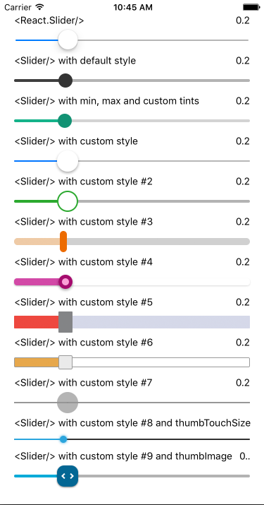
A pure JavaScript <Slider> component for react-native. This is still very much a work
in progress, ideas and contributions are very welcome.
It is a drop-in replacement for SliderIOS.
npm i --save react-native-slider'use strict';
var React = require('react-native');
var Slider = require('react-native-slider');
var {
AppRegistry,
StyleSheet,
View,
Text,
} = React;
var SliderExample = React.createClass({
getInitialState() {
return {
value: 0.2,
};
},
render() {
return (
<View style={styles.container}>
<Slider
value={this.state.value}
onValueChange={(value) => this.setState({value})} />
<Text>Value: {this.state.value}</Text>
</View>
);
}
});
var styles = StyleSheet.create({
container: {
flex: 1,
marginLeft: 10,
marginRight: 10,
alignItems: 'stretch',
justifyContent: 'center',
},
});
AppRegistry.registerComponent('SliderExample', () => SliderExample);| Prop | Type | Optional | Default | Description |
|---|---|---|---|---|
| value | number | Yes | 0 | Initial value of the slider |
| disabled | bool | Yes | false | If true the user won't be able to move the slider |
| minimumValue | number | Yes | 0 | Initial minimum value of the slider |
| maximumValue | number | Yes | 1 | Initial maximum value of the slider |
| step | number | Yes | 0 | Step value of the slider. The value should be between 0 and maximumValue - minimumValue) |
| minimumTrackTintColor | string | Yes | '#3f3f3f' | The color used for the track to the left of the button |
| maximumTrackTintColor | string | Yes | '#b3b3b3' | The color used for the track to the right of the button |
| thumbTintColor | string | Yes | '#343434' | The color used for the thumb |
| thumbTouchSize | object | Yes | {width: 40, height: 40} |
The size of the touch area that allows moving the thumb. The touch area has the same center as the visible thumb. This allows to have a visually small thumb while still allowing the user to move it easily. |
| onValueChange | function | Yes | Callback continuously called while the user is dragging the slider | |
| onSlidingStart | function | Yes | Callback called when the user starts changing the value (e.g. when the slider is pressed) | |
| onSlidingComplete | function | Yes | Callback called when the user finishes changing the value (e.g. when the slider is released) | |
| style | style | Yes | The style applied to the slider container | |
| trackStyle | style | Yes | The style applied to the track | |
| thumbStyle | style | Yes | The style applied to the thumb | |
| debugTouchArea | bool | Yes | false | Set this to true to visually see the thumb touch rect in green. |
MIT Licensed


