Browsers apply styles to elements before you've written any CSS at all, and sometimes those styles vary.
Normalizing your CSS lets you rest assured, knowing that you have the same base layer of styles applied across all browsers. It should be noted that I am talking about normalization and not resetting.
marginfor separating elementspaddingfor giving space inside element
The position property specifies the type of positioning method used for an element
There are five different position values:
Elements are then positioned using the top, bottom, left, and right properties. However, these properties will not work unless the position property is set first. They also work differently depending on the position value.
HTML elements are positioned static by default.
Static positioned elements are not affected by the top, bottom, left, and right properties.
An element with position: static; is not positioned in any special way; it is always positioned according to the normal flow of the page.
An element with position: relative; is positioned relative to its normal position.
Setting the top, right, bottom, and left properties of a relatively-positioned element will cause it to be adjusted away from its normal position. Other content will not be adjusted to fit into any gap left by the element.
An element with position: fixed; is positioned relative to the viewport,
which means it always stays in the same place even if the page is scrolled.
The top, right, bottom, and left properties are used to position the element.
A fixed element does not leave a gap in the page where it would normally have been located.
An element with position: absolute; is positioned relative to the nearest positioned ancestor (instead of positioned relative to the viewport, like fixed).
However; if an absolute positioned element has no positioned ancestors, it uses the document body, and moves along with page scrolling.
Note: Absolute positioned elements are removed from the normal flow, and can overlap elements.
An element with position: sticky; is positioned based on the user's scroll position.
A sticky element toggles between relative and fixed, depending on the scroll position.
It is positioned relative until a given offset position is met in the viewport - then it "sticks" in place (like position:fixed).
CSS Grid is a multi-dimension layout module, which means that it has columns and rows. Flexbox can lay out its child items either as columns or rows, but not both
Ask yourself those questions:
- How the component child items are displayed? Inline or as columns and rows?
- How the component is expected to work on various screen sizes?
Most of the time, if the component you are viewing has all of its child items displayed inline, then most probably flexbox is the best solution here. Consider the following example:
However, if you see columns and rows, then CSS grid is the solution for your case.
To learn more read this article 👉 Grid for layout, Flexbox for components
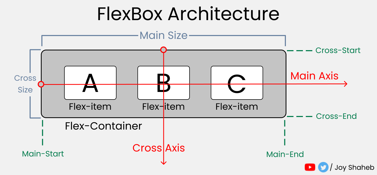
When you're building a house, you need a blueprint. In the same way, we need a blueprint when we're making websites. And Flexbox is the blueprint.
The Flexbox model allows us to layout the content of our website. Not only that, it helps us create the structures needed for creating responsive websites for multiple devices.
For start using flex first declare:
display: flex;This property allows us to set the direction and orientation in which our flex-items should be distributed inside the flex-container.
This property helps you set the number of flex-items you want in a line or row.
This is the shorthand for the flex-direction and flex-wrap properties:
This property arranges flex-items along the MAIN AXIS inside the flex-container.
Arrange text to left, center, right, start, end
This property arranges flex-items along the CROSS AXIS inside the flex-container. This is similar to justify-content.
Please note that without the flex-wrap property, this property doesn't work. Here's a demo:
This is the shorthand for the align-content and justify-content properties:
This property distributes Flex-items along the Cross Axis.
This property works on the child classes. It positions the selected item along the Cross Axis.
In total we have 6 values:
- flex-start
- flex-end
- center
- baseline
- stretch
- auto
In addition to reversing the order in which flex items are visually displayed, you can target individual items and change where they appear in the visual order with the order property.
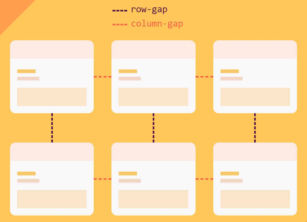
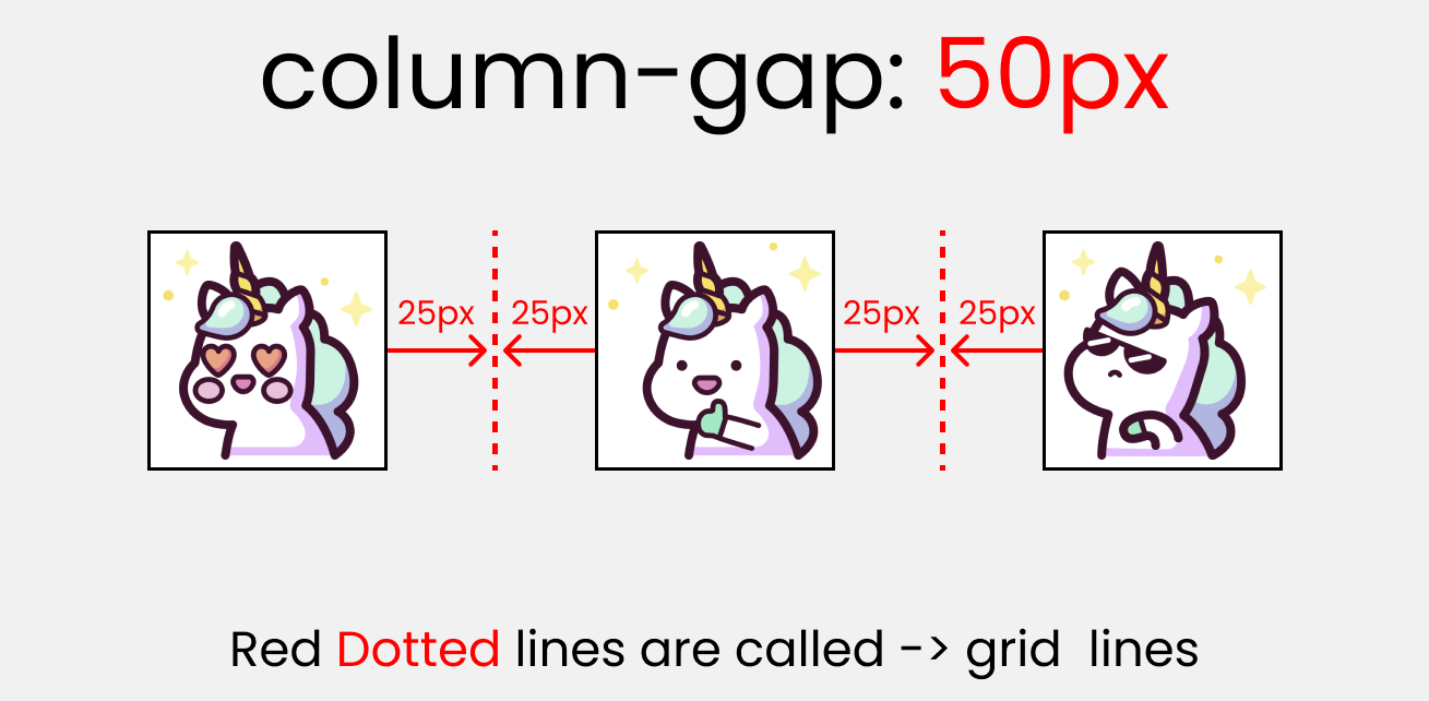
The gap CSS property sets the gaps (gutters) between rows and columns. It is a shorthand for row-gap and column-gap.
gap: 10px;The properties will work when we resize the window.
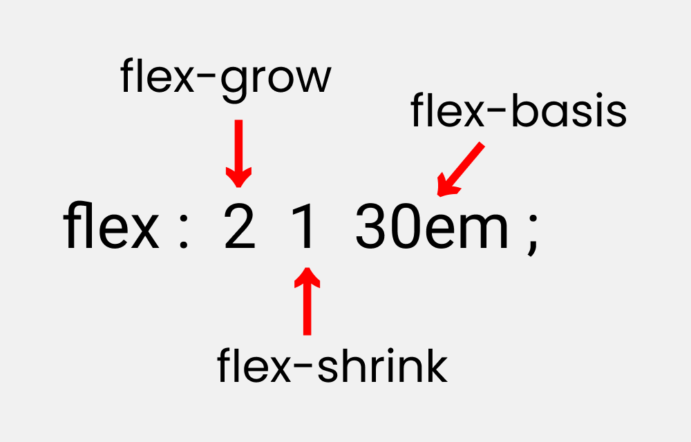
The initial size of a flex item
This is similar to adding width to a flex-item, but only more flexible. flex-basis: 10em, for example, will set the initial size of a flex-item to 10em. Its final size will be based on the available space, flex-grow, and flex-shrink.
This property grows the size of a flex-item based on the width of the flex-container.
This property helps a flex item shrink based on the width of the flex-container. It's the opposite of flex-grow.
Please note that flex-grow and flex-shrink work on child classes. So, we will target all our boxes like this:
.box-1 {
  flex-grow: 1;
}
.box-2 {
  flex-grow: 5;
}
.box-1 {
  flex-grow: 1;
}This is the shorthand for the flex-grow, flex-shrink and flex-basis properties combined.
Grid properties are divided into:
- Parent properties
- Child Properties
Note: The red colored text denotes the shorthand properties:
to use grid on items first declare it:
display: grid;You use this property to define the number and width of columns.
- You can either individually set the width of each column,
- or set a uniform width for all columns using the
repeat()function.
- The pixel values will be an exact measurement. The "auto" keyword will cover the available space.
- If you use
fr (fraction unit)as a unit of measurement, all the boxes will be equal in size. - for
repeat()you can usegrid-template-columns: repeat(3, 1fr);
grid-template-columns: repeat(3, 100px);
define the number and height of rows. You can either individually set the height of each row, or set a uniform height for all rows using the repeat() function.
This is the shorthand of 2 properties:
- grid-template-rows
- grid-template-columns
grid-template-rows: 100px 100px;
grid-template-columns: 200px 200px;

/* The shorthand */
grid-template: 100px 100px / 200px 200px;use this property to specify the amount of space a grid cell should carry in terms of columns and rows across the parent container.
Call it the blueprint(template) of our layout👇
grid-template-areas:The parent property that will create the blueprintgrid-area:the child property that will follow the blueprint.
Like this 👇 inside the parent .container class:
.container {
  display: grid;
  gap: 20px;
  height: 100vh;

  grid-template-areas:
    "A A A A   A A A A   A A A A"
    "B B B B   B B B B   B B C C"
    "B B B B   B B B B   B B C C";
}Target all our child .box-\* classes and set the values like this
.box-1 {
  grid-area: A;
}
.box-2 {
  grid-area: B;
}
.box-3 {
  grid-area: C;
}
column-gap works with grid-template-columns
row-gap works with grid-template-rows
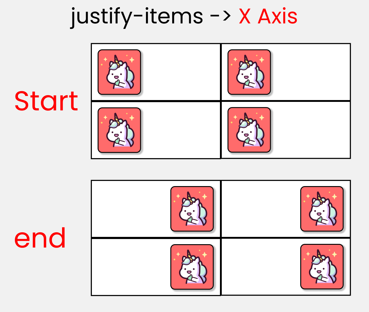
You use this property to position grid-items (children) inside grid containers along the X-Axis [Main Axis]. The 4 values are 👇
Alt Text
You use this property to position your grid [Basically everything] inside the grid container along the X-Axis [Main Axis]. The 7 values are 👇
use this property to position grid-items (children) inside the grid container along the Y-Axis [Cross Axis].
use this property to position our grid [Basically everything] inside the grid container along the Y-Axis [Cross Axis].
short form of
- justify-items
- align-items
short form of
- justify-content
- align-content
The illustration below 👇 shows the start and end points of rows and columns of a single cell.
join multiple Columns together
Write this code in your CSS:
.container {
  display: grid;
  gap: 20px;
  height: 100vh;

  grid-template-columns: repeat(12, 1fr);
  grid-template-rows: repeat(12, 1fr);
}
The result looks like this:
As we are dealing with child properties, we need to target our .box-* classes like this:
.box-1 {
}
.box-2 {
}
.box-3 {
}
.box-4 {
}
The default scale of every .box-* class is:
grid-column-start: 1;
grid-column-end: 10;

/* The shorthand -> */
grid-column: 1 / 10;
/* or */
grid-column: span 10;
The result looks like this: 👇
short form of
- grid-column-start
- grid-column-end
grid-column-start: 1;
grid-column-end: 2;

/* The shorthand -> */
grid-column: 1 / 10;
/* or */
grid-column: span 10;use these two properties to join multiple ROWS together.
.box-1 {
  grid-row-start: 1;
  grid-row-end: 11;

  /* shorthand */
  grid-row: 1/11;
}- Css Media Query Syntex
- min-width & max-width
- max-width
- min-width
- desktop first approach vs mobile first approach
Here's the syntax of a Media Query:
@media screen and (max-width: 768px) {
  .container {
    //Your code's here
  }
}the media type, min-width, and max-width functions are basically conditions we are giving to the browser. We don't write the "and" operator if we have one condition. Like this ->
@media screen {
  .container {
    // Your code here
  }
}
We write the and operator if we have two conditions, like this:
@media screen and (max-width: 768px) {
  .container {
    // Your code here
  }
}
You can also skip the media type and work with just min-width & max-width, like this:
//Targeting screen sizes between 480px & 768px

@media (min-width: 480px) and (max-width: 768px) {
  .container {
    // Your code here
  }
}
If you have three conditions or more, you can use a comma, like this:
//Targeting screen sizes between 480px & 768px

@media screen, (min-width: 480px) and (max-width: 768px) {
  .container {
    // Your code here
  }
}there's no such thing as a standard screen break-point guide because there are so many screen sizes on the market
Using this function, we are creating a boundary. This will work as long as we are inside the boundary. Here's a sample 👇
Our Boundary is 500px:
Notice how the light purple color gets Disabled when we hit above 500px.
We are also creating a boundary here. But this will work if we go outside the boundary. Here's a sample: 👇
Our boundary is 500px:
Notice how the light purple color gets enabled after we hit above 500px width.
mobile first approach: min-widthdesktop first approach: max-width
- REM Unit
- How to change the root font-size
- How to Make Responsive Websites with REM Units
- EM Unit
- VW unit - viewport width
- VH unit - viewport height
px
%relative to the size of the containervw,vhrelative to the viewportem,remrelative to the font size
👇 Notice font size is not changing when we resize the window.
👇 Notice that the font size of 50px doesn't change when we resize the window.
The REM unit depends on the root element [the HTML element]. Here's an image to show you how it works:👇
By default root fon-size is 16px. But you can change it 👇
html {
  font-size: 40px; /* Change here */
}

.text {
  font-size: 1rem;
}Write your styles in rem units instead of the pixels and change the root elements at different breakpoints using media queries.
// large screen

@media (max-width: 1400px) {
  html {
    font-size: 25px;
  }
}

// Tablet screen

@media (max-width: 768px) {
  html {
    font-size: 18px;
  }
}

// Mobile screen

@media (max-width: 450px) {
  html {
    font-size: 12px;
  }
}.text {
font-size: 3rem;
}And here's the result: 👇
Here are the calculations:
- For the large screen -> 3 rem * 25px = 75px
- For tablet screen -> 3 rem * 18px = 54px
- For mobile screen -> 3 rem * 12px = 36px
- Default setting -> 3rem * 16px = 48px
Using the EM unit is not worth the effort because:
- you have a high chance of making a calculation error
- you have to write a lot of code in media queries while trying to make the website responsive on all screen sizes
- it's too time-consuming.
The EM unit is the same as the REM unit but it depends on the parent font size. Here's a demo. 👇
Note: make sure you remove all the media queries.
html {
  font-size: 16px;
}

.text {
  font-size: 3em;
}

/** Calculations
  font-size should be
  3 em * 16px = 48px
**/
Now, let's try adding 3em padding to the .text class.
html {
  font-size: 16px;
}

.text {
  font-size: 3em;
  padding: 3em;
}

/** Calculations
text    => 3em * 16px = 48px
padding => 3em * 3em * 16px = 144px
**/
Instead of being 48px of padding, we are getting 144px padding. As you can see, it is getting multiplied by the previous number.
Here's the computed part from the developer console: 👇
It works like the percentage unit. Specifying 50vw is equivalent to occupying 50% of entire visible screen width
.text {
  display: none;
}

.box {
  width: 50vw;

  height: 300px;
  /* display: none; */
}
If you look carefully, you can see that 50vw means 50%, which will cover half of the entire screen width.
resizing box which is 50vw in size. It is taking 50% of entire screen even if we resize the window.
It works like the percentage unit as well. Specifying 50vh is equivalent to occupying 50% of entire visible screen height
.text {
  display: none;
}

.box {
  width: 300px;

  height: 50vh;
  /* display: none; */
}
And here's the result: 👇
As you can see, it will always cover that much space even if we resize the window.
- Learn CSS Units – Em, Rem, VH, and VW with Code Examples ✨✨
- Flexbox Tutorial with Flexbox Properties Cheat Sheet 🎖️
- Grid for layout, Flexbox for components
- Media Queries for Standard Devices
- CSS Notes for Professionals book


