| order | title |
|---|---|
4 |
Icons |
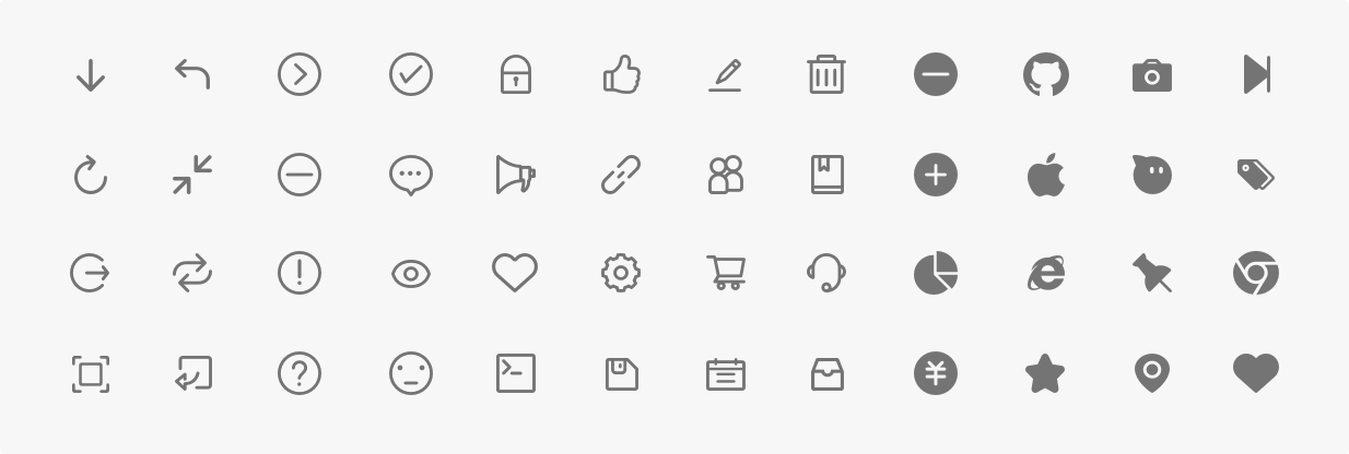
An icon is a graphical representation of meaning. Icons can be used to express actions, state, and even to categorize data. Ant Design's icons adhere to the following two principles and are designed for cross-platform consistency:
- Graphics that are clear, intuitive, and simple enjoy a higher degree of recognition and are more easily understood
- All icons in the user interface should be consistent in style (detail design, perspective, stroke weight, etc.)
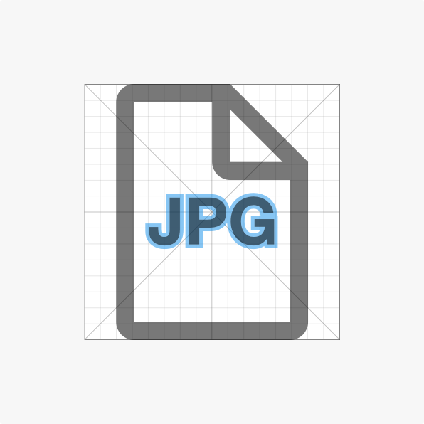
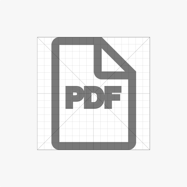
System icons are often used to represent commonly used operations, such as: save, edit, delete. The library also includes icons to represent file types and state.
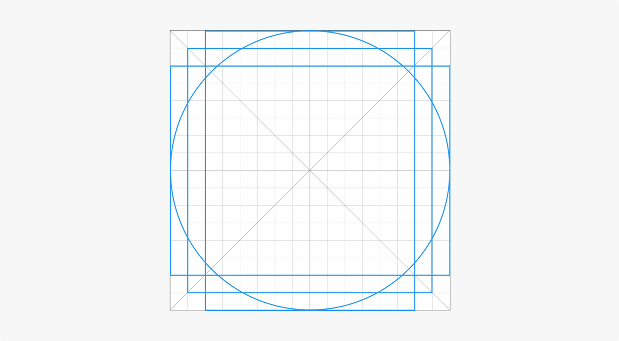
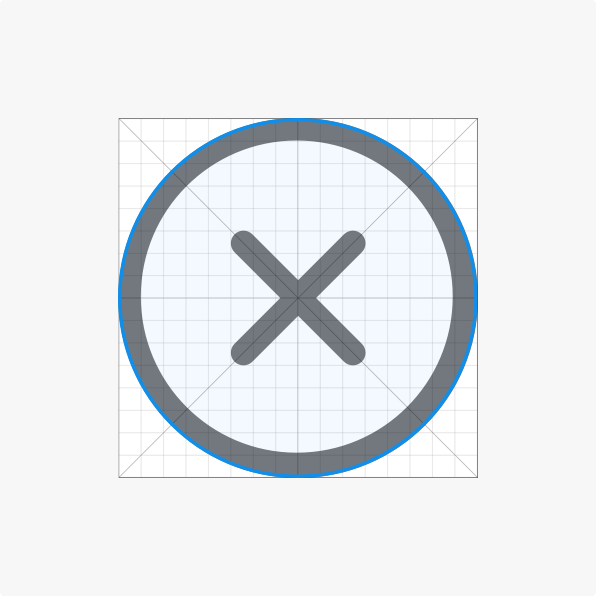
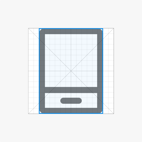
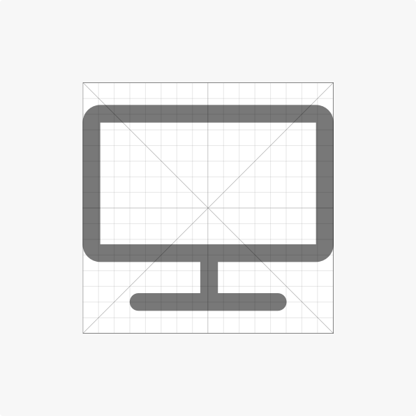
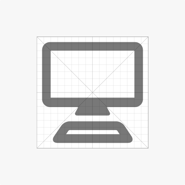
Contour lines play an important role in making various icons with the same visual effect. We recommend using a template following Ant Design's contour lines when creating new icons.
Please make all icons in the 1024×1024 resolution (16×16 64 times).
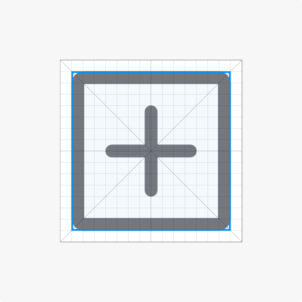
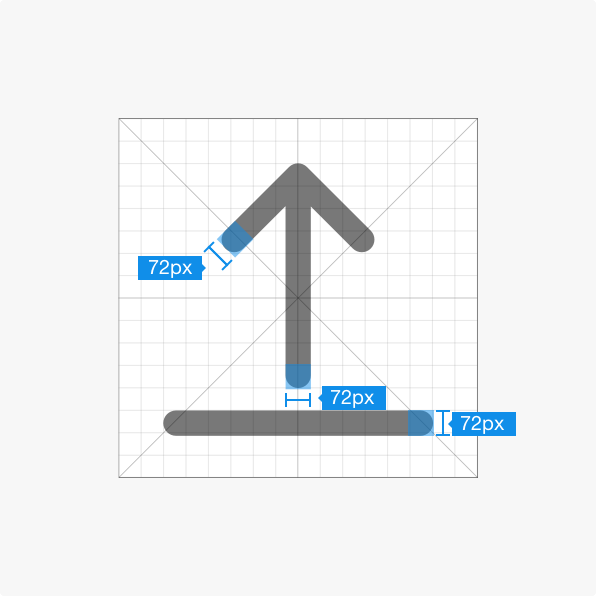
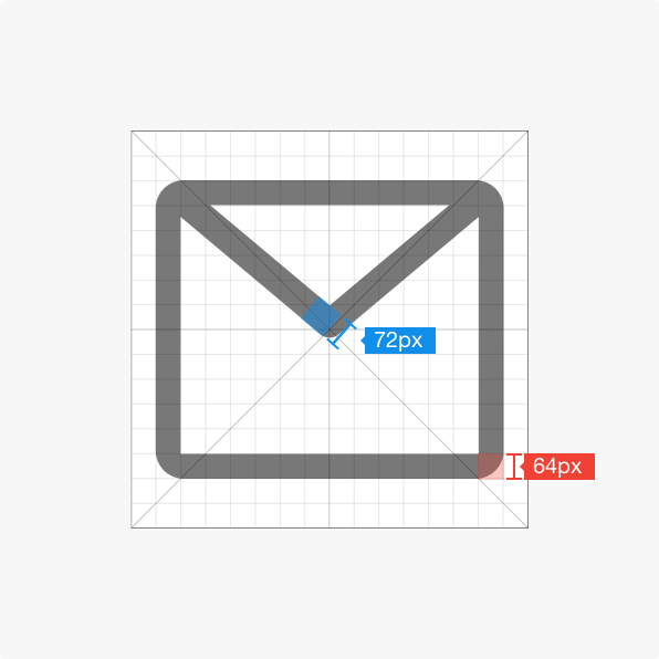
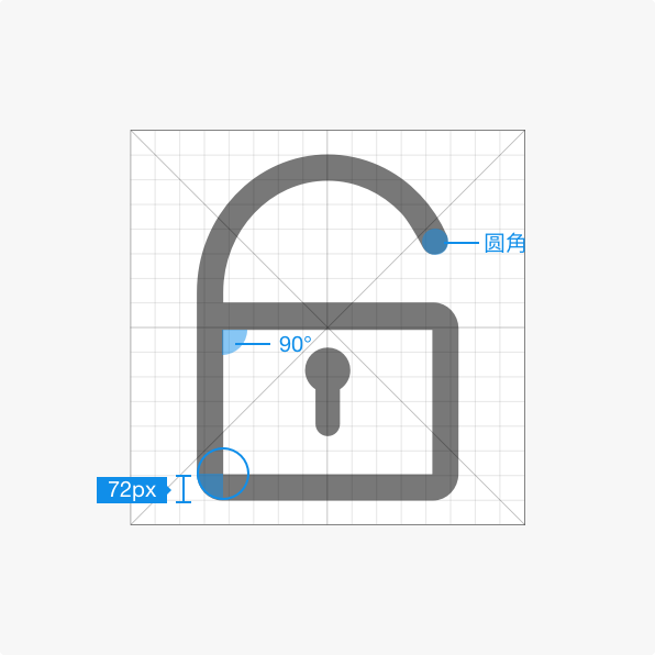
Consistent stroke weight is the key to maintaining the visual unity of the entire icon system. Ant Design's icons have a consistent line width of 72px.
Consistent rounding of corners and sizing of angles is also an important element in maintaining visual unity.
Icons that follow Ant Design should have rounded corners and edges using a 72px radius. Angles should be a multiple of 45°.
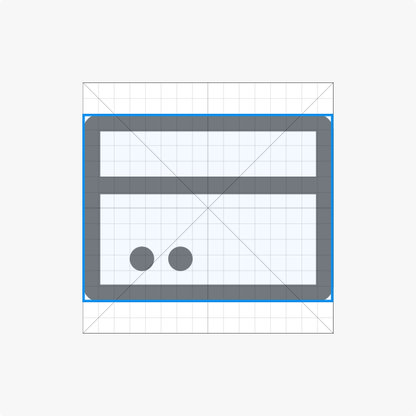
In certain special cases (for example, when the icon is too compact), adjustments to line width, outlines, or other subtle changes may be made to increase readability.
Always keep a simple, flat style. Icons should not have a sense of depth nor a large amount of detail.
Uniform naming conventions make finding icons faster and easier. For example, icons with a surrounding outline have a uniform "-o" suffix.
Icons should be scaled according to the text size, according to the Ant Design specification.
For example, icons inline with 12pt font should be 12px in size with 8px of spacing.
The color of the icon should be consistent the color of the surrounding copy, unless the icon is being used to express state (in which case it should be colored accordingly).
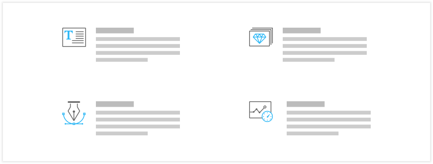
While certain icons may be used to express an action or to communicate state, other icons may act as pictographs which can be used to either communicate meaning or to help a user remember an abstract concept.
Note: The design principles for system icons (stroke weight, etc.) also apply to pictographs.
Conventionally, we recommend storing pictograph icons in three sizes: 32px, 48px, and 64px. That said, the physical dimensions of an icon should match the dimensions of where it is used.
Pictographs should either be monochrome (using a neutral color) or consist of two colors (the neutral color + primary color), with the primary color not exceeding 40% of the pictograph's area.
