Exam time again!!!
Here's a useful link to help Rmarkdown writing, by Rstudio : R Markdown cheat sheet
library(lubridate,warn.conflicts = F)
library(dplyr,warn.conflicts = F)
library(ggplot2)

#To make AWESOME tables
library(xtable)if (!file.exists("activity.csv")) unzip("activity.zip")
d <- read.csv("activity.csv", stringsAsFactors = F)
# data<-data[complete.cases(data),]
data <- mutate(d, date = ymd(date))Aggregating datas
# dplyr version sumSteps<-d %>% group_by(date) %>% summarise( sum(steps))

# Basic version
sumSteps <- aggregate(steps ~ date, data = d, FUN = sum)

# renaming columns for convenience
colnames(sumSteps) = c("Date", "Steps")

# Computing median and mean

Mean1 <- as.integer(round(mean(sumSteps$Steps, na.rm = T), 0))
Median1 <- as.integer(round(median(sumSteps$Steps, na.rm = T), 0))
Now plotting time
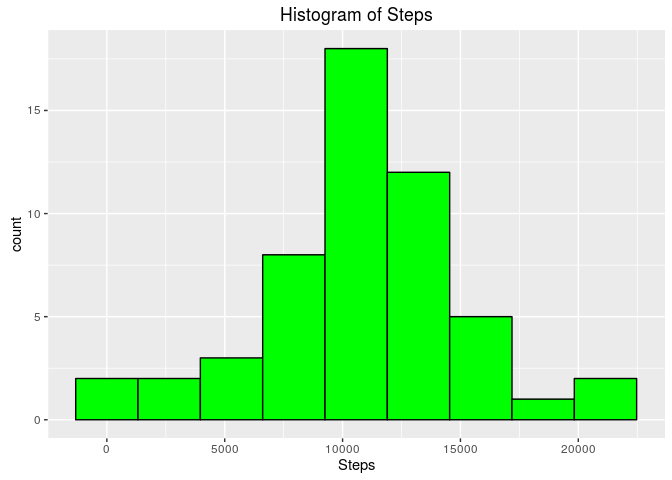
ggplot(sumSteps, aes(Steps)) + geom_histogram(bins = 9, col = "black", fill = "green") +
    ggtitle("Histogram of Steps")
The mean total number of steps taken per day is 10766 and the median is 10765
The choice of 9 beans instead the default of 30 bins by ggplot has been made to have kind of a 'Gaussian' look, with no empty bean.
From this graphic, we can note
- Data looks like normally distributed
- Th mean and the median being very close, reinforcing this impression
We'll draw the corresponding Gaussian distribution:
- Mean= 1.0766189\times 10^{4}
- Standard deviation = 4269.1804927
ggplot(sumSteps, aes(Steps))+
  geom_histogram( aes(y=..density..), bins=9,col='black', fill='green')+
  stat_function(fun=dnorm, colour='red', lwd=2, args=list(mean=mean(sumSteps$Steps), sd=sd(sumSteps$Steps)))+
  ggtitle('Comparing histogram and normal distribution')
The graphic belows shows:
- Histogram : in green
- Density plot: in blue
- Gaussian distribution : in red
ggplot(sumSteps, aes(Steps))+
  geom_histogram( aes(y=..density..), bins=30,col='black', fill='green')+
  geom_density(colour='blue', lwd=1, fill='blue', alpha=0.3)+
  stat_function(fun=dnorm, colour='red', lwd=2, args=list(mean=mean(sumSteps$Steps), sd=sd(sumSteps$Steps)))+
  ggtitle('Comparing histogram and normal distribution with 30 bins histograms')
Comparison not so obvious.... for the histogram, as it depends on number of bins
However, we get a better feel with the density plotting (in blue)
First, we do aggregate data by interval
I enclosed 2 versions of the aggregation code:
- One using the dplyr package, as My personal goal is to mater it, as it is more flexible and advanced than the 'base' package
- Another one using Ocam's razor aggregate() function
# dplyr version daily<-d %>% group_by(interval) %>%
# summarise(steps=mean(steps, na.rm=T))
daily <- aggregate(steps ~ interval, data = d, FUN = function(x) {
    mean(x, na.rm = T)
})
Now about the plotting, the assigment required a line plot, that you can find below. However, this plot does'nt show the missing intervals, so I built a 'barplot', with the line plot ovrlay clearly showing the data 'holes'
ggplot(daily, aes(x=interval,y=steps) ) +
geom_line(col='red')This one shows clearly how ggplot operates
- barplot in blue
- lineplot in red
Both using the same dataset
ggplot(daily, aes(x=interval,y=steps) ) +
  geom_bar(stat = 'identity',col='blue')+
  geom_line(col='red')
The interval having the maximal mean step value being
**
daily[[which.max(daily$steps),1]]## [1] 835
**
t<-table(is.na(d), dnn = 'Missing Values')

#now making it look AWESOME with xtable
print(xtable(t), type = 'html')| Missing Values | |
|---|---|
| FALSE | 50400 |
| TRUE | 2304 |
So there are 2304 missing values out of 52704 (about 4.37%)
The filling strategy is as following: We'll replace the missing intervals for a specific day with the average of this interval
#First: Build a table of means by interval
meanByIntervalAndDate <- d %>%group_by(interval,date) %>% summarize(steps=mean(steps, rm.na=T))
meanByInterval  <-aggregate(steps~interval, data=meanByIntervalAndDate, FUN=function(x) {mean(x,na.rm=TRUE)})

# Then we split data in two parts: the NA part and the non-NA part
naIndexes <-is.na(d$steps)

# We keep the NA lines and drop the 'steps' (containig only NAs) column
naPart= d[naIndexes,]
naPart$steps=NULL

#We drop the NA lines from the data
nonNaPart=d[!naIndexes,]

#Then we do a left join with the 'Mean by interval' table
naPart<-left_join(naPart, meanByInterval, by='interval')

# We check that all lines have been filled
length(naPart[is.na(naPart$steps),'steps'])
## [1] 0
#Then we go for row_bind betwen the naPartand the nonNaPart

d <- bind_rows(naPart, nonNaPart)
Now that we have a new dataframe,it is time to bilsdan histogram to check if the fact of filling data had an impact
sumSteps2 <- aggregate(steps ~ date, data = d, FUN = sum)

# renaming columns for convenience
colnames(sumSteps2) = c("Date", "Steps")

# computing median and mean
Mean2 <- as.integer(round(mean(sumSteps2$Steps, na.rm = T), 0))
Median2 <- as.integer(round(median(sumSteps2$Steps, na.rm = T), 0))


ggplot(sumSteps2, aes(Steps)) + geom_histogram(bins = 9, col = "black", fill = "green") +
    ggtitle("Histogram of Steps")
** For this new dataset **
The mean total number of steps taken per day is 10766 and the median is 10766
So we notice that the mean didn't change after having filled data. However, the median increased by 1 unit (10765 to 10766), a 0.01% change what is non significative
This part is two fold: 1 Create a new factor variable in the dataset with two levels – “weekday” and “weekend” indicating whether a given date is a weekday or weekend day.
2 Make a panel plot containing a time series plot (i.e. type = "l") of the 5-minute interval (x-axis) and the average number of steps taken, averaged across all weekday days or weekend days (y-axis). See the README file in the GitHub repository to see an example of what this plot should look like using simulated data.
# adding the weekday factor

#To do so, we use the wday() function what return 1 for sunday, 7for saturday, and 2..6 for the other weekday
d<-mutate(d,dayType= ifelse(wday(date) %in% c(1,7), 'weekend', 'weekday'))

#Makes it a factor, as requested
d$dayType<-as.factor(d$dayType)dailyByDayType <- aggregate(steps ~ interval + dayType, data = d, FUN = function(x) {
mean(x, na.rm = T)
})
ggplot(dailyByDayType, aes(interval, steps)) + geom_area(col = "red", fill = "red") +
facet_grid(dayType ~ .)So we can see there is a difference in activity level between the weekdays and the weekends!
##Bonus track
A variant of the plot, what shows better the difference in the activity levels
dailyByDayType <- aggregate(steps ~ interval + dayType, data = d, FUN = function(x) {
    mean(x, na.rm = T)
})

ggplot(dailyByDayType, aes(interval, steps, coloour = dayType, fill = dayType)) +
    geom_area(col = "black", alpha = 0.5)


