| title | toc |
|---|---|
Change Log |
hidden |
2019-09-20
-
Feat
PickerandDatePickeradd propkeep-index, used to set the last stop position when the column data changes
-
Fix
- Fix the problem that
Toastis covered byLandscape - Fix the problem of
TabBarrendering crash#567 - Remove the useless style variables of
Textarea
- Fix the problem that
2019-09-04
-
Feat
- Add part of global reset style
- Add new component
Skeleton - Add new component
TextareaItem - Add new components
RadioGroupandRadioBox - Add options
type,plain,round,inactive,loading,icon,iconSvgtoActionBarandResultPagebutton configration#544 - Add handlers
onShowandonHideto singleton modeDialog InputItemadd proppreview-type, used to set the type of pre-filled impression
<md-input-item
  type="bankCard" <!-- type when entering normally -->
  preview-type="text" <!-- type when pre-filling display -->
  title="银行卡号"
  value="6222 **** **** 1234"  <!-- pre-filled value with mask -->
></md-input-item>
-
Fix
- fix page flipping problem when sliding out of touch area in
Swiper#540 - modify button background color setting property to
backgroundand the container element todiv
- fix page flipping problem when sliding out of touch area in
2019-08-13
- Fix
- fix style issues with
FieldItemandInputItemheaders and content alignment#528 - bolder font weight in android devices of
FieldItemandInputItem
- fix style issues with
2019-08-03
- Fix
- Fix the problem that
InputItemcannot limit the max length of characters when using virtual keyboard input#524 - Fix
Amountwith the loss of precision in animation mode
- Fix the problem that
2019-07-29
-
Design
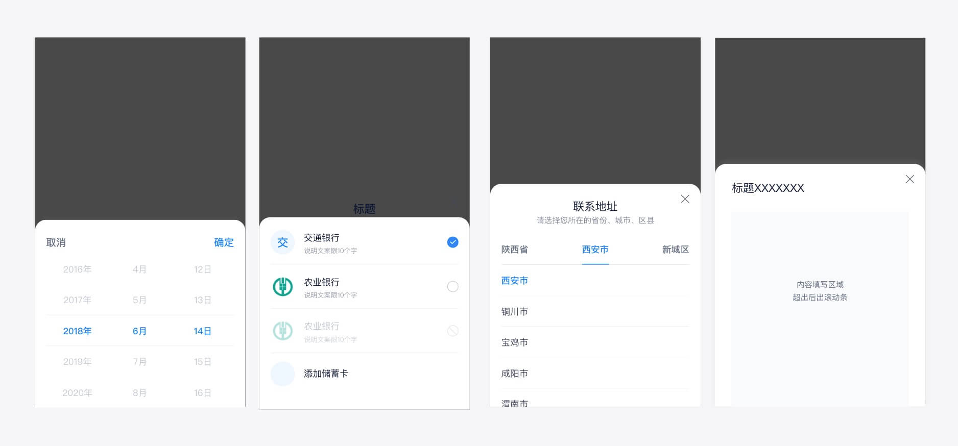
- 🍭Financial design specification update, the title bar
border-radiusofPopupbased components changed from8pxto40px(Large-Radius pattern),border-radiusofDialogchanged from8pxto12px
- 🍭Financial design specification update, the title bar
-
Feature
-
PopupTitleBaradds following Props:large-radiusfor supporting Large-Radius patternonly-close, used to quickly set a single close buttontitle-align, used to set the position of title and description(left/right/center)
-
Picker,DatePicker,TabPicker,Selector,Cashieradd Proplarge-radiusfor supporting Large-Radius pattern -
Selectoradds Prophide-title-bar, used to support hiding the title bar in no confirmation mode, and adds slotsheader,footer -
Buttonadds Proploading, used to set the loading status -
DialogPropbtnsadds two status settingsdisabled/loading, and passing back thebtninstance inhandler#500export default { data () { return { btns: [{ text: 'Search', handler: this.btnHandler }] } }, methods: { btnHandler (btn) { this.$set(btn, 'loading', true) this.$set(btn, 'text', 'Searching') }, } }
-
-
Fix
2019-07-18
- Fix
- Fix compatibility issues when fixing
Toastcustom positions#485 - Fix
TabPickerwhen settingdefault-value,TabBarcan't automatically select the last item#488 - Fix
SelectorandCheckListclick icons can't select current item#491 - Fix this problem
Popupcan't coverNoticeBar#492 - Fix partial
stylusvariable assignment error inStepper
- Fix compatibility issues when fixing
2019-07-05
- Fix
- fix
Codeboxvalue could not be assigned when initializing - fix the problem that the
NumberKeyboardkeys may be clicked incorrectly#477
- fix
2019-06-22
-
Feature
NumberKeyboardadds propertyisHideConfirm, used to control whether the confirmation button click action automatically hides the keyboard#474NumberKeyboardadd default slot
-
Fix
2019-06-13
-
Feature
CheckandCheckListincrease the icon size, location and other related configuration properties#383CheckListslot addsindex,selectedfield
  <template>
    <md-check-list :options="data">
      <template slot-scope="{ option, index, selected }">
        <!-- xxx -->
      </template>
    </md-check-list>
  </template>
RadioListslot addsindex,selectedfields, and does not display icons wheniconis emptySelectoradds propertymultito support multiple selections#296Toastadds the attributecomponent, which is used and customized in component form#445- ScrollView
adds propertyis-prevent` to support setting whether to prevent the default behavior when scrolling in non-scrollable areas#454
-
Fix
2019-05-26
- Fix
- Fix the problem that the first and last items of
TabBarcannot be automatically repaired after they are selected#434 - Texts of
TabBaritems cannot be selected
- Fix the problem that the first and last items of
2019-05-25
- Fix
- Utility style
hairlinereplaceswidthandheightwithborder
- Utility style
2019-05-11
-
Feature
TabPickeradd eventselect#436
-
Fix
- When the option in the tab list of each level of
TabPickeris selected, the internal container is reset to the top RadioListautomatically clears the filled out text box when switching to a non-text optionDatePickerpropcustom-typessupportHH#433- Add
onCancelto the type declaration ofDialog - Optimize some components documentation
- When the option in the tab list of each level of
2019-04-22
-
Feature
-
Fix
- Fix the exception thrown by
Pickerwhen setting a wrongdefault-index#416 - Optimize some component styles
- Fix the exception thrown by
2019-04-13
-
Feature
- New
RulerComponent ScrollViewRefreshadd proprollerColor, used to set the progress bar color of pull-down refreshing#399- Optimize
WaterMarkcomponent by usingcanvasto render watermark Stepperaddincrease,decreaseevents
- New
-
Fix
2019-03-22
- Fix
InputItemnot update when slots changeCodeboxbottom border not shown on some devices
2019-03-15
2019-03-08
-
Feature
- Optimize
Swipergestures
- Optimize
-
Fix
- Some build bugs
ScrollViewmove out screen not trigger scroll end actionPopupsynchronously operate problem#341
2019-02-25
- Fix
- Fix
ScrollViewis not able to trigger the problem when the content is not full.#335 - Fixed a problem with the line break when the
InputItemtitle floated
- Fix
2019-02-23
- Fix
- Fix the problem that
postcssis not in effect at build time, causing assets such as images inmand-mobile.cssnot to be processed by url inline。
- Fix the problem that
2019-02-22
-
Feature
Seletor:defaultValueprop remove type limits#305ScrollView: addimmediateCheckEndReachingprop,in order to check reach bottom immediately and emitendReachedevent#312PickerandDatePicker: addlineHeightprop, which is used to customize option line height#323ScrollView: addtouchAngleprop, in order to control scroll angle#326Amount: use system default font
-
Fix
2019-01-30
-
Feature
DetailItemincrease supported types ofcontent#285Dialogadd default valuetrueofpreventScroll#286Radioincrease supported types ofvalue#289Iconfont type increases without prefix class name#295Check,CheckBoxincrease supported types ofnameandvalue#297InputItemadd propvirtual-keyboard-vm, used to support external custom financial keyboardsCashieradd scoped slotfooterandchannelsadd propertyimg
-
Fix
InputItemremove setting cursor for native type #268- supplement
index.d.ts - fix part of components style issues
2019-01-04
-
Feature
- Add
PascalCasename to global components#261 ScrollViewadd propmanual-initand methodinitTabBar,Tabsadd propimmediateSwiperadd proptransition-duration
- Add
-
Fix
- fix part of components style issues
2018-12-21
-
Feature
- Optimize
NumberKeyboardinput experience Cashieradds slotscenePickeradds propdefault-value#255
- Optimize
-
Fix
- Fix
Popupcontinuous "show & hide" invalidation problem - Fix
Stepsstyle compatibility issues - Fix
InputItemstyle problem, increase close button click area setErrorofCaptchano longer clears codes
- Fix
2018-12-14
🎉🎉🎉 👏👏👏 Learn more in theMigration from 1.x.
Visit GitHub to read 1.x change logs.
