 Suki is the name of my dog :-)
UI Theme and Controls for AvaloniaUI

- Cleaner code (because the library is very young)
- More Controls (and make actual richer)
- Dark Theme
- out of the box Mobile Theme !
- Install SukiUI Nuget Package
- Reference SukiUI in your App.axaml file
<Application ...>
     <Application.Styles>
        ...
        <StyleInclude Source="avares://SukiUI/Theme/Index.xaml"/>
        ...
    </Application.Styles>
</Application>
Screen video of an empty android app in debug mode with avalonia mobile, trying to use Suki UI on mobile. Controls need lots of small modifications (mostly sizing) but can look great on mobile.
---> The goal is to make asap a style file that adapt every control to mobile to be used out of the box
screen-20220411-112413.mp4

<Window
  ...
  Classes="NakedWindow"
  xmlns:suki="clr-namespace:SukiUI.Controls;assembly=SukiUI"
>

  <suki:DesktopPage LogoColor="#2f54eb" LogoKind="Xaml">
    <suki:DesktopPage.MenuItems>
      <MenuItem Header="File">
        <MenuItem Header="File" />
        <MenuItem Header="Edit" />
        <MenuItem Header="Help" />
      </MenuItem>
      <MenuItem Header="Edit" />
      <MenuItem Header="Help" />
    </suki:DesktopPage.MenuItems>

    <Grid>
          <TextBlock>Content<TextBlock/>
    <Grid/>
    <suki:DesktopPage/>
<Window/>

Menu for a mobile app to switch between pages and go back
<UserControl
  ...
  xmlns:suki="clr-namespace:SukiUI.Controls;assembly=SukiUI"
>

  <suki:MobilePage  Header="Test" Name="MobileMenu" >
    <Grid >
      <Button Click="AddPage" VerticalAlignment="Center" HorizontalAlignment="Center">
        <TextBlock>Go To A Next Page</TextBlock>
      </Button>
    </Grid>
  </suki:MobilePage>
<UserControl/>
public void NavigateToNewPage(){

     var menu = this.FindControl<MobilePage>("MobileMenu");
     menu.NewPage("Header", new RecursivePage());

}

<ToggleSwitch OffContent="No" OnContent="Yes" />

xmlns:suki="clr-namespace:SukiUI.Controls;assembly=SukiUI"
...

<suki:Stepper Name="myStep" />
this.FindControl<Stepper>("myStep").Steps = new List<string>() { "one", "two", "thre", "four", "five" };
this.FindControl<Stepper>("myStep").Index = 2;

xmlns:suki="clr-namespace:SukiUI.Controls;assembly=SukiUI"
...

<suki:CircleProgressBar Height="150" StrokeWidth="12" Value="50" Width="150">
             <TextBlock Classes="h3">50 %</TextBlock>
</suki:CircleProgressBar>

xmlns:suki="clr-namespace:SukiUI.Controls;assembly=SukiUI"
...

<suki:Loading></suki:Loading>

xmlns:suki="clr-namespace:SukiUI.Controls;assembly=SukiUI"
...

<suki:PropertyGrid Name="propertyGrid" />

...

this.FindControl<PropertyGrid>("propertyGrid").Item = new Person()
{
    Name = "Billy",
    Partner = new Person()
    {
         Name = "Charles"
    }
};
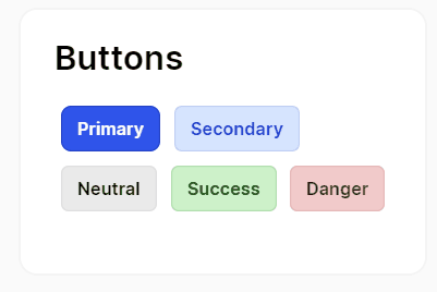
<Button Classes="Primary">
    <TextBlock>Primary</TextBlock>
</Button>
<Button Classes="Secondary">
    <TextBlock>Secondary</TextBlock>
</Button>
<Button>
    <TextBlock>Neutral</TextBlock>
</Button>
<Button Classes="Success">
    <TextBlock>Success</TextBlock>
</Button>
<Button Classes="Danger">
    <TextBlock>Danger</TextBlock>
</Button>

 WindowNotificationManager notificationManager;

public MainWindow()
{
    InitializeComponent();
    notificationManager = new WindowNotificationManager(this);
}

private void ShowNotification(object sender, RoutedEventArgs e)
{
    var notif = new Avalonia.Controls.Notifications.Notification("title","message");
    notificationManager.Show(notif);
}

xmlns:suki="clr-namespace:SukiUI.Controls;assembly=SukiUI"
...

<suki:GroupBox Header="Test Header">
   <Grid Height="100" Width="150">
         <TextBlock VerticalAlignment="Center" HorizontalAlignment="Center">Test Content</TextBlock>
   </Grid>
</suki:GroupBox>

 <TabControl>
      <TabItem Header="Tab 1" />
      <TabItem Header="Tab 2" />
      <TabItem Header="Tab 3" />
 </TabControl>

 <TabControl Classes="FlatTabControl">
      <TabItem Classes="FlatTabItem" Header="Tab 1" />
      <TabItem Classes="FlatTabItem" Header="Tab 2" />
      <TabItem Classes="FlatTabItem" Header="Tab 3" />
 </TabControl>

 <ListBox>
      <TextBlock>item 1</TextBlock>
      <TextBlock>item 2</TextBlock>
      <TextBlock>item 3</TextBlock>
 </ListBox>

 SukiUI.MessageBox.MessageBox.Info(this, "Title", "This is an information message that need to be read.");
 MessageBox.Success(this, "Title", "This is an Success message that need to be read.");
 MessageBox.Error(this, "Title", "This is an Success message that need to be read.");

 <ComboBox PlaceholderText="Select an item">
    <ComboBoxItem>
       <TextBlock>Main Item 1</TextBlock>
    </ComboBoxItem>
    <ComboBoxItem>
        <TextBlock>Main Item 2</TextBlock>
    </ComboBoxItem>
</ComboBox>

<ProgressBar Value="60" />

<Border Classes="Card"></Border>
<Border Classes="Card Hoverable"></Border>

<DataGrid Name="myDataGrid" AutoGenerateColumns="True" IsReadOnly="True" />
this.FindControl<DataGrid>("myDataGrid").Items = new List<Person>();

<Slider IsSnapToTickEnabled="True" Maximum="100" Minimum="0" TickFrequency="1" Value="50"></Slider>

<TextBox Classes="Prefix" Margin="5" Text="avaloniaui.net" Watermark="https://" />
<TextBox Classes="Suffix" Margin="5" Text="avaloniaui" Watermark="@gmail.com" />
<TextBox Margin="5" Text="Elem" />
<TextBox Classes="FlatTextBox" Text="Elem" />

<StackPanel>
     <TextBlock Classes="h1">h1</TextBlock>
     <TextBlock Classes="h2">h2</TextBlock>
     <TextBlock Classes="h3">h3</TextBlock>
     <TextBlock Classes="h4">h4</TextBlock>
     <TextBlock>Normal</TextBlock>
     <TextBlock Classes="Accent">Accent</TextBlock>
</StackPanel>

<Calendar></Calendar>

<Expander Header="Click To Expand">
          <TextBlock>Expanded</TextBlock>
</Expander>

<NumericUpDown></NumericUpDown>

<StackPanel Orientation="Vertical">
          <RadioButton Margin="5">Item 1</RadioButton>
          <RadioButton Margin="5">Item 2</RadioButton>
          <RadioButton Margin="5">Item 3</RadioButton>
</StackPanel>

<TreeView>
      <TreeViewItem Header="blub">
          <TreeViewItem Header="blub" />
          <TreeViewItem Header="blub" />
      </TreeViewItem>
      <TreeViewItem Header="blub" />
      <TreeViewItem Header="blub" />
</TreeView>

<Border.ContextMenu>
     <ContextMenu>
           <MenuItem Header="Menu item 1" />
           <MenuItem Header="Menu item 2" />
           <Separator />
           <MenuItem Header="Menu item 3" />
     </ContextMenu>
</Border.ContextMenu>