A Polymer interpretation of Dan Grossman's awesome bootstrap-daterangepicker
-
Add the library to your project using the Bower package manager:
bower install polymer-date-picker --save -
Import Polymer's core polyfill library:
<script type="text/javascript" src="../platform/platform.js"></script>
-
Import the polymer-date-picker custom element:
<link rel="import" href="../polymer-date-picker/polymer-date-picker.html">
Note: The above paths assume you are utilizing the date picker in a sibling element. You may need to update the path to be relative to bower_components.
<input id="trigger" value="{{selectedDate}}"
  on-click="{{$.datePicker.toggle}}"
  readonly class="date"/>
<polymer-date-picker
  id="datePicker"
  selectedDate="{{selectedDate}}"
  relatedTarget="{{$.trigger}}"
  opened="false"/>
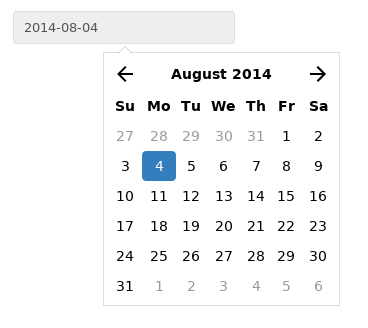
This example will create a basic date picker with the value of selectedDate bound to an input field. The input field will toggle the date picker open and closed when clicked and will reflect the currently selected date in a readonly format. The date picker will be positioned relative to the input field via the relatedTarget attribute.
<input id="triggerRange"
  value="{{startDate}} to {{endDate}}"
  on-click="{{$.datePicker.toggle}}" readonly/>
<polymer-date-picker
  id="datePicker"
  range
  startDate="{{startDate}}"
  endDate="{{endDate}}"
  relatedTarget="{{$.triggerRange}}"
  opened="true"
  halign="right" />
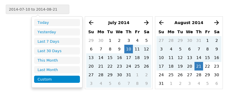
This example will create a range date picker that is opened by default. The startDate and endDate values are bound to an input field which will also toggle the date picker on click. The date picker will be positioned relative to the bottom right of the input field based on the relatedTarget and halign attributes.
The date picker can be themed by importing or including a core-style element in your application with an id of "polymer-date-picker". Your core-style element should include a style block with any applicable CSS you would like applied to the date picker.
range: (boolean) Render a date picker with the option of choosing a range of dates.startDate: (string) The selected start date if therangeoption is enabled.endDate: (string) The selected end date if therangeoption is enabled.selectedDate: (string) The selected date if therangeoption is not enabled.opened: (boolean) Whether the date picker elements are currently showing. Elements are by default rendered in an overlay that is controlled by this option.halign: (string|left,middle,right) The positioning of the date picker elements relative to your target element. All vertical positioning will be at the bottom of the target.relatedTarget: (object) A Polymer selector identifying the element that will be used to control the date picker overlay.
$.datePicker.open: Set the date pickeropenedattribute to true.$.datePicker.close: Set the date pickeropenedattribute to false.$.datePicker.toggle: Toggle the date pickeropenedattribute.
- Christophe Clapp
- Christopher Hartmann

