A project made by Rodrigo Guarneros, Samuel Cerón, Eduardo Ayala and Carlos Casio
This web application was created using information from the last 2020 Census made from the National Institute of Statistics and Geography (INEGI in spanish). We wanted to show a summary specifically on digital inclusion for the country, that is, how many people have access to some of the most important technologic tools nowadays, like internet, cellphone, streaming services or a computer. On a technology driven world, this information is very valuable for new and existing companies willing to offer such products or services, therefore, this is a great start to have a good idea on where you could look further to increase sales or enter a new market.
-
National approach.
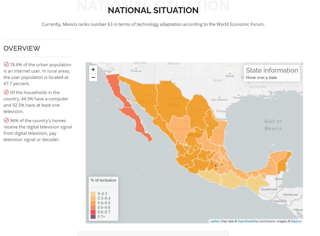
- You can compare at a glance which states have more or less inclusion depending on the color intensity. When you hover over on any state you can look at the total population, the inclusion ranking (from 1 to 32, being 1 the state with the most access to digital services) and the inclusiong percentage (measured as a weighted average considering the total populated households and wheteher or not those households have access to each specific service)
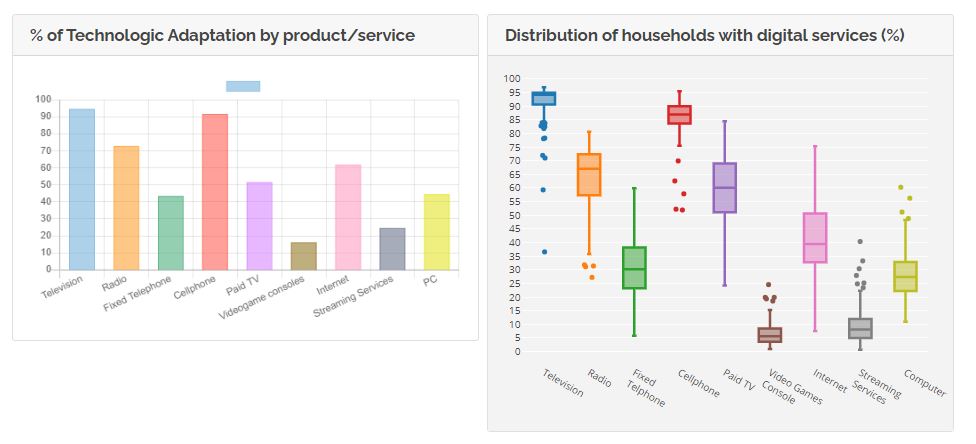
- You can compare each service nationwide on a boxplot, where you can realize which is the maximum and minimum access level for each service, what is the median and mean of each service and which of those are better distributed overall.
-
State approach
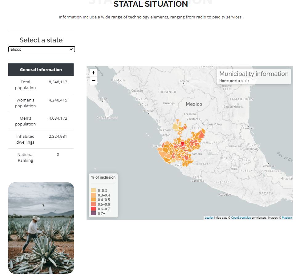
- On the left side of the page, you will see a dropdown list with the 32 states of Mexico and a small table containing data about population and the same national ranking from the National overview. This will update automatically each time you select another state (and also you will see a really beautiful image from a very representative place on the state!).
- Right on the middle, you will see a very similar map like in the national view, with a big difference: you can now see each state divided by municipalities. Let's imagine you already provide any service in Mexico City but you want to increase your presence and you don't know exactly where. This map will tell you right on the spot which municipalities have more or less access to the services overall.
- After you see a municpiality, maybe you're interested in looking only at the Internet service or the streaming service, don't worry! On the bottom you will see two graphs that will help you have a better look on that business opportunity you might be missing
-
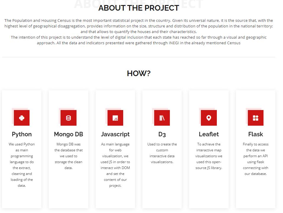
Web Application (Front-End)
- HTML/CSS
- JavaScript
- Leaflet.js
- Plotly.js
- D3.js
-
Database
- MongoDB Atlas (Cloud-based database)
-
Back-end
- Flask
-
Programming language
- Python
Landing page
National overview
State overview
State graphs
About
The final web application is deployed and ready to use on this Heroku Link
All the data used can be found on the Official INEGI website
