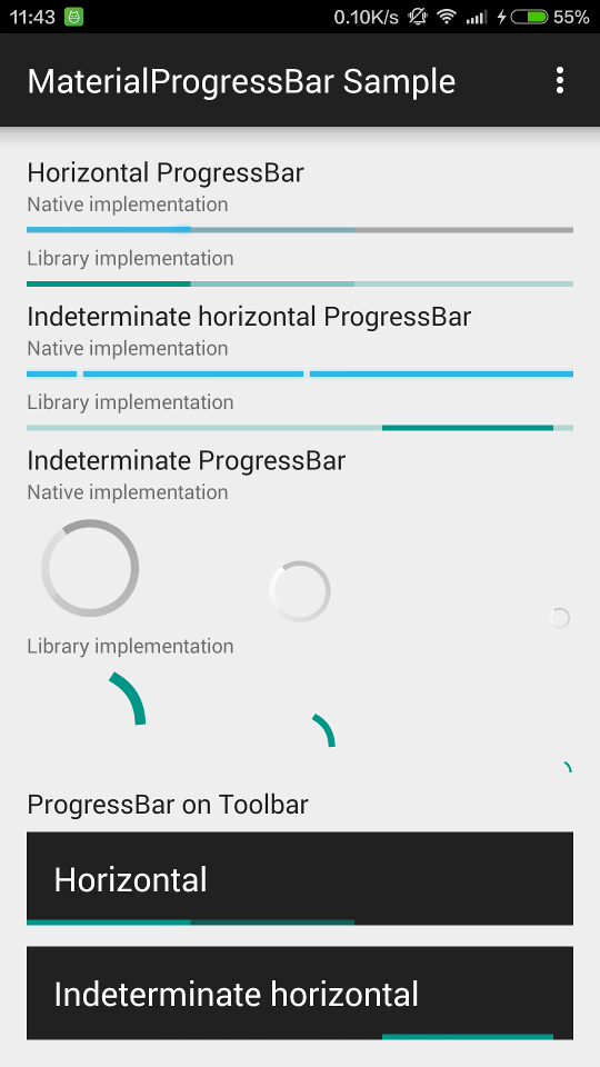
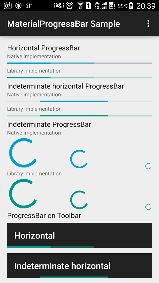
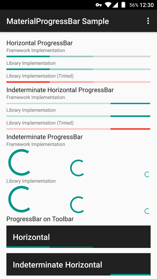
Material Design ProgressBar with consistent appearance on Android 4.0+.
- Consistent appearance on Android 4.0+.
- Correct tinting across platforms.
- Able to remove the intrinsic padding of framework
ProgressBar. - Able to hide the progress background of framework horizontal
ProgressBar. - Able to show a determinate circular progress.
- Used as a drop-in replacement for framework
ProgressBar.
Android 4.4.4
Samsung Android 5.0.1 (native implementation fails to tint)
Android 6.0.1
Gradle:
implementation 'me.zhanghai.android.materialprogressbar:library:1.6.1'You can either simply use the MaterialProgressBar widget, or set drawables from this library on a regular ProgressBar.
Simply replace your ProgressBar with MaterialProgressBar, and remember to apply corresponding style and attribute for correct behavior.
For example, to create an indeterminate horizontal MaterialProgressBar:
<me.zhanghai.android.materialprogressbar.MaterialProgressBar
    android:layout_width="wrap_content"
    android:layout_height="wrap_content"
    android:indeterminate="true"
    app:mpb_progressStyle="horizontal"
    style="@style/Widget.MaterialProgressBar.ProgressBar.Horizontal" />
In order to make your ProgressBar take the correct and consistent size on all versions, you will always need to use one of the styles from this library. The trick inside it is android:minWidth, android:maxWidth (and height) that controls the drawable size.
Widget.MaterialProgressBar.ProgressBarWidget.MaterialProgressBar.ProgressBar.Horizontal- And more size and no-padding variants in styles.xml
Available custom attributes:
app:mpb_progressStyle: Style of progress drawable:circularorhorizontal. Defaults tocircular.app:mpb_setBothDrawables: Whether both determinate and indeterminate drawables should be set on this progress bar. Defaults tofalse(for performance). Should be set totrueif you want to use both of the backported determinate and indeterminate drawables.app:mpb_useIntrinsicPadding: Whether progress drawable should use its intrinsic padding. Defaults totrue.app:mpb_showProgressBackground: Whether progress drawable should show a progress background. Defaults totruefor horizontal progress drawable,falseotherwise.app:mpb_determinateCircularProgressStyle: Style of determinate circular progress drawable: normal or dynamic. Defaults tonormal.
8 tint-related attributes such as app:mpb_progressTint and app:mpb_progressTintMode are also supported so that they can control the tinting of progress drawables. The default tint color is ?colorControlActivated, and the default tint mode is src_in.
For a detailed example, you can refer to the sample app's layout, where you can find examples such as removing progress padding or background.
Three Material Design drawables are backported to Android 4.0 (API 14), so you can create one and set it directly on your ProgressBar.
HorizontalProgressDrawableIndeterminateHorizontalProgressDrawableCircularProgressDrawableIndeterminateCircularProgressDrawable
For example, to set a IndeterminateHorizontalProgressDrawable on a ProgressBar.
progressBar.setIndeterminateDrawable(new IndeterminateHorizontalProgressDrawable(this));You will also need to set a style from this library as in the section above.
For example, to define an indeterminate horizontal ProgressBar.
<ProgressBar
            android:id="@+id/indeterminate_horizontal_progress"
            android:layout_width="match_parent"
            android:layout_height="wrap_content"
            android:indeterminate="true"
            style="@style/Widget.MaterialProgressBar.ProgressBar.Horizontal" />
Don't forget to create and set the drawable as above.
You can also customize the behavior of these drawables by calling setShowBackground() and setUseIntrinsicPadding(). Tint-related methods setTint(), setTintList() and setTintMode() are also backported so that you can use them directly, but remember to take these drawables as their actual type or TintableDrawable because VM won't be able to find these methods on Drawable for legacy platforms.
If you want to support API level < 18, you'll need to workaround a canvas limitation as in here; Using MaterialProgressBar does this automatically.
For a detailed example, you can refer to the onCreate() method of the old sample's MainActivity and its layout main_activity.xml.
The AAR of this library has already included a ProGuard configuration file to make ObjectAnimator work properly.
Neither Support v4 nor AppCompat v7 backported animation API to versions prior to ICS, and the NineOldAndroids library has already been deprecated since people should all be using minSdkVersion="14" now, so versions older than ICS are not supported.
Copyright 2015 Hai Zhang

Licensed under the Apache License, Version 2.0 (the "License");
you may not use this file except in compliance with the License.
You may obtain a copy of the License at

   http://www.apache.org/licenses/LICENSE-2.0

Unless required by applicable law or agreed to in writing, software
distributed under the License is distributed on an "AS IS" BASIS,
WITHOUT WARRANTIES OR CONDITIONS OF ANY KIND, either express or implied.
See the License for the specific language governing permissions and
limitations under the License.


