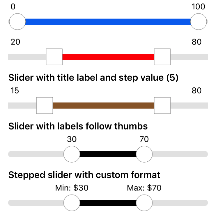
A custom range slider in Swift. Well-documented with examples. Forked from RangeSlider with some enhancements.
- iOS: 8.0+
- Xcode 10.0+
- Swift 4.2+
CocoaPods 1.1.0+ is required to build NHRangeSlider.
platform :ios, '10.0'
use_frameworks!

target '<Your Target Name>' do
    pod 'NHRangeSlider', :git => 'https://github.com/Kent-Liu/NHRangeSlider'
end
Then, run the:
$ pod installYou can just copy the 2 source files (NHRangeSlider and NHRangeSliderView) under NHRangeSlider/NHRangeSlider folder into your project.
By default, the title label is not shown and the left and right thumbs will be circles (curvaceousness set to 1). You can add the view in code or via story board:
 override func viewDidLoad() {
    super.viewDidLoad()

    // default slider. Configure the frame
    let sliderView = NHRangeSliderView(frame: CGRect(x: 16, y: 20, width: self.view.bounds.width - 32, height: 80) )
    // call size to fit to resize the height to fit exactly
    sliderView.sizeToFit()
    self.view.addSubview(sliderView)

}let sliderSquareView = NHRangeSliderView(frame: ...)
// set to 0 for square
sliderSquareView.curvaceousness = 0.0
sliderSquareView.trackHighlightTintColor = UIColor.red
sliderSquareView.lowerValue = 20.0
sliderSquareView.upperValue = 80.0
sliderSquareView.sizeToFit()
self.view.addSubview(sliderSquareView)let sliderSquareWithLabelView = NHRangeSliderView(frame: ...)
sliderSquareWithLabelView.curvaceousness = 0.0
sliderSquareWithLabelView.trackHighlightTintColor = UIColor.brown
sliderSquareWithLabelView.lowerValue = 20.0
sliderSquareWithLabelView.upperValue = 80.0
// set title text
sliderSquareWithLabelView.titleLabel?.text = "Slider with title label"
sliderSquareWithLabelView.sizeToFit()
self.view.addSubview(sliderSquareWithLabelView)let sliderWithLabelFollowView = NHRangeSliderView(frame: ...)
sliderWithLabelFollowView.trackHighlightTintColor = UIColor.black
sliderWithLabelFollowView.lowerValue = 30.0
sliderWithLabelFollowView.upperValue = 70.0
sliderWithLabelFollowView.gapBetweenThumbs = 5
// set style to follow
sliderWithLabelFollowView.thumbLabelStyle = .FOLLOW
sliderWithLabelFollowView.titleLabel?.text = "Slider with labels follow thumbs"
sliderWithLabelFollowView.sizeToFit()
self.view.addSubview(sliderWithLabelFollowView)let sliderCustomStringView = NHRangeSliderView(frame: ...)
sliderCustomStringView.trackHighlightTintColor = UIColor.black
sliderCustomStringView.lowerValue = 30.0
sliderCustomStringView.upperValue = 70.0
sliderCustomStringView.stepValue = 10
sliderCustomStringView.gapBetweenThumbs = 10
sliderCustomStringView.thumbLabelStyle = .FOLLOW
sliderCustomStringView.titleLabel?.text = "Stepped slider with custom format"
sliderCustomStringView.lowerDisplayStringFormat = "Min: $%.0f"
sliderCustomStringView.upperDisplayStringFormat = "Max: $%.0f"
sliderCustomStringView.sizeToFit()
self.view.addSubview(sliderCustomStringView)Handle stepped values. The slider will snap to discrete points (after dragging stopped) along the slider based on the stepped value.
sliderSquareWithLabelView.stepValue = 5.0The range slider view (NHRangeSliderView) can be customized and information can be accessed through these properties :
titleLabel: label for title (optional)lowerLabel: label for lower thumbupperLabel: label for upper thumbminimumValue: The minimum possible value of the rangemaximumValue: The maximum possible value of the rangelowerValue: The value corresponding to the left thumb current positionupperValue: The value corresponding to the right thumb current positionstepValue: If set, will snap to discrete step points along the slider . Default to nil.trackTintColor: The track colortrackHighlightTintColor: The color of the section of the track located between the two thumbsthumbTintColor: The thumb colorthumbBorderColor: The thumb border colorthumbBorderWidth: The width of the thumb bordercurvaceousness: From 0.0 for square thumbs to 1.0 for circle thumbslowerDisplayStringFormat: display format for lower thumb value. Default to%.0fto display value as Int. Change this if you need to display decimal places or want a different label.upperDisplayStringFormat: display format for upper thumb value. Default to%.0fto display value as Int. Change this if you need to display decimal places or want a different label.spacing: vertical spacing between the labels and thumbsthumbLabelStyle: position of thumb labels. Set to STICKY to stick to left and right positions. Set to FOLLOW to follow left and right thumbsgapBetweenThumbs: minimum distance between thumbs
To listen for value changes event, you can set the delegate (NHRangeSliderViewDelegate): sliderValueChanged(slider:)


