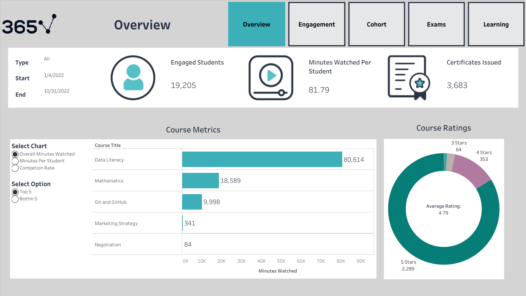
Analyzing own data of an online learning platform to understand how students learn and engage on the platform. Create some dashboards in Tableau including KPIs.
- Give a student the best learning experience. It would happen if we had complete control of the entire user journey
- Learn how students interact with products
we live in a competitive environment with an abundance of choices if a customer is unsatisfied with a product and doesn’t find it straightforward. It could be easy to find an alternative solution. Customers who engage with a product to a greater extent are more likely to stay loyal for a more extended period, especially regarding subscription services.
Terminology
- Engagement: Begining one of the following activities a lecture from a course, quiz, or exam
- Onboarding: First-time Engagement
- Student Type: Free Plan Student or Paying Student
Key Questions
- How engaged are the students inside the platform, and how can this metric be improved?
- How long do students stay engaged on the platform, and how can this period be extended?
- What’s the difference between free and paid students?
- Which are the most popular courses on the platform?
- How many students sit for an exam?
- Is Engagement changing with time?
- Marketing campaign effects?
- Onboard students / Registered students? Refers to students who found the platform intuitive
- Average minutes watched by students? And the difference between free and paid students?
- What is the free-to-paid conversion rate? Based on the minutes watched
- Most watched and enjoyed the course on the platform: • Total minutes watched • Average minutes watched • Completion rate
Display overall engagement with the product including:
- Three Key Performance Indicators (KPIs):
- Number of engaged students
- Minutes watched per student
- Number of certificates issued
with filters include the status of the student and specify which date to see the KPIs
- Horizontal Chart: Each bar corresponds to a course and represents the following metrics
- Overall Minutes Watched: Filter to show the top five courses based on minutes watched. Filter to show the bottom five courses based on minutes watched.
- Minutes Watched per Student: Filter to show the top five courses based on minutes watched per student. Filter to show the bottom five courses based on minutes watched per student.
- Completion Rate: Filter to show the top five courses based on completion rate. Filter to show the bottom five courses based on completion rate.
- Donut Chart: A center represents the average rating of a platform
- Top Part - Line Chart: Number of Engaged Students vs. Time
- Filter Options: Users can filter between Free Plan and Paying Plan. Allow users to select a custom time period.
- Line Chart: X-axis represents time (date or time period). Y-axis represents the number of engaged students.
- Bottom Part - Line Chart: Percentage of Onboarded Students vs. Date of Registration
- Filter Options: Users can choose the period themselves. Users can select a custom time period.
- Line Chart: X-axis represents the date of registration. Y-axis represents the percentage of onboarded students.
Create three navigate buttons that show different Views:
First View:
User-Selected Period: Users can choose the start and end dates for the period they are interested in.
Second View:
Monthly Split - User Chooses a Month: Users select a specific month, and the line chart adjusts to show data for that month.
Third View:
Monthly Bar Chart: Data is aggregated on a monthly basis.


