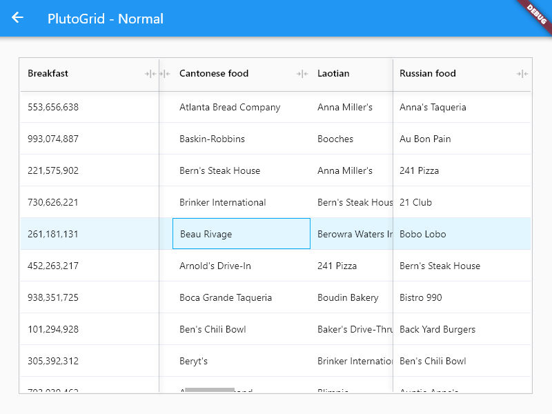
PlutoGrid is a dataGrid that can be controlled by the keyboard on desktop and web.
Of course, it works well on Android and IOS.
You can try out various functions and usage methods right away.
All features provide example code.
Check out how to install from the official distribution site.
The documentation has more details.
Report any questions or errors.
- Columns
- Dragging the column heading moves the column left and right.
- Drag the icon to the right of the column heading to adjust the width of the column.
- Click the icon to the right of the column title to fix the column left or right or automatically adjust the width of the column.
- Ascending or Descending the list by clicking on a column heading.
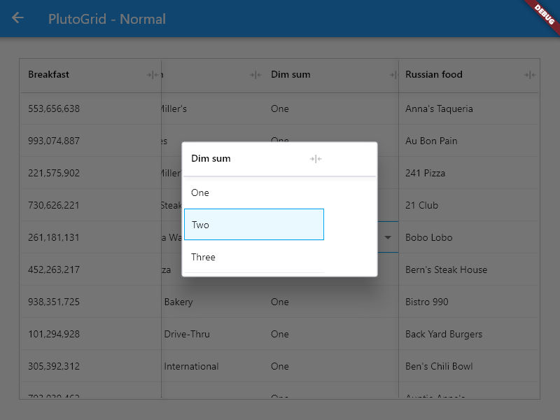
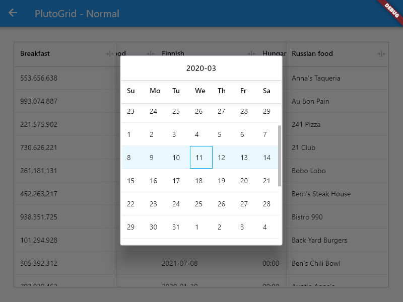
- Text, number, date, time, select list type column.
- (To do) Filtering.
- (To do) Multi sorting.
- (To do) Hide specific columns.
- Selection
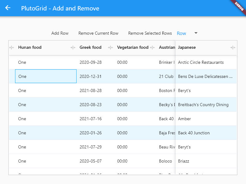
- Row mode - Select rows.
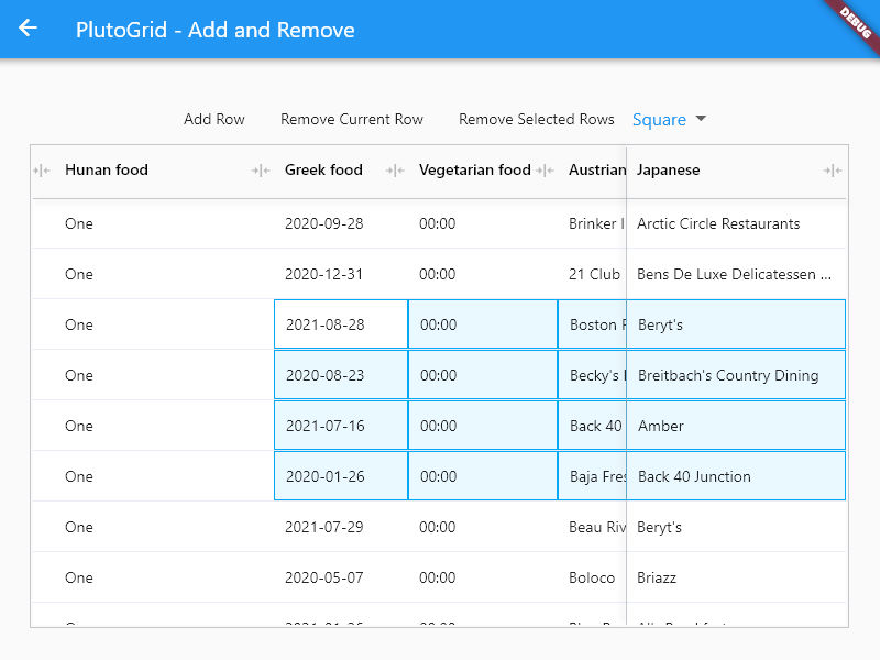
- Square mode - Select a square area like Excel.
- None mode - Not selectable.
- (Row mode) - Select Row by Control(Meta on MacOs) + Click.
- (Row, Square mode) - (Shift + arrow keys) or (shift + click) or (long tapping and move) to select.
- Select all rows or cells. Control(Meta on MacOs) + A.
- Copy and Paste
- Control(Meta on MacOs) + C or V
- If there is no selected cell, it operates based on the current cell.
- If there are selected Rows in Row mode, it operates based on the selected state.
- Works even if rows get selected irregularly in Row mode.
- Moving
- Move with arrow keys.
- Press Enter to edit the cell or move it down.
- Tab key to move left and right cells.
- Shift + (Enter, Tap) works in the opposite direction.
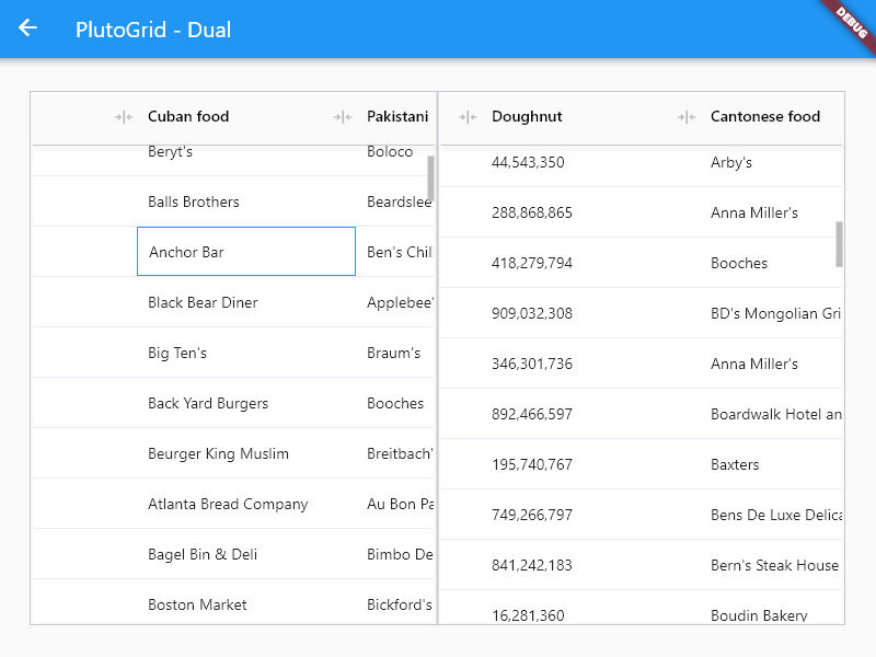
- Dual Mode
- Working with different grids on both sides.
- At the end of the grid, you can move between grids with the left and right arrow keys, or the tab key.
- Configuration
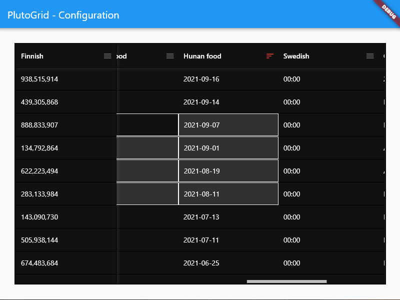
- Various properties can be changed.
- A dark mode.
- UI for Mobile
- (To do) - UI for convenient use on mobile.
- Internationalization
- (To do) - Support a lot of languages.
Generate the data to be used in the grid.
List<PlutoColumn> columns = [
  /// Text Column definition
  PlutoColumn(
    title: 'text column',
    field: 'text_field',
    type: PlutoColumnType.text(),
  ),
  /// Number Column definition
  PlutoColumn(
    title: 'number column',
    field: 'number_field',
    type: PlutoColumnType.number(),
  ),
  /// Select Column definition
  PlutoColumn(
    title: 'select column',
    field: 'select_field',
    type: PlutoColumnType.select(['item1', 'item2', 'item3']),
  ),
  /// Datetime Column definition
  PlutoColumn(
    title: 'date column',
    field: 'date_field',
    type: PlutoColumnType.date(),
  ),
  /// Time Column definition
  PlutoColumn(
    title: 'time column',
    field: 'time_field',
    type: PlutoColumnType.time(),
  ),
];

List<PlutoRow> rows = [
  PlutoRow(
    cells: {
      'text_field': PlutoCell(value: 'Text cell value1'),
      'number_field': PlutoCell(value: 2020),
      'select_field': PlutoCell(value: 'item1'),
      'date_field': PlutoCell(value: '2020-08-06'),
      'time_field': PlutoCell(value: '12:30'),
    },
  ),
  PlutoRow(
    cells: {
      'text_field': PlutoCell(value: 'Text cell value2'),
      'number_field': PlutoCell(value: 2021),
      'select_field': PlutoCell(value: 'item2'),
      'date_field': PlutoCell(value: '2020-08-07'),
      'time_field': PlutoCell(value: '18:45'),
    },
  ),
  PlutoRow(
    cells: {
      'text_field': PlutoCell(value: 'Text cell value3'),
      'number_field': PlutoCell(value: 2022),
      'select_field': PlutoCell(value: 'item3'),
      'date_field': PlutoCell(value: '2020-08-08'),
      'time_field': PlutoCell(value: '23:59'),
    },
  ),
];
Create a grid with the data created above.
  @override
  Widget build(BuildContext context) {
    return Scaffold(
      appBar: AppBar(
        title: const Text('PlutoGrid Demo'),
      ),
      body: Container(
        padding: const EdgeInsets.all(30),
        child: PlutoGrid(
          columns: columns,
          rows: rows,
          onChanged: (PlutoOnChangedEvent event) {
            print(event);
          },
          onLoaded: (PlutoOnLoadedEvent event) {
            print(event);
          }
        ),
      ),
    );
}develop packages that make it easy to develop admin pages or CMS with Flutter.
MIT
