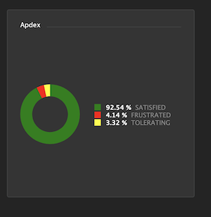
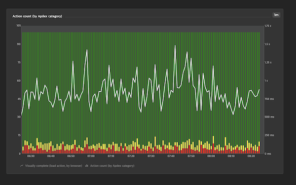
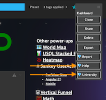
This extension powers-up Dynatrace dashboards to enable cool new experimental features live, such as:
- Color changing tiles based on thresholds
- Color changing icons based on thresholds
- Generating reports
- USQL values on world maps
Please note: this is a community developed demonstration application. It is provided without any representations, warranties, or support from Dynatrace. If you have questions about this app, please post on our forum or create an issue on Github
- Install
- Configure
- Reports
- Powerup List:
- Disclaimer
- Tooltips
- Colorize
- Icons
- Worldmaps
- Banner
- Line chart threshold
- USQL stacked bar chart
- USQL colors
- Heatmap
- Sankey
- Vertical funnel
- Math
- Date
- Gauge
- Compare
- VLookup
- Stdev
- 100stack
- Table
- mCompare
- Image
- Background
- Funnelcolors
- Forecast
- Grid
- TileCSS
- Menu
- Topcolor
- Honeycomb
- Autohide
- Treemap
- TimeOnPage
- Cumulative
- Ellipsis
- Marquee
- RageClick
- Graph
- Install the extension from the Chrome Store
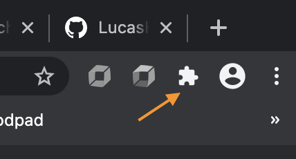
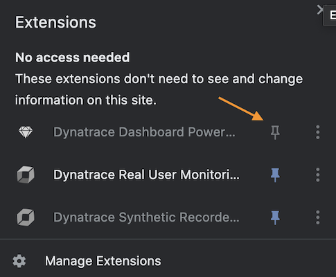
- Click the puzzle icon and pin PowerUps
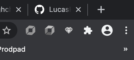
- The icon will change from gray to blue when active (and purple when the extension has updated)
- When a new update is released via Chrome Web Store it will automatically be updated. Google can take several days to approve an update to an Extension. If you wish to run the very latest version, change Library Location to GitHub in the Extension preferences.
- Click blue (or purple) powerup icon
- Modify preferences
- Click save. Note: you may need to refresh your page for changes to take effect.
To add PowerUps to your existing dashboards, you may add markup text in your dashboard tile titles. Alternatively, you may deploy dashboard packs with PowerUps already included via the BizOpsConfigurator.
As of 1.53, PowerUps now includes a Report Generator. For details, see: Reports.
If you manually add markup, it is best practice to add a Powerup disclaimer tile so that users who do not yet have the Extension, will be directed to install it. To add the disclaimer, add the following to your dashboard JSON:
{
    "name": "Markdown",
    "tileType": "MARKDOWN",
    "configured": true,
    "bounds": {
        "top": 0,
        "left": 0,
        "width": 1254,
        "height": 76
    },
    "tileFilter": {},
    "markdown": "##\uD83D\uDC8E Powerup Enabled Dashboard \uD83D\uDC8E\n\n##  [Install Chrome Extension](https://chrome.google.com/webstore/detail/dynatrace-dashboard-power/dmpgdhbpdodhddciokonbahhbpaalmco)"
}
If you deploy dashboard packs from the BizOpsConfigurator, this tile is already added for you. Once the Extension loads this tile is hidden.
Nothing required, just enable the extension as per above and refresh your browser on a dashboard.
✔️ Deprecated Tooltips are now available in-product with Explorer tiles.
For Single Value Tiles, either custom chart or USQL, you can add color coding by adding markup to the title:
!PU(color):base=high;warn=90;crit=80. Note: also see USQL colors PowerUp for simply changing colors for USQL and Explorer tiles.
✔️ Deprecated Please use Data Explorer.
For markdown and header tiles, use !PU(color):color=blue style syntax.
Explanation:
!PU(color):this starts the markupbase=highthis is the base case for your metric, ie is it good to beloworhigh?warn=90this is the warning threshold, once breached color coding will be yellowcrit=80this is the critical threshold, once breached color coding will be rednan=orange(optional) change color if no data is found or null So in the example of availability, high is better. Greater than 90 would be green, 90 to 80 yellow, and 80 or less red.
Alternative: Absolute value comparison
base=abs,1warn=0.05crit=0.1This example would result in red: <= .9 or >= 1.1, yellow: <=.95 or >= 1.05, green otherwise.
This powerup renders icons in place of Markdown tiles. These icons change color to give a quick visual indication of environment / business health. For example, if payment processing was beyond a threshold hold, you might have a creditcard icon turn red. Here's how that might look:
[Extension Needed](https://github.com/LucasHocker/DynatraceDashboardPowerUps)
!PU(svg):icon=creditcard;link=val3;base=high;warn=90;crit=85
Explanation:
- Link to extension: this lets users without the extension know to download it
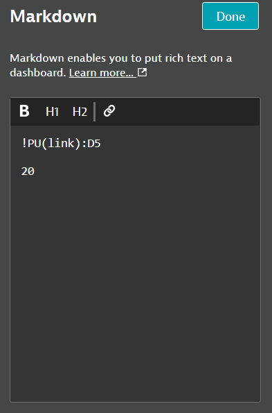
!PU(svg):this starts the markupicon=this refers to an SVG file in the 3rdParty/node_modules/@dynatrace/barista-icons folder. (Optional) you can use a comma-seperated list of 3 icons if you want the icon shape to change based on the value, e.g.icon=smiley-happy-1,smiley-ok-2,smiley-unhappy-2link=this is used to link to a Single Value Tile to get the comparison valuebase=this is the base case for your metric, ie is it good to be low or high?warn=this is the warning threshold, once breached color coding will be yellowcrit=this is the critical threshold, once breached color coding will be redtooltip=tooltip text for the icon. Use underscores in place of spaces, they'll be swapped for spaces.url=(optional) if you want the icon to be clickable, give it a url. REQUIRED: use this as last argument. Just be sure to include the!PU(link):with a matching string in the desired Single Value Tile
This powerup reloads the data in world maps with that from a USQL table. This allows you to map arbitrary things like revenue. It also enables click or scrollwheel to zoom. Click in an ocean to reset zoom. Add markup to your USQL table's title like this:
Revenue !PU(map):color=green;link=Apdex
Explanation:
- Revenue: title for your USQL table and Worldmap
!PU(map):indicates this is a map powerupcolor=what color scale to use, e.g. "green" or "#E9422F"link=refers to the standard metric picked for the chart in the OOTB tile configuration. This allows you to have multiple worldmaps driven by multiple USQL tables
If you have multiple environment with dashboards up on screens and need an easy way of telling which is say Production and which one is say QA, you can color code the top of the dashboard. Use a dashboard tag markdown tile like this:
!PU(banner):color=purple
⚠️ DEPRECATION NOTICE: Using dashboard tags for the Banner PowerUp is deprecated and replaced by Markdown tiles. Please update your dashboards as of 1.49. Targeting 1.51 for removal.
Explanation:
!PU(banner):indicates a banner powerupcolor=what color background to make the banner, e.g. "purple" or "#B6E5F8"
If you would like a chart that shows as one color above a threshold but a different color below, this powerup enables that. Add markup to to the chart title like so:
!PU(line):thld=4000;hcol=green;lcol=red
✔️ Deprecated Please use Data Explorer.
Explanation:
!PU(line):indicates this linechart should have a thresholdthld=4000;the threshold (Note: does not currently support units)hcol=green;the color above the thresholdlcol=redthe color below
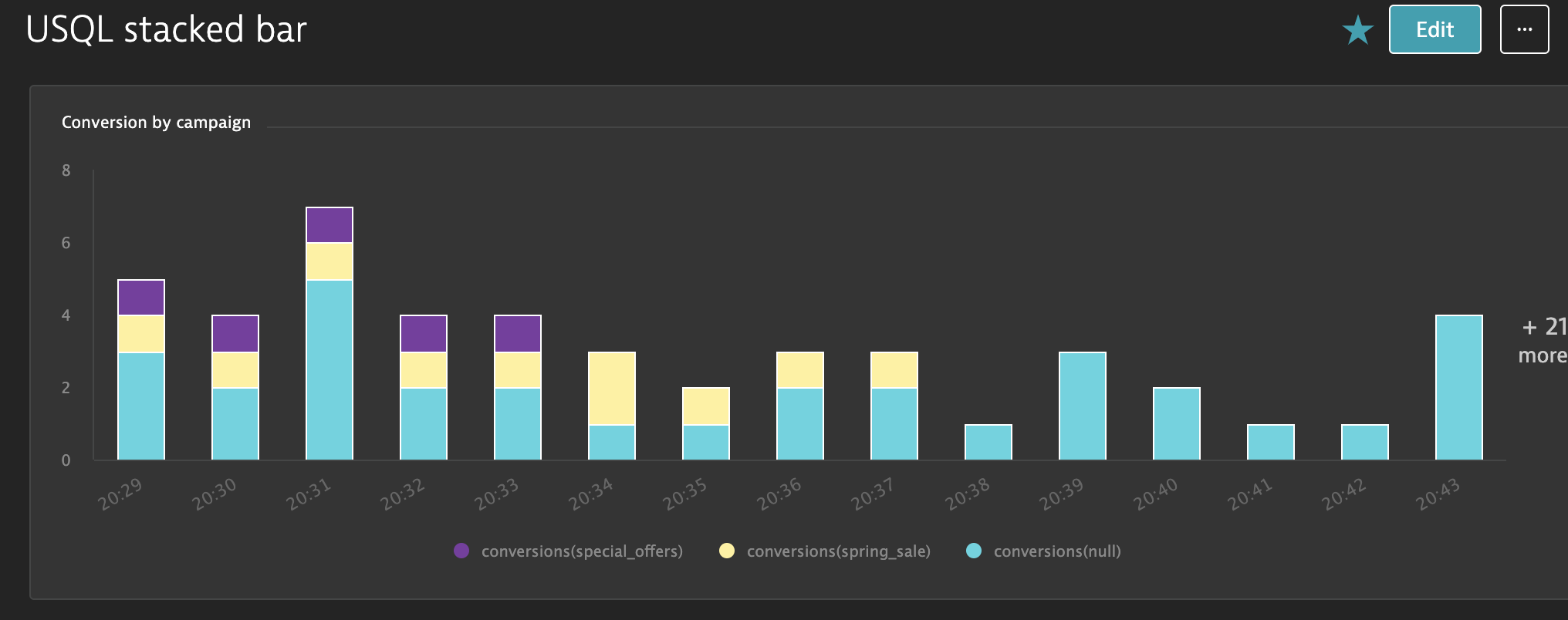
This powerup switches to a stacked bar chart for a USQL result instead of stacked xaxis labels. Change the title like this:
!PU(usqlstack):colors=green,blue,#aabbcc
Explanation:
!PU(usqlstack):- indicates the powerupvals=- (optional) align colors to specific valuescolors=green,blue,#aabbcc- assigns colors to each seriesdataLabels=true- (optional) display data label on each segment, defaults to no
This powerup switches the color palette for a USQL or Explorer chart. Change the title like this:
!PU(usqlcolor):vals=satisfied,tolerating,frustrated;colors=green,yellow,red
Explanation:
!PU(usqlcolor):- indicates the powerupvals=- (optional) align colors to specific valuescolors=green,blue,#aabbcc- assigns colors to each seriesdataLabels=true- (optional) display data label on each segment, defaults to no
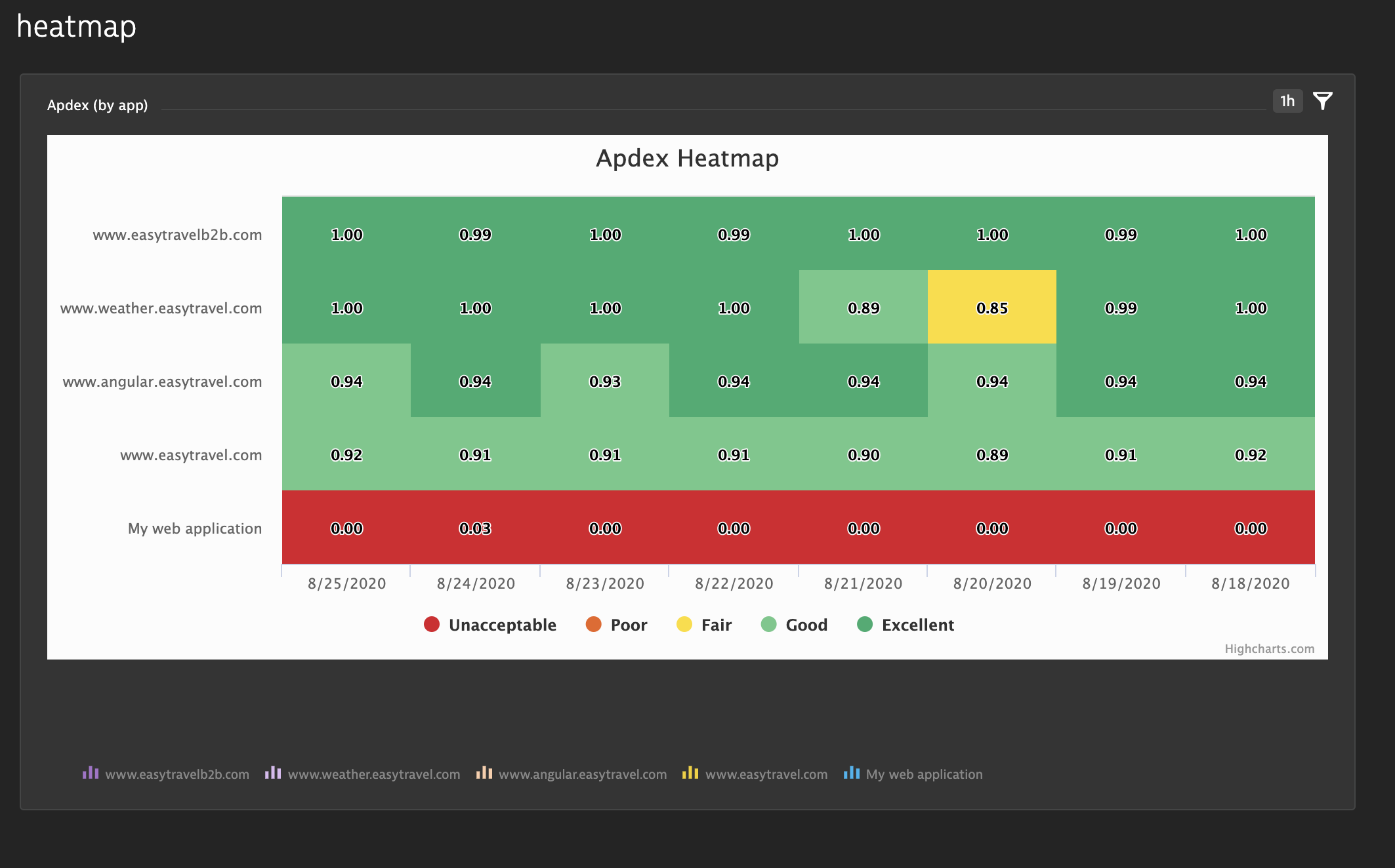
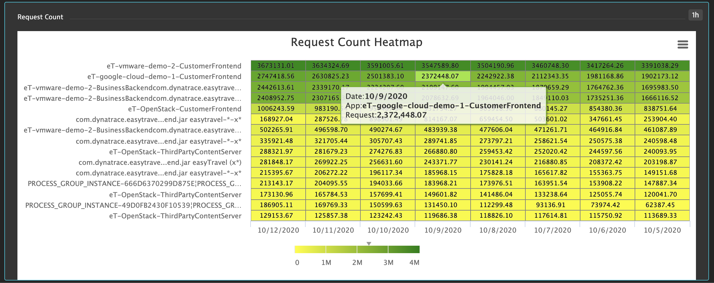
Currently this powerup can display a heatmap based on a bar chart. Eventually, it will be more generic.
✔️ Deprecated Please use Data Explorer.
Apdex !PU(heatmap):vals=.5,.7,.85,.94;names=Unacceptable,Poor,Fair,Good,Excellent;colors=#dc172a,#ef651f,#ffe11c,#6bcb8b,#2ab06f
Request Count !PU(heatmap):minColor=yellow;maxColor=green;txtColor=black;ms=3600000;fmt=HH:mm
Explanation:
!PU(heatmap):- denotes the heatmap powerup, anything prior to this is treated as the titletxtColor=- (optional) what color text to use for data labels, defaults to whitems=- (optional) number of milliseconds to bucket time by on x-axis, e.g.:-
86400000- 1 day (default)
-
3600000- 1 hour
fmt=- (optional) date format for x-axis, see date-fnsscale=- (optional) multiply values by this number, defaults to 1. Affects display andvals. e.g.:-
.000001- bytes into gb
Option 1 - Color classes:
vals=- thresholds, should be N-1 of themnames=- names for each area on the color axis, should be N of themcolors=- CSS colors, should be N of them
Option 2 - Color gradient:
min=&max=- (optional) min and max values for color axis, defaults to extreme values in the datasetminColor&maxColor- (optional) min and max colors, colors will be interpolated between these, defaults to white and blue
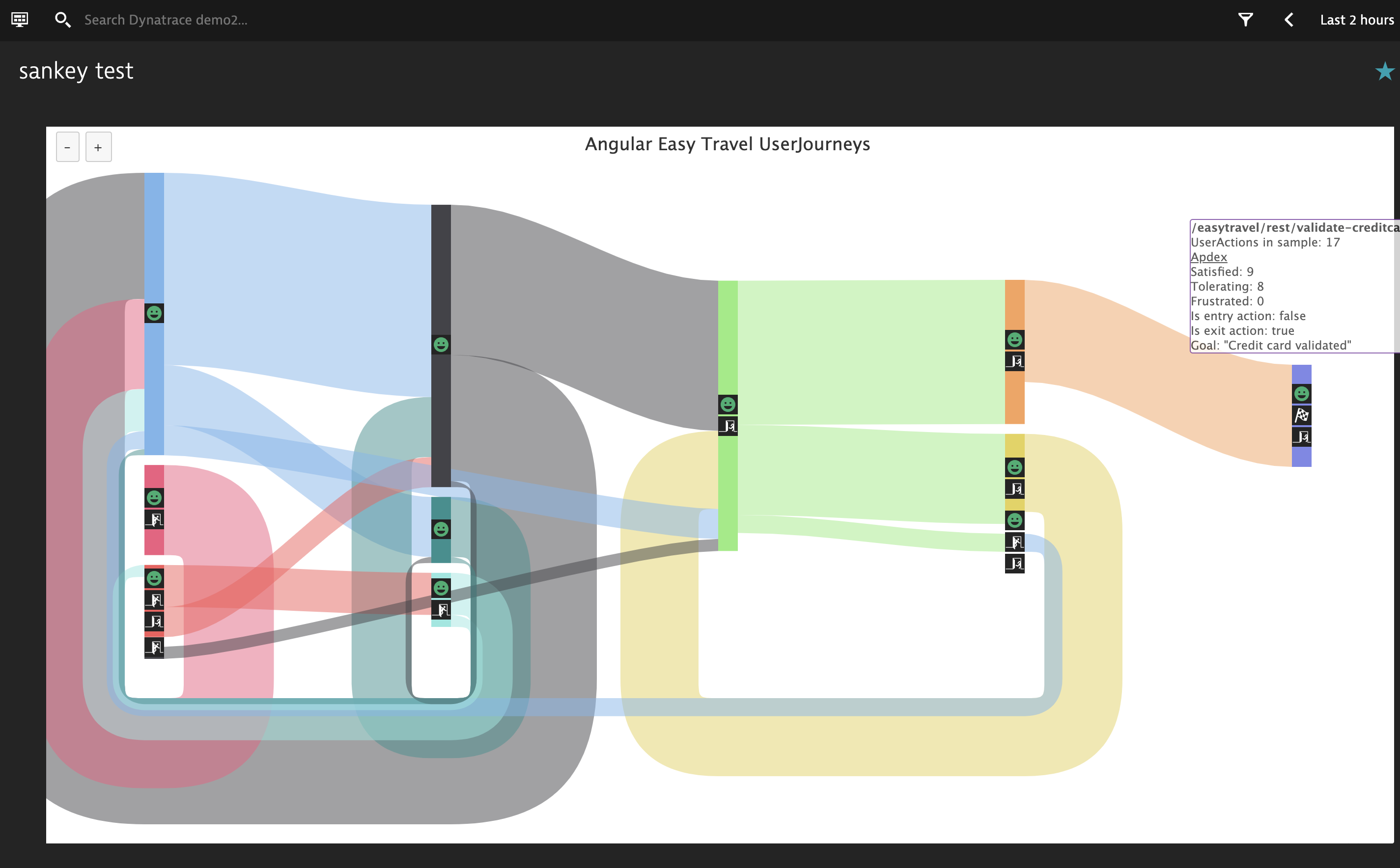
This powerup shows UserActions for your application, where they start, end, how many, do users circle in loops, etc. Create a USQL query, like this:
select useraction.*, usersession.* FROM usersession WHERE useraction.application="www.angular.easytravel.com"
encoded with a title like this:
Angular Easy Travel UserJourneys !PU(sankey):link=sankey1;kpi=revenue;kpicurr=EUR
and Markdown tile to get swapped out like this:
[Extension Needed](https://github.com/LucasHocker/DynatraceDashboardPowerUps)
!PU(link):sankey1
Explanation:
!PU(sankey):- denotes the powerup sourcelink=- points to markdown tile via the link powerupkpi=- (optional) the name of a User Action Property (double) to be displayed in the main tooltip, usually something likerevenue, notuseraction.double.revenue.kpicurr=- (optional) how to format the KPI if its a currency, e.g. USD, EUR, CNY. If omitted, will format with max 2 fractional digits
colors=apdex- (optional) set default color mode to apdex. As of 1.44 this is now the default.colors=false- rainbow colors, which makes it easier to see links.colors=errors- highlight actions with errors, yellow > 1 error, red > 10colors=crashes- highlight actions leading to a crash (mobile/custom only)
exclude=Search,recent- (optional) comma seperated list of case-sensitive strings to hide from useraction list. Note: where possible it is recommended to limit via the USQL where clause instead to provide more meaningful data.include=Search,recent- (optional) comma seperated list of case-sensitive strings to only include from useraction list, all others will be hidden. Note: where possible it is recommended to limit via the USQL where clause instead to provide more meaningful data.limit=20- (optional) default amount of action to action links to show in the chart, defaults to 20. Valid values are integers from 2 to 100.flink=- (optional) points to a markdown tile via the link powerup. After the!PU(link):something, on a seperate line include the JSON-encoded filter list in the markdown. You can get this by clicking the down arrow to the right of color mode.
Notes:
- To increase/decrease the amount of clutter, use the plus and minus buttons. These slice the data in the USQL query.
- To get even more data from the USQL query, edit the dashboard JSON and add to the USQL tile (default 50, max 5000, more can result in slower load):
"limit": 500 - Be sure to click on useraction "nodes" in the graph for additional details and drilldowns into user sessions
This powerup changes the Dynatrace horizontal funnel into a vertical funnel. To utilize encode your title like so:
Angular UserJourney !PU(funnel):mode=height;small=5;big=20;links=funnelinks
✔️ Deprecated due to low usage.
Explanation:
mode=height- which type of funnel visualization, options areheight,slope,barsmall=- minimum percentage to treat as a small positive or negative change, ie gray below this and light green/red abovebig=- minimum percentage to treat as a big positive or negative change, ie bold green/red above thislinks=- link to markdown tile with drilldown urls
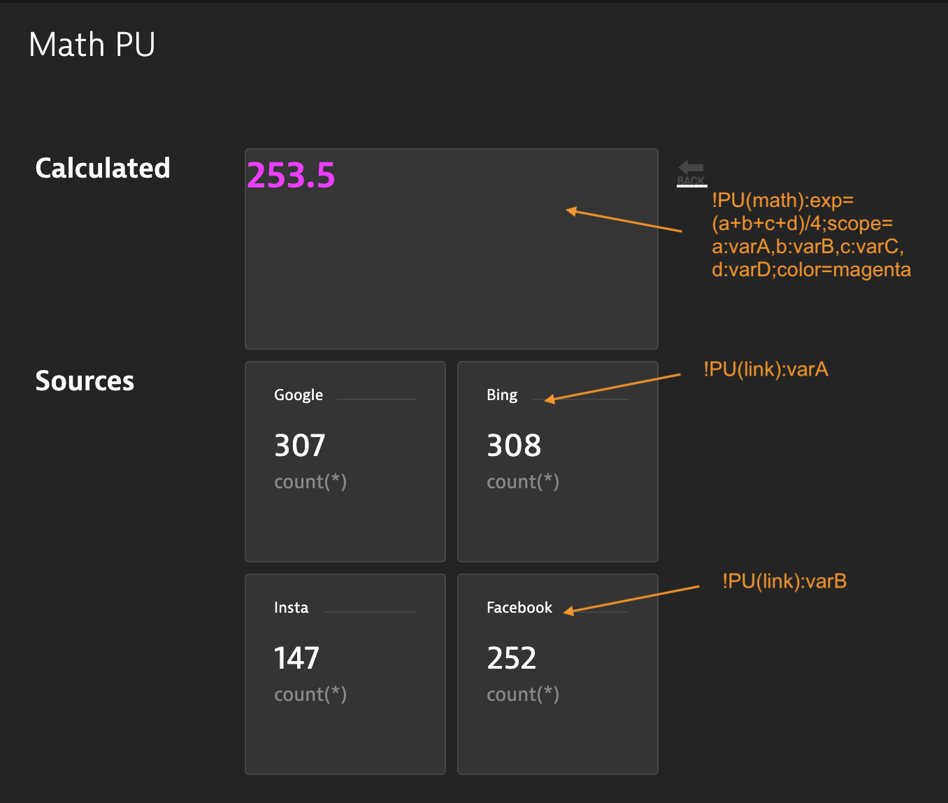
This powerup allows you to do complex math based on other values on the dashboard. See math-expression-evaluator for help with math expressions.
✔️ Targeted for Deprecation Please use Metric Expressions instead.
Syntax:
!PU(math):exp=(x1+x2+x3+x4)/4;scope=x1,x2,x3,x4:link4;color=blue
Explanation:
!PU(math):- denotes a math powerupexp=- a math expression Note: be sure to escape*by adding a backslash in front of itscope=- list of any variables used in your expression. Optionally, you may have seperate variable names from link name, e.g.x4:link4, otherwise assume var and link are the same string e.g.x1color=- (optional) a valid CSS color, defaults to whitesize=- (optional) a valid CSS font-size, defaults to 36pxbase=- (optional) if using thresholds, define whether the base (normal) isloworhighwarn=- (optional) if using thresholds, warning threshold, once breached color coding will be yellowcrit=- (optional) if using thresholds, critical threshold, once breached color coding will be reddates=true- (optional) use if special date math logic is neededtimeunit=- (optional) units if doing date math:sfor seconds,m,h,d. Defaults tomsfor milliseconds.full=false- (optional) by default take up the full tile. Optionally,falseto not hide other text in markdown tile. Must be false to support multiple math powerups in a single tile.currency=- (optional) display according to an ISO currency code, e.g.USD,EUR,CNY, etcprio=- (optional) if you need to ensure the order of which math operations are performed in which order, set to an integer. Higher happens first. Please note: all PU(vlookup) operations happen before all PU(math), but this allows you to reliably reference other math results.unit=- (optional) use unit aware calculations, ie look for a unit (e.g.kB/s) in linked tiles and convert to target unit (e.g.MB/s). See units for supported units and conversions.dig=- (optional) setmaximumFractionDigitsto number, defaults to 2.
Note:
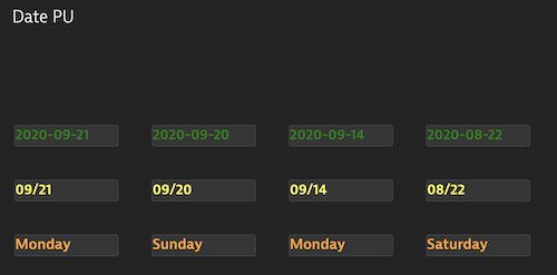
This powerup allows you to use Dynatrace date format strings and format in Markdown tiles. Now supports mixing multiple dates with text.
Syntax:
My Date: !PU(date):res=now-7d/d;fmt=YYYY-MM-DD;color=green - !PU(date):res=now-6d/d;fmt=YYYY-MM-DD;color=orange
Explanation:
!PU(date):- denotes the date powerupres=- resolve this date string, click on global time selector for help with syntax. Use$gtssfor the global time selector's start time and$gtsefor end time.fmt=- display format, see date-fnscolor=- a valid CSS color
res or fmt, instead use an underscore which will be replaced with a space at render time.
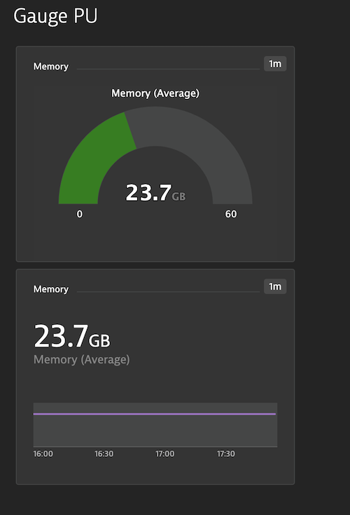
This powerup converts a Single Value Tile into a solid gauge. Works for SVT from custom chart, explorer, or USQL.
Syntax:
Memory !PU(gauge):stops=.5,.75,.9;colors=green,yellow,orange,red;min=0;max=100
Explanation:
!PU(gauge):- denotes the gauge powerupstops=- color stops as a percentage of the max, valid values rante 0 through 1colors=- colors for color stops. You should have an equal number of colors and stops.min=- left end of the gauge, defaults to 0max=- right end of the gauage, defaults to 100digits=2- digits after the decimal, defaults to 1size=- (optional) a valid CSS font-size, defaults to 20px
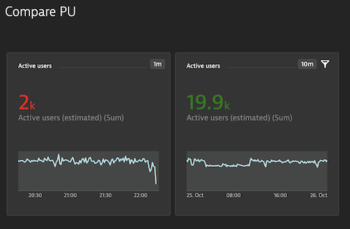
This powerup compares a Single Value Tile (SVT) to another SVT and applies coloring based on the comparison.
Syntax:
Active users !PU(compare):link=link2;lt=red;gt=green;eq=yellow !PU(link):link1
Explanation:
!PU(compare):- denotes the compare poweruplink=link2- references another SVT to compare againstlt=red- a color if this SVT is less than the othergt=green- a color if this SVT is greater than the othereq=yellow- a color if this SVT is equal to the other!PU(link):link1- this is a reference back from the other SVT which is also using !PU(compare)
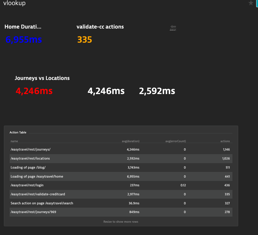
This powerup extracts a value from a USQL table, and optionally compares it to another table value.
Syntax:
!PU(vlookup):link=table;val=/easytravel/rest/journeys/;col=1;compareTable=table;compareVal=/easytravel/rest/locations;compareCol=1;lt=green;gt=red;eq=yellow
Explanation:
!PU(vlookup):- denotes this poweruplink=table- reference the table tile, ie put!PU(link):tablein the title of the USQL tileval=...- value to look for in the first column of the tablecol=1- column number (or name) of where to look up the value, ie 1 is 2nd column of the tablestring=true- (optional) skip various processing and just treat looked up value as a string
Options:
color=blue- what color to make the textrow=1- ignore val and instead lookup value by row number. Starting at 1 from top or -1 from bottom.notfound=0- if value isn't found, instead use this value. Defaults to blank. Consider setting to zero if math tiles depend on this tile.size=14px- optionally change size of text, defaults to 36px.unit=s- optionally convert the unit, for example, if the USQL table returns results inms,unit=swill convert to seconds. See units for supported units and conversions.dig=2- (optional) setmaximumFractionDigitsto number, defaults to 2.as=name- (optional) Search and replace within the tile. Swaps${name}with the vlookup-ed value and${name.enc}with a URI encoded vlookup-ed value.
Optional comparison:
compareTable=table- reference the table tile, ie put!PU(link):tablein the title of the USQL tilecompareVal=...- value to look for in the first column of the tablecompareCol=1- column number (or name) of where to look up the value, ie 1 is 2nd column of the tablelt=green- color to make the text, if the value is lower than the comparison valueeq=yellow- color to make the text, if the value is equal than the comparison valuegt=red- color to make the text, if the value is greater than the comparison value
Optional thresholds, mutually exclusive of comparison:
base=highthis is the base case for your metric, ie is it good to be low or high?warn=90this is the warning threshold, once breached color coding will be yellowcrit=80this is the critical threshold, once breached color coding will be red
"AS" example:
!PU(vlookup):link=table;row=1;col=0;as=name

name=${name}

[link text](https://dynatrace.com?name=${name.enc})
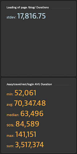
This powerup computes standard deviation (or other value) over a series. Apply to a USQL table.
Syntax:
!PU(stdev):color=orange;output=min,avg,median,90%,max,sum,stdev
Explanation:
!PU(stdev):- denotes this powerupoutput=min,avg,median,90%,max,sum,stdev- which function(s) to output, defaults to stdevcolor=orange- what color to make the text, defaults to white
This powerup switches stacked column charts to 100% stacked charts.
Syntax:
!PU(100stack):pad=0.1
Explanation
!PU(100stack):- denotes this poweruppad=0.1- (optional) override standard padding between points. Note: small padding can lead to uneven looking spacing due to pixel rounding from antialiasing -- use a larger graph to avoid.
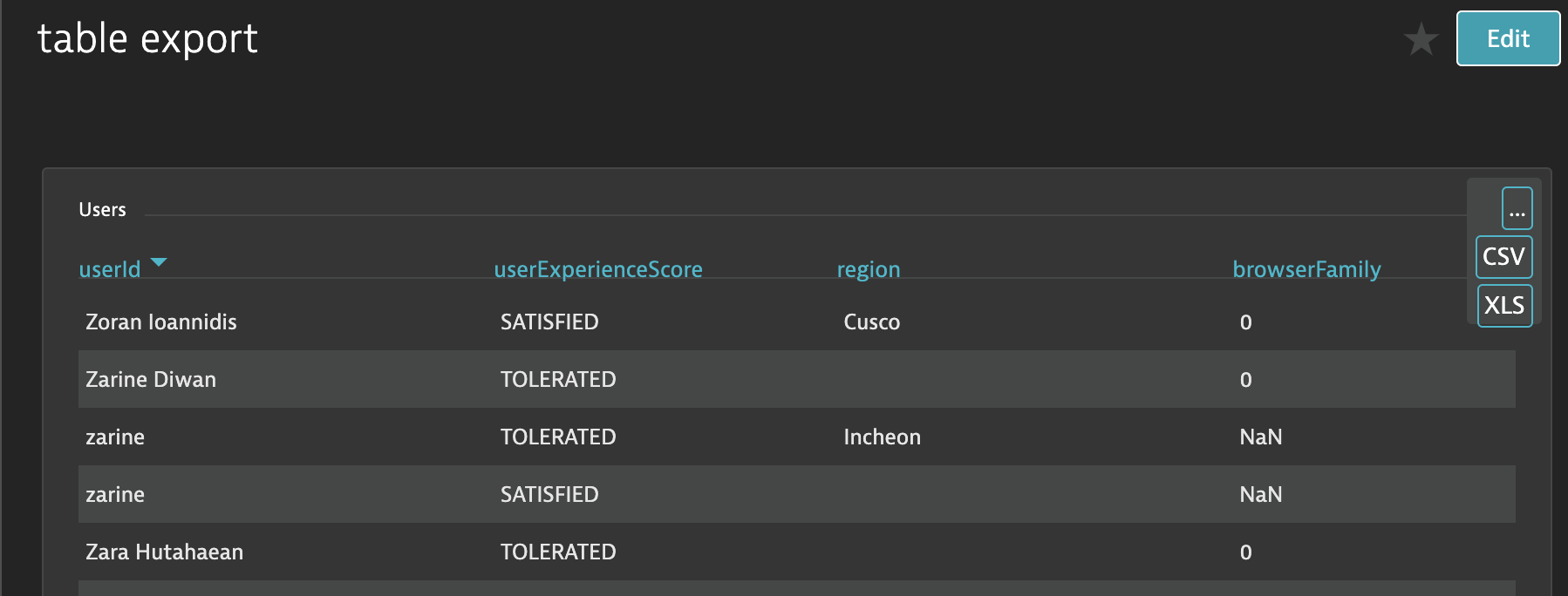
This powerup enables exporting USQL tables to CSV/XLS, sortable columns, and scrolling.
Syntax:
!PU(table):
Explanation:
!PU(table):- denotes this powerupcol=- (optional) default sort order, e.g. 1 sort by first column ascending, -5 sort by fifth column descendingscroll=false- (optional) do not add scrollbarsurl=/ui/user-sessions/${userSessionId}- (optional) add/replace link for 1st column. Use${columnName}syntax for value substitution. Note: must base last parameter in the powerup syntax.
This powerup changes the background of the dashdoard to an external image. This should be placed in an offscreen markdown tile. The tile will auto-hide when the extension runs.
✔️ Targetted for Deprecation Please use built-in image tiles, where possible.
Syntax:
!PU(background):url=https://myurl.com/myimage.png
Explanation:
!PU(background):- denotes this powerupurl=- url of the image to load
Note: you should limit usage to only trusted image sources and keep file size reasonable
This powerup adds an external image. This swaps a markdown tile with the image.
✔️ Deprecated Please use built-in image tiles.
Syntax:
!PU(background):url=https://myurl.com/myimage.png out=https://www.dynatrace.com
Explanation
!PU(background):- denotes this powerupurl=- url of the image to loadout=- (optional) makes image a clickable link. Where should the link go. Also note the space delimiter.
Note: you should limit usage to only trusted image sources and keep file size reasonable
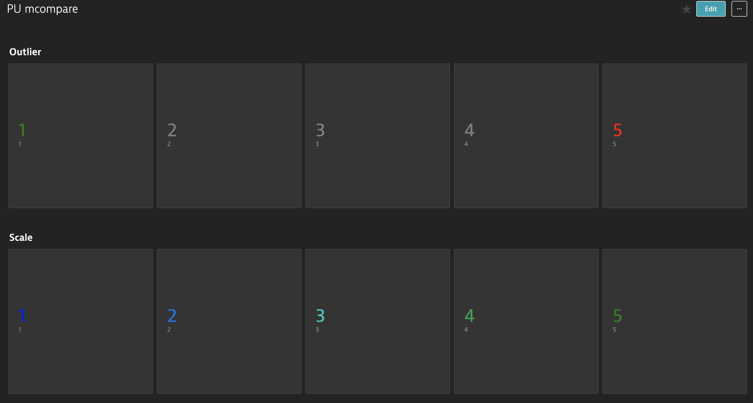
This powerup compares multiple SVTs (or vlookups). It has two modes: outlier and scale. Outlier mode highlights the low and high; whereas, scale uses color to show distance from extremes.
Syntax:
!PU(mcompare):links=link1,link2,link3,link4,link5;low=green;high=red;other=gray !PU(link):link1!PU(mcompare):mode=scale;links=linkA,linkB,linkC,linkD,linkE;low=blue;high=green !PU(link):linkA
Explanation:
!PU(mcompare):- denotes this powerupmode=scale- which mode, defaults tooutlierlinks=- list of links to SVTs (or vlookup)low=- CSS color for lowest valuehigh=- CSS color for highest valueother=- CSS color for middle values in outlier mode
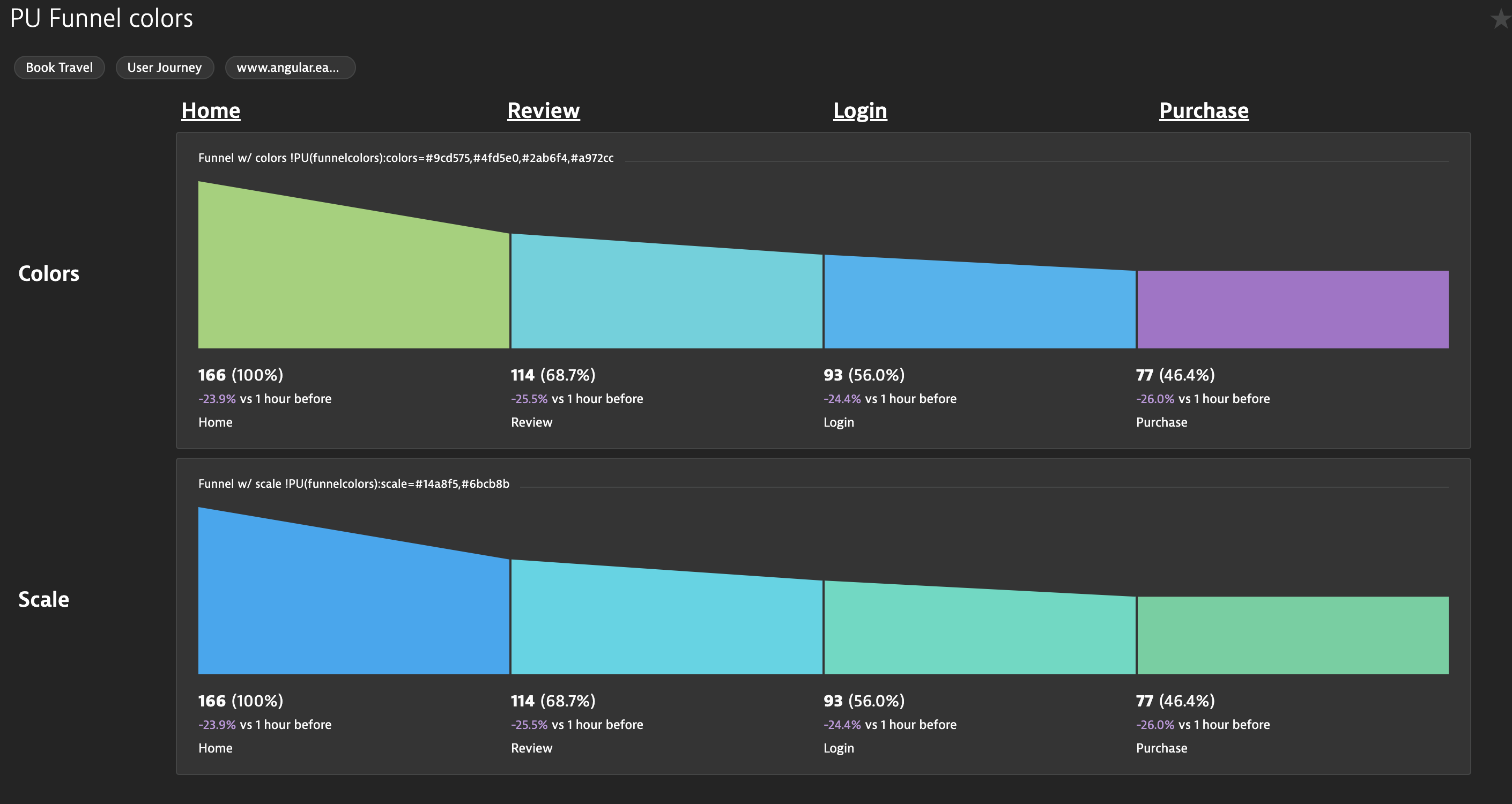
This powerup retains the existing funnel design but allows changing the colors. You can either specify colors directly or specify a scale between two colors.
Syntax:
!PU(funnelcolors):colors=#9cd575,#4fd5e0,#2ab6f4,#a972cc!PU(funnelcolors):scale=#14a8f5,#6bcb8b
Explanation:
!PU(funnelcolors):- denotes this powerupcolors=- specify colors for each funnel step from left to rightscale=- specify a color scale starting with the first color and ending with the last
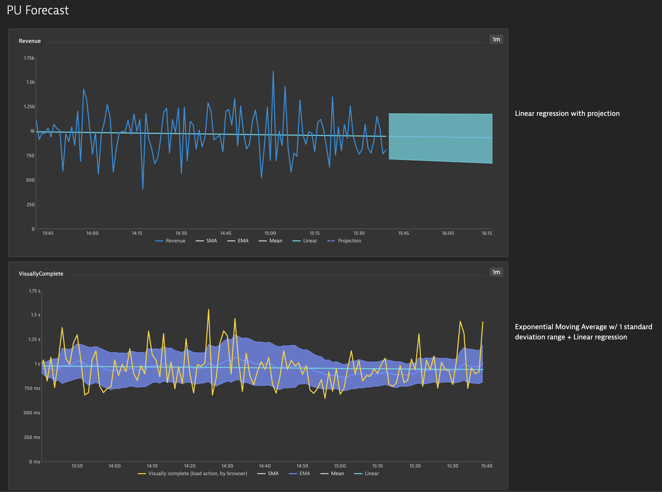
This powerup provides basic statistical tools to analyze one line chart. Additionally, you can also forecast future values based on these tools.
Syntax:
Revenue !PU(forecast):n=20%;p=30%- project revenue forward 30% of the graph, using a 20% sliding windowVisuallyComplete !PU(forecast):analysis=EMA,Linear- apply EMA and Linear regression to Visually complete
Explanation:
!PU(forecast):- denotes this powerupn=20%- how many data points to use for sliding windows. Can either be integer values for specific number of data point or percentage for a portion of the current data points. Defaults to 20%.p=20%- how many data point to project into the future. Integer values for specific number of points or percentage to base on chart size. Defaults to 0.analysis=Linear- Analyses to default to on:SMA- Simple Moving Average based on annsized moving windowEMA- Exponential Moving Average based on annsized moving window, includes 1 standard deviation range also based onnMean- Determines the average or mean across the timeseries also showing 1 standard devation for the timeseriesLinear- Linear regression of the timeseriesProjection- (on by default ifp> 0) Projects the Linear Regressionppoints into the future. Additionally, linear regressions are performed on +/- 1 standard deviation.
leg=SMA,EMA,Mean,Stdev,Bands,Linear- Which series to show in the legend, default showncolors=#2ab6f4,#4fd5e0,#748cff,#4fd5e0,#fd8232- colors to use for analysis series.zIndex=2- (optional) Place forecast series in foreground (2+) or background (1-). Default is background.
Add grid lines to your dashboards.
✔️ Deprecated due to low usage.
Syntax:
!PU(grid):hor=0,9,18;ver=0,9,18,27,35;color=#454646
Explanation:
!PU(grid):- denotes the poweruphor=0,9,18- draw horizontal lines at the 0th, 9th, and 18th blocks on the dashboard. Blocks are 38px apart.ver=0,9,18,27,35- draw vertical lines at various blockscolor=- (optional) css color to use for the grid, defaults to#454646wid=38- (optional) width of the lines in px, defaults to 38margin=4- (optional) margin in px to swallow up by the lines, defaults to 4. Ie default lines will be 46px wide (4 + 38 + 4)
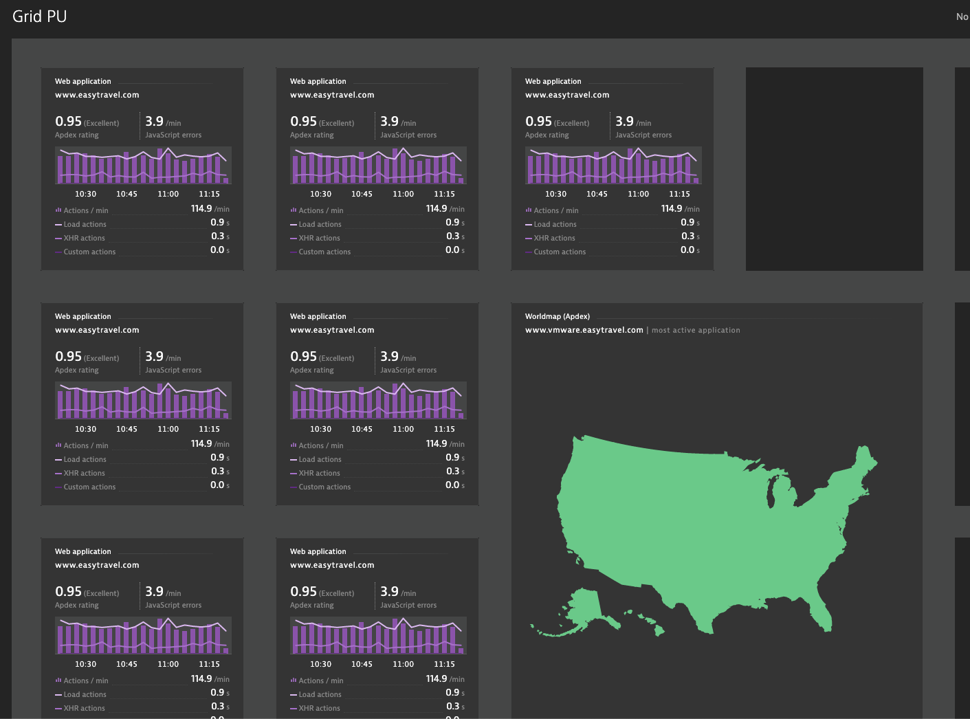
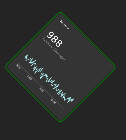
Use CSS directives to further style a tile. Note: First version is somewhat limited; further enhancements will be made to select different parts of the tile.
✔️ Deprecated due to low usage.
Syntax:
Revenue !PU(tilecss):`border:3px green solid;border-radius: 15px;transform: rotateZ(45deg);`
Explanation:
!PU(tilecss):- denotes the powerup`...`- css directives wrapped in backticks.url()is disallowed.
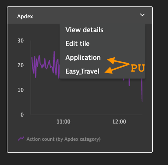
Add additional context menu items. Requires Dynatrace >= 1.214.
Syntax:
Apdex !PU(menu):name=Application;url=#uemapplications/uemappmetrics;uemapplicationId=APPLICATION-008569CDB300AE03 !PU(menu):name=Easy_Travel;url=http://www.easytravel.com
Explanation:
!PU(menu):- denotes the poweruptitle=Azure_Servicebus_SLO- (optional) for tiles which don't have a spot for PowerUp markup, use a seperate markdown tile and include a parameter fortitlewhich matches the title of the tile you wish to add to the context menu. Be sure to use underscores in place of spaces in the title.name=- what text to put in the menu (do not use spaces)url=- URL to link to. Note: Absolute URLs (ie starts withhttp) will open in a new tab.
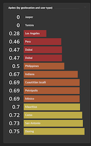
Apply coloring to toplists. Note: where possible please use Explorer tiles instead of this PowerUp. Explorer tiles should support sorting in a few sprints (~1.220).
✔️ Deprecated Please use Data Explorer.
Syntax:
Worst Apdex by Geo !PU(topcolor):vals=.5,.7,.85,.94;colors=#dc172a,#ef651f,#ffe11c,#6bcb8b,#2ab06f
Explanation:
!PU(topcolor):- denotes this powerupvals=- thresholds, should be N-1 of themcolors=- CSS colors, should be N of them
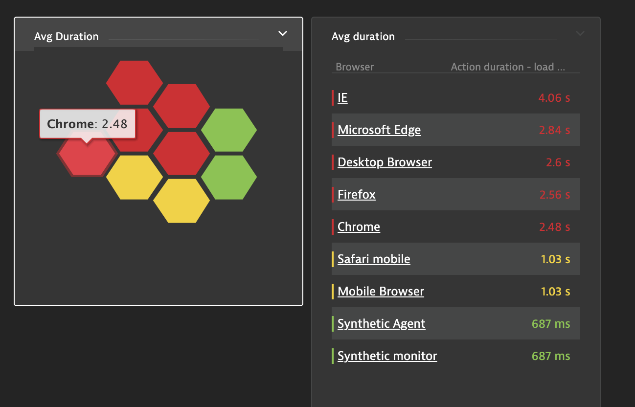
Transform an Explorer tile table into honeycombs. Color coding should be done in Explorer.
✔️ Deprecated Please use Data Explorer.
Syntax:
CPU Usage !PU(honeycomb):
Explanation:
!PU(honeycomb):- denotes this poweruplinks=link1,link2- merge data from other Explorer table tiles. NOTE: columns must match.drill=#uemapplications/performanceanalysis;uemapplicationId=...filtr3sProp0-=$colname%20s$name- override drilldown url.$colnameis replaced by the column name,$nameby the name in the first column, and$valueby the value of the row.base=low- (USQL tables only) which direction is good for color codingwarn=- (USQL tables only) warning thresholdcrit=- (USQL tables only) critical threshold
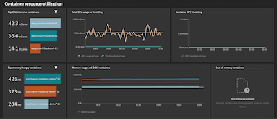
Automatically hide a tile's content if there's no data.
Syntax:
Out of memory containers !PU(autohide):
Explanation:
!PU(autohide):- denotes this powerup
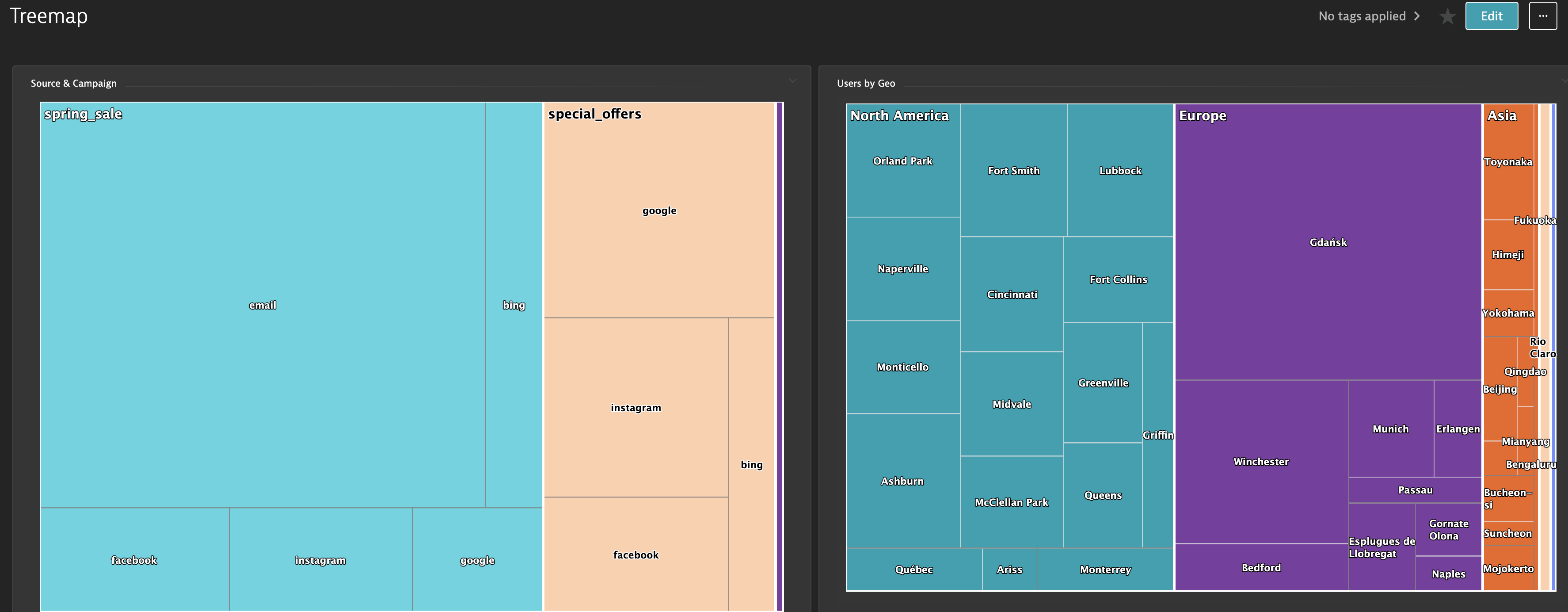
Convert an Explorer or USQL table into a tree map. Clicking on the chart drills down a level. Each level is a column in your table. Note: requires version 1.51+.
✔️ Deprecated due to low usage, please open an issue if still needed.
Syntax:
Users by Geo !PU(treemap):
Explanation:
!PU(treemap):- denotes the powerupcolors=blue,yellow,#aabbcc- (optional) give a list of colors the chart will randomly pull from
Calculate the time spent on a page, based on when that page's load action ended and the next one started. Note: user action names cannot contain commas, use a renaming rule to replace.
Syntax:
Title !PU(timeonpage): !PU(table):
Required USQL:
select useraction.name AS name, useraction.startTime* 1 AS start, useraction.endTime * 1 as end FROM usersession where useraction.type="Load"
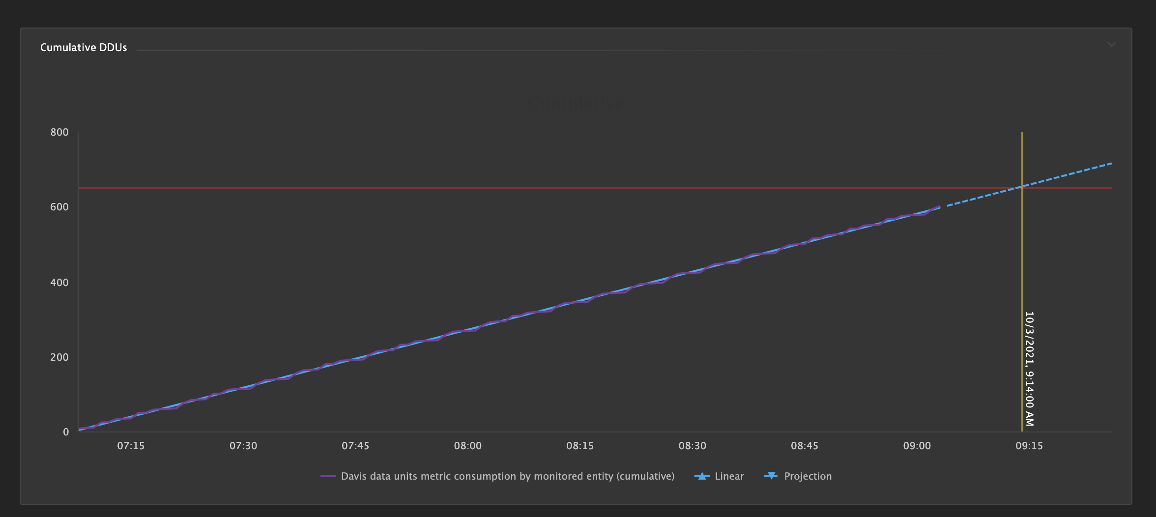
Compare a running total of a timeseries versus a limit. Project forecast growth into the future and predict threshold breach.
Syntax:
Cumulative DDUs !PU(cumulative):cast=20%;lim=650
Explanation:
cast=20%- how far to forecast into the future.cast=20is 20 data points,cast=20%is 20% of the current interval shown.lim=650- threshold limit. A predictive breach is shown in yellow and an existing breach is shown in red.castcolor=- (optional) color of the forecastlimcolor=- (optional) color of the threshold limit linewarncolor=- (optional) color for a predictive breachcritcolor=- (optional) color for an existing breach
Add menu items to the ellipsis menu. Add syntax to a markdown tile which will get hidden.
Syntax:
!PU(ellipsis):text=Help;url=https://github.com/dynatrace-oss/DynatraceDashboardPowerups#powerup-howto
Explanation:
text=- Text of the button. A PowerUp symbol will automatically be added.url=- URL to open in a new tab
Group of data explorer tiles which will automatically scroll to the right.
Syntax:
!PU(marky):row=1;tile=1;timer=3
Explanation:
row=- Row to which this tile will belong to if there is more than one group of marquee tiles (Limitation: only up to TWO rows).tile=- Number of tile that belongs to the group (1, 2, 3, etc.).timer=- (optional) Timer is 2.5 sec by default. This will override the timer value in seconds (1, 2, 3.5, 4, etc.)
This powerup correlates Rage Click events with the User Action that appears at the same time in any session, displaying a Rage Click count per unique User Action.
Create a new User Session Query Language tile and use the below query as a base.
You may apply additional WHERE filters, but do not modify the query in any other way.
In the query editor, do not toggle on Compare with previous timeframe and leave the Visualization type as Table Only.
Query:
SELECT useraction.name as "UserAction", userevent.name as "UserEvent", DATETIME(useraction.startTime, 'yyyy-MM-dd HH:mm:ss', '1s') as "ActionTime", DATETIME(userevent.startTime, 'yyyy-MM-dd HH:mm:ss', '1s') as "EventTime" from usersession where userevent.type="RageClick"
Syntax:
!PU(rageclick):
This powerup will plot a list of datapoints that you specify using !PU(link) within a Markdown tile.
Datapoints will be plotted in the order that they are listed. Thresholds can be included.
The type argument can take line, column, or area arguments.
To use, create a new Graph tile, plot a metric, replace the chart title with the Power Up syntax.
Syntax:
!PU(graph):values=R1,R2,R3,R4,R5,R6,R7,R8,R9,R10,R11;type=line!PU(graph):values=D1,D2,D3,D4,D5;color=green;thld=15;hcol=green;lcol=red;type=line

