In the previous lesson we described our machine learning process as the following:
- Gather and clean the data
- Study the data
- Select a model
- Training: Optimize the model for some other criteria (eg. how well the model predicts our known labeled data)
- Use the model predict on new data
We learned how to use Python to gather and clean the data, and now it's time to focus on exploring the data with visualization and graphs.
- Understand the components of a point in a graph, an
$x$ value, and a$y$ value - Understand where to place a point on a graph, from knowing a point's
$x$ and$y$ value - Get a sense of how to use a graphing library, like Plotly, to answer questions about our data
Imagine that Molly is selling cupcakes out of her kitchen. She gains more and more customers, so she decides to hire a delivery person, Bob. Molly asks us to calculate which customers are closest to and furthest from Bob. This way, she can pay him appropriately.
Molly gives us a list of all of the customer locations, along with Bob's. Here they are:
| Name | Avenue # | Block # |
|---|---|---|
| Bob | 4 | 8 |
| Suzie | 1 | 11 |
| Fred | 5 | 8 |
| Edgar | 6 | 13 |
| Steven | 3 | 6 |
| Natalie | 5 | 4 |
Now to determine the person closest to Bob you decide to make a graph of each customer's locations, as well as Bob's, in a graph.
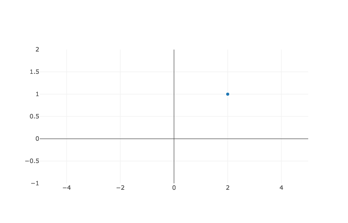
Before plotting everyone's locations, let's start off with a scatter plot of just one random point, the point
Ok so that graph above uses the cartesian coordinate system. The coordinate system is used to display data along both an x-axis and y-axis. The x-axis runs horizontally, from left to right, and you can see it as the labeled gray line along the bottom. The y-axis runs vertically, from the bottom to the top. You can see it labeled on the far left of our graph.
In the graph above, it shows the x-axis starting at -4 and the y-axis starting at -1, but that's just to make things easy to see. In reality, you can imagine the x-axis and y-axis both including all numbers from negative infinity to positive infinity. And that blue marker in top right portion of our graph represents the point where $x = 2 $ and
The light-gray lines form a grid on the graph to help us see where any given point is on a graph. A point in geometry just means a location. Now, test your knowledge by moving your mouse to the point
Ok, now let's plot the data given.
| Name | Avenue # | Block # |
|---|---|---|
| Bob | 4 | 8 |
| Suzie | 1 | 11 |
| Fred | 5 | 8 |
| Edgar | 6 | 13 |
| Steven | 3 | 6 |
| Natalie | 5 | 4 |
We cannot graph the data with python itself, so we need to download a library from the Internet. This is easy enough. Simply go to your terminal and type in pip install plotly followed by the enter key. Or you can press shift enter on the cell below. If you already have plotly installed, you will see a message saying that it's already installed -- which you can safely ignore.
!pip install plotlyNow we have plotly on our computer. The next step is to apply it to this notebook. We do so with the following two lines.
import plotly

plotly.offline.init_notebook_mode(connected=True)
# use offline mode to avoid initial registration
We bring in the plotly library by using the keyword import followed by our library name, plotly. We create a new dictionary in python with the dict constructor. Then we pass through named arguments to the constructor to create a dictionary with an trace0, and passing it through as an argument to the plotly.offline.iplot method.
import plotly
plotly.offline.init_notebook_mode(connected=True)
# we repeat these first lines just to keep the code together

trace0 = dict(x=[4, 1, 5, 6, 3, 2], y=[8, 11, 8, 13, 6, 4])

# All that, and it doesn't even look good :(
plotly.offline.iplot([trace0])The points were plotted correctly, but they are connected by a line, which doesn't represent anything in particular.
The lines are getting in the way. Let's remove all of the connecting lines by setting mode = "markers". Then, let's also set labels to each of the dots, by setting text equal to a list of our names.
trace1 = dict(x=[4, 1, 5, 6, 3, 2],
              y=[8, 11, 8, 13, 6, 4],
              mode="markers",
              text=["bob", "suzie", "fred", "edgar", "steven", "natalie"],)


plotly.offline.iplot([trace1])

# much better :)Ok, so if you move your mouse over the dots, you can see the names that correspond to each point. Also, when we hover over the dot at the x axis of point four, we can see that is Bob's point, just like it should be. Now, who is closest to Bob? It looks like Fred is closest since he's only one avenue away. Fred seems to be the easiest delivery for Bob.
In this section, we saw how we use data visualisations to better understand the data. A cartesian coordinate system nicely represents two dimensional data. It allows us to represent a point's
To display the data with plotly we need to do a couple of things. First, we install plotly by going to our terminal and running pip install plotly. Then to use the library, we import the plotly library into our notebook. Once the library is loaded in our notebook, it's time to use it. We create a new dictionary with keys of mode attribute equal to 'markers'.
