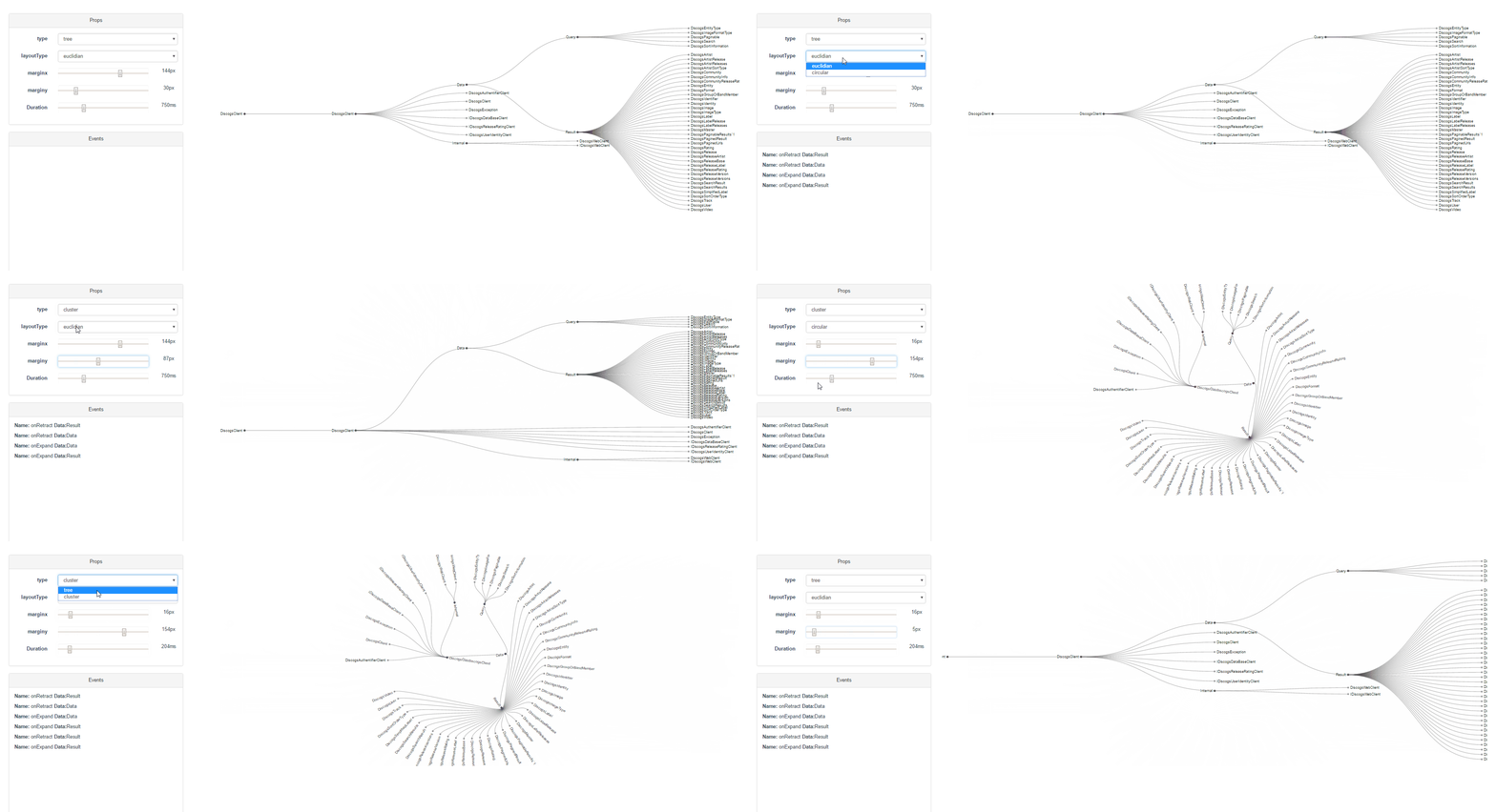
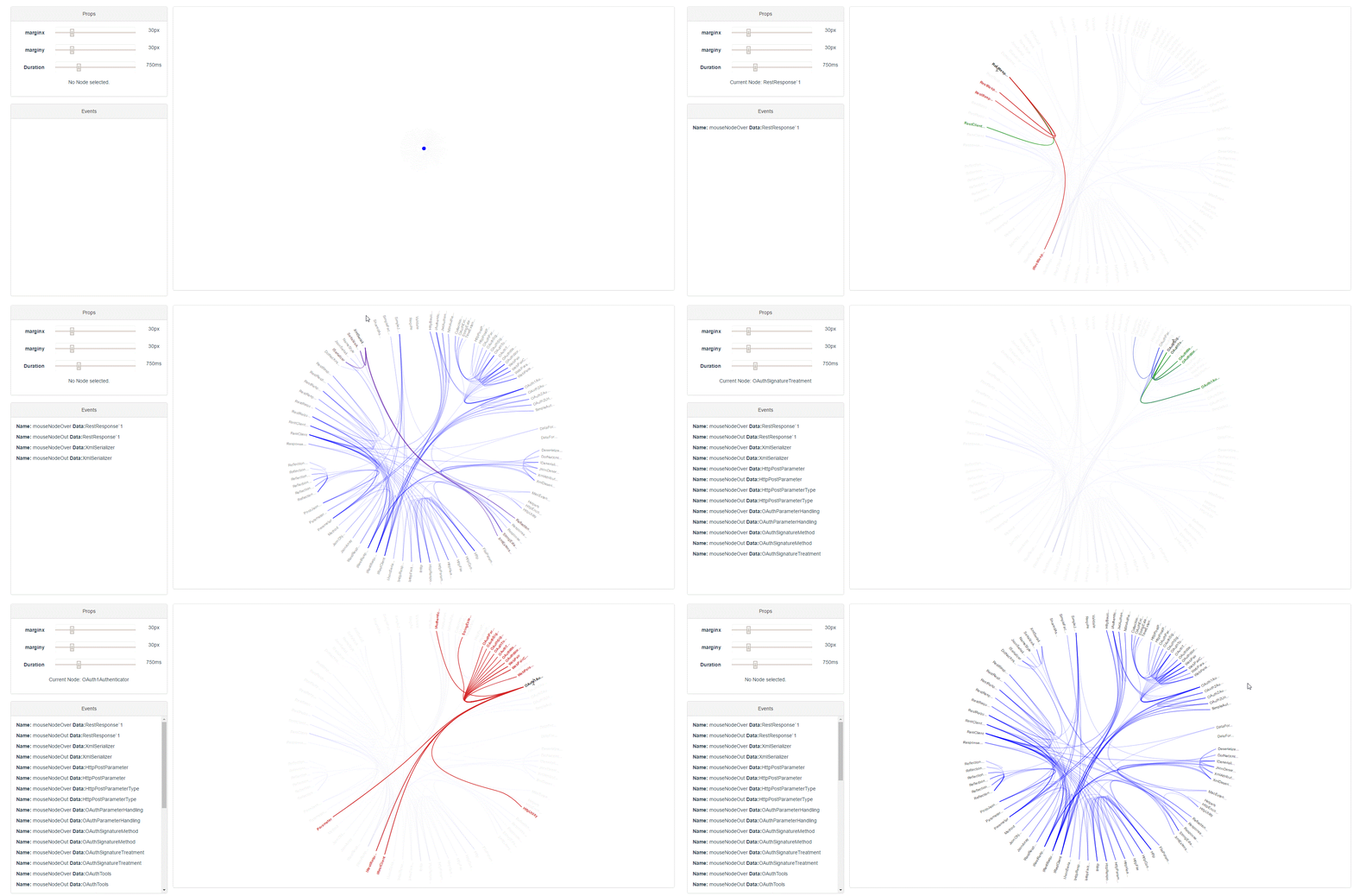
Vue components to display graphics based on D3.js layout.
<tree :data="tree" node-text="name" layoutType="circular">
</tree>
import {tree} from 'vued3tree'
export default {
components: {
tree
},
data() {
return {
tree: {
name: "father",
children:[{
name: "son1",
children:[ {name: "grandson"}, {name: "grandson2"}]
},{
name: "son2",
children:[ {name: "grandson3"}, {name: "grandson4"}]
}]
}
}
}
}
//...| Name | Required | Type/Value | Default | Description |
|---|---|---|---|---|
| data | no | Object |
null | Data representing tree structure, children nodes are represented by children property |
| duration | no | Number |
750 | Animation duration in milliseconds |
| layoutType | no | 'circular' 'vertical' or 'horizontal' | 'horizontal' | Circular, vertical or horizontal layout |
| leafTextMargin | no | Number |
6 | margin in pixel for leaf node text |
| linkLayout | no | 'bezier' or 'orthogonal' | bezier' | Define the link layout |
| identifier | no | Function |
() => i++ | Function that receives a data and returns its identity that can be a number or a string, useful when dynamically updating the tree |
| marginX | no | Number |
20 | margin for X axis in pixel |
| marginY | no | Number |
20 | margin for Y axis in pixel |
| maxZoom | no | Number |
0.8 | minimal zoom value |
| minZoom | no | Number |
9 | maximum zoom value |
| nodeText | no | String |
'name' | name of the property of the node to be used as a display name |
| nodeTextDisplay | no | 'all' 'leaves' or 'extremities' | 'all' | Determine wether all node texts are displayed or only leaf nodes or leaves and root node respectively. |
| nodeTextMargin | no | Number |
6 | margin in pixel for node text |
| popUpPlacement | no | String |
'bottom-start' | Pop-up position as defined by popper.js |
| radius | no | Number |
3 | node circle radius in pixel |
| selected | no | Object |
null |
The selected node -on which a selected class is applied-. It can be bound using a v-model directive. By default, click on text to select a node but this behavior can be customized using the behavior slot. |
| strokeWidth | no | Number |
1.5 | The path stroke-width in pixel. |
| type | no | 'tree' or 'cluster' | 'tree' | kind of layout: tree or cluster |
| zoomable | no | Boolean |
false | If true tree can be zoomed in using mouse wheel and drag-and-drop |
Use this slot to customize the rendering of individual node.
Note that the mark-up will be rendered inside a svg element, so only svg elements are allowed here
Slot-scope:
| Name | Type | Description |
|---|---|---|
| actions | Object |
Value: {collapse, collapseAll, expand, expandAll, setSelected, show, toggleExpandCollapse} where each property is a component method (see below for detailed description) |
| data | Object |
node data as provided by the data props |
| isRetracted | Bool |
true if the node has hidden children -retracted state- |
| isSelected | Bool |
true if the node is selected |
| node | D3.js node | D3.js node to be displayed |
| radius | Number |
tree radius props value |
Example:
<template #node="{data, node: {depth}, radius, isRetracted}">
  <template v-if="data.children && data.children.length">
    <path :fill="isRetracted? 'red' : 'blue'" d="M190.5..">
      <title>{{data.text}} {{depth}}</title>
    </path>
  </template>
  <template v-else>
    <circle r="6" :stroke="blue? 'blue' : 'yellow'">
      <title>{{data.text}} {{depth}}</title>
    </circle>
  </template>
</template>Use this slot to create a pop-up, tooltip or context menu for nodes. The position of the pop-up relative to its target is defined by the popUpPlacement prop.
By default, pop-up will open when clicking on node text. This behavior can be overridden using behavioral slot. For example by using the PopUpOnTextHover component provides opening of pop-up when hovering the node test. See below for example.
Slot-scope:
| Name | Type | Description |
|---|---|---|
| data | Object |
node data as provided by the data props |
| close | Function |
function to close the pop-up |
| node | D3.js node | D3.js node to be displayed |
Example:
<template #popUp="{data,node}">
  <div class="btn-group-vertical">
    <button @click="addFor(data)">
      <i class="fa fa-plus" aria-hidden="true"></i>
    </button>
    <button @click="remove(data, node)">
      <i class="fa fa-trash" aria-hidden="true"></i>
    </button>
  </div>
</template>Behavior slots provide an elegant way to customize the tree behavior by receiving as slot-scope both node information (including clicked node, hovered node, ...) and actions to alter the graph accordingly.
The concept of this slot is to react to changes in node information by calling an action
By design this slot is renderless.
For more about this pattern, you can check here.
Slot-scope:
| Name | Type | Description |
|---|---|---|
| on | Function |
Value: $on method of the tree component, exposing all events |
| actions | Object |
Value: {collapse, collapseAll, expand, expandAll, setSelected, show, toggleExpandCollapse} where each property is a component method (see below for detailed description) |
By default tree component use standardBehavior as component which provides toggle retract on node click and select the node on clicking on its text.
Example:
<tree>
  <template #behavior="{on, actions}">
    <CollapseOnClick v-bind="{on, actions}"/>
  </template>
</tree>
With CollapseOnClick component:
export default {
  props: ['on', 'actions'],

  render: () => null,

  created () {
    const {on, actions: {toggleExpandCollapse}} = this;

    on('clickedNode', ({element}) => {
      toggleExpandCollapse(element);
    })
  }
}
To display pop-up on hover, use the built-in popUpOnHoverText:
<tree>
  <template #behavior="{on, actions}">
    <popUpOnHoverText v-bind="{on, actions}"/>
  </template>
</tree>
import {tree, popUpOnHoverText} from 'vued3tree'
export default {
components: {
tree,
popUpOnHoverText
},
//...- Argument : node raw data.
- Sent when the node is selected
- Argument :
{element, data, target}whereelementrepresents the node build byD3.js,datais the node raw data andtargetthe target DOM element. - Sent when the node is clicked
- Argument: none
- Sent when mouse is clicked outside any geometry or text of the tree
- Argument: same as mouseNodeOver
- Sent when the node text is clicked
- Argument : same as clicked.
- Sent when the node is clicked and the node children are expanded
- Argument: same as mouseNodeOver
- Sent when mouse hovers the node text
- Argument: same as mouseNodeOver
- Sent when mouse leaves the node text
- Argument : same as clicked.
- Sent when the node is clicked and the node children are retracted
For all these events, the argument passed is {element, data} .
- Argument :
{transform}where transform is d3.zoom transform object. - Sent when the tree is zoomed.
| Name | Argument | return | Description |
|---|---|---|---|
| expand | D3.js node |
a promise which resolve when animation is over | Expand the given node. |
| expandAll | D3.js node |
a promise which resolve when animation is over | Expand the given node and all its children. |
| collapse | D3.js node |
a promise which resolve when animation is over | Collapse the given node. |
| collapseAll | D3.js node |
a promise which resolve when animation is over | Collapse the given node and all its children. |
| resetZoom | - | a promise which resolve when animation is over | Set zoom matrix to identity |
| resetPopUp | - | undefined |
close pop-up |
| setPopUp | {target, node} |
undefined |
Open pop-up for the corresponding node, using the target DOM element as reference. Designed to be called with event argument. |
| setSelected | Object: node data |
undefined |
Select the given node by sending a change event. Should be used with a v-model binding |
| show | D3.js node |
a promise which resolve when animation is over | Expand nodes if needed in order to show the given node. |
| showOnly | D3.js node |
a promise which resolve when animation is over | Retract all node that are not in the path of the given node. |
| toggleExpandCollapse | D3.js node |
a promise which resolve when animation is over | Retract or collapse the given node depending on its current state. |
This component is responsive and will adjust to resizing. In order for this to work properly, you must define for this component or its parent wether:
- a height or a max-height
- or a width or a max-width.
Failing to do so may result in a component whose size that will keep increasing.
<hierarchical-edge-bundling identifier="id" :data="tree" :links="links" node-text="name"/>import {hierarchicalEdgeBundling} from 'vued3tree'
export default {
components: {
hierarchicalEdgeBundling
},
data() {
return {
tree: {
name: "father",
children:[{
name: "son1",
children:[ {name: "grandson", id: 1}, {name: "grandson2", id: 2}]
},{
name: "son2",
children:[ {name: "grandson3", id: 3}, {name: "grandson4", id: 4}]
}]
},
links: [
{source: 3, target: 1, type: 1},
{source: 3, target: 4, type: 2}
],
linkTypes: [
{id: 1, name: 'depends', symmetric: true},
{id: 2, name: 'implement', inName: 'implements', outName: 'is implemented by'},
{id: 3, name: 'uses', inName: 'uses', outName: 'is used by'},
]
}
}
}
//...| Name | Required | Type/Value | Default | Description |
|---|---|---|---|---|
| data | no | Object |
null | Data representing tree structure, children nodes are represented by children property |
| duration | no | Number |
750 | Animation duration in milliseconds |
| links | no | Array |
null | Data representing links between the nodes, having source and target properties referencing node identifiers |
| identifier | yes | String or Function |
- | name of the property of the node to be used as a identifier or function taking a node and returning its identifier |
| marginX | no | Number |
20 | margin for X axis in pixel |
| marginY | no | Number |
20 | margin for Y axis in pixel |
| maxTextWidth | no | Number |
-1 | Max node text width (in pixel) to be displayed, if -1 text is not truncated. |
| nodeClass | no | String |
'graph' | class to be applied to the root div. Useful when custom CSS rules have to be applied. |
| nodeText | yes | String |
- | name of the property of the node to be used as a display name |
- Argument:
{element, data}whereelementrepresents the node build byD3.jsanddatais the node raw data. - Sent when the node name is hovered by mouse
- Argument: same as mouseNodeOver
- Sent when mouse leaves the node name
- Argument: none
- Sent when mouse is clicked outside any geometry or text of the hierarchical edge bundling
- Argument: D3.js hierarchy node
- Sent when D3.js nodes are computed using
dataprops. Called with
- Argument: none
- Sent when highlighted node has changed.
Highlighted node: when set to a node data, the corresponding node and its related links will be highlighted. If null standard display is showing.
This component is responsive and will adjust to resizing. In order for this to work properly, you must define for this component or its parent wether:
- a height or a max-height
- or a width or a max-width.
Failing to do so may result in a component whose size that will keep increasing.
- Available through:
npm install vued3tree# install dependencies
npm install
# serve with hot reload at localhost:8080
npm run dev
# build for production with minification
npm run build


