React Table Component Package (WIP)
Forthcoming update : More Presets & An easy Way to build your own Presets.
On NPM : https://www.npmjs.com/package/@asklddco/react-table
DOCUMENTATION
3 - Customization through props
4 - Presets & Adding the Font of your Choice
5 - Presets Deeper Customization
6 - Adding some Custom Cells & Buttons to Your Table
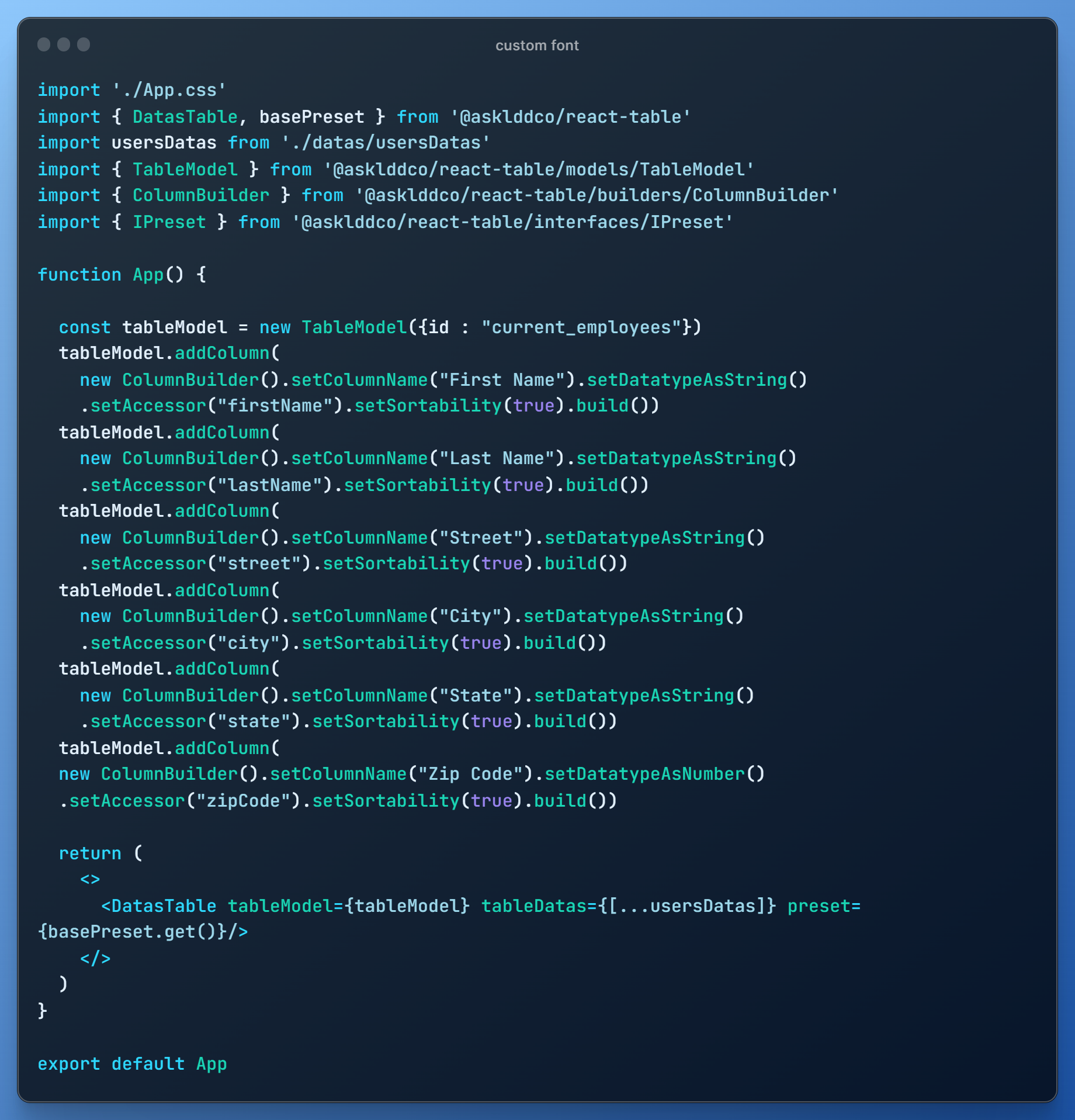
7 - Summary - Simple React Example
The Table Model is essential for defining the relationships between the displayed table and the data object.
Let's now build this model into the react page component that will host your react table.
This model will be key in order to define the following properties :
- Which specific datas should be extracted from your data object.
- Of which types those datas are. Mandatory since it will auto-define a sorting algorithm.
- Which name should be given to your columns (your '< th >' tag content).
- Are some of your columns sortable ?
As expected, with :
| Builders Methods | Description |
|---|---|
| setColumnName("name") | We give a name to our column |
| setColumnName("name", "align-left" | "align-center" | "align-right") | Overrides the default preset alignment for this TH |
| setDatatypeAsString() | We define the data type that should populate my column. Here it should be populated with strings |
| setAccessor("accessor") | We specifie the key in the data object associated with the value needed to fill the column |
| SetSortability(boolean) | We indicate to our model if our column should be sortable or not |
| setCustomComponent(customCell) | Each row of our column will contain the same custom cell (cf. "adding custom cells" section) |
Here are the different methods to define your datatypes :
- setDatatypeAsString()
- setDatatypeAsNumber()
- setDatatypeAsDate()
As an example, building this model would qualify for such a data object :
You would then end up with the following three sortable columns table :
Now that your tableModel is defined, it can be passed as a Prop with your Datas Object to our Component :
<DatasTable tableModel={tableModel} tableDatas={tableDatas} nRowsDefault={25}/>
nRowsDefault possible values : [10, 25, 50, 100]
All those subcomponents are integrated by default.
You can hide some of those subcomponents passing the following props to your Datatable component :
| Prop | Value | Description |
|---|---|---|
| hidePagination | true | false : boolean | Hide both pagination components under the Table |
| hideSearchBar | true | false : boolean | Hide the search component in the top right corner |
| hideNRowsSelect | true | false : boolean | Hide the select component in the top left corner |
To use a Preset, simply pass it as a Prop. Here is a list of the 4 available presets (more to come) :
<DatasTable tableModel={tableModel} tableDatas={tableDatas} preset={basePreset.get()}/>
<DatasTable tableModel={tableModel} tableDatas={tableDatas} preset={lightPurplePreset.get()}/>
<DatasTable tableModel={tableModel} tableDatas={tableDatas} preset={darkGreenPreset.get()}/>
<DatasTable tableModel={tableModel} tableDatas={tableDatas} preset={darkPurplePreset.get()}/>
To replace a preset's default font, use the setGlobalFont method and pass the desired font family value as a parameter, similar to the CSS font-family property.
<DatasTable tableModel={tableModel} tableDatas={tableDatas} preset={darkPurplePreset.setGlobalFont("Arial").get()}/>
If the text in your cell is not vertically centered you can add some padding to fix it, use those methods of the preset class with a number of pixels as parameter :
.setRowTopPadding('numberOfPixels') & .setRowBottomPadding('numberOfPixels')
You can take any existing preset and modify some of its values through those methods :
| Methods | Targets | Usage Example |
|---|---|---|
| setGlobalFont | The Font for the Table & all its subcomponents | .setGlobalFont("Arial") |
| setBordersColors | The Border Colors of the Searchbar & the Dropdown depending on their states |
.setBorderColors({ _default: "#CCCCCC", focus: "#0000FF" }) |
| setSeparatorColor | The Color of the last & first Separators | .setSeparatorColor("#000000") |
| setTHStyle | The Style of the Table Header |
.setTHStyle({ textColor: "#000000", textAlign: "left", background: "#FFFFFF", arrowColor: "#CCCCCC", activeArrowColor: "#0000FF" }) |
| setHoveredElementsStyle | The Style of the Hoverable Elements | .setHoveredElementsStyle({ textColor: "#FFFFFF", background: "#0000FF" }) |
| setOddRowsStyle | The Style of the Odd Rows | .setOddRowsStyle({ background: "#DDDDDD", separatorColor: "#BBBBBB" textColor: "#BBBBBB" }) |
| setEvenRowsStyle | The Style of the Even Rows | .setEvenRowsStyle({ background: "#FFFFFF", separatorColor: "#BBBBBB" textColor: "#BBBBBB" }) |
You can fill a whole column with a custom component of your choice. It's really handy when you want to add buttons to your table that can trigger custom interactions.
Here is an example :
Notice that your component should take index and dataRow as parameters. Why? Beacause these datas will be passed to your component at render so you can use them to trigger any behavior you want.
Here is how the previous example would be rendered inside your table :


