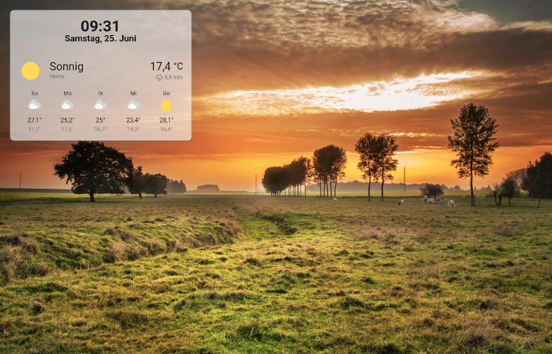
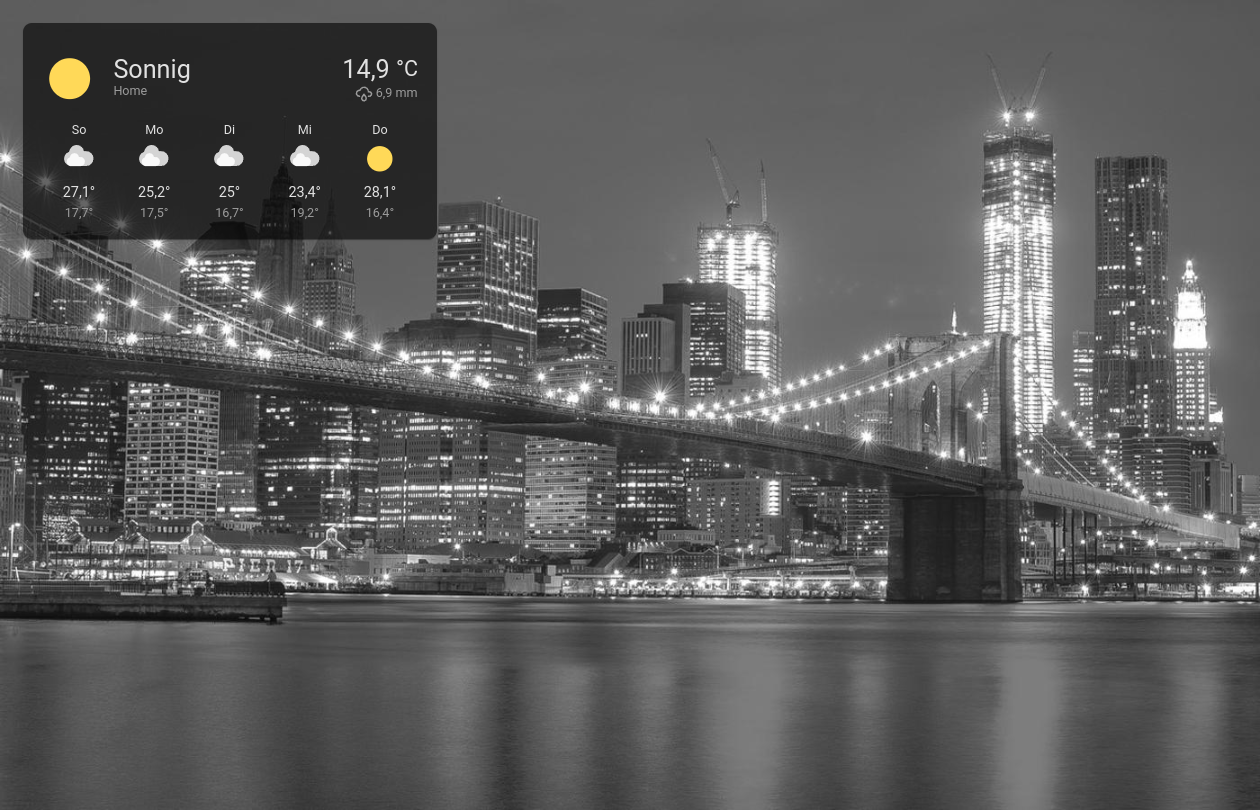
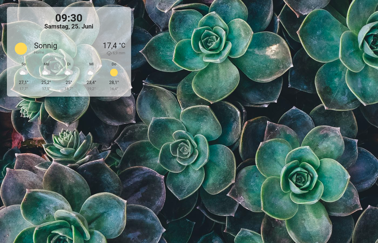
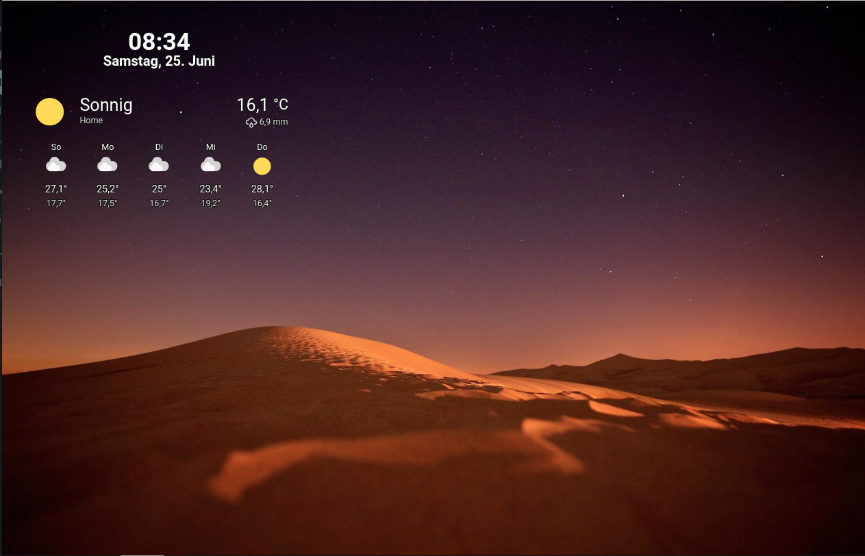
🖼️ Wall panel mode for your Home Assistant Dashboards. Configurable extension which features a fullscreen mode, photo slideshow screensaver, screen wake lock and the ability to hide side and top bar. Show dashboard cards and badges of your choice on top of the images.
The recommended way is to install this plugin using HACS.
- Go to HACS => Frontend
- Click on the three dots in the top right corner
- Select "Custom repositories"
- Insert
https://github.com/j-a-n/lovelace-wallpanelinto repository. - Select the
Lovelaceas category. - Click the
ADDbutton.
- Search for
WallPanelin the Frontend repository list - Click on the repository card
- Click on
Install this repository in HACS - Select the latest version
- Click on
Download
- Download wallpanel.js and place it into the folder config/www.
- Open Configuration => Lovelace Dashboards => Resources and add /local/wallpanel.js (Resource type: JavaScript module).
The recommended way is to upgrade this plugin using HACS.
- Search for
WallPanelin the Frontend repository list - Click on the repository card
- Click on
Install this repository in HACS - Select the latest version
- Click on
Download
- Download current wallpanel.js and place it into the folder config/www.
- Open Configuration => Lovelace Dashboards => Resources and modify the resource URL to force browsers to reload the resource. For example you could add or change the query string: /local/wallpanel.js?v2
You can set the following configuration parameters for every individual Home Assistant Dashboard:
| Config | Description | Default |
|---|---|---|
| enabled | Enable WallPanel? You will need to set this to true to activate the wall panel for the dashboard. |
false |
| enabled_on_tabs | Enable WallPanel on the named panel tabs only. If the list is empty, wallpanel is enabled on all tabs. | [] |
| debug | Enable debug mode? | false |
| hide_toolbar | Hide the upper panel toolbar? Please see FAQ how to edit your dashboard when toolbar is hidden. | false |
| hide_toolbar_action_icons | Hide action items in the toolbar? | false |
| hide_sidebar | Hide the navigation sidebar? | false |
| fullscreen | Set browser window to fullscreen? Due to browser restrictions you will need to interact with the screen once to activate fullscreen mode after loading the dashboard page. |
false |
| idle_time | Time in seconds after which the screensaver will start (0 = screensaver disabled). | 15 |
| fade_in_time | Screensaver fade-in time in seconds. | 3.0 |
| crossfade_time | Crossfade duration in seconds for screensaver images. | 3.0 |
| display_time | Duration in seconds after which the next screensaver image will be shown. | 15.0 |
| keep_screen_on_time | Time in seconds for how long to prevent screen to dimm or lock (0 = disabled). | 0 |
| black_screen_after_time | Time in seconds after which the screensaver will show just a black screen (0 = disabled). | 0 |
| control_reactivation_time | Time in seconds for which interaction with the dashboard is disabled after the screensaver is stopped. | 1.0 |
| stop_screensaver_on_mouse_move | Stop screensaver on mouse movement? | true |
| stop_screensaver_on_location_change | Stop screensaver on navigation (location-changed events)? | true |
| screensaver_stop_navigation_path | Path to navigate to (e.g., /lovelace/default_view) when screensaver is stopped. | |
| screensaver_entity | An entity of type 'input_boolean' to reflect and change the screensaver state (on = started, off = stopped). If browser_mod is installed, ${browser_id} will be replaced with Browser ID (see below). |
|
| show_images | Show images if screensaver is active? | true |
| image_url | Fetch screensaver images from this URL. See below for details. | See below |
| image_excludes | List of regular expressions for excluding files and directories from local media sources. See below for details. | [] |
| image_fit | Value to be used for the CSS-property 'object-fit' of the images (possible values are: cover / contain / fill / ...). | cover |
| image_background | If set to image, the current image is also displayed as the background over the entire screen. Use the wallpanel-screensaver-image-background class to style the background. |
color |
| image_list_update_interval | When using a local media source, the image list is updated at this interval. | 3600 |
| image_order | The order in which the images are displayed (possible values are: sorted / random). | sorted |
| image_animation_ken_burns | Apply a Ken Burns effect (panning and zooming) to the images? | false |
| image_animation_ken_burns_zoom | Zoom level for the Ken Burns effect. | 1.3 |
| image_animation_ken_burns_delay | Start Ken Burns effect with a delay (in seconds). | 0 |
| show_image_info | Show image info (EXIF / API) on top of image? Only available for local jpeg images containing EXIF data and images from the new Unsplash API. The config name was show_exif_info before version 4.7. |
false |
| show_progress_bar | Show animated progress bar towards next image being displayed? | false |
| fetch_address_data | Fetch address data for EXIF GPS coordinates from nominatim.openstreetmap.org? | false |
| image_info_template | Format of image info display (HTML). ${EXIF-tag-name} will be replaced with the corresponding EXIF tag value. The config name was exif_info_template before version 4.7. |
${DateTimeOriginal} |
| info_animation_duration_x | Animation duration in seconds for the movement of the info box in x-direction (0 = no animation). | 0 |
| info_animation_duration_y | Animation duration in seconds for the movement of the info box in y-direction (0 = no animation). | 0 |
| info_animation_timing_function_x | The CSS timing-function to use for the animation of the info box movement in x-direction. | ease |
| info_animation_timing_function_y | The CSS timing-function to use for the animation of the info box movement in y-direction. | ease |
| info_move_pattern | Movement pattern of the info box at a specified interval (possible values are: random / corners). | random |
| info_move_interval | Interval of movement of the info box in seconds (0 = no movement). | 0 |
| info_move_fade_duration | Duration of the fade-in and fade-out animation of the info box in case of movement (0 = no animation). | 2.0 |
| style | Additional CSS styles for wallpanel elements. | {} |
| badges | Badges to display in info box. Set to [] to show no badges at all. See below for details. | [] |
| cards | Cards to display in info box. Set to [] to show no cards at all. See below for details. | See below |
| card_interaction | Allow interaction with the cards displayed in the info box? | false |
| profiles | Configuration profiles. See below for details. | {} |
| profile | Configuration profile to activate. If browser_mod is installed, ${browser_id} will be replaced with Browser ID (see below). |
|
| profile_entity | An entity of type 'input_text' used for dynamic activation of profiles. If browser_mod is installed, ${browser_id} will be replaced with Browser ID (see below). |
You can add the configuration to your Home Assistant Dashboard configuration yaml (raw config).
- Click Overview in your sidebar.
- Click the three dots menu (top-right) and click on Edit Dashboard.
- Click the three dots menu again and click on Raw configuration editor.
- Add the
wallpanelconfiguration above anything else.
Short example:
wallpanel:
  enabled: true
  hide_toolbar: true
  hide_sidebar: true
  fullscreen: true
Extended example:
wallpanel:
  enabled: true
  enabled_on_tabs:
    - default_view
  debug: false
  hide_toolbar: true
  hide_sidebar: true
  fullscreen: true
  idle_time: 10
  keep_screen_on_time: 86400
  black_screen_after_time: 7200
  control_reactivation_time: 1.0
  screensaver_stop_navigation_path: /lovelace/default_view
  image_url: 'http://picsum.photos/${width}/${height}?random=${timestamp}'
  image_fit: cover
  image_list_update_interval: 3600
  image_order: 'sorted'
  image_excludes: []
  show_image_info: false
  fetch_address_data: true
  image_info_template: '${address.town|address.city!prefix=!suffix= // }${DateTimeOriginal!options=year:numeric,month:long}'
  screensaver_entity: input_boolean.wallpanel_screensaver
  info_animation_duration_x: 30
  info_animation_duration_y: 11
  info_animation_timing_function_x: 'ease-in-out'
  info_animation_timing_function_y: 'ease-in-out'
  info_move_pattern: random
  info_move_interval: 0
  info_move_fade_duration: 2.0
  card_interaction: true
  style:
    wallpanel-screensaver-info-box:
      font-size: 8vh
      font-weight: 600
      color: '#eeeeee'
text-shadow: '-2px -2px 0 #03a9f4, 2px -2px 0 #03a9f4, -2px 2px 0 #03a9f4, 2px 2px 0 #03a9f4'It is also possible to pass configuration parameters in the query string. These parameters (wp_<parameter>) will override the corresponding properties in the yaml configuration. This will allow you to use device specific settings. Use JSON syntax for the values.
Example:
http://hass:8123/lovelace/default_view?wp_hide_sidebar=false&wp_idle_time=60&wp_style={"wallpanel-screensaver-info-box":{"font-size":"4vh"}}
- Set enabled to false in your dashboard configuration.
wallpanel:
enabled: false- Add a query string to the URL to activate on a device:
http://hass:8123/lovelace/default_view?wp_enabled=true
Screensaver images will be fetched from this URL. This can be any HTTP URL, a Home Assistant media-source URL or a Home Assistant entity that has the entity_picture attribute.
The default value is: http://picsum.photos/${width}/${height}?random=${timestamp}
The following variables can be used in HTTP URLs:
${timestamp}= current unix timestamp${width}= viewport width${height}= viewport height
Example of using images from unsplash.com (old api):
https://source.unsplash.com/random/${width}x${height}?sig=${timestamp}
You can narrow down the images from unsplash.com using certain search terms, for example "fruit" and "beer".
https://source.unsplash.com/random/${width}x${height}?fruit,beer&sig=${timestamp}
Example of using images from api.unsplash.com (new api):
image_order: random
image_list_update_interval: 3600
image_url: https://api.unsplash.com/photos/random?client_id=YOUR_ACCESS_KEY&query=dogs
show_image_info: true
image_info_template: '<span style="color:#990000">//</span> ${description|alt_description}'
See Unsplash API documentation (Get a random photo) for details.
It is also possible to use images from the Home Assistant Local Media source.
Just set the image_url to a media-source URL as displayed in the URL of the Home Assistant Media Browser.
See Home Assistant Media Source integration documentation for details.
Instead of using media-source://media_source/ as image_url you can just use / as a shortcut.
/= Images in all Local Media sources/media1= Images in the Local Media directory namedmedia1/media1/folder1= Images infolder1of the Local Media directory namedmedia1
Tip: If you click on the far right side of the screen while the screen saver is active, the next image will be displayed.
When an entity has the entity_picture attribute you can use the image to be shown when the screensaver starts. If the image is dynamic, for example when using a camera entity, the image will change when the entity_picture resolves to a changed image. You can control how often the the image is checked by adjusting the display_time settting. To use an entity as source for images, set the image_url setting to media-entity://<entity_id>.
Example:
display_time: 15
image_url: media-entity://camera.my_camera_entity_id
With the entity_picture you can combine this integration with the Google Photos Integration extension from Daanoz to display your photos.
Example:
image_url: media-entity://camera.google_photos_favorites_mediaSee Google Photos Integration README for details.
A list of regular expressions which can be used to exclude files and directories from local media sources.
Example
image_excludes:
  - '\.tif$'
- '/@eaDir'Set show_image_info to true to show info on top of images if available.
This will only work for local jpeg images.
The image info can be formatted by specifying HTML code in image_info_template.
Placeholders like ${EXIF-tag-name} will be replaced with the corresponding EXIF tag value.
See exif.js for available EXIF tag names.
If the EXIF data contains GPS location information and the fetch_address_data configuration is set to true,
address data for the GPS coordinates will be fetched from nominatim.openstreetmap.org.
The received address data can be used via placeholders in the form address.<attribute>.
Available attributes are: country, country_code, county, municipality, postcode, region, road, state, city, town and village.
See Nominatim Reverse Geocoding for details.
Please respect the Nominatim Usage Policy.
If you specify multiple alternative values separated by a pipe symbol (|), the first available attribute is used.
A prefix and suffix string can be added for each placeholder. Prefix and suffix are not displayed if the placeholder value is empty.
For date values you can specify date format options.
Each option must consist of an <option name>:<option value> pair.
Multiple options must be separated by commas.
Available option names are: year, month, day, weekday, hour, minute and second.
Possible option values are: long, short, narrow, numeric and 2-digit.
See toLocaleDateString options for details.
The image.relativePath placeholder is replaced with the pathname to the current image, relative to the image_url
configuration parameter. image.url is the complete URL of the image, while image.path is the image path.
image.folderName contains the name of the parent folder.
Examples
Display location and date
show_image_info: true
image_info_template: '<span style="color:#990000">//</span> ${address.town|address.city|address.municipality!prefix=!suffix= // }${DateTimeOriginal!options=year:numeric,month:long,day:2-digit}'
Display image path
show_image_info: true
image_info_template: >-
    <span style="font-family: 'Roboto Condensed', sans-serif; font-size: 1em; font-weight: 400; color: #999;">
      ${image.relativePath}
    </span>
The CSS class wallpanel-screensaver-image-info can be used to style the image info.
See section "Styles".
A so-called info box can be displayed above the images. You can add badges and cards to this box.
You can use the same yaml config, as used in the Home Assistant Dashboard configuration (raw config).
Example (and default) for cards:
wallpanel:
  cards:
    - type: weather-forecast
      entity: weather.home
      show_forecast: true
If you want to interact with the cards, as in the dashboard, you can set card_interaction to true.
wallpanel:
  card_interaction: true
Example for badges:
wallpanel:
  badges:
    - entity: person.somebody
- entity: sun.sunThe info box, which contains the cards and badges, can be animated and moved around the screen using CSS animations. The following settings can be used to configure the animation:
info_animation_duration_x: How long it will take in seconds to move the info box from one end of the screen to the other in x-direction. If set to 0, animation in x-direction will be disabled.
info_animation_duration_y: Same as above, but in y-direction.
The style of the animation can be configured with info_animation_timing_function_x for x-direction and info_animation_timing_function_y for the y-direction using a CSS animation-timing-function.
Possible values are, for example, ease and linear. For details, please have a look at MDN - CSS animation-timing-function.
An example of a nice animated movement using the Easing function:
info_animation_duration_x: 30
info_animation_duration_y: 13
info_animation_timing_function_x: ease-in-out
info_animation_timing_function_y: ease-in-out
Be aware that animations increase CPU/GPU usage and power consumption.
A timing function that requires few resources is the step function (steps(<number-of-steps> [, <step-position> ])).
You can play with the number of steps to achieve the desired result.
Here is one example in combination with duration settings:
info_animation_duration_x: 10
info_animation_duration_y: 20
info_animation_timing_function_x: steps(3, end)
info_animation_timing_function_y: steps(3, end)
Fewer steps and higher duration will result in fewer movements and lower resource consumption.
In addition, it is possible to move the info box to a random position on the screen or around corners of the screen (ie. top left, bottom left, bottom right, top right, and so forth), at a fixed time interval.
Example
info_move_pattern: random
info_move_interval: 10
info_move_fade_duration: 2.0If you set this attribute to a value greater than zero, the screen is prevented from dimming or locking for the specified time in seconds.
If supported by the browser, this is done via the Screen Wake Lock API. The Screen Wake Lock API is usually only available when provided over HTTPS.
If the screen lock API is not available, a short invisible video is played in a loop instead to keep the screen on. Due to browser limitations, you must interact with the screen once to enable the screen lock after the Dashboard page loads.
You can create an input_boolean helper in HA and set screensaver_entity to this entity id.
When the screensaver starts this input_boolean will be set to on and to off when the screensaver stops.
It is also possible to start and stop the screensaver by changing this input_boolean.
You can customize the style of every wallpanel element.
The most important element IDs are:
wallpanel-screensaver-containerwallpanel-screensaver-info-boxwallpanel-screensaver-info-box-contentwallpanel-screensaver-image-backgroundwallpanel-screensaver-image-infowallpanel-screensaver-image-overlaywallpanel-screensaver-overlay
Use the style configuration attribute and add a key for the element ID for which you want to set style attributes.
Example
style:
  wallpanel-screensaver-overlay:
    background: '#00000055'
  wallpanel-screensaver-info-box-content:
    background: '#ffffff'
The following CSS custom properties (variables) can be used to set styles for all added cards, the defaults are:
style:
  wallpanel-screensaver-info-box:
    '--wp-card-width': 500px
    '--wp-card-margin': 5px
    '--wp-card-padding': 0px
    '--wp-card-backdrop-filter': none
You can add the wp_style attribute for individual cards to set CSS styles as needed.
Example
cards:
  - type: weather-forecast
    entity: weather.home
    wp_style:
      margin-top: 10px
      '--ha-card-background': '#990000'
The CSS class wallpanel-screensaver-image-info can be used to style the image info layer.
Example and default:
style:
  wallpanel-screensaver-image-info:
    position: 'absolute'
    bottom: '0.5em'
    right: '0.5em'
    padding: '0.1em 0.5em 0.1em 0.5em'
    font-size: '2em'
    background: '#00000055'
    backdrop-filter: 'blur(2px)'
    border-radius: '0.1em'
Another example:
style:
  wallpanel-screensaver-image-info:
    position: 'absolute'
    bottom: '0.5em'
    right: '1.0em'
    font-size: '2.5em'
    -webkit-text-stroke: '0.02em #000'
    color: '#ff9a00'
    font-weight: '900'
    font-family: 'monospace'
Here are some style examples:
style:
  wallpanel-screensaver-info-box:
    '--wp-card-width': 450px
    background-color: '#00000099'
    box-shadow: 0px 2px 1px -1px rgba(0, 0, 0, 0.2), 0px 1px 1px 0px rgba(0, 0, 0, 0.14), 0px 1px 3px 0px rgba(0, 0, 0, 0.12)
  wallpanel-screensaver-info-box-content:
    '--ha-card-background': none
    '--ha-card-box-shadow': none
    '--ha-card-border-width': 0px
    '--primary-background-color': '#111111'
    '--secondary-background-color': '#202020'
    '--primary-text-color': '#e1e1e1'
'--secondary-text-color': '#9b9b9b'style:
wallpanel-screensaver-container:
background-color: '#333333dd'
wallpanel-screensaver-info-box:
'--wp-card-width': 450px
background-color: '#ffffff99'
box-shadow: 0px 2px 1px -1px rgba(0, 0, 0, 0.2), 0px 1px 1px 0px rgba(0, 0, 0, 0.14), 0px 1px 3px 0px rgba(0, 0, 0, 0.12)
wallpanel-screensaver-info-box-content:
'--ha-card-background': none
'--ha-card-box-shadow': none
'--ha-card-border-width': 0px
'--primary-background-color': '#fafafa'
'--secondary-background-color': '#e5e5e5'
'--primary-text-color': '#212121'
'--secondary-text-color': '#727272'style:
wallpanel-screensaver-info-box:
'--wp-card-width': 450px
wallpanel-screensaver-info-box-content:
'--ha-card-background': none
'--ha-card-box-shadow': none
'--ha-card-border-width': 0px
text-shadow: -0.5px -0.5px 0 rgb(17, 17, 17), 0.5px -0.5px 0 rgb(17, 17, 17), -0.5px 0.5px 0 rgb(17, 17, 17), 0.5px 0.5px 0 rgb(17, 17, 17)
'--primary-text-color': '#ffffff'
'--secondary-text-color': '#dddddd'The cards and badges are positionend by a Grid_Layout.
Example
  cards:
    - type: markdown
      content: Card 1
      wp_style:
        width: 810px
        grid-row: 1
        grid-column: 1 / span 2
    - type: markdown
      content: Card 2
      wp_style:
        width: 400px
        grid-row: 2
        grid-column: 2
    - type: markdown
      content: Card 3
      wp_style:
        width: 400px
        grid-row: 3
        grid-column: 1
    - type: markdown
      content: Card 4
      wp_style:
        width: 400px
        grid-row: 3
grid-column: 2The wallpanel configuration can be changed dynamically by using input_text or input_select helpers.
Placeholders can be used in the yaml configuration, which are replaced by the state value of the corresponding entity.
These placeholders have the form ${entity:<entity-id>}, where <entity-id> must be replaced by the ID of an existing HA entity.
Whenever the state of such an entity changes, the configuration is updated immediately.
For the example, an input_select helper named wallpanel_image_url must be created in HA.
The enity ID of the helper will be input_select.wallpanel_image_url by default.
A placeholder can now be inserted in the yaml configuration:
wallpanel:
  image_url: '${entity:input_select.wallpanel_image_url}'
Whenever the state of the entity is changed manually or by automation, the configuration is updated accordingly.
It is also possible to dynamically change only a part of the configuration value:
wallpanel:
image_url: 'https://api.unsplash.com/photos/random?client_id=YOUR_ACCESS_KEY&query=${entity:input_text.wallpanel_unsplash_query}'With profiles you can easily switch between different configurations. The profiles definition is added at the end of the wallpanel definition. everything before this section represents the 'standard' or default profile.
Example
wallpanel:
  enabled: true
  info_animation_duration_x: 30
  info_animation_duration_y: 20
  style:
    wallpanel-screensaver-overlay:
      background: '#00000000'
  profiles:
    night:
      info_animation_duration_x: 0
      info_animation_duration_y: 0
      style:
        wallpanel-screensaver-overlay:
          background: '#000000bb'
    black:
      black_screen_after_time: 1
    user.jane:
      enabled: false
  profile: night
  profile_entity: input_text.wallpanel_profile
The example contains three (additional) profiles night, black and user.jane.
Setting the profile configuration to a profile name will overwrite the
main (default) configuration with the settings defined in the referenced profile.
There are three different options to activate a profile:
A) Activation by a query string parameter:
http://hass:8123/lovelace/default_view?wp_profile="night"
B) Dynamically activation by using an input_text or input_select helper.
For the example, an input_text helper named wallpanel_profile must be created in HA.
The profile can then be changed by setting the status of input_text.wallpanel_profile either
manually or by an (e.g. time based) automation. Changing the value of the helper to the
(exact) name of the profile will change the display immediately. Any value different to
the defined additional profiles will switch back to the default/standard definitions
C) Adding the line profile: (name) to the profile section (second last line in example) however this may be useful in rare situations only
D) An existing user profile is automatically activated if it matches the logged-in user.
The name of a user profile must start with the string user. followed by a user name.
The username of the logged in user is converted to lowercase and spaces are replaced with _.
Therefore, the username Jane Doe will activate the user profile user.jane_doe.
Normally, it is not possible to set different configuration for different devices. That gap can be closed by integrating WallPanel with Browser Mod.
Once Browser Mod is correctly installed and configured, Browser ID can be used to define per-device settings.
A separate screensaver entity can exist for each device:
wallpanel:
  enabled: true
  screensaver_entity: input_boolean.screensaver_${browser_id}
${browser_id} will be replaced with the value of Browser ID (eg. input_boolean.screensaver_e9a2c86e_5526f1ee).
A separate profile can be defined for each device:
wallpanel:
  enabled: true
  image_order: random
  profiles:
    device_e9a2c86e_5526f1ee:
      image_url: media-source://media_source/local/kitchen
      screensaver_entity: input_boolean.screensaver_kitchen
    device_89ae788b_cd883eb1:
      image_url: media-source://media_source/local/livingroom
      screensaver_entity: input_boolean.screensaver_livingroom
  profile: device_${browser_id}
Note: It is not required to define profiles for all devices.
Finally, a separate profile entity can be used for each device:
wallpanel:
  enabled: true
  profiles:
    dogs:
      image_url: https://source.unsplash.com/random/${width}x${height}?dogs&sig=${timestamp}
    cats:
      image_url: https://source.unsplash.com/random/${width}x${height}?cats&sig=${timestamp}
  profile_entity: input_text.screensaver_profile_${browser_id}
You can stop the screensaver with the javascript code below from a browser mod service.
document.querySelector("home-assistant").shadowRoot.querySelector("home-assistant-main").shadowRoot.querySelector("wallpanel-view").stopScreensaver();After hiding the toolbar, I can no longer edit the dashboard. How can I recover?
If you add ?edit=1 or ?wp_enabled=false to the URL in the browser, wallpanel will not be active, so the toolbar will not be hidden either.
You can also use ?wp_hide_toolbar=false to only change this setting.
Example: http://192.168.1.1:8123/lovelace/default_view?wp_enabled=false
If debug mode is enabled, log messages are written to the browser console. In addition, an overlay is displayed in which status information is shown. The debug mode can be activated and deactivated via the configuration. You can also turn debug mode on and off by triple-clicking in the lower middle part of the screen while the screen saver is active.
Thanks to Unsplash and to all the photographers for sharing their great photos! Many thanks to Openstreetmap for providing the excellent Nominatim search engine! Thanks to Jacob Seidelin for exif-js!
This project is inspired by:


