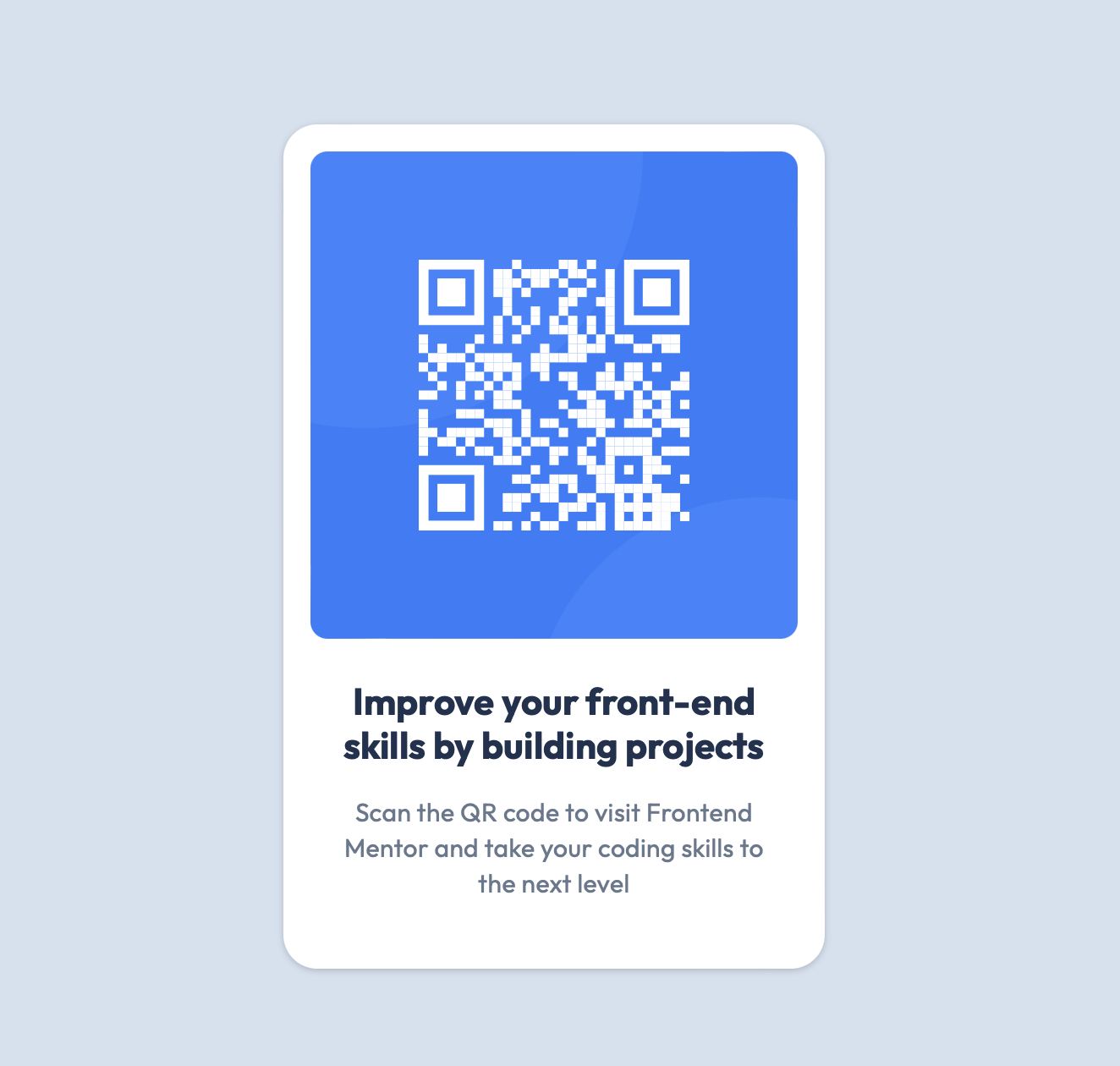
This is a solution to the QR code component challenge on Frontend Mentor. Frontend Mentor challenges help you improve your coding skills by building realistic projects.
- Semantic HTML5 markup
- Mobile-first workflow
- CSS Flexbox
- CSS BEM
- I tried to match the card height in the Figma file, I started with with
margin-bottom: 24pxon the image to create the gap between image and the text box. - Noticed extra vertical space added when using
margin-bottom, even though the developer tools showed a 24px margin.
- Replaced
gap: 24pxin the.cardflex container withmargin-bottom: 24pxon the image.
-
Margin:
- Adds space outside the element.
- Can cause issues like collapsing margins, where vertical margins between elements may combine into a single margin, leading to inconsistent spacing.
- Margins contribute to the overall height of the container, possibly causing the "extra" space you observed.
-
Gap:
- Adds space only between flex items (child elements).
- Does not affect the space outside the elements, leading to more consistent and predictable spacing.
- Ideal for ensuring even spacing between items in a flexbox or grid layout without influencing the overall height of the container.
- Use
gapin Flexbox/Grid Layouts: It provides consistent, predictable spacing between items. - Avoid Margins for Spacing Between Flex Items: Margins can lead to unpredictable extra space and are more complex to manage in a layout.
- Choose
gapfor simpler and more reliable layout control.
- Website - Edward Pau
- Frontend Mentor - @edpau
