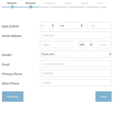
is a multi-step, wizard component for data collection via forms and other sub components. It basically lets you throw a bunch of react components at it (data forms, text / html components etc) and it will take the user through those components in steps. If it's a data entry form it will tigger validation and only proceed if the data is valid.
- something like this of course:
- run
npm install react-stepzilla
- require into your project via
var StepZilla = require('react-stepzilla')
- define the list of all the components you want to step through. The
nameindicates the title of the UI step and component is what loads.
const steps =
    [
      {name: 'Step 1', component: <Step1 />},
      {name: 'Step 2', component: <Step2 />},
      {name: 'Step 3', component: <Step3 />},
      {name: 'Step 4', component: <Step4 />},
      {name: 'Step 5', component: <Step5 />}
    ]
- and now render it out somewhere in your app
    <div className='step-progress'>
        <StepZilla steps={steps}/>
    </div>
- pass in following options as well if you want to customise it further
// hide or show Next and Previous Buttons
showNavigation: true | false

// disable or enable the steps UI navigation on top
showSteps: true | false

// disable or enable onClick step jumping from the UI navigation summary on top
stepsNavigation: true | false

// show or hide the previews button in the last step (maybe the last step is a thank you message and you don't want them to go back)
prevBtnOnLastStep: true | false

// dev control to disable calling and Child form component validation
dontValidate: true | false

// by default if you hit the Enter key on any element it validates the form and moves to next step if validation passes. Use this to prevent this behaviour
preventEnterSubmission: true | false

// specify what step to start from in the case you need to skip steps (send in a 0 based index for the item in the steps array. e.g. 2 will load <Step3 /> initially)
startAtStep: [stepIndex]

// specify what the Next button text should be in the step before the last (This is usually the last "Actionable" step. You can use this option to change the Next button to say Save - if you save the form data collected in previous steps)
nextTextOnFinalActionStep: "Save"
example options usage:
<div className='step-progress'>
    <StepZilla steps={steps} stepsNavigation={false} prevBtnOnLastStep={false} startAtStep=2 />
</div>
-
if one of your components is a form that requires validation before moving to the next component, then that component needs to implement a
isValidated()public method which validates the form and returns true/false if the data is valid. For an e.g. on this have a look at thesrc/examples/Step2component. -
also if you want some default style, copy the source from
src/css/main.csscode into your project (the above look in the picture also requires bootstrap)
- all node source is in src/main.js
- you need to install dependencies first
npm install - make any changes and run
npm run buildto transpile the jsx intodist - the transpilation is run as a auto pre-publish task so it should usually be up to date when consumed via npm
A full example is found in the src/examples directory.
- run
npm install - then run
npm run example - then go to
http://localhost:8080/webpack-dev-server/src/examples/index.htmlin your browser - enjoy
- write the tests
- 1.9.0
- added the nextTextOnFinalActionStep option
- 1.8.0
- added the startAtStep option
- 1.7.0
- fixed the example and made it so you can run it via the browser
- 1.6.0
- added preventEnterSubmission option to prevent moving to next step if enter is hit
- 1.5.0
- update to improve showSteps. prevent UI elements from completed rendering
- 1.4.0
- added the option showSteps which hides the top steps if needed
- 1.3.0
- added the options showNavigation, stepsNavigation, prevBtnOnLastStep, dontValidate
- 1.2.0
- fixed issue when when consumed via npm the jsx was causing a build error on the host project. Its not transpiled via babel into dist
- 1.0.0
- initial working version
