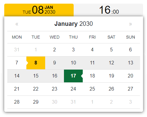
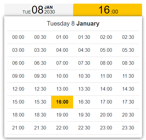
DateTimePickerComponent is a very lightweight (just over 20KB) and dependency-free web component written in pure JavaScript. It supports localization, date formats, range selections and disabled dates. See the online demo.
Some time ago, during the development of some booking applications, I needed a date time picker that didn't require any heavy dependencies. I didn't find anything that met all my needs and browser's native implementations are currently inconsistent, so I developed mine.
All desktop/mobile recent browsers and IE11.
DateTimePickerComponent is usually delivered via npm:
npm install --save date-time-picker-component
DateTimePickerComponent exposes four different classes:
- DatePicker;
- DateTimePicker;
- DateRangePicker;
- DateTimeRangePicker.
From now on we'll refer to DatePicker and DateTimePicker as Date*Picker classes and we'll refer to DateRangePicker and DateTimeRangePicker as Date*RangePicker classes instead.
If you're using a bundler like Webpack, you'll need to import the class you need.
import 'date-time-picker-component/dist/css/date-time-picker-component.min.css';
import { DatePicker } from "date-time-picker-component/dist/js/date-time-picker-component.min";

new DatePicker( 'select_date' );DateTimePickerComponent works as well in non-module environments. You can include the necessary files from local
<link href="local-path-to/date-time-picker-component.min.css" rel="stylesheet">
<script src="local-path-to/date-time-picker-component.min.js"></script>
or from jsDelivr CDN.
<link href="https://cdn.jsdelivr.net/gh/marcellosurdi/DateTimePickerComponent/dist/css/date-time-picker-component.min.css" rel="stylesheet">
<script src="https://cdn.jsdelivr.net/gh/marcellosurdi/DateTimePickerComponent/dist/js/date-time-picker-component.min.js"></script>
In non-module environments you must access the classes via DateTimePickerComponent object:
new DateTimePickerComponent.DatePicker( 'select_date' );When one of the classes is called with new operator like above (new DatePicker( 'select_date' );), the necessary HTML is dynamically appended to the div#select_date.
The resulting HTML for Date*Picker classes will look similar to these lines of code:
<div id="select_date" class="datetime-container">
  <div class="buttons-container">
    <button type="button" class="date start">
      <span class="week-day">mon</span>
      <span class="month-day">00</span>
      <span class="month-year"><span>jan</span><br>2000</span>
    </button>
  </div>
  <div class="picker"></div>
  <input type="hidden" name="select_date_value" class="date_output" value="">
</div>
For Date*RangePicker classes instead:
<div id="select_date" class="datetime-container fix-float">
  <div class="buttons-container fix-float">
    <button type="button" class="date start w-50">
      <span class="week-day">mon</span>
      <span class="month-day">00</span>
      <span class="month-year"><span>jan</span><br>2000</span>
    </button>
    <button type="button" class="time start w-50">
      <span class="hours">00</span>
      <span class="minutes">:00</span>
    </button>
  </div>
  <div class="picker"></div>
  <input type="hidden" name="select_date_value" class="date_output" value="">
</div>As you can see, the picker is not tied to an input text, so the selected date is always returned to the value attribute of the input.date_output, according to settings.date_output property. So we simply have to get the value of input.date_output inside the top level div.
new DatePicker( 'select_date' );

// your code...

// Retrieves the date time selection and puts it in the 'selection' variable
let selection = document.querySelector( 'div#select_date input.date_output' ).value;
See the settings section below to know supported date time formats.
DatePicker and DateTimePicker classes allow to select a date or a date/time respectively, see the online demo.
| Property | Type | Default | Description |
|---|---|---|---|
id |
{string} |
None | Id of the div element where to append the component. An error is thrown if no value or invalid value is passed |
[settings] |
{object} |
{} |
Object with user defined settings |
See the settings section for more details.
Here a JavaScript example:
import 'date-time-picker-component/dist/css/date-time-picker-component.min.css';
import { DatePicker } from "date-time-picker-component/dist/js/date-time-picker-component.min";

new DatePicker( 'select_date', {
  first_date: "2030-01-02",
  start_date: "2030-01-05",
  last_date: new Date( 2030, 0, 29 ),
  first_day_no: 1,
  date_output: "timestamp",
  styles: {
    active_background: '#e34c26',
    active_color: '#fff'
  }
} );
And the corresponding HTML:
<body>
  <div id="select_date"></div>
</body>DateRangePicker and DateTimeRangePicker classes allow to select a date range or a date/time range respectively, see the online demo.
| Property | Type | Default | Description |
|---|---|---|---|
start_id |
{string} |
None | Id of the start date div element. An error is thrown if no value or invalid value is passed |
end_id |
{string} |
None | Id of the end date div element. An error is thrown if no value or invalid value is passed |
[settings] |
{object} |
{} |
Object with user defined settings |
See the settings section for more details.
Here a JavaScript example:
import 'date-time-picker-component/dist/css/date-time-picker-component.min.css';
import { DateTimeRangePicker } from "date-time-picker-component/dist/js/date-time-picker-component.min";

new DateTimeRangePicker( 'start_date_time', 'end_date_time', {
  first_date: "2030-01-02T10:30:00",
  start_date: "2030-01-05T16:00:00",
  end_date: "2030-01-06T18:00:00",
  last_date: new Date( 2030, 0, 29, 14, 0 ),
  first_day_no: 1,
  date_output: "timestamp",
  styles: {
    active_background: '#e34c26',
    active_color: '#fff',
    inactive_background: '#0366d9',
    inactive_color: '#fff'
  },
    min_range_hours: 18
} );
And the corresponding HTML:
<body>
  <div id="start_date"></div>
  <div id="end_date"></div>
</body>All classes support these properties in settings object. All *_date properties can be a date string (in ISO format) or a date object.
| Property | Type | Default | Description |
|---|---|---|---|
first_date |
{Date|string} |
Current date | First selectable date. |
start_date |
{Date|string} |
One day more than current date | Start selected date |
last_date |
{Date|string} |
One year more than start_date |
Last selectable date |
first_day_no |
{number} |
0 (Sunday) |
Day the week must start with. Accepted range values are 0-6 where 0 means Sunday, 1 means Monday and so on |
date_output |
{string} |
"short_ISO" or "full_ISO" |
The date format returned to the value attribute of input.date_output. Accepted values are short_ISO (default for Date* classes, e.g. "2030-01-05"), full_ISO (default for DateTime* classes, e.g. "2021-07-16T09:30:00") and timestamp (without milliseconds). |
l10n |
{object} |
Object with English strings | Object with strings for translation |
styles |
{object} |
{} |
Object with custom styles |
Only the Date*RangePicker classes also support these properties:
| Property | Type | Default | Description |
|---|---|---|---|
end_date |
{Date|string} |
One day more than start_date |
End selected date |
min_range_hours |
{number} |
1 |
The minimum range expressed in hours that must elapse between start_date and end_date |
With DateTimePicker and DateTimeRangePicker classes it also make sense to set the settings.round_to property.
| Property | Type | Default | Description |
|---|---|---|---|
round_to |
{number} |
false |
Value to round minutes of time picker. Accepted values are 1, 5, 10, 15, 20, 30 |
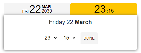
If you don't set this property you'll see the time picker exactly as the 1.0.x version (see example 4). If you set this property you'll get a time picker with two select elements, one for the hours and one for the minutes (see example 6). Minutes will be rounded to the round_to value and his multiples. For instance with round_to set to 15, the options in the select element will be 00, 15, 30, 45; with round_to set to 20, the options will be 00, 20, 40 and so on. 1 (or an unaccepted value) will show all values from 00 to 59.
new DateTimeRangePicker( 'start_date_time', 'end_date_time', {
  first_date: "2030-01-02T10:30:00",
  start_date: "2030-01-05T16:00:00",
  end_date: "2030-01-06T18:00:00",
  last_date: new Date( 2030, 0, 29, 14, 0 ),
  first_day_no: 1,
  round_to: 5, // Enables the time picker with two select elements
  date_output: "timestamp",
  styles: {
    active_background: '#e34c26',
    active_color: '#fff',
    inactive_background: '#0366d9',
    inactive_color: '#fff'
  },
    min_range_hours: 18
} );All classes support the settings.l10n property to localize the component in your language. You just have to pass an object like the one below to that property.
let it = {
  'jan':'Gen',
  'feb':'Feb',
  'mar':'Mar',
  'apr':'Apr',
  'may':'Mag',
  'jun':'Giu',
  'jul':'Lug',
  'aug':'Ago',
  'sep':'Set',
  'oct':'Ott',
  'nov':'Nov',
  'dec':'Dic',
  'jan_':'Gennaio',
  'feb_':'Febbraio',
  'mar_':'Marzo',
  'apr_':'Aprile',
  'may_':'Maggio',
  'jun_':'Giugno',
  'jul_':'Luglio',
  'aug_':'Agosto',
  'sep_':'Settembre',
  'oct_':'Ottobre',
  'nov_':'Novembre',
  'dec_':'Dicembre',
  'mon':'Lun',
  'tue':'Mar',
  'wed':'Mer',
  'thu':'Gio',
  'fri':'Ven',
  'sat':'Sab',
  'sun':'Dom',
  'mon_':'Lunedì',
  'tue_':'Martedì',
  'wed_':'Mercoledì',
  'thu_':'Giovedì',
  'fri_':'Venerdì',
  'sat_':'Sabato',
  'sun_':'Domenica',
  'done':'Imposta' // @since 1.1.0
};

new DatePicker( 'select_date', {
    l10n: it,
  }
);All classes support the settings.styles property for styles customization.
// Date*Picker classes
new DatePicker( 'select_date', {
  styles: {
    active_background: '#e34c26',
    active_color: '#fff'
  }
} );

// Date*RangePicker classes
new DateTimeRangePicker( 'start_date_time', 'end_date_time', {
  styles: {
    active_background: '#e34c26',
    active_color: '#fff',
    inactive_background: '#0366d9',
    inactive_color: '#fff'
  },
} );
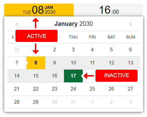
All you need to do is to use active_background, active_color, inactive_background and inactive_color properties like above. Active colors denote the clicked buttons and the day/hour you're setting, inactive colors the other day in the range. Date*Picker classes of course don't support inactive_* properties because there isn't a range.
To set date time default or to retain the date time selection after a page reload due, for instance, to a failed validation, you can add by yourself the input.date_output inside the top level div in this way:
<body>
  <!-- Date*Picker classes -->
  <div id="select_date">
    <input type="hidden" name="my_value" class="date_output" value="2030-05-22">
  </div>

  <!-- Date*RangePicker classes -->
  <div id="start_date">
    <!-- Overwrites start_date -->
    <input type="hidden" name="my_value" class="date_output" value="2030-05-22">
  </div>
  <div id="end_date">
    <!-- Overwrites end_date -->
    <input type="hidden" name="my_value" class="date_output" value="2030-05-22T10:00:00">
  </div>
</body>
The component will detect hidden input fields (it will no longer add them), and use the content of their value attribute as default. This may be useful if you are a server side developer and you can't access separate js files of your application. In this case the content of name attribute is totally up to you, otherwise it will be top_level_div_id + '_value'.
To compile DateTimePickerComponent by yourself, make sure that you have Node.js installed, then:
- Fork and clone the GitHub repository.
- From the command line go to the local DateTimePickerComponent folder.
- Run
npm installand wait for the necessary modules installation. Webpack will be installed, look at the other dev dependencies in thepackage.jsonfile. - The
npm run devcommand opens a new Chrome window for developing purposes,npm run buildcompiles indistfolder. - The
npm run jsdoccommand generates the code documentation indocsfolder.
That's it!
Let me know with a link if you've used DateTimePickerComponent in some interesting way, or on a popular site.


