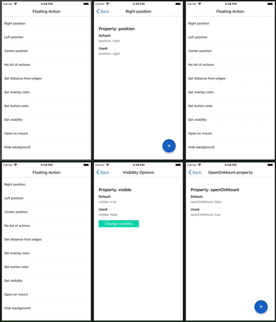
Floating action button for React Native
Table of Content:
Open the following click on your phone: Expo link
or user your phone and scan the following QR:
npm i react-native-floating-action --save
or
yarn add react-native-floating-action
Take a look into example/ReactNativeFloatingAction-Expo
To execute the example using Expo run the following command:
yarn run run:exampleor open Expo link from your mobile
First step: import the component:
import { FloatingAction } from "react-native-floating-action";Second step: define the buttons
const actions = [
  {
    text: "Accessibility",
    icon: require("./images/ic_accessibility_white.png"),
    name: "bt_accessibility",
    position: 2
  },
  {
    text: "Language",
    icon: require("./images/ic_language_white.png"),
    name: "bt_language",
    position: 1
  },
  {
    text: "Location",
    icon: require("./images/ic_room_white.png"),
    name: "bt_room",
    position: 3
  },
  {
    text: "Video",
    icon: require("./images/ic_videocam_white.png"),
    name: "bt_videocam",
    position: 4
  }
];
Third step: use it
<View style={styles.container}>
  <Text style={styles.example}>Floating Action example</Text>
  <FloatingAction
    actions={actions}
    onPressItem={name => {
      console.log(`selected button: ${name}`);
    }}
  />
</View>There are some cases where you want to show or hide the component without pressing the main button:
<FloatingAction
  ref={(ref) => { this.floatingAction = ref; }}
  actions={[...]}
  ...
/>
and then:
this.floatingAction.animateButton();Default: []
Actions to be shown when user press the main Floating Button. See Actions section for more info about the Object keys and values.
Deprecated! use color instead!
Default: '#1253bc'
Color of the main button. Pass this String as an hexadecimal color respecting the default format.
Default: 30
Distance from button to edge. Can be a Number or an Object respecting the { vertical: Number, horizontal: Number } format.
Default: true
Hide or Show the component using an animation.
Default: 'rgba(68, 68, 68, 0.6)'
Color of the background overlay. The String must respect the rgba() pattern described in default value.
Default: 'right'
Position to render the main button and actions, options: (left, right, center).
Default: 'false'
Override the main action with the first action inside list actions, will not show other action.
Default: ReactElement
Change the default plus icon using require(pathToImage) or ReactElement.
Default: true
Show or Hide background after open.
Default: false
Open component after mounting it, useful on some weird cases like tutorials.
Default: 8
Change distance between actions.
Default: 15
Icon width of the main button.
Default: 15
Icon height of the main button.
Default: 56
Size of the main button.
Default: false
Change position when the keyboard will appear.
Default: false
Dismiss keyboard when user press on the main button.
Default: { shadowOpacity: 0.35, shadowOffset: { width: 0, height: 5 }, shadowColor: "#000000", shadowRadius: 3 }
Change how we render the shadow of every button, this style will apply to the main button and to every action button.
Function to be called as soon as the user select an option from actions. Will return the name of the action.
Function to be called as soon as use click main button and will return true or false depeneding of the state.
Function to be called as soon as the backdrop is clicked.
Function to be called after set state to false.
Function to be called after set state to true.
Function to be called after every state change. Will return state object.
Default: true
Enable the animation to be called after every state change. Will return state object.
Default: '#1253bc'
Color of the action button.
Default: '#ffffff'
Change default icon color
Icon to be rendered inside the action, will accept an URL or React.Image. If we want to send an URL we need to send it in this way: icon: { uri: 'https://imageurl.com' } if we want to send a React.Image we will use it in this way: icon: require('path/image').
Name of the icon, this name is used as parameter for onPressItem prop.
Default: 40
Size of of the action button.
Text to show near to the button. (Only apply for position = ['left', 'right']).
Default: { fontSize: 12 }
Style to update text size.
Default: #ffffff
Background color for Text container.
Default: #444444
Text color for every action.
*Deprecated! use textElevation instead!
Default: 5
Elevation property (also modifies "shadowOffset" in iOS)
Default: 5
Custom render function for Action. If provided, other properties are not applicable. The provided function should return a React Node
Default: 8
Additional margin for action. This property is useful when we want to override the current margin for example using custom render
Default: 40
Size of of the icon rendered inside the action
- first implementation
- example
- add colors configurations
- add more positions like left, center and right
- support hide or show the component with an animation
- change plus icon to be customizable
- use components as icon
- hide background
- open on mounting
- migrate to TypeScript
- allow user defined animations
- use crazy animations

