This exercise meant to teach you the basics of page layout using HTML and CSS.
- Fork this repository to your own account (or one specific teammate's account if you're working in a group)
- Add any teammates as collaborators
- Use
git cloneto create a local copy of the repository - Deploy using the
surgecommand
Note: The code for the site lives in the site/ directory and that's what you want to deploy.
Also Note: When referring to a directory like site, it generally doesn't matter if we say site or site/. Programs are designed to handle either. We type out site/ here because the trailing / makes it clear we're talking about a directory.
From the project directory, you can deploy everything in site/ using the following command:
surge site(Yes, surge site/ will also work.)
There's nothing special about the directory name site/, but if we don't keep the files for the site itself separate then running surge from inside the project directory will publish everything in this repository (like this README).
These exercises are all about using CSS to control the design of your website.
We've marked up a simple blog post design in HTML. Your goal is to change the layout to something that more closely resembles a blog and improve the overall design.
The site/ directory contains two files you need to care about:
site/index.html— The HTML for the blog postsite/stylesheets/main.css— A stylesheet referenced via a link tag that you will fill out
Your goal is to improve the layout and design of the website by editing only main.css. That's right: you shouldn't really need to touch index.html.
You can edit index.html to add new class and/or id attributes to pre-existing elements, but no adding new tags or re-arranging existing tags.
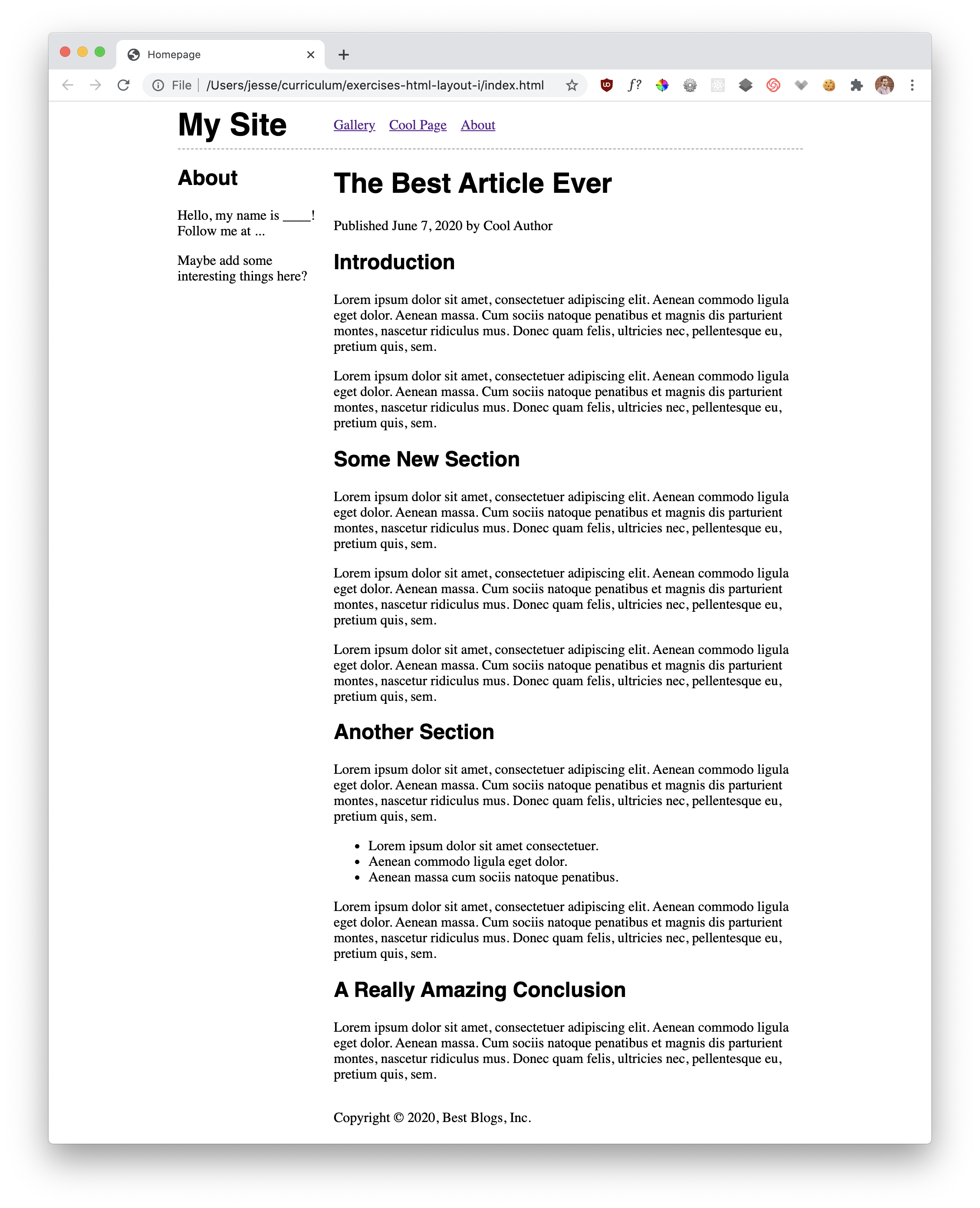
Open up sites/index.html. Using CSS grid for layout, change the page so that...
- The header + navigation span across the top of the page
- The sidebar and main content are side by side
- The footer spans across the bottom of the page
Visually, the before and after:
- Before — https://raw.githubusercontent.com/jfarmer/exercises-html-layout-i/master/layout-no-css.png
- After — https://raw.githubusercontent.com/jfarmer/exercises-html-layout-i/master/layout-with-css.png
You will feel like this and that's expected:

The following resources are not meant to be exhaustive, but we like them!
- The noob's guide to CSS grid contains everything you need to know to do this
- MDN's guide to CSS grid is a good overview with generic, interactive examples. It also contains everything you need to know to do this.
- CSS Grid By Example
- A Complete Guide to Grid — when they say complete they mean it. Lots of great info here, but very dense.
Make the page your own. Change the fonts, colors, etc. Add some of your own content. Keep the design looking good, though.
Depending on what you do, you might need to change index.html to achieve this. But don't break the existing design.
Fundamentally, the web is a text-based medium and therefore typography has a lot to do with what makes a website look "nice".
If this sounds interesting to you, one of the first thing you should learn about is vertical rhythm. The default spacing between elements in an HTML document is somewhat random. Related things are spaced the same as unrelated things. Some elements are cramped, some are spaced way out.
Vertical rhythm is a way of creating consistent spacing as you scroll up and down the page. It's one of the easiest things you can do to make your site look nicer.
In CSS this is achieved by making line-height and margin properties multiples of a common value.
Here are some resources. Try to apply the concepts to this design:
- https://designmodo.com/vertical-rhythm/
- https://www.amazeelabs.com/en/journal/designer-toolbox-vertical-rhythm
- https://zellwk.com/blog/why-vertical-rhythms/
How do you make your design work on both large desktop monitor, a laptop screen, and a smart phone?
A design that works regardless of screen size is called "responsive". The holy grail is having to only ever write your HTML and CSS once, but do so in a way that adapts dynamically to the screen size.
This is...not easy.
But try to improve the way this site looks when it's in both a big window and a small window. Some resources: