The purpose of this workshop is to become familiar with the R package ggplot2, a powerful package that enables users to use simple syntax in order to create elegant graphs.
We begin with a .csv file and, using ggplot2, execute several manipulations in order to learn the basic functions of ggplot2 using a Pokemon-based dataset. This is not meant to be comprehensive re: learning ggplot but, in conjunction with the Powerpoint, is meant to establish a basic ggplot2 intuition that can be coupled with hardcore Stack Exchange + Google + furious coffee coding sessions to make the most beautiful graphs you can!
The workshop assumes some knowledge of R (e.g. setting working directories, loading libraries, etc;), but we can work on it together if not!
Please see the accompanying powerpoint for more details.
#Set the working directory to wherever your file is located,
and load in the following packages (which should already be pre-installed):

setwd(C:/Path/to/file)
library("tidyverse")
library("ggplot2")
library("gridExtra")
library("RColorBrewer")
library("viridis")
Now, we will load in the Pokemon dataset. This dataset was taken from The Complete Pokemon Dataset, which contains information on all 802 Pokemon from 7 Generations. Neeeeerddd. The datset is titled Pokemon.csv and can also be downloaded from the GitHub.
For those who are young and/or had friends growing up, Pokemon is a Japanese media franchise based on "pocket monsters" that you can train, befriend, coexist with. There are a lot of them, and there is a passionate culture centered around them.

p <- read.csv("pokemon.csv")
#This puts the .csv into a list titled 'p'
To make the dataset more manageable, we will use the subset() function to only extract one generation (the first one, which is the best, obviously!). The syntax is subset(list, Column == "Desired_String").
p<-subset(p, Generation =="1")
Note: let's say you wanted to use all generations except generation 5. Then, what you would use instead would be subset(p, Generation != "5").
ggplot2 was made following the Grammar of Graphics, a textbook by Leland Wilkinson. A grammar of graphics is a framework which follows a layered approach to describe & construct visualizations or graphics in a structured manner. Hadley Wickham et al wrote a book describing their incorporation of the Grammar of Graphics into the ggplot2 package.
Take a look at the p dataset by Ctrl+Enter on the given line. You should see columns such as Name, Type.1, Total, HP, Attack, etc;. Each row corresponds to a given Pokemon 'species'.
If you want to look at specifics for a given column, you can add a $ after the object. For example, typing in p$Type.1 will show you all the Type 1 (all Pokemon have a 'type' that summarizes their physical properties) rows. If you want to see those which are unique, you could write in unique(p$Type.1).
Now, it is time to start making an actual ggplot!
Let's start by loading in a ggplot item.
ggplot(p)
You might see, well, nothing!

The ggplot() function establishes that a plot needs to be made. It 'initializes' a ggplot option, and declares the input data frame. But, so far there are no aesthetics mapped on to it. The data is 'there' but is not seen.
What you need to do is load in the aesthetics, which is called by aes(). And then the layers, scales, coords and facets are added with +. Let's see this!
The way aes() works is by describing how data variables are mapped to the visual properties, or aesthetics, or aes of the geoms (the geoms, remember, are the 0, 1 or 2 dimensional graphic representations of the data point!). It is used in the following way: aes(x, y, ...). The official aes() documentation can be found here.
There are lots of ways to call aes(). Several can be read about here. We are going to run through a few of the most common iterations via using a scatterplot example.
In our case, let's think of two items we want to map onto a scatter plot. Let's say, mmm, Attack and Defense. The we run the following:
ggplot(p, aes(Attack, Defense))
What do you see now?

Probably nothing that interesting... yet. But there's a key difference between this image and the other one. The first image shows an empty plot. But this one indicates an axis, which shows the X axis Attack, and the Y is Defense. The scales have been automatically set to be within the bounds of the data - these can be manipulated later on downstream. The specific data set to be mapped has been loaded in. However, we do not yet see any data points! This is because the geom has not been indicated yet. As I mention in the slide, a geom is a geometric object, which is the visual representation of the observation. A geom can be a point, text, lines, etc;. A geom is how you choose to represent the data, which can be multiple different ways. Another link on some uses can be found here.
How do we represent the data? Since we are interested in making a scatterplot, we will use geom_point() (more info on usage here. Each dataset is represented by a _ point_. Keep in mind there are other types of geoms, as we described. There is geom_boxplot(), geom_histogram(), etc;. A point is merely one type of geom. I know I'm repeating myself, but this is something I have never seen emphasized in learning this program.
So, we will add the geom point aesthetic to these points by running the following code:
ggplot(p) + aes(Attack, Defense) + geom_point()

Dope, right?!
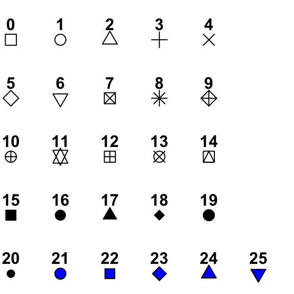
Within the syntax above, the geom_point() function can be manipulated. A link to some of the manipulation types can be found here. For example, let's say I'm not super into dots. You can change the shape to look like any of these (among others):
To reflect this change in the code, we make the following manipulation:
ggplot(p) + aes(Attack, Defense) +
  geom_point(shape=23)

There are other manipulations you can make to each point. Try manipulating the code below to see what each function changes:
ggplot(p) + aes(Attack, Defense) +
  geom_point(shape=23,
             fill="forestgreen",
             size=3,
             color="yellow",
             alpha=0.5)
So far we have representations of two variables: Attack, and Defense. What if we wanted to add in a third variable? One option is by represent a third variable by changing the color of each point. We do this by manipulating the aes() function further and specifying the 'color' variable, as so:
ggplot(p) + aes(Attack, Defense, color=HP) + geom_point()

Note that this is different than the color manipulations we did above. In the above image, we were changing the default of these geoms. Now, we are changing the aes() so it is reading in another variable, and this variable is changing the color such that the color is represented by a specific variable. The previous geom_point() change was global. This aes() change is specific to the variable. Got it?
Keep in mind that this is assigning a quantitative variable color to each point, so you will see a quantitative color scale. However, you can also do the same with discrete variables, such as Type.1:
ggplot(p) + aes(Attack, Defense, color=Type.1) + geom_point()

So far we have three different variables represented: Attack, Defense, and Type.1. Dope! What if we want to go DEEPER and add another one? A fourth variable?
Another way we can manipulate the graph is by changing the size of each point. Again, we will manipulate the aes() function and assign a variable to this size. Let's play around and change the size depending on the Pokemon's speed!
ggplot(p) + aes(Attack, Defense, color=HP, size=Speed) + geom_point()

Are you ready for one more variable?! A fifth one!?!? Let's change the shape of each data point. Keep in mind that shape is a discrete trait, so it can only function with discrete variables.
ggplot(p) + aes(Attack, Defense, color=HP, size=Speed, shape=Legendary) + geom_point()

This is getting hella noisy. Let's take a breath and focus on one thing we can do to change the 'broad' overall aesthetic of a graph: changing the theme!
- Previously, we changed the
alpha()settings. How could you manipulate the code above to change the transparency based on a new variable?
Themes area fun way of changing all the non-data display. Just, like, the vibe, tu sabes.
One thing we will do to make looking at this a little easier is to put our whole ggplot so far into an object titled p1, as so:
p1 <- ggplot(p) + aes(Attack, Defense, color=HP,
                size=Speed,
                shape=Legendary) + geom_point()
Now, running p1 should give you the previous graph. But it is also easier to make quick manipulations now that we have the 'core'. Let's run through a few of the themes to see how they can make sudden and aesthetically pleasing changes to the graph style. You can add a theme (overriding the defaults) by adding the theme function with a '+' at the end of the script, e.g.
p1 + theme_bw()

Notice a change?
Now, try out a few of these themes and see what is prettiest for you:
p1 + theme_light()
p1 + theme_dark()
p1 + theme_minimal()
p1 + theme_void()
p1 + theme_classic()
Disclaimer: I know very little about linear regressions. But other people, such as Dr. Juarez, and the guy who wrote this, totally do! But I will run through a basic function:
Let's say I want to run a linear model for how Attack corresponds to Defense. Firstly, in order to do this, we need to work with the original .csv data frame. The lm() function that does this is (I believe) part of the base R package and doesn't deal with this ggplot nonsense.
So, first let's reload in the Pokemon dataset, subsetting the first generation:
p <- read.csv("pokemon.csv")
p <- subset(p, Generation == 1)
Take a look at the graph. Do you expect a line to fit through these data?
ggplot(p) + aes(Attack, Defense) + geom_point(color="darkgreen")

We then run the lm() function, which fits linear models to the data points specified, e.g. lm(X ~ Y, data = data). You can then view summary statistics for the model.
So...
  model <- lm(Attack ~ Defense, data = p)
summary(model)
NOW! If you want to add that model, that layer, to the graph, you add on another geom. The linear model is part of the geom called geom_smooth(). Its usage is like so:
ggplot(p) + aes(Attack, Defense) + geom_point(color="darkgreen") + geom_smooth(methods='lm')

More information about the geom_smooth() function can be found here.
This may not be that useful, but I'll share it anyways. Personally, I'm really into Pokemon (ndur), and I love messing around with these graphs to see what they tell me about them. One thing that could be useful is by adding text to these scatterplots. Turns out there is a function for this! They are geom_text() and geom_label().
Text geoms are useful for labeling plots. They can be used by themselves as scatterplots or in combination with other geoms, for example, for labeling points or for annotating the height of bars. geom_text() adds only text to the plot. geom_label() draws a rectangle behind the text, making it easier to read.
Let's look at a few examples of the usage, subsetting only Legendary pokemon to make the graphs more manageable to work with:
p <- read.csv("pokemon.csv")
lgd1 <- subset(p, Legendary ==TRUE)
lgd2 <- ggplot(lgd1) + aes(Attack, Defense, color=Type.1)
Now, the ggplot object lgd2 contains legendary Pokemon with Attack, Defense, and colored by Type.1. Now we will add geom-text(), with the modifier label=lgd1$Name which tells us that the actual label we want to display is the name of the Pokemon:
lgd2 + geom_text(label = lgd1$Name)
This graph is kind of unwieldy af because the text is all over the place. However, we can make a few modifications to make it more manageable: 1) we use the check_overlap function, which will keep text from overlapping. Then, we can 2) change the size of the text:
lgd2 + geom_text(label = lgd1$Name, check_overlap=TRUE, size=2)
Now try the same with geom_label(). What is the major difference between these?

- Of all the Pokemon in generation 2, which is the fastest?
- of all the legendary Pokemon in generations EXCLUDING the first, which has the highest HP?
- Is there a statistically significant association between HP and speed for all Pokemon in generation 4?
- What are a few types of geoms? What are the ways of using them to show information?
Okay, enough time with the scatterplots and continuous variables! Boo! Now we are going to play around with a histogram geom. One guide for these geoms can be found here.
A histogram is a counter. It counts how many of something can be found given a dataset. For example, let's say we want to see the distribution of means for Hit Points in a pokemon. As before, we load in the dataset. The aesthetic set up is a little bit different: instead of assigning an X and Y, we only establish an X, since we are only looking at one variable and then counting it (hence, the Y will inherently by the count). Let's plug this in as a default:
p <- read.csv("pokemon.csv")
ggplot(p, aes(x=HP)) + geom_histogram()

Run & play around with the following code:
ggplot(p, aes(x=HP)) + geom_histogram(binwidth=2, fill="blue", color="green")
- What do you think changing the binwidth does?
- What do you think changing fill does?
- What does changing the color do?
- What is (approximately) the most common Pokemon speed?
Now, run & play with this code:
contando_legendarios <- ggplot(p,
             aes(x=Speed,
                 color=Legendary)) + geom_histogram(binwidth=5,
                                            fill="black")
contando_legendarios

- How is the new variable,
Legendary, reflected in the histogram?
Now run this code!
contando_legendarios <- ggplot(p,
             aes(x=Speed,
                 color=Legendary)) + geom_histogram(binwidth=5,
                                            fill="black",
                                            color="Blue")
contando_legendarios
- What's the main difference between this graph and the one above?
- Look at the new graph. Do you still see the variable 'Legendary' reflected in this graph? What does this say about preference & overriding of defaults in ggplot2? That is to say: which is given more priority: the defaults (initially assigned with
aes()or thegeom?
Boxplots are a way of examining the quantitative means between categorical variables. A great guide to using boxplots can be found here. Let's go nuts for a second and see how the HP of legendaries compares to those of non-legendaries:
ggplot(p, aes(x=Legendary, y=HP)) + geom_boxplot()

I mean, obviously, right? They're legendaries, you would expect the mean to be a bit higher.
Let's say you want to compare the mean Speeds of Pokemon from different generations. Try it now. Do you run into any issues?
Well, yeah, of course. The problem is that, when dealing with a numerical variable, like, generation 1, the computer doesn't know that this is actually categorical. We're nerds and know that generations are distinct entities, and that Gen 1 Pokemon are from Kanto while the second is Johto and so on and so forth... anyways. To address this, we can convert the numerical variables into categorical ones with the as.factor() function, like so:
ggplot(p, aes(x=as.factor(Generation), y=Speed)) + geom_boxplot()
Let's run the following:
ggplot(p, aes(x=as.factor(Generation), y=Defense, color=as.factor(Generation), fill="orange")) + geom_boxplot()
-
Based on the above, what do you think
color= functiondoes in the boxplot context? What about fill? -
Add
fill=Legendary. What happens? What does this data tell you about how consistently Pokemon legendaries are stronger than non-Legendaries across generations? What are some examples of how this type of plot could be useful?

This example is pretty uncommon, but I wanted to show one iteration of mapping a discrete against a discrete variable. Thus do we introduce the uncommon geom_count() function. A good guide to its usage can be found here and here.
It's kind of like a histogram, but in two dimensions:
ggplot(p, aes(x=Legendary, y=as.factor(Generation))) + geom_count()

A critical part of making compelling graphs is the presentation. We've spent a lot of time discussing the data we choose and the geoms we use to present them. Now we will discuss the presentation.
Clearly, one aspect of presentation is going to be the axes. Sometimes, the way we format .csv data will not be compatible with how we want data in our graphs: we use underscorse since it can't handle strings, etc;. For example, p$Legendary returns TRUE or FALSE, since it is Boolean data.
Let's consider the graph we made above, the count geom. As it stands, the axes are written as they are read in: as.factor(Generation) with the labels TRUE or FALSE. How can we fix this?
We can add a few different functions: xlab(), ylab(), and ggtitle() (which adds a general title). You add these using a plus sign and it overrides the defaults.
Let's try the following:
 ggplot(p, aes(x=Legendary, y=as.factor(Generation))) + geom_count() + theme_bw() +
 ggtitle("Counts of Legendaries per Generation") +
 xlab("Legendary?") +
 ylab("Generation")

However, there are still a few things I don't love about this graph. First, the fact that generations are in descending order. Then, the fact that legendary Pokemon are only indicated with FALSE or TRUE. Kind of ugly.
To change the order of the y axis for this discrete variable, you add the following code: scale_y_discrete(limits=rev). Details on how to reverse the scale for a continuous variable can be found here.
What if we want to change the ticks on the axis? For example, in our case, we want to change the presentation of each legendary label so it says "Non-Legendary", etc; instead of a Boolean value.
This can be kind of annoying (if you have LOTS of different variables, not a binary trait like Legendary or Not), but we need to create a list of the labels we want: Legend <- c("Non-Legendary", "Legendary"). Then, we add it as a discrete scale into the code using scale_x_discrete() function:
Legend <- c("Non-Legendary", "Legendary")
ggplot(p, aes(x=Legendary, y=as.factor(Generation))) + geom_count() + theme_bw() +
 ggtitle("Counts of Legendaries per Generation") +
 xlab("Legendary?") +
 ylab("Generation") + scale_y_discrete(limits=rev) +
 scale_x_discrete(labels=Legend)
Now, we see this!

Better, huh?
This is a specific sort of example with discrete data, so I will take a second to show you how you can manipulate axes with quantitative data, which you will probably use more frequently.
Plug in this chaotic but beautiful graph:
p3 <- ggplot(p) + aes(Attack, Defense,
               color=Type.1,
               shape=Type.2) +  theme_bw() +
 geom_point()
p3

Let's say I want to change the axes. Above, we made modifications using the scale_x_discrete() (or the y equivalent) function. There is a different function for quantitative data. It is, you guessed it, scale_y_continuous() (or the x equivalent).
It works by adding in a vector c() function into the limits() option. The vector contains the boundaries of each axis. We will look at an example shortly.
The current scale is approximately y = (0,250), and x= (0, 200). If we want to zoom out a little bit, let's run the following manipulation:
p3 <- ggplot(p) + aes(Attack, Defense,
                color=Type.1,
                shape=Type.2) +  theme_bw() +
  geom_point() +
  scale_x_continuous(limits=c(0,500)) +
  scale_y_continuous(limits=c(0,300))
p3

Nice! More interesting manipulations of the axes can be found here.
Choosing aesthetically pleasing colors is important. In the enlightened age of accessibility, it's important that our color palettes be not only aesthetically pleasing, but also color-blind accessible. About 8% of men and 1/200 women are colorblind. About 99% of CB folks have red/green colorblindness. Some tips on making color-blind friendly palettes can be found here, and, plus, Dr. Stepfanie Aguillon will be discussing how to make CB-friendly plots in her following workshop. I will be discussing how to manipulate colors in ggplot2, coding-wise.
We will be using the R package RColorBrewer. RColorBrewer is an R packages that uses the work from http://colorbrewer2.org/ to help you choose sensible colour schemes for figures in R. It includes several different color schemes, which can also be customized. It also has specifically CB-friendly palettes that can be integrated into the code.
Another package we will use is viridis. viridis is a CB-friendly color package for R. It provides a series of color maps designed to improve graph readability for readers with common forms of color blindness.
Run the following:
display.brewer.all()

You can also see which palettes are CB-friendly by running the following:
display.brewer.all(colorblindFriendly = T)
The way the color packages works is the same way you manipulate most ggplots. You add it on, using the + modifier.
So, you set a scale, and then add it on top of the ggplot. For example, let's consider the following CB-disastrous graph we made earlier:

We can change the color scheme by creating a scale_color_* or scale_fill_* object. We know from the above code that 'Set2' is a CB-friendly palette. We are working with discrete color scales (since we are looking at discrete Types). Note: If we were using quantitative data (for example, assigning color to speed instead of type), we would use the scale_color_continuous() function.
So, in order to use the RColorBrewer palette on this graph, we use the scale_color_brewer() function, and assign it a palette, as so:
ggplot(p) + aes(Attack, Defense,
                color=Type.1) + geom_point() +
  scale_color_brewer(palette="Set2")

One limitation you might observe here is that there are simply not enough colors. For that I prefer the viridis package, which I think is a little more powerful, esp. re: CB-friendliness.
In viridis, we make scale_colour_viridis() object. A guide can be found here and also here.
For example, let's run the following code. Carefully consider what each piece is doing!
vir_color <- scale_colour_viridis(
  alpha=1,
  begin=0,
  end=1,
  direction=1,
  discrete=TRUE,
  option="E")

  #alpha changes transparency and is between [0,1]
  #begin - where color map begins - see link below for more deets - usually 0
  #end - where it ends - usually 1
  #direction = order of colors in scale; 1 is default; if -1 order is reverse
  #discrete = generates a DISCRETE palette; if false, generates continuous
  #option - chooses a color map to use. there are 8 options from A to H
  #A is "magma", B is "inferno", etc;
  #See the maps here:
  #https://cran.r-project.org/web/packages/viridis/vignettes/intro-to-viridis.html

  #Further info here
  #https://cran.r-project.org/web/packages/viridis/viridis.pdf
This makes a color scale that we are naming vir_color using the viridis package. We will modify the original graph we showed you above, except this time, we are adding the CB-friendly, viridis-made palette. See a difference?
ggplot(p) + aes(Attack, Defense, color=Type.1) + geom_point() + vir_color

There are of course lots of ways to manipulate color. Here are a few graphs I encourage you to run, and manipulate each line of code to see what's up!
ggplot(p) + aes(Attack, Defense,
                color=as.factor(Generation)) + geom_point() +
  scale_color_brewer(palette="Set2")


ggplot(p) + aes(Attack, Defense,
                color=Speed) + geom_point() +
  scale_colour_viridis(option="magma")


ggplot(p) + aes(Attack, Defense,
                color=Speed) + geom_point() +
  scale_colour_gradient(
    low="blue",
    high="orange"#Gators Chomp Chomp
  )

ggplot(p) + aes(Attack, Defense,
                color=Speed,
                size=HP) + geom_point() +
  scale_colour_gradient(
    low="blue",
    high="orange"#Gators Chomp Chomp
  )
I encourage you to check out the links above to see how you can add more color manipulations!
The above discussed manipulations of pre-existing color scales and assigning them to graphs. Now I'm going to discuss how to manually set color scales for discrete objects.
I took my weird ass, looked at every Gen 1 Pokemon and assigned it an overall 'color'. For example, I took Lapras (example below) and labeled it as 'Blue'. This data is in pokemon_colors.csv.

A Blue Pokemon.
Read it in and check it out!
p <- read.csv("pokemon_colors.csv")
p
p$Color
unique(p$Color)
The way we assign colors to each one is by using the function scale_color_manual(). So, run the below:
colors_type <- scale_colour_manual(values=c(
 "Green" = "green",
 "Orange" = "orange",
 "Blue" = "blue",
 "Purple" = "purple",
 "Yellow" = "yellow",
 "Brown" = "brown",
 "Pink" = "pink",
 "Red" = "red",
 "White" = "white",
 "Gray" = "gray"),
 name="Color")
colors_type
Let's say I want to make a histogram of how many Pokemon are of each color. I would run the following:
p <- read.csv("pokemon_colors.csv")
uq <- sort(unique(p$Color))
uq
count <- table(p$Color)
count #makes a table with the counts for each with table() function
#details here: https://www.datasciencemadesimple.com/table-function-in-r/
count.df <- data.frame(uq, count)
count.df #arranges them into a data frame

his <-ggplot(count.df,
            aes(x=uq, y=Freq)) +
 geom_bar(stat="identity",
                                       width=0.5,
                                       fill=uq,
                                       color="black") + colors_type

his

Cool, huh? :) This would also qualify as CB-friendly, since the colors are ornamental - they are not necessary, and the data can be interpeted without them.
Now let's say we want to arrange these plots nicely, like, for science. To this end we can use the gridExtra() package, which we loaded in right at the very beginning. More info on it can be found here. I like it since it's a little more intuitive than the base R grid function.
First, we will make a few plots and give them each a name. Take a second to figure out what each plot is doing!
Legend <- c("Non-Legendary", "Legendary")
p1 <- ggplot(p, aes(x=Legendary, y=as.factor(Generation))) + geom_count() + theme_bw() +
 xlab("Legendary?") +
 ylab("Generation") + scale_y_discrete(limits=rev) +
 scale_x_discrete(labels=Legend)
p1

p2 <- ggplot(p,
            aes(x=Speed,
                color=Legendary)) + geom_histogram(binwidth=5,
                                           fill="black")
p2

p3 <- ggplot(p) + aes(Attack, Defense,
                     color=Type.1,
                     shape=Type.2,
                     size=HP) +  theme_bw() +
 geom_point(show.legend=FALSE)

p3

p <- read.csv("pokemon.csv")
ggplot(p) + aes(Attack, Defense) +
 geom_point(color="darkgreen")
model <- lm(Attack ~ Defense, data = p)
summary(model)
p4 <- ggplot(p) + aes(Attack, Defense) +
 geom_point(color="darkgreen") + geom_smooth(methods='lm')
p4

p5 <- ggplot(p,
            aes(x=as.factor(Generation),
                y=Defense,
                color=as.factor(Generation),
                fill=Legendary)) + geom_boxplot(show.legend=FALSE)
p5
Wow! This is some absolute CHAOS going on. Awesome.
Now, each crazy ass plot is relatively different. We have five plots. We want to arrange them using the grid.arrange() function. The syntax is as such:
grid.arrange(plot1, plot2, ..., nrow= no_rows, ncol=ncols)
For example, let's say we want to show the three graphs in a way where there are two rows and three columns. We would plot the following:
grid.arrange(p1, p2, p3, p4, p5, nrow=2, ncol=3)
Sometimes it can look very weird in the RStudio plot guide.

Sometimes you need to manipulate the boundaries of the Plot window in order to get what you want. Dr. Juarez knows more about this. I just make my screen wider and mess aorund with the settings until there is no text overlap, all images are crisp, etc;. Sometimes this may necessitate going into the actual plot and adjusting point, text size, etc; accordingly:

That's all for now! If you benefited from this guide, or have recommendations for its improvement, please feel free to send me an email at [email protected] or message me on Twitter @kirvers! I'm hoping to keep this up as long as people find it useful, and hope that it may make learning ggplot2 somewhat easier for newcomers by starting from the basics and incorporating the unique Grammar of Graphics, ggplot2 syntax into its pedagogy.
Thanks for reading!