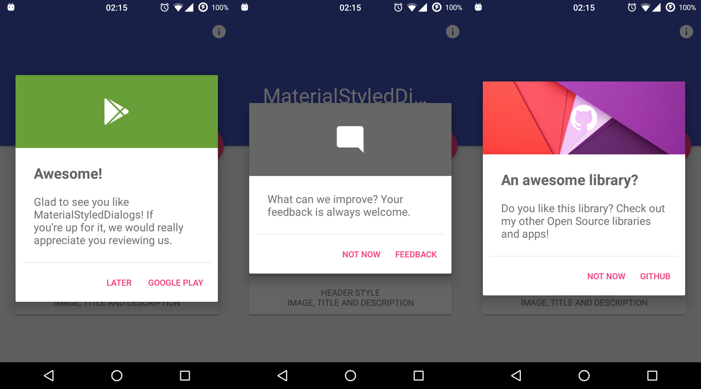
Android Library that shows a beautiful and customizable Material designed dialog with header. Based on material-dialogs and inspired by this dribbble.
You can download the latest sample APK from Google Play:
Add the repository to your project build.gradle:
repositories {
    jcenter()
    maven {
        url "https://jitpack.io"
    }
}
And add the library to your module build.gradle:
dependencies {
    compile 'com.github.javiersantos:MaterialStyledDialogs:1.2.2'
}A basic dialog will show the provided title (optional) and description, using your primary color as the header background.
new MaterialStyledDialog(this)
        .setTitle("Awesome!")
        .setDescription("What can we improve? Your feedback is always welcome.")
        .show();
or using the builder...
MaterialStyledDialog dialog = new MaterialStyledDialog(this)
        .setTitle("Awesome!")
        .setDescription("What can we improve? Your feedback is always welcome.")
        .build();
...
dialog.show();// Set an icon for the dialog header.
.setIcon(R.drawable.ic_launcher)// Set if the header icon will be displayed with an initial animation.
// Default: true
.withIconAnimation(false)// Set if the dialog will be displayed with an open and close animation, with custom duration.
// Default: false
.withDialogAnimation(true)
// Default: false, Duration.NORMAL
.withDialogAnimation(true, Duration.SLOW)// Set a color for the dialog header.
// Default: Theme primary color.
.setHeaderColor(R.color.dialog_header)// Set an image for the dialog header.
// API 16+ required.
.setHeaderDrawable(R.drawable.header)// Set if the dialog will be hidden when touching outside.
// Default: true
.setCancelable(false)// Set if the description will be scrollable, with custom maximum lines.
// Default: false
.setScrollable(true)
// Default: false, 5
.setScrollable(true, 10)// Set a positive, negative and/or neutral button for the dialog.
.setPositive(getResources().getString(R.string.button), new MaterialDialog.SingleButtonCallback() {
@Override
public void onClick(MaterialDialog dialog, DialogAction which) {
Log.d("MaterialStyledDialogs", "Do something!");
}
})
//.setNegative(...)
//.setNeutral(...)

|
Copyright 2016 Javier Santos

Licensed under the Apache License, Version 2.0 (the "License");
you may not use this file except in compliance with the License.
You may obtain a copy of the License at

   http://www.apache.org/licenses/LICENSE-2.0

Unless required by applicable law or agreed to in writing, software
distributed under the License is distributed on an "AS IS" BASIS,
WITHOUT WARRANTIES OR CONDITIONS OF ANY KIND, either express or implied.
See the License for the specific language governing permissions and
limitations under the License.

MaterialStyledDialogs includes code from material-dialogs, which is
licensed under the MIT license. You may obtain a copy at

   https://github.com/afollestad/material-dialogs/blob/master/LICENSE.txt


