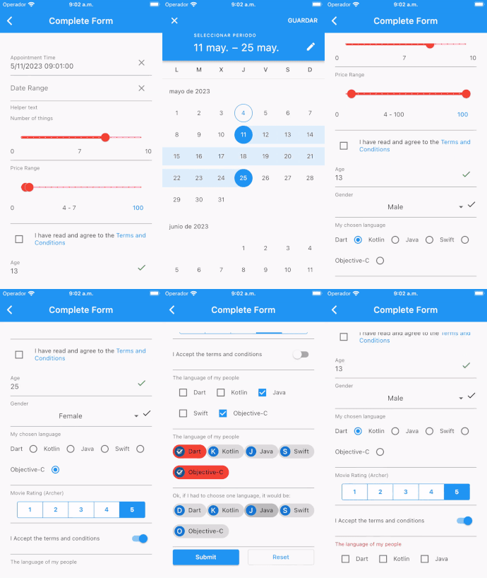
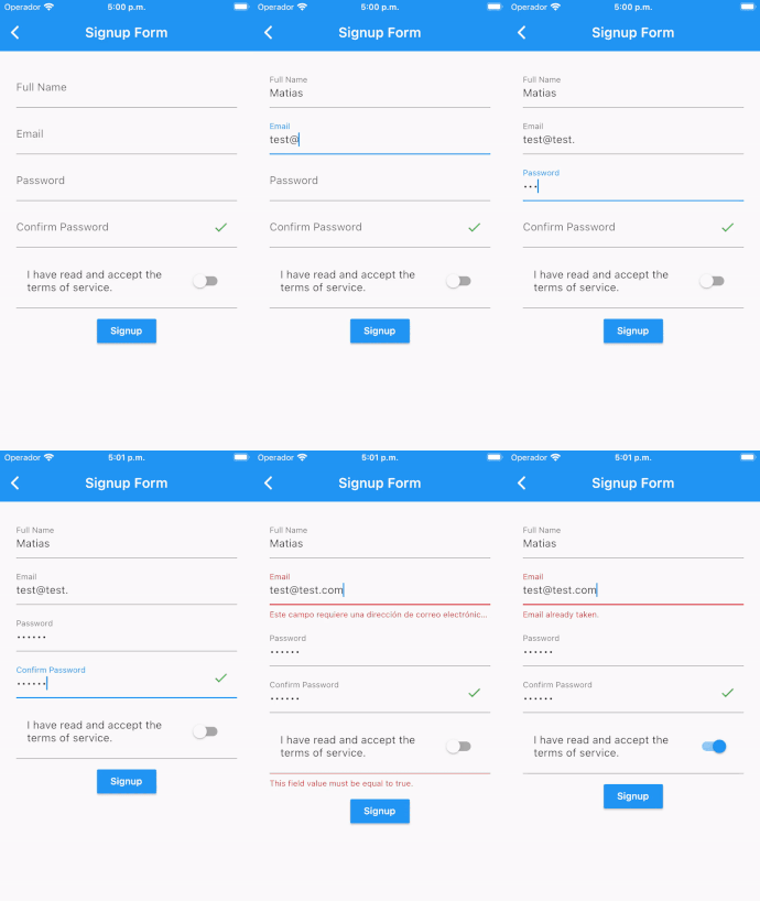
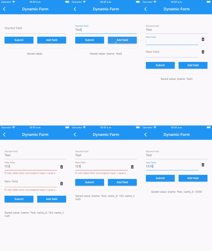
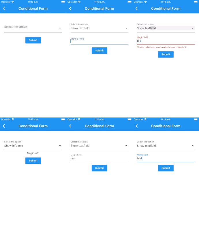
This package helps in creation of data collection forms in Flutter by removing the boilerplate needed to build a form, validate fields, react to changes and collect final user input.
Also included are common ready-made form input fields for FormBuilder. This gives you a convenient way of adding common ready-made input fields instead of creating your own FormBuilderField from scratch.
We are looking for maintainers to contribute to the development and maintenance of Flutter Form Builder Ecosystem. Is very important to keep the project alive and growing, so we need your help to keep it up to date and with new features. You can contribute in many ways, we describe some of them in Support section.
- Create a form with several type of inputs
- Get values from form by easy way
- Apply validators to inputs fields
- React to form fields changes and validations
| Complete Form | Sign Up | Dynamic Fields | Conditional Form |
|---|---|---|---|
 |
 |
 |
 |
The currently supported fields include:
FormBuilderCheckbox- Single checkbox fieldFormBuilderCheckboxGroup- List of checkboxes for multiple selectionFormBuilderChoiceChip- Creates a chip that acts like a radio button.FormBuilderDateRangePicker- For selection of a range of datesFormBuilderDateTimePicker- ForDate,TimeandDateTimeinputFormBuilderDropdown- Used to select one value from a list as a DropdownFormBuilderFilterChip- Creates a chip that acts like a checkboxFormBuilderRadioGroup- Used to select one value from a list of Radio WidgetsFormBuilderRangeSlider- Used to select a range from a range of valuesFormBuilderSlider- For selection of a numerical value on a sliderFormBuilderSwitch- On/Off switch fieldFormBuilderTextField- A Material Design text field input
In order to create an input field in the form, along with the label, and any applicable validation, there are several attributes that are supported by all types of inputs namely:
| Attribute | Type | Default | Required | Description |
|---|---|---|---|---|
name |
String |
Yes |
This will form the key in the form value Map | |
initialValue |
T |
null |
No |
The initial value of the input field |
enabled |
bool |
true |
No |
Determines whether the field widget will accept user input. |
decoration |
InputDecoration |
InputDecoration() |
No |
Defines the border, labels, icons, and styles used to decorate the field. |
validator |
FormFieldValidator<T> |
null |
No |
A FormFieldValidator that will check the validity of value in the FormField |
onChanged |
ValueChanged<T> |
null |
No |
This event function will fire immediately the the field value changes |
valueTransformer |
ValueTransformer<T> |
null |
No |
Function that transforms field value before saving to form value. e.g. transform TextField value for numeric field from String to num |
| The rest of the attributes will be determined by the type of Widget being used. |
No specific setup required: only install the dependency and use :)
final _formKey = GlobalKey<FormBuilderState>();

FormBuilder(
    key: _formKey,
    child:  FormBuilderTextField(
        name: 'text',
        onChanged: (val) {
            print(val); // Print the text value write into TextField
        },
    ),
)
See pub.dev example tab or github code for more details
Note: Validators are in a separate package (form_builder_validators).
final _formKey = GlobalKey<FormBuilderState>();

FormBuilder(
  key: _formKey,
  child: Column(
    children: [
      FormBuilderTextField(
        key: _emailFieldKey,
        name: 'email',
        decoration: const InputDecoration(labelText: 'Email'),
        validator: FormBuilderValidators.compose([
          FormBuilderValidators.required(),
          FormBuilderValidators.email(),
        ]),
      ),
      const SizedBox(height: 10),
      FormBuilderTextField(
        name: 'password',
        decoration: const InputDecoration(labelText: 'Password'),
        obscureText: true,
        validator: FormBuilderValidators.compose([
          FormBuilderValidators.required(),
        ]),
      ),
      MaterialButton(
        color: Theme.of(context).colorScheme.secondary,
        onPressed: () {
          // Validate and save the form values
          _formKey.currentState?.saveAndValidate();
          debugPrint(_formKey.currentState?.value.toString());

          // On another side, can access all field values without saving form with instantValues
          _formKey.currentState?.validate();
          debugPrint(_formKey.currentState?.instantValue.toString());
        },
        child: const Text('Login'),
      )
    ],
  ),
),To build your own field within a FormBuilder, we use FormBuilderField which will require that you define your own field.
Read this article for step-by-step instructions on how to build your own custom field.
var options = ["Option 1", "Option 2", "Option 3"];FormBuilderField(
name: "name",
validator: FormBuilderValidators.compose([
FormBuilderValidators.required(),
]),
builder: (FormFieldState<dynamic> field) {
return InputDecorator(
decoration: InputDecoration(
labelText: "Select option",
contentPadding:
EdgeInsets.only(top: 10.0, bottom: 0.0),
border: InputBorder.none,
errorText: field.errorText,
),
child: Container(
height: 200,
child: CupertinoPicker(
itemExtent: 30,
children: options.map((c) => Text(c)).toList(),
onSelectedItemChanged: (index) {
field.didChange(options[index]);
},
),
),
);
},
),You can either change the value of one field at a time like so:
_formKey.currentState.fields['color_picker'].didChange(Colors.black);Or multiple fields value like so:
_formKey.currentState.patchValue({
  'age': '50',
  'slider': 6.7,
  'filter_chip': ['Test 1'],
  'choice_chip': 'Test 2',
  'rate': 4,
  'chips_test': [
    Contact(
        'Andrew',
        '[email protected]',
        'https://d2gg9evh47fn9z.cloudfront.net/800px_COLOURBOX4057996.jpg',
    ),
  ],
});final _formKey = GlobalKey<FormBuilderState>();
final _emailFieldKey = GlobalKey<FormBuilderFieldState>();
...
FormBuilder(
key: _formKey,
child: Column(
children: [
FormBuilderTextField(
key: _emailFieldKey,
name: 'email',
decoration: const InputDecoration(labelText: 'Email'),
validator: FormBuilderValidators.compose([
FormBuilderValidators.required(),
FormBuilderValidators.email(),
]),
),
ElevatedButton(
child: const Text('Submit'),
onPressed: () async {
if(await checkIfEmailExists()){
// Either invalidate using Form Key
_formKey.currentState?.fields['email']?.invalidate('Email already taken');
// OR invalidate using Field Key
_emailFieldKey.currentState?.invalidate('Email already taken');
}
},
),
],
),
),When use invalidate and validate methods, can use two optional parameters configure the behavior
when invalidate field or form, like focus or auto scroll. Take a look on method documentation for more details
Declare a variable to hold your error:
String _emailError;Use the variable as the errorText within InputDecoration
FormBuilderTextField(
  name: 'email',
  decoration: InputDecoration(
    labelText: 'Email',
    errorText: _emailError,
  ),
  validator: FormBuilderValidators.compose([
      FormBuilderValidators.required(),
      FormBuilderValidators.email(),
  ]),
),
Set the error text
ElevatedButton(
  child: Text('Submit'),
  onPressed: () async {
    setState(() => _emailError = null);
    if(await checkIfEmailExists()){
      setState(() => _emailError = 'Email already taken.');
    }
  },
),You can also validate a field based on the value of another field
FormBuilderRadioGroup(
  decoration: InputDecoration(labelText: 'My best language'),
  name: 'my_language',
  validator: FormBuilderValidators.required(),
  options: [
    'Dart',
    'Kotlin',
    'Java',
    'Swift',
    'Objective-C',
    'Other'
  ]
    .map((lang) => FormBuilderFieldOption(value: lang))
    .toList(growable: false),
  ),
  FormBuilderTextField(
    name: 'specify',
    decoration:
        InputDecoration(labelText: 'If Other, please specify'),
    validator: (val) {
      if (_formKey.currentState.fields['my_language']?.value ==
              'Other' &&
          (val == null || val.isEmpty)) {
        return 'Kindly specify your language';
      }
      return null;
    },
),If you can add some button to reset specific field, can use the decoration parameter like this:
List<String> genderOptions = ['Male', 'Female', 'Other'];

FormBuilderDropdown<String>(
  name: 'gender',
  initialValue: 'Male',
  decoration: InputDecoration(
    labelText: 'Gender',
    suffix: IconButton(
      icon: const Icon(Icons.close),
      onPressed: () {
        _formKey.currentState!.fields['gender']
            ?.reset();
      },
    ),
    hintText: 'Select Gender',
  ),
  items: genderOptions
      .map((gender) => DropdownMenuItem(
            alignment: AlignmentDirectional.center,
            value: gender,
            child: Text(gender),
          ))
      .toList(),
),
Or reset value like this:
class ClearFormBuilderTextField extends StatefulWidget {
  const ClearFormBuilderTextField({super.key});

  @override
  State<ClearFormBuilderTextField> createState() =>
      _ClearFormBuilderTextFieldState();
}

class _ClearFormBuilderTextFieldState
    extends State<ClearFormBuilderTextField> {
  final ValueNotifier<String?> text = ValueNotifier<String?>(null);
  final textFieldKey = GlobalKey<FormBuilderFieldState>();

  @override
  Widget build(BuildContext context) {
    return FormBuilderTextField(
      autovalidateMode: AutovalidateMode.always,
      name: 'age',
      key: textFieldKey,
      onChanged: (value) {
        text.value = value;
      },
      decoration: InputDecoration(
        labelText: 'Age',
        suffixIcon: ValueListenableBuilder<String?>(
          valueListenable: text,
          child: IconButton(
            onPressed: () => textFieldKey.currentState?.didChange(null),
            tooltip: 'Clear',
            icon: const Icon(Icons.clear),
          ),
          builder: (context, value, child) =>
              (value?.isEmpty ?? true) ? const SizedBox() : child!,
        ),
      ),
    );
  }
}You have some ways to contribute to this packages
- Beginner: Reporting bugs or request new features
- Intermediate: Implement new features (from issues or not) and created pull requests
- Advanced: Join to organization like a member and help coding, manage issues, dicuss new features and other things
See contribution file for more details
You can question or search answers on Github discussion or on StackOverflow
Donate or become a sponsor of Flutter Form Builder Ecosystem
Take a look to our awesome ecosystem and all packages in there


