Give a ⭐️ to this repository, Starring a repository will motivate contributors.
To deploy the component see Deploy
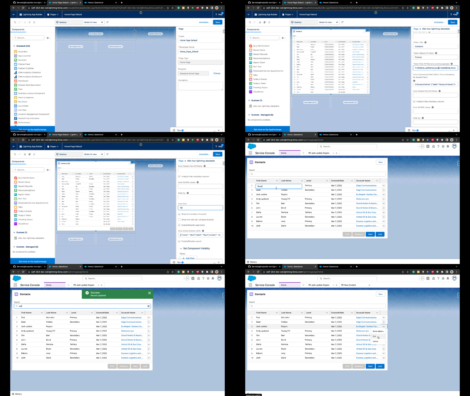
This is a generic lighting datatable, which is built in LWC. The customization is done by design attributes.
Main features
- Show records for both custom and standard objects.
- Add cols as per the fields that exist in object in JSON format.
- Pagination as First, Previous, Next and Last buttons.
- New record creation action
- Row action like : show detail, edit a record, delete a record
- Hide/Unhide checkbox column
- Configurable actions buttons (for developers, see Buttons configuration )
- Sorting by field (Note: sort will not work on search).
- Search
Custom Data types (the component extendedDatatable extends lightning:datatable) :
- picklist
- lookup
| Label | Required | Type | Value | Example |
|---|---|---|---|---|
| Enter Icon Name | ❌ | String | provide slds icon name (if you wish to override the default icon of the object) | standard:account |
| Enter Title | ✔️ | String | provide table title | LWC Table |
| Enter Object API Name | ✔️ | String | provide object custom or standard API name | Contact |
| Enter Columns API Name by comma seprated | ✔️ | String | Note : for related field it should be concat with . i.e : Account.Name for contact, Inline Edit not support cross reference Field | FirstName,LastName,Email,Phone |
| Enter Customized Field JSON ( This is Mandatory for Related Field ) | ❌ | String | customized Column Label, Record Redirect, Data Type. Note : This is Mandatory for Related Fields i.e : Account.Name for contact | See below Customized Field JSON |
| Enter Related field API Name | ❌ | String | Enter related field api name | Example AccountId for contact when component is on account layout. |
| Hide/Unhide checkbox column | ❌ | Boolean | true/false | Hide/Unhide Checkbox |
| Enter WHERE clause | ❌ | String | provide aditional filters | Example LastName like '%s' AND Account.Name like '%t' |
| Order by | ❌ | String | set the order by clause | Example LastName, Account.Name DESC |
| Enter limit | ❌ | Integer | limit the displayed number of records for the list | an integer |
| Show the number of record | ❌ | Boolean | append the number of records in the title | checked(true) OR not checked(false) |
| Show the view all / collapse buttons | ❌ | Boolean | display buttons to expand/collapse records | checked(true) OR not checked(false) |
| Enable/Disable pagination | ❌ | Boolean | enable or disable pagination for the list | checked(true) OR not checked(false) |
| Buttons to display | ❌ | String | buttons that we want to display | See below Buttons configuration |
| Enable/Disable search | ❌ | Boolean | enable or disable search bar | checked(true) OR not checked |
label : This key is for override column Name. ( Example : Override Column Label )
type : This key is for the override column Type :
- supported_lwc_datatable_datatype. ( Ex :
url). ( Example : Related Field Customized ) - lookup editable column
- picklist editable column
typeAttributes : This key is used for custom columns :
- a hyperlink to recordId (id of the current detail page) (
recIdstored recordId Field ). ( Example : Add Hyperlink for navigate to record ) - lookup editable column
{ "AccountId": { "label": "Account Record Id", "type": "Id" } }AccountId : the api name of the column for which you want to override the label (only use the columns displayed)
{ "FirstName": { "label": "{!Label.MyLabelName}", "type": "text" } }{
"LastName": { "label": "Surname", "type": "text" },
"AccountId": { "label": "Account Record Id", "type": "Id" }
}When overriding columns you can override different columns for the different uses cases :
{ "Account.Name": { "label": "Account Name", "type": "text" } } {"StageName" : {"type": "picklist"} }you can also override the label
{"StageName" : {"label": "Step", "type": "picklist"} }{
"Account.Name":
{
"label":"Account Name",
"type":"lookup",
"typeAttributes":{
"placeholder": "Choose Account",
"objectApiName": "Contact",
"fieldName": "AccountId",
"label": "Account",
"value": { "fieldName": "AccountId" },
"context": { "fieldName": "Id" },
"variant": "label-hidden",
"name": "Account",
"fields": ["Account.Name"],
"target": "_self"
}
}
}placeholder : text displayed when the lookup search bar is empty
fieldName and value.fieldName : field API name that links the record to the parent record
fields : what is displayed in the column (here the name of the account)
Use cases :
- non-editable lookup redirection to the record page
- redirection when a field is clicked (ex: a click on the firstname or lastname of a contact redirects to the record page)
The example enables redirection to the account when we click on the account name of a contact (the field Account.Name is included in columns API name in the example).
When used for a lookup the field is not editable (to have an editable lookup field see the section above for editable lookup)
{
    "Account.Name":
        {
            "label": "Account Name",
            "type": "url",
            "typeAttributes":
                {
                    "label":
                        { "fieldName": "Account.Name", "recId": "AccountId" }
                }
        }
}To configure buttons(variant is the style of a button) see the documentation here : buttons documentation
[{ "name": "New", "label": "New", "variant": "neutral" }][
{ "name": "New", "label": "New", "variant": "neutral" },
{ "name": "DeleteAll", "label": "Delete all", "variant": "destructive" }
]The "New" button is displayed by default
You can implement your logic for your new buttons based on button JSON (new, delete-selected...).
  handleButtonAction(event) {
      //call desired javacript method or apex call, or throw an event based on the button key(new, delete-selected...)
      //you have selected rows in this.selectedRows
      const buttonLabel = event.target.dataset.name;
      switch (buttonLabel) {
          case 'New':
              this.newRecord();
              break;
          default:
      }
}Click Button to deploy source in Developer/Sandbox

Feel free to ask any Question, Suggestion, Issue here
Create Pull Request to dev branch with your feature branch. Read Contribution Guidelines
