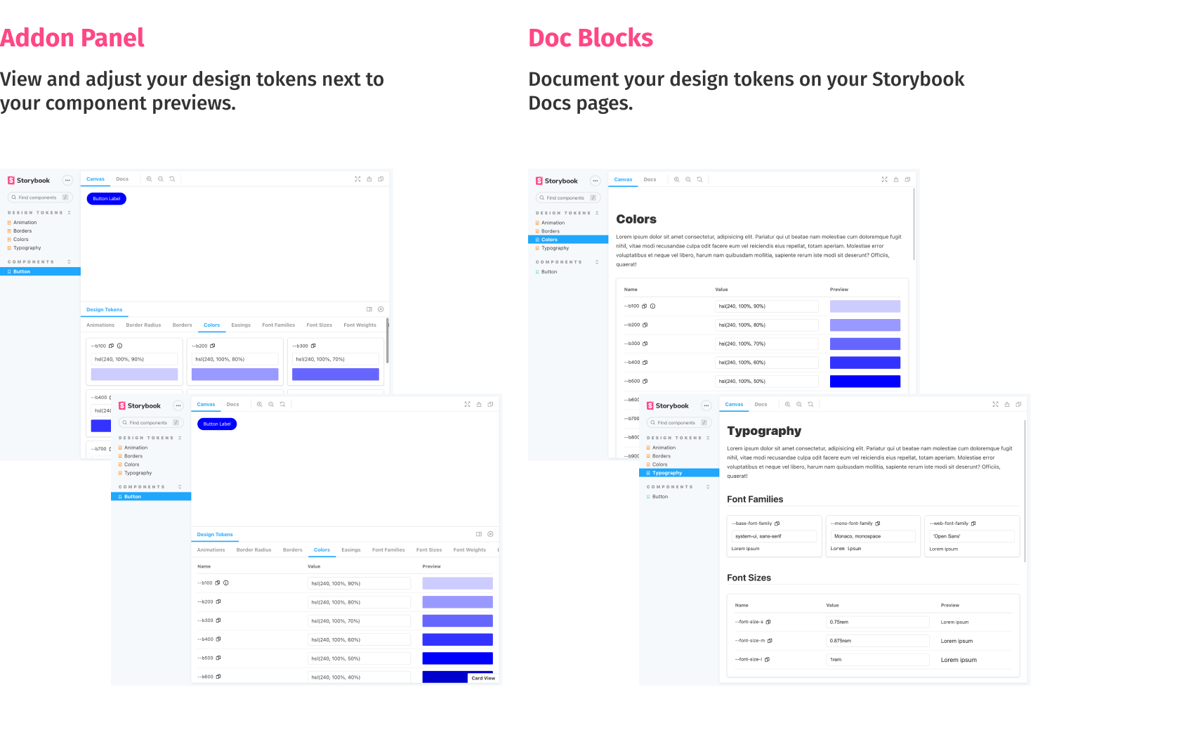
Display design token documentation generated from your stylesheets and icon files. Preview design token changes in the browser. Add your design tokens to your Storybook Docs pages using the custom Doc Blocks.
Contents:
First, install the addon.
$ yarn add --dev storybook-design-token
# or
$ npm add --save-dev storybook-design-token
Add the addon to your storybook addon list inside .storybook/main.js:
module.exports = {
  addons: ['storybook-design-token']
};
The last step is to annotate your design tokens with a category name and a presenter. You can do this by adding special comment blocks to your stylesheets. Below is an example of a css stylesheet defining three categories ("Animations", "Colors", "Others"). It works the same way for scss and less files.
:root {
  /**
  * @tokens Animations
  * @presenter Animation
  */

  --animation-rotate: rotate 1.2s infinite cubic-bezier(0.55, 0, 0.1, 1);

  /**
  * @tokens Colors
  * @presenter Color
  */

  --b100: hsl(240, 100%, 90%); /* Token Description Example  @presenter Color */
  --b200: hsl(240, 100%, 80%);
  --b300: hsl(240, 100%, 70%);

  /**
  * @tokens Others
  */
  --border-normal: 3px dashed red; /* Token Description Example @presenter BorderRadius */
}
The presenter controls how your token previews are rendered. See the next section for a complete list of available presenters. You can omit the presenter definition if you don't want to render a preview or no presenter works with your token.
By default, a token category ends with the comment block of the next category. If you want to end a category block before the next category comment, you can insert a special comment to end the block early:
/**
  * @tokens-end
  */
To list your svg icons, the addon parses your svg files searching for svg elements. Important: Only svg elements with an id or data-token-name attribute are added to the token list. You can provide descriptions and category names for your icons using the (optional) attributes data-token-description and data-token-category.
Please check the demo to see the presenters in action.
- Animation
- Border
- BorderRadius
- Color
- Easing
- FontFamily
- FontSize
- FontWeight
- LetterSpacing
- LineHeight
- Opacity
- Shadow
- Spacing
You can specify the default tab shown in the addon panel. Set it to the corresponding category name.
.storybook/preview.js
export const parameters = {
  designToken: {
    defaultTab: 'Colors'
  }
};To inject styles needed by your design token documentation, use the styleInjection parameter. A typical usecase are web fonts needed by your font family tokens. Please note that the styleInjection parameter only works with valid css.
.storybook/preview.js
export const parameters = {
  designToken: {
    styleInjection:
      '@import url("https://fonts.googleapis.com/css2?family=Open+Sans&display=swap");'
  }
};In some cases you might only want to use the Doc Blocks and hide the addon panel. You can do so by the setting the disable parameter:
export const parameters = {
  designToken: {
    disable: true
  }
};In some cases you might not need the search field to be visible. You can control its visibility by the setting the showSearch parameter:
export const parameters = {
  designToken: {
    showSearch: false
  }
};By default pageSize of the card view is 50 items. You can configure it by setting the pageSize parameter:
export const parameters = {
  designToken: {
    pageSize: 10
  }
};
You can disable pagination in the following way:
export const parameters = {
  designToken: {
    // specify max value to disable pagination
    pageSize: Number.MAX_VALUE
  }
};By default, the addon parses all .css, .scss, .less, .svg, .jpeg, .png and .gif files of your code base for annotated design tokens. If you only want to parse specific files, you can pass a glob via the DESIGN_TOKEN_GLOB environment variable or via an option in your main.js.
For example:
DESIGN_TOKEN_GLOB=**/*.tokens.{css,scss,less,svg}
By default, the addon extracts values of CSS variables at build time. As a result, presenters use fixed values at runtime. This behavior might impose limitations in some scenarios:
- Stylesheet with CSS variables is loaded separately from tokens
- Theme is replaced at runtime and new values of CSS variables are loaded
If you want to preserve CSS variables in the presenters, enable preserveCSSVars option in your main.js file:
module.exports = {
  stories: [
    // stories
  ],
  addons: [
    { name: 'storybook-design-token', options: { preserveCSSVars: true } }
  ]
  // other options
};This addon comes with a custom Storybook Doc Block allowing you to display your design token documentation inside docs pages.
// colors.stories.mdx

import { DesignTokenDocBlock } from 'storybook-design-token/dist/doc-blocks';

<DesignTokenDocBlock categoryName="Colors" maxHeight={600} viewType="card" />;
The categoryName parameter references your token category name (the part after @tokens in your stylesheet annotations). The viewType parameter can be set to card or table to switch between both presentations. In some cases you might want to hide the token values. You can do that by passing showValueColumn={false}.
Check the demo file for usage examples.
- All modern browsers
- Internet Explorer 11
- Please check the Get started section for the updated addon configuration.
- The
filesproperty required in earlier versions has been removed. Please delete it from your.storybook/preview.js. You are no longer required to load the token files inside.storybook/preview.js.
