jupyter-kernel --kernel=ir
jupyter-kernel --kernel=python3Clustering is an unsupervised machine learning task that tries to assign labels to data. It does this by minimising the within group similarities and maximising the between groups dissimilarities. It is unsupervised as we generally do not know those labels citep:jain1999data.
In this section, the main clustering techniques will be introduced followed by an explanation on how those are usually applied to time series. The importance and structure of this work will then be explained.
As defined by cite:han2000data, clustering can be classified into multiple kinds of methods: partitioning, hierarchical, density-based, grid-based and model-based. All those methods were developed and thought for static data type, or values fixed at a certain time, which are much easier to deal without the time dimension.
Partitioning, can be crisp, as each data point is part of one and only one cluster, or fuzzy and can have various degrees of belonging to multiple clusters. Most common crisp partitioning algorithms are the k-means algorithm citep:macqueen1967some, and the k-medioids citep:rousseeuw1990finding. Similarly for the fuzzy ones, there is the c-means citep:bezdek1981objective and the c-medioids citep:krishnapuram2001low.
Hierarchical clustering algorithms can either be agglomerative or divisive, depending on whether it splits or merge clusters at each of its iterations. The main advantage of these methods is that it doesn’t require any knowledge about the number of clusters. However, once a merge (or division) of clusters occurs, it cannot be redefined later. There exist some algorithms that try to solve this issue citep:zhang1996birch,guha1998cure,karypis1999chameleon.
Density-based algorithms will grow the clusters until a certain density threshold is encountered in the neighbourhood. An example is the DBSCAN algorithm citep:ester1996density. Grid-based algorithms will split the space into a finite number of cells and perform the clustering operations of those cells cite:wang1997sting. Finally, model-based clustering is either based on statistical techniques like in cite:cheeseman1988autoclass or on neural networks (see cite:carpenter1987massively,kohonen1998self).
Time series are usually large datasets that have inherited, over time, of a high dimensionality of dependent measurements. Interestingly, it is possible to look at a series either as a high dimensional vector or as a single data point. As shown by cite:liao2005clustering and cite:aghabozorgi2015time, the interest for time series clustering has been growing in a wide variety of fields. It is often an important step of exploratory analysis.
As defined by cite:liao2005clustering in his review (see Fig. ref:fig:types_clusterTS), there are three types of time series clustering. Raw-data based methods compare series directly and will usually compute a distance or similarity metric. Then, there are feature based and model based data that summarise each series into a set of parameters. The problem with those is that it often can oversimplify the series, and although faster to compute, requires many assumptions about each series to be made.
cite:aghabozorgi2015time has identified the four main aspects of time series clustering research: the dimensionality reduction necessary to remove noise and reduce the size of large series, similarity/distance measures, clustering algorithms and cluster prototypes (or how to characterise a group of data).
Essentially, once the distance matrix or parameters of the time series are extracted, most of the static data clustering methods can be used as is.
Furthermore, as explained in cite:gcc2017, previous time series clustering methods have been using similarities among series based on their univariate models in a parametric framework, by its periodogram or their autocorrelation. Those methods are useful when the series are independent and can be classified using their univariate features. However, it is also possible to use the linear dependencies present within those series, by using distances such as cross-correlation that will summarise the correlation at multiple lags. This can be important for series that do not demonstrate obvious classification patterns.
The clustering of electricity consumption series is crucial for the detection of patterns and trends that help predict the future consumption of a population. cite:van1999cluster was one of the first to do this using the consumption in the Netherlands. Their approach was to use agglomerative hierarchical clustering on daily power consumption based on the root mean square distance (RMSD).
The RMSD calculated between two series,
\begin{equation} RMSD = \sqrt{\frac{∑^Tt=1(x_t-y_t)^2}{T}} \end{equation}
and is basically just a Euclidean distance scaled to the length of those series. Those distances are considered univariate, as it does not look at the linear dependencies present within the series.
In this thesis, I would like to show an application of the Generalized Cross Correlation (GCC), defined by cite:gcc2017. It is a similarity metric based on cross correlation that can cluster using the linear dependency between the series. As such, it is very general and non parametric. Moreover, as demonstrated by cite:gcc2017, clustering by cross dependency can produce significantly different results compared to other methods, such as univariate distances like the Euclidean distance.
The rest of the document is organised as follows: Section 2 describes the data and the required preparation be applying the GCC. The metric was implemented both in R and in Python (for comparison purpose). In section 3, agglomerative hierarchical clustering is used as it does not require any assumption on the number of clusters. The clusters will then be analysed to find further structure and identify their dynamic patterns. Finally, we will look at the differences with the Euclidean distance in finding clusters of electricity consumption in France.
\pagebreak
The electricity consumption was available at a 30 minutes frequency for each of the 12 regions of France from 2013 to 2017. Each year of each region can be downloaded from the French transmission operator (Rte) download portal[fn:1].
Consumption from January 2013 to September of 2017 were downloaded for each of the 12 metropolitan mainland regions of France (excluding Corsica).
Those regions are still very young, as before 2016, those were 21 separate regions. In France, regions lack separate legislative power, but can manage a considerable part of their budget for main infrastructures such as education, public transport, universities and research, and help to businesses. It is therefore expected to find some interesting clusters, where we might see some reminiscence of the old regions.
[fn:1] http://www.rte-france.com/en/eco2mix/eco2mix-telechargement-en
The complete data set was spread across 60 different tables (years and regions) that were merged into one large table (Table ref:tab:raw-series).
As data rarely comes clean, there were some imperfections in the names of the regions. Some days the regions were named after the old ones e.g. Languedoc-Roussillon et Midi-Pyrénées instead of Occitanie, or Aquitaine, Limousin et Poitou-Charentes instead of Nouvelle-Aquitaine.
With the raw data cleaned from imperfections, each column was formatted to the required data type. A pivot table was then used so as to move each region to a column, and each row as a consumption measurement. The date then needed to be set to UTC in order to avoid problems at the summer/winter time change. As the original frequency of the data is 15 minutes, with only data every 30 minutes available, the table was resampled by taking the sum for each 30 minutes, resulting in the table below (Table ref:tab:regional-series).
| Périmètre | Date | Heures | Consommation |
|---|---|---|---|
| Auvergne-Rhône-Alpes | 2013-01-01 | 00:00 | ND |
| Auvergne-Rhône-Alpes | 2013-01-01 | 00:15 | |
| Auvergne-Rhône-Alpes | 2013-01-01 | 00:30 | 8173 |
| Auvergne-Rhône-Alpes | 2013-01-01 | 00:45 | |
| Auvergne-Rhône-Alpes | 2013-01-01 | 01:00 | 7944 |
| ..... |
| Périmètre | Auvergne-Rhône-Alpes | Bourgogne-Franche-Comté | … |
| Datetime | |||
|---|---|---|---|
| 2013-01-01_00:00:00+00:00 | NaN | NaN | … |
| 2013-01-01_00:30:00+00:00 | 8173.0 | 2357.0 | … |
| 2013-01-01_01:00:00+00:00 | 7944.0 | 2289.0 | … |
| 2013-01-01_01:30:00+00:00 | 7896.0 | 2326.0 | |
| 2013-01-01_02:00:00+00:00 | 7882.0 | 2409.0 |
The region with the highest consumption are observed in the Iles-de-France and the lowest in the Centre-Val de Loire. We can also clearly see yearly seasonality with higher consumption during winter times (Fig. ref:fig:regions-consumption), from October to March. The lowest mean and lowest variance consumption across France is at the end of July. We can also see a lower general lower consumption during the winter 2013-14 (end of December - early January). This is most likely due to the particularly mild winter as mentioned in the report of Meteo France[fn:2], which ranked it as the second warmest winter since 1989-90.
import matplotlib.pyplot as plt
%matplotlib inline

consommation.loc[:,consommation.mean().sort_values(ascending=False).index].plot(
    alpha=0.7, lw=.1, figsize=(16,9), colormap='Spectral')
leg = plt.legend(loc='upper right')
for lh in leg.legendHandles:
    lh.set_linewidth(2)
    lh.set_alpha(1)
A pivot table was used again so that each row is a daily value for a certain time and region. Furthermore, the first day was removed as it does not have data for midnight. The resulting table has 576 columns (48 half hours x 12 regions) and 1794 rows (days).(Table ref:tab:final-data).
| Périmètre | Auvergne-Rhône-Alpes | ||
| time | 00:00:00 | 00:30:00 | 01:00:00 |
|---|---|---|---|
| date | |||
| 2013-01-02 | 7847.0 | 7674.0 | 7427.0 |
| 2013-01-03 | 9028.0 | 8839.0 | 8544.0 |
| 2013-01-04 | 8982.0 | 8754.0 | 8476.0 |
| 2013-01-05 | 8625.0 | 8465.0 | 8165.0 |
| 2013-01-06 | 8314.0 | 8097.0 | 7814.0 |
In Figure ref:fig:day-consumption, we can already see that consumption midday is much higher than at night, with more spread in the summer than in the winter. That larger spread might be due to the higher need to air conditioning in offices around midday.
mean_by_time  = consommation.groupby(level=1,  axis=1).mean().reset_index()
mean_by_time = mean_by_time.loc[:,mean_by_time.mean().sort_values(ascending=False).index]
mean_by_time.index = consommation.index
mean_by_time.plot(alpha=0.9, lw=.5, figsize=(20,14), colormap='Spectral')
leg = plt.legend(loc='upper right')
for lh in leg.legendHandles:
    lh.set_linewidth(2)
    lh.set_alpha(1)
\pagebreak \pagebreak
The original series have a strong seasonality as show in Figure ref:fig:acf-raw.
library(tidyverse)
library(xts)

consommation <- read.csv('./data/consommation.csv', row.names='date')

par(mfrow=c(3,4))
par(mar=c(5.1,4.1,4.1,2.1))
for (i in 1:12){
  acf(consommation[,(i-1)*48+1], lag=100, main=colnames(consommation)[(i-1)*48+1])
}
To try and remove it, we first take a regular difference, since the series have strong dependence compatible to long memory processes. For sake of simplicity, we use a regular differences instead of fractional ones. (Fig. ref:fig:acf-regular).
par(mfrow=c(3,4))
par(mar=c(5.1,4.1,4.1,2.1))
for (i in 1:12){
  acf(diff(consommation[,(i-1)*48+1], 1), lag=100, main=colnames(consommation)[(i-1)*48+1])
}
The weekly difference was then taken (difference between all the values separated by seven days). This was able to remove most seasonality, as nearly all the values stay within the confidence interval (Fig. ref:fig:acf-final).
par(mfrow=c(3,4))
par(mar=c(5.1,4.1,4.1,2.1))
for (i in 1:12){
  acf(diff(diff(consommation[,(i-1)*48+1],1),7), lag=100, main=colnames(consommation)[(i-1)*48+1])
}
The Dickey-Fuller test was used on all the series to confirm that they are now significantly stationary (all p-values lower than 10e-21).
In order to standardise the data so as to get a zero mean and standard deviation of 1, the z-score was applied to each individual series:
\begin{equation} z_t = \frac{x_t - \hat{μ}}{\hat{σ}} \label{eq:zscore}, \end{equation}
where
\pagebreak
As described before, the GCC is a general non parametric similarity metric (as it does not assume any parametric model for the series), that look at the dependencies between series using their cross correlation. The main idea is that it is possible to first cluster the series by the dependency among those, without any assumption made. Then it is possible to break down the more homogeneous clusters looking at the internal dependency of their series.
The GCC computation is based on the determinant of the cross correlation
matrices from lag zero to lag k. To do this, for a given k, it is necessary
to construct the
\begin{equation}
X(i) =
\begin{pmatrix}
Xi,1 & Xi,2 & \ldots & Xi,k+1
Xi,2 & Xi,3 & \ldots & Xi,k+2\
\vdots & \vdots & \ddots & \vdots \
Xi,T-k & Xi,T-k+1 & \ldots & Xi,T \
\end{pmatrix}.
\end{equation}
With both
\begin{equation} X(i,j) = (X(i),X(j)). \end{equation}
The GCC can be computed as:
\begin{equation} \widehat{GCC}(X_i,X_i) = 1 - \frac{|\widehat{R}X(i,j)|k+1}{|\widehat{R}X(i)|k+1|\widehat{R}X(j)|k+1}, \label{eq:GCC} \end{equation}
where
For clustering, it is then necessary to build a distance matrix as such:
\begin{equation}
DM\widehat{GCC} =
\begin{pmatrix}
0 & 1-\widehat{GCC}(X_1,X_2) & \ldots & 1-\widehat{GCC}(X_1,X_N)
1-\widehat{GCC}(X_2,X_1) & 0 & \ldots & 1-\widehat{GCC}(X_2,X_N)\
\vdots & \vdots & \ddots & \vdots \
1-\widehat{GCC}(X_N,X_1) & 1-\widehat{GCC}(X_N,X_2) & \ldots & 0 \
\end{pmatrix}.
\end{equation}
It is necessary to do
There are two ways for selecting the number of lag k. Either by taking the
maximum order
\pagebreak
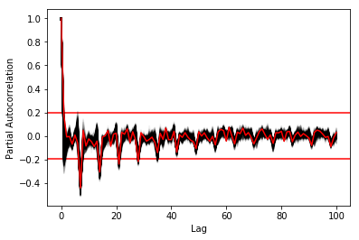
In order to select k, the maximum lag was taken by fitting auto-regressive models to each of the series (using BIC). A maximum lag of 40 was used and was computed both in R and in Python (see appendix Code for selection of k). In both cases, it found a maximum fitted lag of 37. This k was considered sufficiently large to capture the cross dependencies between the series and was therefore used.
This lag seems appropriate when looking at the partial autocorrelation functions in Figure ref:fig:pacf, as that is where the last significant value is observed.
The GCC was computed in both R and in Python to validate the results (see Appendix Code for GCC computation). The maximum difference between the results of the computation in the two language was of ±5.3e-15 and can therefore be considered equivalent.
\pagebreak
Hierarchical clustering was used, as it doesn’t require a defined number of clusters to be set, and can directly be computed with a distance matrix.
More specifically, agglomerative clustering was used, where each data points starts in its own cluster and iteratively gets merged with its closest cluster. There are different methods to compute that intra-cluster distance, referred to as linkage method. The most popular methods were compared using the cophenetic correlation, which is the correlation coefficient between the distances between each point using their cluster distances and the original distances. A value closer to 1 means that the defined clusters respect better the original distances.
As such, in both R and Python, the most conservative method was the average linkage and was therefore used to create the dendrogram (Table ref:tab:cophenetic). Different results were obtained for the “centroid” and “median” method, but still did not surpass the 0.77 of cophenetic correlation of the “average” linkage.
| Average | Centroid | Complete | Median | Single | Ward | Weighted | |
|---|---|---|---|---|---|---|---|
| Python | 0.77 | 0.73 | 0.69 | 0.70 | 0.69 | 0.66 | 0.74 |
| R | 0.77 | 0.55 | 0.69 | 0.29 | 0.69 | 0.66 | 0.74 |
In Figure ref:fig:heatmap we can clearly see that there is a lot of structure. There are distances across the whole range of the GCC (0-1), making it easier to distinguish the groups. In fact, the regions appear to be the main influencing factor.
import seaborn as sns
linkage = hcl.linkage(squareform(DM_GCC), method='average')
sns.clustermap(DM_GCC, row_linkage=linkage, col_linkage=linkage)
plt.show()
\pagebreak
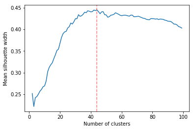
Determining the number of cluster can be very challenging. The silhouette score were compared for different cluster number (Fig. ref:fig:sil_gcc). A high value is observed at two clusters, then a slight peak at five clusters, until it increases rapidly to 44 clusters. That is a high number of cluster, but considering multiple cluster related to the time of the day within each of the 12 regions, we can see how that number can increase quickly. However, most of the analysis will be conducted on five clusters, as it allows to draw some more general conclusions.
In Figure ref:fig:dendrogram, we can see that the regions are of high importance to the construction of the clusters. Although 44 clusters is suggested by the silhouette statistic, five cluster seem to be a clear cut. For a detailed view of the 44 clusters see Appendix 44 clusters of GCC. Another way to look at those clusters is by looking the first two principal coordinates of the distance matrix (Fig. ref:fig:pca_cluster), where the five clusters are again well defined. We can see that, although cluster 1 and 4 contain points far away from each other, five clusters is a good generalisation of the data.
library(factoextra)
hc <- hclust(as.dist(DM_GCC), method = 'average')
groups <- cutree(hc, k=5)
groups <- 6-groups
fviz_cluster(list(data=DM_GCC, cluster=groups), geom='point')
In Figure ref:fig:silhouette_width, we can see the silhouette width of each of the samples in their respective cluster. There seems to be some misclassification for some series in cluster 3, but overall each of the five cluster has notably high silhouette width.
require("cluster")
sil <- silhouette(groups, DM_GCC)
fviz_silhouette(sil)
\pagebreak
clusters_euc = hcl.fcluster(linkage_euc, t=2, criterion="maxclust")
cluster_df = pd.DataFrame({'region':DM_GCC.index.to_series().apply(lambda x: x.split('_')[0]),
                           'time':DM_GCC.index.to_series().apply(lambda x: x.split('_')[1]),
                           'gcc':clusters,'euc':clusters_euc})
In Figure ref:fig:comp_gcc_time, we can see that cluster 1, 2 and 3 are not related to the time of the day as there are as many series for each of the half-hours. However, cluster 4 is a night cluster (21:30 to 6:00) and cluster 5 is a day cluster (5:30 to 00:00). In fact this is also reflected in Figure ref:fig:comp_gcc_region, as clusters 4 and 5 share multiple regions. Surprisingly, all the series of the ‘Hauts-de-France’ were classified into the day cluster 5. Cluster 1 is the only cluster with only one region.
gcc_time = cluster_df.groupby('gcc')['time'].value_counts().unstack().T
gcc_time.index = pd.to_datetime(gcc_time.index).time
gcc_time.plot(figsize=(12,5))
plt.xticks(gcc_time.index,gcc_time.index, rotation='vertical')
ax = plt.gca()
ax.set_ylabel('Number of series in cluster')
ax.set_xlabel = 'Time of the day'
fig.autofmt_xdate()
plt.show()
cluster_df.groupby('gcc')['region'].value_counts().unstack().T.plot.bar()
ax = plt.gca()
ax.set_ylabel('Number of series in cluster')
plt.show()
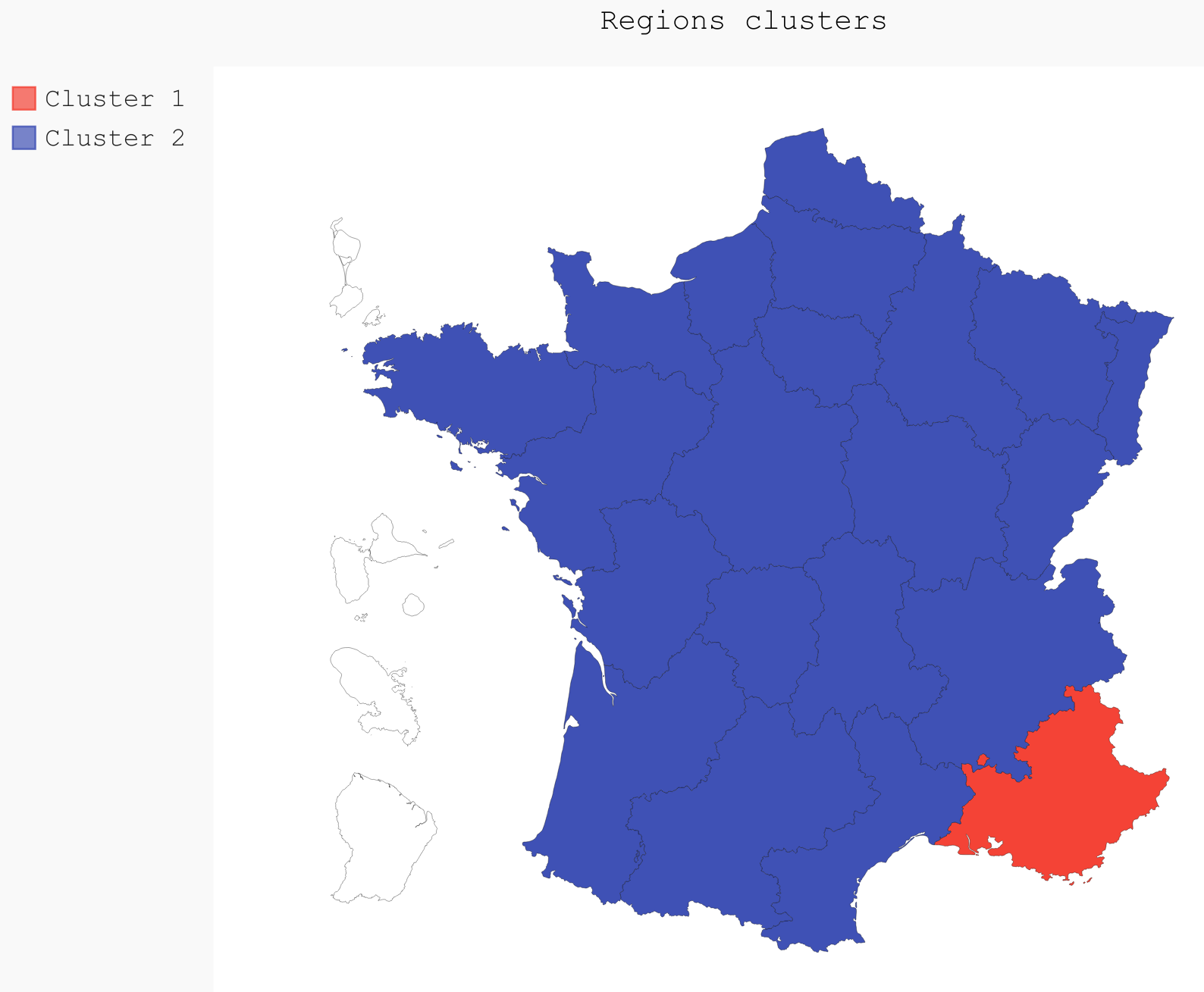
If we were to only use two clusters, the PACA region is clearly the most distinct of all the regions (Fig. ref:fig:2clusters_map).
import pygal
from itertools import chain
import pandas as pd
import scipy.cluster.hierarchy as hcl
from scipy.spatial.distance import squareform
import numpy as np

DM_GCC = pd.read_csv('data/DM_GCC_37.csv', index_col=0)
consommation = pd.read_csv('data/consommation.csv',index_col=0)

n_clusters = 5
linkage = hcl.linkage(squareform(DM_GCC), method='average')
clusters = hcl.fcluster(linkage, t=n_clusters, criterion="maxclust")

regions = [string.split('_')[0] for string in consommation.columns]
times = [string.split('_')[1] for string in consommation.columns]
consommation_clusters = pd.DataFrame(np.transpose([regions,
                                                times,
                                                list(clusters)]), columns=["Region", "Time", "Cluster"])

region_cluster = consommation_clusters.groupby(by="Region")["Cluster"].value_counts().index.to_frame()
region_cluster.index = region_cluster["Region"].values

region_codes = pd.read_csv("./data/frenchRegions.csv")

region_cluster["Region"].isin(region_codes["Region"])
region_cluster["region_match"] = region_cluster["Region"]

region_codes = {}
region_codes["Auvergne-Rhône-Alpes"] = [83, 82]
region_codes["Bourgogne-Franche-Comté"] = [26, 43]
region_codes["Bretagne"] = [53]
region_codes["Centre-Val de Loire"] = [24]
region_codes["Grand-Est"] = [42, 21, 41]
region_codes["Hauts-de-France"] = [31, 22]
region_codes["Ile-de-France"] = [11]
region_codes["Normandie"] = [23, 25]
region_codes["Nouvelle-Aquitaine"] = [72, 54, 74]
region_codes["Occitanie"] = [91, 73]
region_codes["PACA"] = [93]
region_codes["Pays-de-la-Loire"] = [52]

fr_chart = pygal.maps.fr.Regions()
fr_chart.title = 'Regions clusters'
for cluster in np.unique(region_cluster["Cluster"]):
    fr_chart.add("Cluster " + str(cluster),
                list(chain.from_iterable([region_codes[region]
                                        for region in region_cluster.loc[
                                            region_cluster["Cluster"]==cluster, "Region"].values])))
fr_chart.render_to_file("./img/5_regions_clusters.svg")
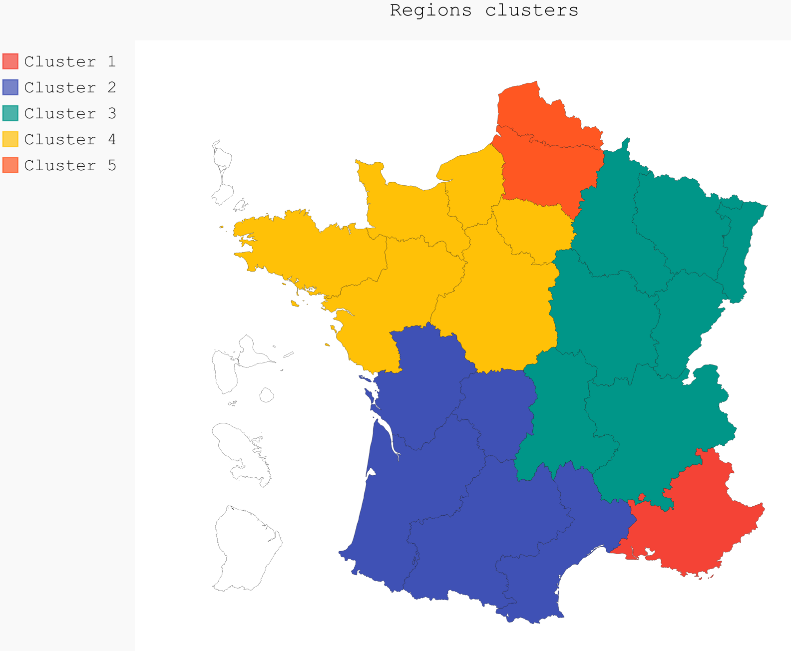
However, in order to have a deeper understanding of the composition of France, five clusters was the other clear delimitation. It is very clear here, that all the clusters have a strong geographical meaning. All regions are in different clusters apart from cluster 4 and 5 that are mixed geographically (Table ref:tab:regions_clusters and Fig. ref:fig:5clusters_map), and are more defined by their consumption over time.
| 1 | 2 | 3 | 4 | 5 |
|---|---|---|---|---|
| PACA | N-A | A-R-A | Bretagne | Bretagne |
| Occitanie | B-F-C | C-V-L | C-V-L | |
| G-E | I-F | I-F | ||
| Normandie | Normandie | |||
| P-L | P-L | |||
| H-F |
\pagebreak \pagebreak
In this section, the goal was to find out which structure within each of the clusters is left unexplained by the five clusters. A dendrogram was plotted for each of them and the label was coloured depending on the time of the day, where red is late in the night and blue is early morning. The lighter colours are towards midday.
In Figure ref:fig:cluster1, cluster 1 only contains the PACA region, so the only variable left to explore is the time of the day. As we can see that there are three main clusters, midday-afternoon from 11:30 to 20:00 in green, the night cluster from 20:00 to 6:00 in red and mornings from 6:30 to 11:00 in blue. Days (11:30 to 20:00) and nights (20:30 to 11:00) are however the most well defined.
sub_DM_GCC = DM_GCC.loc[clusters==1, clusters==1]
sub_linkage = hcl.linkage(squareform(sub_DM_GCC), method='average')

labels = [l.split('_')[1] for l in sub_DM_GCC.columns]
unique_labels = np.unique(labels)
hcl.dendrogram(sub_linkage, color_threshold=0.35,
            labels = labels)
my_palette = plt.cm.get_cmap("coolwarm", len(unique_labels))
label_color = {l:my_palette(i) for l, i in zip(unique_labels, np.arange(len(unique_labels)))}
ax = plt.gca()
xlbls = ax.get_xmajorticklabels()
for lbl in xlbls:
    lbl.set_color(label_color[lbl.get_text()])

plt.show()
Cluster 2 contains two regions (Nouvelle-Aquitaine and Occitanie). In Figure ref:fig:cluster2, in the top plot the label is coloured by the region and the bottom plot the label was coloured by the time of the day. We can see that the most important clustering is by region, but then similar clustering as in cluster 1, with mornings, afternoons and nights, as shown by the 6 coloured clusters.
sub_DM_GCC = DM_GCC.loc[clusters==2, clusters==2]
sub_linkage = hcl.linkage(squareform(sub_DM_GCC), method='average')

fig = plt.figure(figsize=(8,10), dpi=96)
fig.add_subplot(2,1,1)
labels = [l.split('_')[0] for l in sub_DM_GCC.columns]
unique_labels = np.unique(labels)
hcl.dendrogram(sub_linkage, color_threshold=.5,
            labels = labels)
my_palette = plt.cm.get_cmap("tab20", len(unique_labels))
label_color = {l:my_palette(i) for l, i in zip(unique_labels, np.arange(len(unique_labels)))}
ax = plt.gca()
xlbls = ax.get_xmajorticklabels()
for lbl in xlbls:
    lbl.set_color(label_color[lbl.get_text()])

fig.add_subplot(2,1,2)
labels = [l.split('_')[1] for l in sub_DM_GCC.columns]
unique_labels = np.unique(labels)
hcl.dendrogram(sub_linkage, color_threshold=.3,
            labels = labels)
my_palette = plt.cm.get_cmap("coolwarm", len(unique_labels))
label_color = {l:my_palette(i) for l, i in zip(unique_labels, np.arange(len(unique_labels)))}
ax = plt.gca()
xlbls = ax.get_xmajorticklabels()
for lbl in xlbls:
    lbl.set_color(label_color[lbl.get_text()])

plt.show()
In cluster 3 (Fig. ref:fig:cluster3), containing three regions (Auvergne-Rhône-Alpes, Bourgogne-Franche-Comté and Grand-Est), similar daily stratification as in cluster 1 and 2 is occurring (at a distance of 0.3). However, the time of the day is now more important than the regions. At first, three clusters are formed, mostly defined by time of the day (at a distance of 0.45), then those are split into regions. On the left, we can see the mornings of Bourgogne-Franche-Comté and Grand-Est show more similarity, as those are not split until a ±0.24 distance.
sub_DM_GCC = DM_GCC.loc[clusters==3, clusters==3]
sub_linkage = hcl.linkage(squareform(sub_DM_GCC), method='average')

fig = plt.figure(figsize=(8,10), dpi=96)
fig.add_subplot(2,1,1)
labels = [l.split('_')[0] for l in sub_DM_GCC.columns]
unique_labels = np.unique(labels)
hcl.dendrogram(sub_linkage, color_threshold=.3,
            labels = labels)
my_palette = plt.cm.get_cmap("tab20", len(unique_labels))
label_color = {l:my_palette(i) for l, i in zip(unique_labels, np.arange(len(unique_labels)))}
ax = plt.gca()
xlbls = ax.get_xmajorticklabels()
for lbl in xlbls:
    lbl.set_color(label_color[lbl.get_text()])

fig.add_subplot(2,1,2)
labels = [l.split('_')[1] for l in sub_DM_GCC.columns]
unique_labels = np.unique(labels)
hcl.dendrogram(sub_linkage,color_threshold=.3,
            labels = labels)
my_palette = plt.cm.get_cmap("coolwarm", len(unique_labels))
label_color = {l:my_palette(i) for l, i in zip(unique_labels, np.arange(len(unique_labels)))}
ax = plt.gca()
xlbls = ax.get_xmajorticklabels()
for lbl in xlbls:
    lbl.set_color(label_color[lbl.get_text()])

plt.show()
Cluster 4 (Fig. ref:fig:cluster4) is special, as it is a specifically a night cluster. For this reason, the only further grouping is done by region. On the left, Pays-de-la-Loire and Bretagne form a cluster, and in the middle, Ile-de-France and Normandie form another. The centre-Val de Loire is notably different from the other four regions.
sub_DM_GCC = DM_GCC.loc[clusters==4, clusters==4]
sub_linkage = hcl.linkage(squareform(sub_DM_GCC), method='average')

fig = plt.figure(figsize=(8,10), dpi=96)
fig.add_subplot(2,1,1)
labels = [l.split('_')[0] for l in sub_DM_GCC.columns]
unique_labels = np.unique(labels)
hcl.dendrogram(sub_linkage,
            labels = labels)
my_palette = plt.cm.get_cmap("tab20", len(unique_labels))
label_color = {l:my_palette(i) for l, i in zip(unique_labels, np.arange(len(unique_labels)))}
ax = plt.gca()
xlbls = ax.get_xmajorticklabels()
for lbl in xlbls:
    lbl.set_color(label_color[lbl.get_text()])

fig.add_subplot(2,1,2)
labels = [l.split('_')[1] for l in sub_DM_GCC.columns]
unique_labels = np.unique(labels)
hcl.dendrogram(sub_linkage,
            labels = labels)
my_palette = plt.cm.get_cmap("coolwarm", len(unique_labels))
label_color = {l:my_palette(i) for l, i in zip(unique_labels, np.arange(len(unique_labels)))}
ax = plt.gca()
xlbls = ax.get_xmajorticklabels()
for lbl in xlbls:
    lbl.set_color(label_color[lbl.get_text()])

plt.show()
In cluster 5 (Fig. ref:fig:cluster5), there are five regions, the same ones as in cluster 4 as well as Hauts-de-France. Similarly to cluster 4, as it is a day cluster, most of the delimitation occurs because of the regions. Then each regions is split between the earlier and later times. A clear example, is the Hauts-de-France that was dissociated from the other regions and feature the early and later times clustering.
sub_DM_GCC = DM_GCC.loc[clusters==5, clusters==5]
sub_linkage = hcl.linkage(squareform(sub_DM_GCC), method='average')

fig = plt.figure(figsize=(8,10), dpi=96)
fig.add_subplot(2,1,1)
labels = [l.split('_')[0] for l in sub_DM_GCC.columns]
unique_labels = np.unique(labels)
hcl.dendrogram(sub_linkage,
            labels = labels)
my_palette = plt.cm.get_cmap("tab20", len(unique_labels))
label_color = {l:my_palette(i) for l, i in zip(unique_labels, np.arange(len(unique_labels)))}
ax = plt.gca()
xlbls = ax.get_xmajorticklabels()
for lbl in xlbls:
    lbl.set_color(label_color[lbl.get_text()])

fig.add_subplot(2,1,2)
labels = [l.split('_')[1] for l in sub_DM_GCC.columns]
unique_labels = np.unique(labels)
hcl.dendrogram(sub_linkage,
            labels = labels)
my_palette = plt.cm.get_cmap("coolwarm", len(unique_labels))
label_color = {l:my_palette(i) for l, i in zip(unique_labels, np.arange(len(unique_labels)))}
ax = plt.gca()
xlbls = ax.get_xmajorticklabels()
for lbl in xlbls:
    lbl.set_color(label_color[lbl.get_text()])

plt.show()
\pagebreak
As no information about the size of the population in each region was used, the absolute consumptions were not compared between clusters. However, we can still compare relative changes over the years (Fig. ref:fig:cluster-trend1y), seasons (Fig. ref:fig:cluster-trend3m) and a typical week and day (Fig. ref:fig:cluster-week and Fig. ref:fig:cluster-day).
On Figure ref:fig:cluster-trend1y, the one year moving average trend estimate of each cluster seem to suggest that the regions that had lower consumptions in 2013-2014 have increased their consumptions in 2016-2017, and inversely for regions that had it higher in the 2013-2014 period. The PACA region (cluster 1) is also clearly differentiated from the other ones. Overall, it is difficult to draw conclusions over the longer term trends, as there are not enough data to analyse those. The general pattern observed during those 4.5 years are most likely due to weather conditions across each year.
from scipy.stats.mstats import zscore
import pandas as pd
import matplotlib.pyplot as plt
import scipy.cluster.hierarchy as hcl
from scipy.spatial.distance import squareform
from os.path import join
%matplotlib inline

consommation = pd.read_csv(join('data', 'consommation.csv'), index_col=0)
consommation.index = pd.to_datetime(consommation.index, format="%Y-%m-%d")
consommation = consommation.apply(zscore, axis=0)
linkage = hcl.linkage(squareform(DM_GCC), method='average')
clusters = hcl.fcluster(linkage, t=5, criterion="maxclust")
#consommation = consommation.diff(365).iloc[365:,:]
consommation.groupby(clusters, axis=1).mean().rolling(365,center=True).mean().plot(
    figsize=(10,5))
plt.show()
In the three months moving average trend (Fig. ref:fig:cluster-trend3m), we can see that cluster 1 and 2 have a higher energy consumption during the summer. This is most likely due to the use of air conditioning, as those two clusters are in the south of France, which is not really common (nor necessary) in the north. In general, the energy consumption is significantly higher during the winter.
from scipy.stats.mstats import zscore
import pandas as pd
import matplotlib.pyplot as plt
import scipy.cluster.hierarchy as hcl
from scipy.spatial.distance import squareform
from os.path import join
%matplotlib inline

consommation = pd.read_csv(join('data', 'consommation.csv'), index_col=0)
consommation.index = pd.to_datetime(consommation.index, format="%Y-%m-%d")
consommation = consommation.apply(zscore, axis=0)
linkage = hcl.linkage(squareform(DM_GCC), method='average')
clusters = hcl.fcluster(linkage, t=5, criterion="maxclust")
consommation.groupby(clusters, axis=1).mean().rolling(30*3,center=True).mean().plot(
    figsize=(10,5))
plt.show()
Cluster 3 and 5 have the highest energy consumption during the week (ref:fig:cluster-week) and the lowest during the weekend. It is not surprising for cluster 5 is a day cluster. However, cluster 3 has a notably different consumption that the other two normal cluster (1 and 2). On the opposite, cluster 4, which is a night cluster, has higher consumption during the weekend than during the week.
from scipy.stats.mstats import zscore
import pandas as pd
import matplotlib.pyplot as plt
import scipy.cluster.hierarchy as hcl
from scipy.spatial.distance import squareform
from os.path import join

consommation = pd.read_csv(join('data', 'consommation.csv'), index_col=0)
consommation.index = pd.to_datetime(consommation.index, format="%Y-%m-%d")
consommation = consommation.apply(zscore, axis=0)
linkage = hcl.linkage(squareform(DM_GCC), method='average')
clusters = hcl.fcluster(linkage, t=5, criterion="maxclust")
consommation.groupby(clusters, axis=1).mean().groupby(consommation.index.weekday).mean().plot(figsize=(10,5))
ax = plt.gca()
ax.set_xlabel('Day of the week')
plt.xticks(np.arange(7), ('Monday','Tuesday','Wednesday','Thursday','Friday','Saturday','Sunday'))
plt.show()
Over the day (Fig. ref:fig:cluster-day), cluster 1, and to a smaller extend cluster 2, tend to use electricity later than the other regions. Again, this is most likely due to the different life style between the north and south regions of France. As it is very warm during the days, people tend to go out more in the evenings, as shown by the higher consumption around 20:00.
\newpage
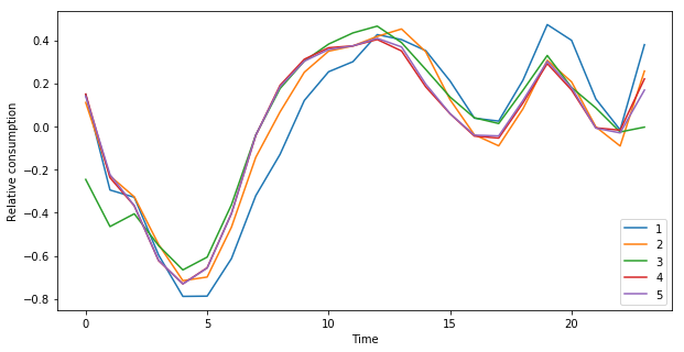
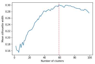
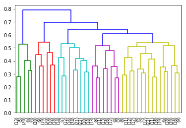
The silhouette statistic seem to suggest a higher number of clusters when using the Euclidean distance (Fig. ref:fig:euc-sil), with 59 clusters. As before, this study will only focus on the main clusters as shown in Figure ref:fig:cluster-euc. There, the main observable cluster are of the nights, on the left, (00:00 to 9:30) and days, on the right (5:00 to 23:30). The time clustering is also shown in Figure ref:fig:time-euc. It is only after this clustering that it is possible to look at regional clusters. Although that differentiation is possible, it occurs low in the tree.
from scipy.spatial.distance import pdist, squareform
from scipy.stats.mstats import zscore
from os.path import join

consommation = pd.read_csv(join('data', 'consommation.csv'), index_col=0)
consommation = consommation.diff(7).diff(1).iloc[8:,:]
consommation = consommation.apply(zscore, axis=0)

pdist_euc = pdist(consommation.values.T, 'euclidean')
DM_euc = squareform(pdist_euc)

DM_euc = pd.DataFrame(
    DM_euc, index=consommation.columns, columns=consommation.columns)
linkage_euc = hcl.linkage(squareform(DM_euc), method='ward')

fig = plt.figure(figsize=(8,10), dpi=96)
fig.add_subplot(2,1,1)
labels = [l.split('_')[0] for l in DM_euc.columns]
unique_labels = np.unique(labels)
hcl.dendrogram(linkage_euc,
               labels = labels)
my_palette = plt.cm.get_cmap("tab20", len(unique_labels))
label_color = {l:my_palette(i) for l, i in zip(unique_labels, np.arange(len(unique_labels)))}
ax = plt.gca()
xlbls = ax.get_xmajorticklabels()
for lbl in xlbls:
    lbl.set_color(label_color[lbl.get_text()])

fig.add_subplot(2,1,2)
labels = [l.split('_')[1] for l in DM_euc.columns]
unique_labels = np.unique(labels)
hcl.dendrogram(linkage_euc,
               labels = labels)
my_palette = plt.cm.get_cmap("coolwarm", len(unique_labels))
label_color = {l:my_palette(i) for l, i in zip(unique_labels, np.arange(len(unique_labels)))}
ax = plt.gca()
xlbls = ax.get_xmajorticklabels()
for lbl in xlbls:
    lbl.set_color(label_color[lbl.get_text()])

plt.show()
gcc_time = cluster_df.groupby('euc')['time'].value_counts().unstack().T
gcc_time.index = pd.to_datetime(gcc_time.index).time
gcc_time.plot(figsize=(12,5))
plt.xticks(gcc_time.index,gcc_time.index, rotation='vertical')
ax = plt.gca()
ax.set_ylabel('Number of series in cluster')
ax.set_xlabel = 'Time of the day'
fig.autofmt_xdate()
plt.show()
In Figure ref:fig:euc-trend3m, we can see that the morning cluster consumes constantly more during the winter than during the day. This most likely due to keeping the household warm. And inversely for the summer, as the air conditioning is mostly used during the day.
In Figure ref:fig:euc-week, the nights have a higher consumption during the weekend than during the week. This was also observed with the GCC distance (cluster 4 and 5 in Fig. ref:fig:cluster-day).
cluster_df.groupby('euc')['region'].value_counts().unstack().T.plot.bar()
ax = plt.gca()
ax.set_ylabel('Number of series in cluster')
plt.show()
gcc cluster 1 -> 2 (00:00 to 9:30) 4 rest cluster 2 -> 2,4,5 cluster 3 -> 2,5 cluster 4 -> 1,3,5 cluster 5 -> 1,3,5
\newpage
The application of the GCC to the electricity consumption of the French regions was
successful, as a high degree of meaningful clustering was detected. It was possible to
group the 576 time series (12 regions
The amount of data was too small to detect any clear long term trends, but enough to detect periods of lower and higher consumption. On the other hand, the use of air conditioning in the summer was detected for the two clusters in the south of France. Furthermore, those two southern clusters also exhibited later lifestyle with a much higher consumption around 20:00. Most likely due to the weather being too hot during the days and people enjoying going out in the evenings. Furthermore, nights clusters tend to consume more electricity during the weekend than during the week.
Both Python and R now provide some very mature environment for the manipulation of time series. The numpy citep:walt2011numpy, pandas citep:mckinney2010data and scipy citep:jones2014scipy packages available in Python provide with a very easy, efficient and consistent set of tools, but can sometimes lack the automatic statistical reports provided by most functions in R cite:team2013r. As such, R now has many tried and tested packages that offer a very high level of details in the result with a very minimum amount of code.
The GCC, as defined by cite:gcc2017, was successful at detecting the cross dependencies between the series to a very fine detail. Although it can be computationally expensive and slow for large series datasets, it has allowed to detect geographical clusters that were more difficultly detected by the Euclidean distance. This study was therefore able to show the importance of using a metric, taking into account the series cross dependencies, such as the GCC alongside other univariate distances for the detection of clusters.
bibliographystyle:apalike bibliography:ref.bib
\pagebreak \appendix
- In R:
library(FitAR)

getOrder <- function(ts, order.max=40) {
  SelectModel(ts, ARModel = 'AR', Criterion = 'BIC', lag.max = order.max)[1,1]
}

k <- max(apply(consommation, 2, getOrder))- In Python:
import statsmodels.api as sm

k = consommation.apply(
    lambda x: sm.tsa.arma_order_select_ic(
        x, ic='bic', trend='nc', max_ar=40, max_ma=1)['bic_min_order'][0]).max()
- In R:
kMatrix <- function(ts, k) {
  m <- ts[1 : (length(ts) - k)]
  for (i in seq(k)) {
    m <- cbind(m, ts[(i+1) : (length(ts) - k + i)])
  }
  m
}

GCC <- function(ts1, ts2, k) {
  Xi <-  kMatrix(ts1, k)
  Xj <-  kMatrix(ts2, k)

  Xij <- cbind(Xi, Xj)

  det(cor(Xij))^(1/(k+1)) /
    (det(cor(Xi))^(1/(k+1)) * det(cor(Xj))^(1/(k+1)))
}
k<-37
combinations <- combn(dim(consommation)[2], 2)
DM_GCC <- matrix(0, dim(consommation)[2], dim(consommation)[2])
for (d in seq(dim(combinations)[2])) {
  distance <- GCC(consommation[, combinations[,d][1]],
                  consommation[, combinations[,d][2]], k)
  DM_GCC[combinations[,d][1], combinations[,d][2]] <- distance
  DM_GCC[combinations[,d][2], combinations[,d][1]] <- distance
}
rownames(DM_GCC) <- colnames(consommation)
colnames(DM_GCC) <- colnames(consommation)
write.csv(DM_GCC, file="data/DM_GCC_37_R.csv")- In Python:
import numpy as np
from scipy.spatial.distance import pdist
from scipy.spatial.distance import squareform
import pickle


def k_matrix(ts, k):
    T = ts.shape[0]
    return np.array(
        [ts[(shift):T - k + shift] for shift in np.arange(0, k + 1)])


def get_GCC(ts1, ts2):
    k = 37
    Xi = k_matrix(ts1, k)
    Xj = k_matrix(ts2, k)
    Xij = np.concatenate((Xi, Xj))
    GCC = np.linalg.det(np.corrcoef(Xij)) ** (1 / (k + 1)) / (
        np.linalg.det(np.corrcoef(Xi)) ** (1 / (k + 1)) \
        * np.linalg.det(np.corrcoef(Xj)) ** (1 / (k + 1)) )
    return GCC


pdist_gcc = pdist(consommation.values.T, get_GCC)
DM_GCC = squareform(pdist_gcc)
DM_GCC = pd.DataFrame(
    DM_GCC, index=consommation.columns, columns=consommation.columns)
DM_GCC.to_csv('data/DM_GCC_37.csv')
clusters = hcl.fcluster(linkage, t=44, criterion="maxclust")

cluster_df = pd.DataFrame({'region':DM_GCC.index.to_series().apply(lambda x: x.split('_')[0]),
                           'time':DM_GCC.index.to_series().apply(lambda x: x.split('_')[1]),
                              'gcc':clusters})
final_df = pd.pivot_table(cluster_df, values='gcc', columns='region',index='time')
| A-R-A | B-F-C | Bret. | C-V-L | G-E | H-F | I-F | Nor. | N-A | Occ. | PACA | P-L | |
|---|---|---|---|---|---|---|---|---|---|---|---|---|
| 00:00:00 | 12 | 13 | 22 | 28 | 15 | 29 | 24 | 25 | 11 | 8 | 3 | 21 |
| 00:30:00 | 12 | 14 | 22 | 26 | 15 | 29 | 24 | 25 | 11 | 8 | 3 | 21 |
| 01:00:00 | 12 | 14 | 22 | 26 | 15 | 30 | 24 | 25 | 11 | 8 | 3 | 21 |
| 01:30:00 | 12 | 14 | 23 | 26 | 15 | 30 | 24 | 25 | 11 | 8 | 3 | 21 |
| 02:00:00 | 12 | 14 | 23 | 26 | 15 | 30 | 24 | 25 | 11 | 8 | 3 | 21 |
| 02:30:00 | 12 | 14 | 23 | 26 | 15 | 30 | 24 | 25 | 11 | 8 | 3 | 21 |
| 03:00:00 | 12 | 14 | 23 | 26 | 15 | 30 | 24 | 25 | 11 | 8 | 3 | 21 |
| 03:30:00 | 12 | 14 | 23 | 26 | 15 | 30 | 24 | 25 | 11 | 8 | 3 | 21 |
| 04:00:00 | 12 | 14 | 23 | 26 | 15 | 30 | 24 | 25 | 11 | 8 | 3 | 21 |
| 04:30:00 | 12 | 14 | 23 | 26 | 15 | 30 | 24 | 25 | 11 | 8 | 3 | 21 |
| 05:00:00 | 12 | 14 | 23 | 26 | 15 | 30 | 24 | 25 | 11 | 8 | 3 | 21 |
| 05:30:00 | 19 | 14 | 23 | 26 | 15 | 30 | 24 | 41 | 11 | 8 | 3 | 39 |
| 06:00:00 | 19 | 14 | 23 | 26 | 15 | 30 | 24 | 41 | 11 | 8 | 3 | 39 |
| 06:30:00 | 19 | 20 | 23 | 40 | 20 | 31 | 41 | 41 | 10 | 8 | 4 | 39 |
| 07:00:00 | 19 | 20 | 39 | 40 | 20 | 31 | 41 | 41 | 10 | 7 | 4 | 39 |
| 07:30:00 | 19 | 20 | 39 | 40 | 20 | 31 | 41 | 41 | 10 | 7 | 4 | 39 |
| 08:00:00 | 19 | 20 | 39 | 40 | 20 | 31 | 41 | 41 | 10 | 7 | 4 | 39 |
| 08:30:00 | 19 | 20 | 39 | 40 | 20 | 31 | 41 | 41 | 10 | 7 | 4 | 39 |
| 09:00:00 | 19 | 20 | 39 | 40 | 20 | 31 | 41 | 41 | 10 | 7 | 4 | 39 |
| 09:30:00 | 19 | 20 | 39 | 33 | 20 | 31 | 41 | 41 | 10 | 7 | 5 | 39 |
| 10:00:00 | 19 | 20 | 39 | 33 | 20 | 31 | 41 | 41 | 10 | 7 | 5 | 39 |
| 10:30:00 | 16 | 17 | 39 | 33 | 20 | 31 | 38 | 36 | 10 | 7 | 5 | 43 |
| 11:00:00 | 16 | 17 | 39 | 33 | 20 | 31 | 38 | 36 | 10 | 7 | 5 | 43 |
| 11:30:00 | 16 | 17 | 42 | 33 | 18 | 31 | 38 | 36 | 9 | 6 | 1 | 43 |
| 12:00:00 | 16 | 17 | 42 | 33 | 18 | 31 | 38 | 36 | 9 | 6 | 1 | 43 |
| 12:30:00 | 16 | 17 | 42 | 33 | 18 | 32 | 38 | 36 | 9 | 6 | 1 | 43 |
| 13:00:00 | 16 | 17 | 42 | 33 | 18 | 32 | 38 | 36 | 9 | 6 | 1 | 43 |
| 13:30:00 | 16 | 17 | 42 | 35 | 18 | 32 | 38 | 36 | 9 | 6 | 1 | 43 |
| 14:00:00 | 16 | 17 | 42 | 35 | 18 | 32 | 38 | 36 | 9 | 6 | 1 | 43 |
| 14:30:00 | 16 | 17 | 42 | 35 | 18 | 32 | 38 | 36 | 9 | 6 | 1 | 43 |
| 15:00:00 | 16 | 17 | 42 | 35 | 18 | 32 | 38 | 36 | 9 | 6 | 1 | 43 |
| 15:30:00 | 16 | 17 | 42 | 35 | 18 | 32 | 38 | 36 | 9 | 6 | 1 | 43 |
| 16:00:00 | 16 | 17 | 42 | 35 | 18 | 32 | 38 | 36 | 9 | 6 | 1 | 43 |
| 16:30:00 | 16 | 17 | 42 | 35 | 18 | 32 | 38 | 36 | 9 | 6 | 1 | 43 |
| 17:00:00 | 16 | 17 | 42 | 35 | 18 | 32 | 38 | 36 | 9 | 6 | 1 | 43 |
| 17:30:00 | 16 | 17 | 42 | 35 | 18 | 32 | 38 | 36 | 9 | 6 | 1 | 43 |
| 18:00:00 | 16 | 17 | 42 | 35 | 18 | 32 | 38 | 36 | 9 | 6 | 2 | 43 |
| 18:30:00 | 16 | 17 | 42 | 35 | 18 | 32 | 37 | 36 | 9 | 6 | 2 | 44 |
| 19:00:00 | 16 | 17 | 42 | 35 | 18 | 32 | 37 | 36 | 9 | 6 | 2 | 44 |
| 19:30:00 | 16 | 17 | 42 | 34 | 18 | 32 | 37 | 36 | 9 | 6 | 2 | 44 |
| 20:00:00 | 16 | 17 | 42 | 34 | 18 | 32 | 37 | 36 | 9 | 6 | 2 | 44 |
| 20:30:00 | 16 | 17 | 42 | 34 | 18 | 32 | 37 | 36 | 9 | 6 | 3 | 44 |
| 21:00:00 | 16 | 13 | 42 | 27 | 18 | 29 | 37 | 36 | 9 | 6 | 3 | 44 |
| 21:30:00 | 16 | 13 | 22 | 27 | 18 | 29 | 37 | 25 | 11 | 8 | 3 | 44 |
| A-R-A | B-F-C | Bret. | C-V-L | G-E | H-F | I-F | Nor. | N-A | Occ. | PACA | P-L | |
| 22:00:00 | 16 | 13 | 22 | 27 | 18 | 29 | 37 | 25 | 11 | 8 | 3 | 44 |
| 22:30:00 | 12 | 13 | 22 | 27 | 15 | 29 | 37 | 25 | 11 | 8 | 3 | 44 |
| 23:00:00 | 12 | 13 | 22 | 28 | 15 | 29 | 37 | 25 | 11 | 8 | 3 | 21 |
| 23:30:00 | 12 | 13 | 22 | 28 | 15 | 29 | 37 | 25 | 11 | 8 | 3 | 21 |

