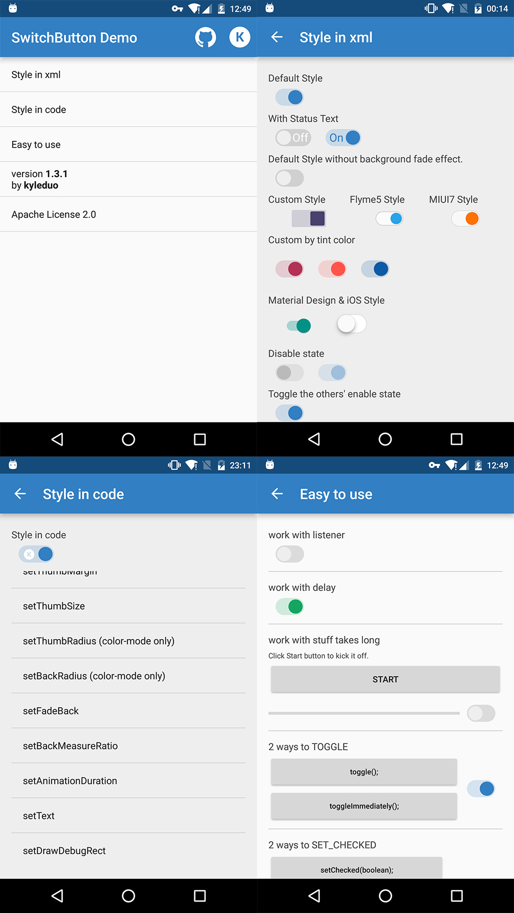
To get a quick preview, you can get Demo apk in Google Play or Directly download.
This project provides you a convenient way to use and customise a SwitchButton widget in Android. With just resources changed and attrs set, you can create a lifelike SwitchButton of Android 5.0+, iOS, MIUI, or Flyme and so on.
Now we get the biggest movement since SwitchButton published. v1.3.0 comes with totally reconsitution and more convenient API. A wholly new demo can give you a tour in it.
ADT
No more support
Gradle
Add dependencies in build.gradle of your module
dependencies {
	compile 'com.kyleduo.switchbutton:library:1.4.1'
}
I create a new demo apk to show you how to style the cute widget and use it. There's some screenshots of the new demo.
The usage of SwitchButton is just like CheckBox. The basic control APIs of SwitchButton.
- setChecked(boolean)
- toggle()
Since SwitchButton has addition animation when checked status changed, there are two addition methods for disable animation for single operation.
- setCheckedImmediately(boolean): like setChecked but NO animation.
- toggleImmediately(): like toggle but NO animation.
From version 1.4.1 on, SwitchButton support operation without onCheckedChanged callback. It makes changing state in code more convenient. Using these methods to achieve that feature.
- setCheckedNoEvent(boolean)
- setCheckedImmediatelyNoEvent(boolean)
- toggleNoEvent()
- toggleImmediatelyNoEvent()
In 1.3.0, I updated the usage of SwitchButton library. To make it more Android way to use, I've combined the thumb and back style each to StateListColor/StateListDrawable. So you are free to create styles in different states.
In xml layout file, you can configure the face of switch button using these attrs.
- kswThumbDrawable: drawable for thumb
- kswThumbColor: color for thumb
- kswThumbMargin: margin from thumb to back, can be negative. maybe cover by single direction margins
- kswThumbMarginTop: same to kswThumbMargin, just top
- kswThumbMarginBottom: same to kswThumbMargin, just bottom
- kswThumbMarginLeft: same to kswThumbMargin, just left
- kswThumbMarginRight: same to kswThumbMargin, just right
- kswThumbWidth: width of thumb
- kswThumbHeight: height of thumb
- kswThumbRadius: radius of thumb rect, only work with kswThumbColor
- kswBackRadius: radius of background rect, only work with kswBackColor
- kswBackDrawable: drawable for background
- kswBackColor: color for background
- kswFadeBack: fade background color/drawable when drag or animate between on/off status or not
- kswBackMeasureRatio: decide width of background from thumb's, this is the ratio
- kswAnimationDuration: duration of animation between 2 status
- kswTintColor: change SwitchButton's style just by one property, all relevant color will be generate automatically. Do not support
SwitchButtonMDor other style created by xml resources. - kswTextOn: text for checked status.
- kswTextOff: text for unchecked status.
- kswTextMarginH: horizontal margin of text.
You can alse change the configuration of SwitchButton in code. You can find the api from Demo apk. There's a glance.
private String[] opts = new String[]{
			"setThumbColorRes/setThumbColor",
			"setThumbDrawableRes/setThumbDrawable",
			"setBackColorRes/setBackColor",
			"setBackDrawableRes/setBackDrawable",
			"setTintColor",
			"setThumbMargin",
			"setThumbSize",
			"setThumbRadius (color-mode only)",
			"setBackRadius (color-mode only)",
			"setFadeBack",
			"setBackMeasureRatio",
			"setAnimationDuration",
			"setDrawDebugRect",
			"setText",
	};
Licensed under the Apache License, Version 2.0 (the "License");
you may not use this file except in compliance with the License.
You may obtain a copy of the License at

   http://www.apache.org/licenses/LICENSE-2.0

Unless required by applicable law or agreed to in writing, software
distributed under the License is distributed on an "AS IS" BASIS,
WITHOUT WARRANTIES OR CONDITIONS OF ANY KIND, either express or implied.
See the License for the specific language governing permissions and
limitations under the License.

