ColorPickerDialog is a simple dialog making it quick and easy to add a color picker functionality to any app.
For testing and experimentation purposes, a sample apk can be downloaded here.
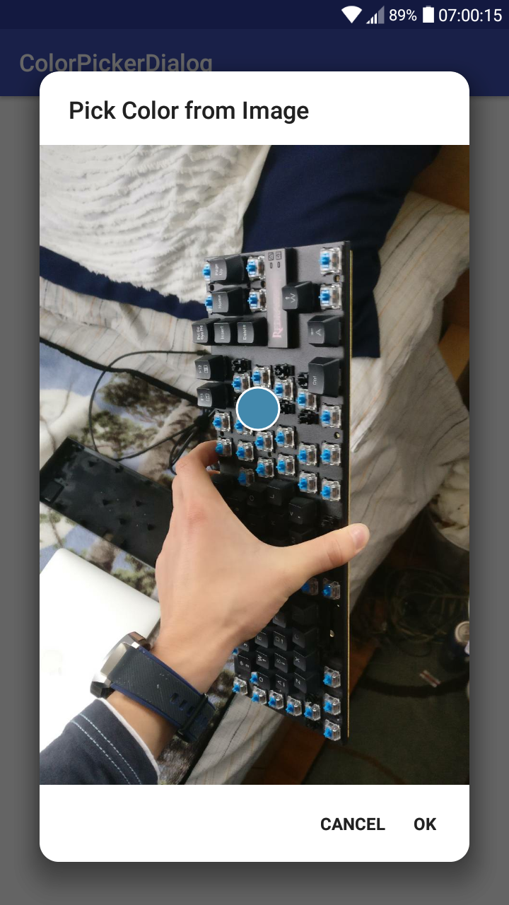
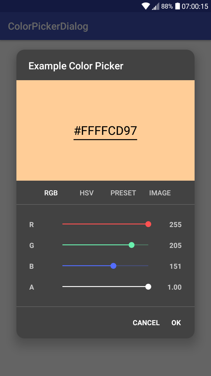
| RGB(A) Picker | HSV Picker | Preset Picker | Image Picker (Tab) | Image Picker (Images) | Dark Theme |
|---|---|---|---|---|---|
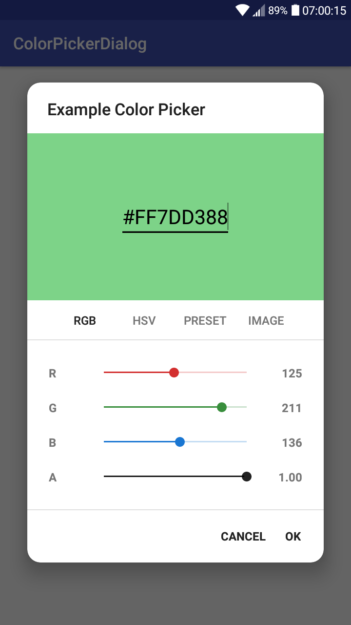 |
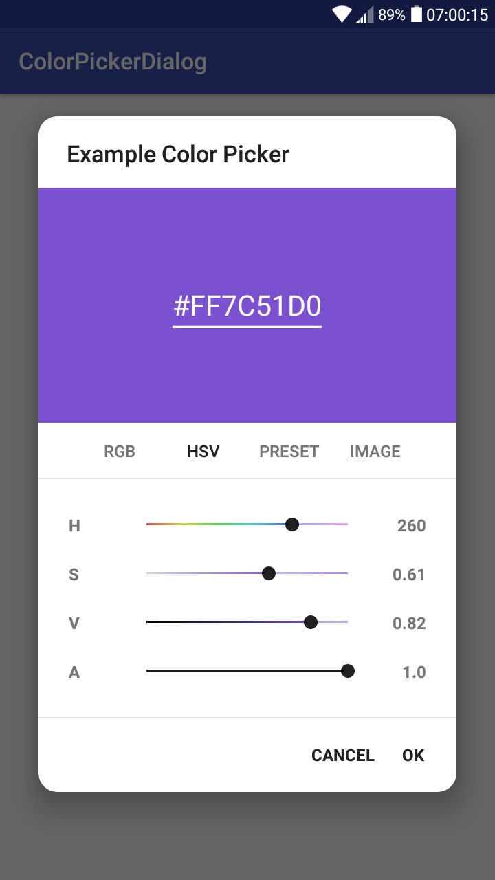 |
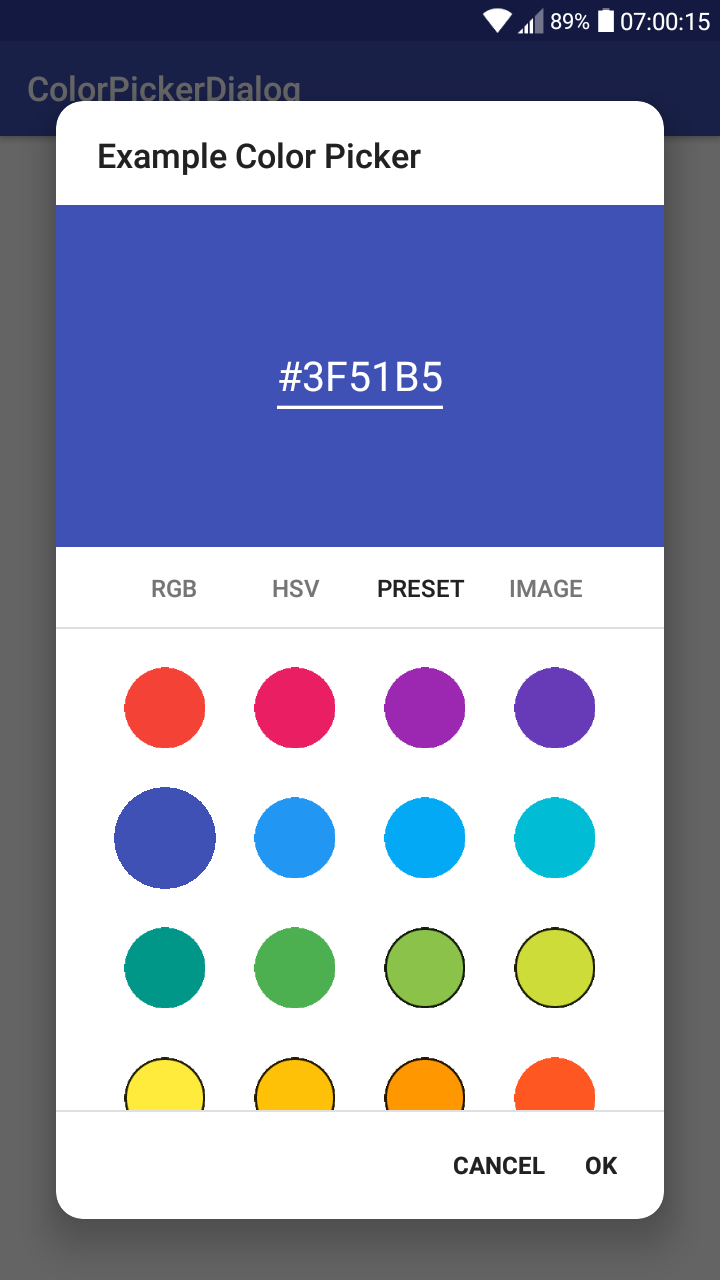 |
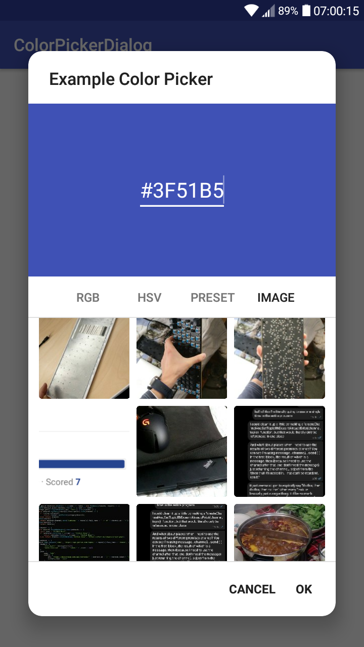 |
 |
 |
This project is published on JitPack, which you can add to your project by copying the following to your root build.gradle at the end of "repositories".
allprojects {
  repositories {
    ...
    maven { url 'https://jitpack.io' }
  }
}
To add the dependency, copy this line into your app module's build.gradle file.
implementation 'me.jfenn.ColorPickerDialog:base:0.2.1'The basic requirements for the dialog are a default color and a listener, and though none of them have to be specified, it is usually a good idea. You can create a simple dialog fragment using the snippet below:
new ColorPickerDialog()
  .withColor(color) // the default / initial color
  .withListener(new OnColorPickedListener<ColorPickerDialog>() {
    @Override
    public void onColorPicked(@Nullable ColorPickerDialog dialog, int color) {
      // a color has been picked; use it
    }
  })
  .show(getSupportFragmentManager(), "colorPicker");
Alternatively, if you are creating the dialog from a fragment, you should use getChildFragmentManager() instead of getSupportFragmentManager().
You can call .withAlpha(boolean) to specify whether you want the color's alpha channel to be configurable by the user (if not, all output colors will be fully opaque). This option is enabled by default. A somewhat unnecessary example:
new ColorPickerDialog(this)
  .withAlphaEnabled(false) // disable the alpha channel
  .withListener(...)
.show();By default, the dialog gives the user three ways to enter a color; they can use RGB sliders, HSV sliders, or enter the hex value into the text box at the top.
There are also some alternative pickers that can be enabled to serve a few different purposes.
The .withPresets() method will enable the "preset" color picker, which simply displays a grid of preset colors for the user to choose from. These colors can be configured by passing them (either as an array or varargs) to the .withPresets() method, like below:
new ColorPickerDialog()
    .withPresets(Color.RED, Color.GREEN, Color.BLUE)
    .withListener(...)
.show(getSupportFragmentManager(), "colorPicker");There is an optional dependency that adds image picking functionality to the color picker; the user can select an image and then select a color from the image they have chosen.
To enable it, add the following to your build.gradle file along with the dependency from before:
implementation 'me.jfenn.ColorPickerDialog:imagepicker:0.2.1'Next, you will need to declare the following permissions in your AndroidManifest.xml (the library does not do it for you).
<uses-permission android:name="android.permission.READ_EXTERNAL_STORAGE"/>
<uses-permission android:name="android.permission.WRITE_EXTERNAL_STORAGE"/>
Now you should be able to add an image picker to your dialog by calling .withPicker(ImagePickerView.class) like below:
new ColorPickerDialog()
    .withPicker(ImagePickerView.class)
    .withListener(...)
.show(getSupportFragmentManager(), "colorPicker");You can theme this dialog by passing your custom theme to .withTheme(int). Support for full "runtime" theming may come later, but now is not later, so you can't do that yet. Here's an example of a ColorPickerDialog with a basic dark theme, demonstrating some of the options that you can specify.
new ColorPickerDialog()
    .withTheme(R.style.ColorPickerDialog_Dark)
.show(getSupportFragmentManager(), "colorPicker");<style name="ColorPickerDialog.Dark" parent="Theme.AppCompat.Dialog">
<item name="redColor">#FF5252</item>
<item name="greenColor">#FF5252</item>
<item name="blueColor">#536DFE</item>
<item name="neutralColor">#FFFFFF</item>
</style>The redColor, greenColor, and blueColor attributes affect the RGB sliders, and the neutralColor attribute changes the "neutral" colors of the others, including the alpha slider and the handles of the sliders in the HSL picker.
The dialog also supports custom values for the rounded corners, which you can specify by calling .withCornerRadius(float) with the dp measurement of the corner radius, or .withCornerRadiusPx(int) with a pixel measurement.
Not only am I lazy, I also miss things, so this page may not describe every feature that this library is capable of. However, the majority of this library's documentation is actually written as javadocs within the source code. You can find the generated documentation pages for it here.
