ColorPickerDialog is a simple dialog making it quick and easy to add a color picker functionality to any app.
For testing and experimentation purposes, a sample apk can be downloaded here.
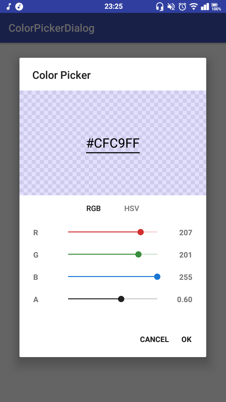
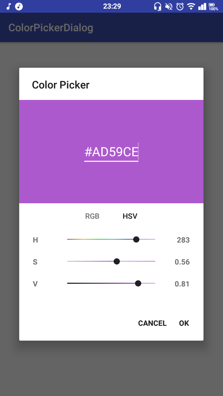
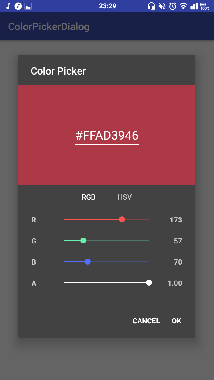
| Color Picker | No Alpha | Dark Theme |
|---|---|---|
 |
 |
 |
This project is published on JitPack, which you can add to your project by copying the following to your root build.gradle at the end of "repositories".
allprojects {
  repositories {
    ...
    maven { url 'https://jitpack.io' }
  }
}
To add the dependency, copy this line into your app module's build.gradle file.
implementation 'me.jfenn.ColorPickerDialog:base:0.2.0'The basic requirements for the dialog are a default color and a listener, and though none of them have to be specified, it is usually a good idea.
new ColorPickerDialog(this) // context
  .withColor(color) // the default / initial color
  .withListener(new OnColorPickedListener<ColorPickerDialog>() {
    @Override
    public void onColorPicked(@Nullable ColorPickerDialog dialog, int color) {
      // a color has been picked; use it
    }
  })
.show();You can call .withAlpha(boolean) to specify whether you want the color's alpha channel to be configurable by the user (if not, all output colors will be fully opaque). This option is enabled by default. A somewhat unnecessary example:
new ColorPickerDialog(this)
  .withAlphaEnabled(false) // disable the alpha channel
  .withListener(...)
.show();By default, the dialog gives the user three ways to enter a color; they can use RGB sliders, HSV sliders, or enter the hex value into the text box at the top.
There are also some alternative pickers that can be enabled to serve a few different purposes.
The .withPresets() method will enable the "preset" color picker, which simply displays a grid of preset colors for the user to choose from. These colors can be configured by passing an array to the .withPresets() method, like below:
new ColorPickerDialog(this)
    .withPresets(new int[]{Color.RED, Color.GREEN, Color.BLUE})
    .withListener(...)
.show();There is an optional dependency that adds image picking functionality to the color picker; the user can select an image and then select a color from the image they have chosen.
To enable it, add the following to your build.gradle file along with the dependency from before:
implementation 'me.jfenn.ColorPickerDialog:imagepicker:0.2.0'Next, you will need to declare the following permissions in your AndroidManifest.xml (the library does not do it for you).
<uses-permission android:name="android.permission.READ_EXTERNAL_STORAGE"/>
<uses-permission android:name="android.permission.WRITE_EXTERNAL_STORAGE"/>
Finally, make sure you add an "Activity Request Handler" as detailed below (or the picker cannot request access to the external storage itself).
Now you should be able to add an image picker to your dialog by calling .withPicker(ImagePickerView.class) like below:
new ColorPickerDialog(this)
    .withPicker(ImagePickerView.class)
    .withListener(...)
.show();Some parts of the picker dialog may require access to an activity or fragment for functionality such as requesting permissions or startActivityForResult. You can enable this functionality using the withActivityRequestHandler method as detailed below.
When the dialog "requests" a specific action, it will pass an ActivityResultHandler object for you to call when you receive a result from the request. For example, you could implement the request handler in an Activity class like so:
public class SomeActivity extends Activity implements ActivityRequestHandler {

    private ActivityResultHandler resultHandler;

    @Override
    protected void onCreate(Bundle savedInstanceState) {
        new ColorPickerDialog(this)
            .withActivityRequestHandler(this)
            .withListener(new ActivityRequestHandler() {
                @Override
                public void handlePermissionsRequest(ActivityResultHandler resultHandler, String... permissions) {
                    ActivityCompat.requestPermissions(SomeActivity.this, permissions, 0);
                    SomeActivity.this.resultHandler = resultHandler;
                }

                @Override
                public void handleActivityRequest(ActivityResultHandler resultHandler, Intent intent) {
                    startActivityForResult(intent, 0);
                    SomeActivity.this.resultHandler = resultHandler;
                }
            })
            .show();
    }

    @Override
    public void onRequestPermissionsResult(int requestCode, @NonNull String[] permissions, @NonNull int[] grantResults) {
        super.onRequestPermissionsResult(requestCode, permissions, grantResults);
        if (resultHandler != null)
            resultHandler.onPermissionsResult(permissions, grantResults);
    }

    @Override
    protected void onActivityResult(int requestCode, int resultCode, @Nullable Intent data) {
        super.onActivityResult(requestCode, resultCode, data);
        if (resultHandler != null)
            resultHandler.onActivityResult(resultCode, data);
    }
}
Here, you can see that the methods implemented by the ActivityRequestHandler are used to start activities / permission requests, and the on...Result methods provided by the activity simply pass the results back to the ActivityResultHandler that was passed to it during the request.
You can theme this dialog the same as any other: by passing a second parameter (a style resource) to its constructor. Full "runtime" theming will come later, but now is not later, so you can't do that yet. Here's an example of a ColorPickerDialog with a basic dark theme, demonstrating all of the options you can specify.
new ColorPickerDialog(this, R.style.ColorPickerTheme).show();<style name="ColorDialog.Dark" parent="Theme.AppCompat.Dialog">
<item name="redColor">#FF5252</item>
<item name="greenColor">#FF5252</item>
<item name="blueColor">#536DFE</item>
<item name="neutralColor">#FFFFFF</item>
</style>The redColor, greenColor, and blueColor attributes affect the RGB sliders, and the neutralColor attribute changes the "neutral" colors of the others, including the alpha slider and the handles of the sliders in the HSL picker.
