Make ant design tokens to a tailwindcss theme config preset
Result on custom components
| Before | After |
|---|---|
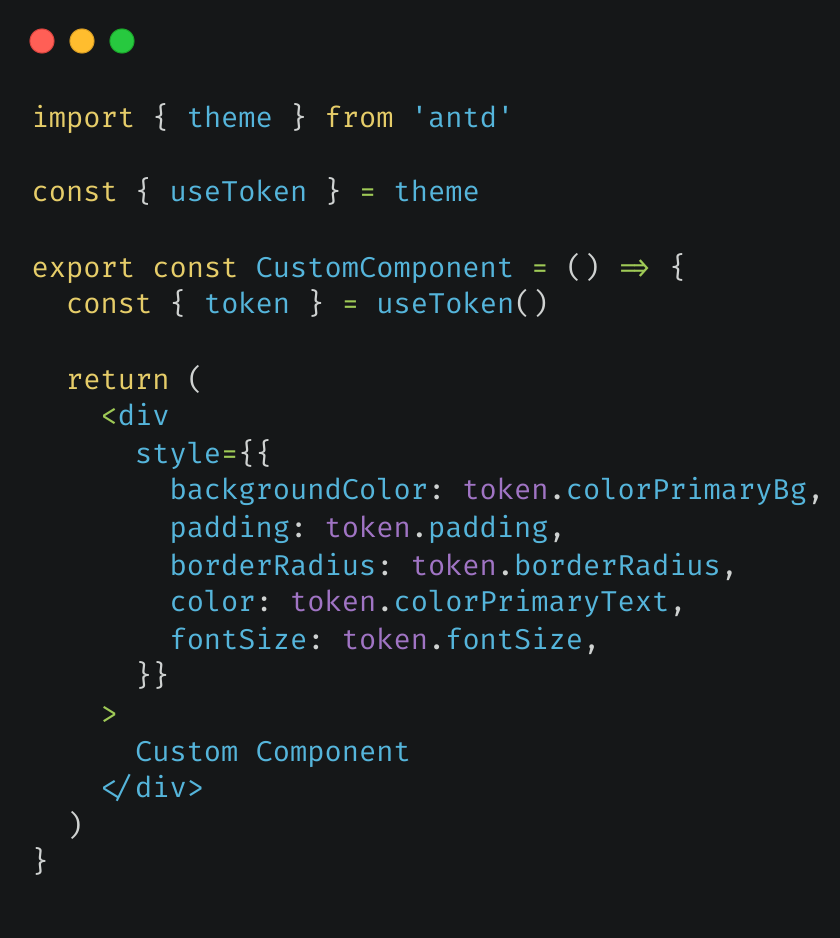 |
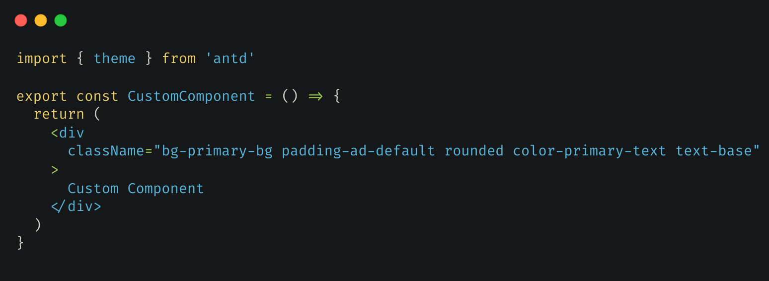 |
To make tailwindcss utility class work with ant design, please follow these steps or read ant design doc
Add @ant-design/cssinjs dependency, run
# npm
npm install @ant-design/cssinjs

# yarn
yarn add @ant-design/cssinjs

# pnpm
pnpm add @ant-design/cssinjs
Wrap app component with StyleProvider
export default () => (
  <StyleProvider layer>
    <MyApp />
  </StyleProvider>
)In global.css, adjust @layer to control the order of style override. Place tailwind-base before antd:
@layer tailwind-base, antd, custom;

@layer tailwind-base {
  @tailwind base;
}

@tailwind components;

@layer custom {
  /* custom utilities will overwrite ant design css */
  @tailwind utilities;
}If you use antd's reset.css style, you need to specify @layer for it to prevent the style from overriding antd:
@layer reset, antd;

@import url(reset.css) layer(reset);
Here's the sample code(only for example, the danger attribute is more suitable for red buttons):
const CustomAntButton = () => <Button className="p-0 bg-ant-error">Custom Button</Button>antd:antdpackage(version > 5) is installed for your projecttailwindcss:tailwindcssis installed and configured for your project
Open webapp in a new tab, copy the json theme from theme editor(Or just use the default theme). Click generate button. Copy and paste generated code into your tailwind config.
You can modify the generated theme on yourself, so this method is the most customizable one.
Copy index.js to your project and use it. You need to install lodash.kebabcase to convert the camelCase tokens to tailwind's kebab-case(tailwind suggested) and lodash.merge to merge preset
Run the command:
# npm
npm i -D tailwindcss-antdesign-preset

# yarn
yarn add --dev tailwindcss-antdesign-preset

# pnpm
pnpm add -D tailwindcss-antdesign-presetAdd to tailwind.config.js(or tailwind.config.ts)
const config = {
  presets: [require('tailwindcss-antdesign-preset')()],
  // ...other settings
}You can use ant design's theme config object to define custom theme. Here's the example:
// Define your theme somewhere

const customTheme = {
  token: {
    colorPrimary: '#00b96b',
  },
}

// Use it in your ConfigProvider Component

function Layout({ children }) {
  return <ConfigProvider theme={customTheme}>{children}</ConfigProvider>
}

// Use it in tailwind css config

const config = {
  presets: [require('tailwindcss-antdesign-preset')({ theme: customTheme })],
  // ...other settings
}Look at the sample file or preview page
I've found these special rules in my use. If you'v found a special rule, issue or pull request is welcomed
To avoid possible conflicts between ant design semantic colors with tailwindcss utility classes, ant design semantic color token such as colorBgSolid will be converted into theme.extend.colors['ant-bg-solid']. Use it with border-ant-border, bg-ant-bg-solid for example.
You can customize the prefix for a better meaning, such as color. Ant design color token colorBgSolid will be converted into theme.extend.colors['color-bg-solid']. Use it with border-color-bg-solid for example.
const config = {
  presets: [require('tailwindcss-antdesign-preset')({ theme: customTheme, colorPrefix: 'color' })],
  // ...other settings
}These ant design tokens override tailwindcss theme default values:
| Ant Design | TailwindCSS Config | Example Usage |
|---|---|---|
| variant colors(blue, etc.) | theme.color.*.{ [variant(1-10)]: color } | bg-blue/text blue |
| fontSize* | theme.fontSize.* | text-sm |
| fontFamily* | theme.fontFamily.* | font-mono/font-sans |
| borderRadius* | theme.borderRadius.* | rounded-md |
| screen* | theme.screens.* | sm: |
These ant design tokens extend tailwindcss theme config:
| Ant Design | TailwindCSS Config | base |
|---|---|---|
| semantic colors(colorBg, etc.) | theme.extend.color.* | |
| padding* | theme.extend.padding.* | v |
| margin* | theme.extend.margin.* | v |
| size* | theme.extend.size.* | v |
| boxShadow* | theme.extend.boxShadow.* | v |
| lineHeight* | theme.extend.lineHeight.* | v |
base: you need use such as padding-base for ant design default value(padding)