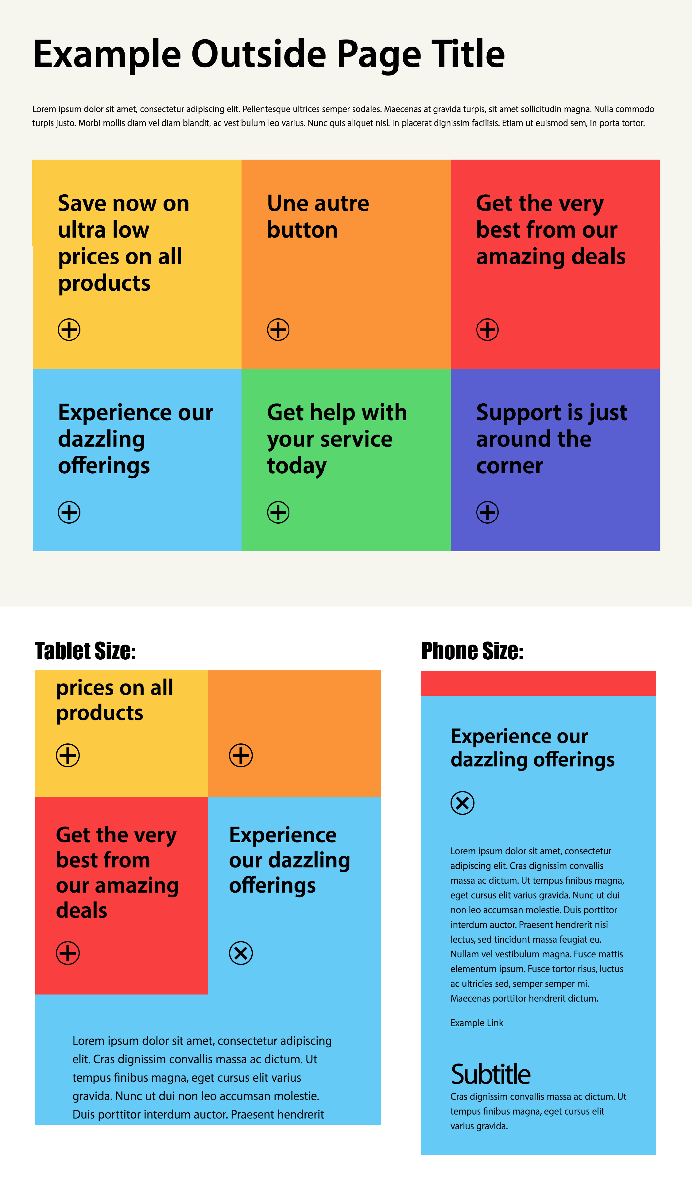
A grid of rectangular "cards" which, when clicked, expand a corresponding block of detailed information whilst closing any already-opened details. When clicked a second time, the details are closed again.
Within the example index.html document, there are some elements which have
class names starting with the word "example" which are meant simply as a
demonstration of how other types of content might interact with the card-grid
if there is an outer context within which this grid is to be placed.
This is not part of the grid itself and can be removed, ignored, or modified as needed ;)
-
All
.cardand.card-detailsblock elements must be siblings and must be direct descendants of a container called.card-grid. -
The order of the
.cardelements must match the order of the.card-detailselements, but it is not necessary that they be directly beside one-another.
For example, the following two code examples are equivalent (as far as the functionality of the grid is concerned).
<div class="card-grid">
  <div class="card">
    Card 1
  </div>
  <div class="card-details">
    Card 1 Details
  </div>

  <div class="card">
    Card 2
  </div>
  <div class="card-details">
    Card 2 Details
  </div>

  <div class="card">
    Card 3
  </div>
  <div class="card-details">
    Card 3 Details
  </div>
</div><div class="card-grid">
<div class="card">
Card 1
</div>
<div class="card">
Card 2
</div>
<div class="card">
Card 3
</div>
<div class="card-details">
Card 1 Details
</div>
<div class="card-details">
Card 2 Details
</div>
<div class="card-details">
Card 3 Details
</div>
</div>The important thing to consider is that the order of each set of elements is
maintained (the Javascript grabs a list of each element type, and based on the
order they are defined in the HTML, they are matched .card to .card-details.
As a result, the following will not work properly since "Card 1" will open "Card 2 Details" due to their order.
<div class="card-grid">
  <div class="card">
    Card 1
  </div>
  <div class="card">
    Card 2
  </div>
  <div class="card">
    Card 3
  </div>

  <div class="card-details">
    Card 2 Details
  </div>
  <div class="card-details">
    Card 1 Details
  </div>
  <div class="card-details">
    Card 3 Details
  </div>
</div>
Adjustments within each card/card-details is not too complicated, so if there are difficulties in implementing the templates with a CMS, you should be able to rejig the markup to suit the CMS constraints.
The trickiest aspect of this component behaviour is the part above .card-grid,
.card and .card-details elements. As long as the structure of those
elements can be maintained, the way the content within them is handled is fairly
straight-forward.
The content within each .card and .card-details element is dynamically
resized based on two factors: 1) the width of the viewport, using the vw unit
of measurement, and 2) breakpoints at different important viewport
size thresholds (e.g., for phone, tablet, laptop, and desktop screen sizes).
As a result of the dynamic nature of these responsive styles, the measurements
are not absolute and can be "fractional" at different sizes in-between each
breakpoint. For example, the vw unit of measurement translates to "1/100th the
width of the viewport", so at any particular viewport size, the size of the
copy itself will be proportional. Said differently, the font size won't ever be
"exactly 12pt" but instead be, for example, "13.4934pt which is 1/100 of the
viewport width of 1349.34px". This allows the font size to grow and shrink as
the dimensions of the card box grow and shrink, keeping it proportional to
the containing box, not necessarily any specific absolute font size.
Due to this dynamic nature of units, it is more useful to think of the
measurements in terms of percentages and proportions rather than any specific
size. That said, and to make things easier to communicate (and design), it
might be a good exercise to make some exact measurements, but to do so relative
to a certain viewport width (for example, perhaps setup a design file using a
specific font size of 24px relative to a viewport width of 1200px (which would
be 2vw that would at least lay out the correct proportions that I should be
paying attention to and I can adjust the stylesheet accordingly.
There are two style behaviours which lay within the domain of the outer/containing webpage within which this grid interface will be loaded:
-
the
device-widthmeta tag which controls the aspect ratio of mobile devices -
the "margin/padding" around the grid itself
The margin/padding around the grid is controlled by the surrounding webpage,
however its styles are set, and the grid itself cannot control this. In this
package I have created a container named .example-container which simulates
what some external content may look like in conjunction with the grid content,
and in this update I have also included a breakpoint at 520px which removes the
margin/padding around the grid to show how it could behave. This, however,
depends on the real-world page doing something similar and I have no data on
how the production environment is configured or how this grid content will be
treated in relation to this unknown outer content. Just something to keep in
mind when implementing this in a CMS ;)
