- Fork and clone this repository.
- Create three new branches,
training,float-site, andlookalike-site. - Install dependencies with
npm install.
Developers should, at the end of the lesson, be able to:
- Explain the box model of element spacing.
- Establish spacing inside and outside of elements using margin and padding.
- Explain the difference between different types of distance measurement in a web page, including 'px', '%', and 'em'.
- Use 'float' and 'clear' to stack elements alongside each other.
- Employ media queries to change CSS rules based on screen size.
- Explain the difference between 'static' and 'fixed' positioning.
So far, we've mostly talked about using CSS for styling our page - adding colors, fonts, etc. In this talk, we'll be examining how CSS can be used to control a webpage's layout.
Back in the 90s, layout was accomplished using tables (<table>), which had
rows (<tr>) and row subdivisions (<td>). However, this was problematic for
several reasons:
- Layout was hard-coded into the page - it couldn't easily be adjusted.
- As a result of (1), keeping layout consistent between multiple pages was tedious.
- Nesting tables within tables quickly became a nightmare - how could you tell
apart the
<tr>of one level from the<td>of another? - It wasn't very semantic - our markup would always say 'table', even though our content was typically not a table.
Using CSS to control our layout addressed all of these issues. What's more, it effectively abstracted away the layout of our page from the content of our page.
In addition to setting an element's height and width, elements have three
other properties that explicitly control spacing:
- 'Border' sets a perimeter around an element. In addition to specifying a color and a particular type of border, you can also specify a thickness.
- 'Margin' specifies spacing between the outside of an element's border and any adjacent elements.
- 'Padding' specifies spacing between the inside of an element's border and the
contents of that element (which includes
heightandwidth!)
Together, these attributes form the box model, a way of describing the space taken up by an element.
Note: The Box Model explains how CSS width is Calculated. By default, how wide an element is on the page is a combination of width + padding + border and the rendered height = height + padding + border. This can be problematic when trying to create a layout or position things logically on the page.
To calculate border, margin, and padding into the element's size, the element's CSS box-sizing property should be changed from the default content-box to border-box.
Every one of these attributes, including height and width, can be specified
in the following terms:
px: fixed number of pixels.%: size is relative to element that contains it ("parent"). As a value ofheight,%is relative to the parent'sheight, but for every other dimension,%is relative to the parent'swidthvalue.em: ties dimensions to font size - oneemis the width of the letter 'm'. For all dimensions exceptfont-size,emwill refer to the font size of the element; as a value forfont-size,emrefers to the font size of the parent.
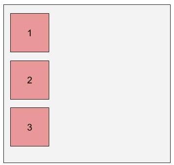
Block elements, as a rule, always stack vertically - never side by side. Each block element effectively has a 'new-line' built into it, forcing the next piece of content down.
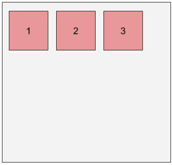
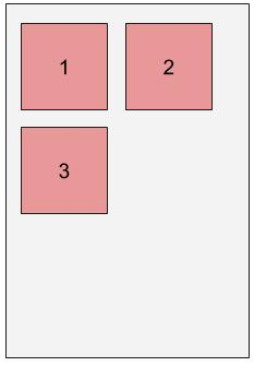
This can be circumvented using the float property; floated elements act like
words within a block of text, wrapping around the screen when it is too narrow
to display the entire line.
Like words, floated elements can be stacked from left-to-right (left-floated) or from right-to-left (right-floated)
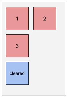
To make something fall beneath a set of floated elements, rather then wrapping
around it, you can use the clear attribute; set clear to left to clear a
left float, right to clear a right float, or both to clear either kind
of float.
Working on our training branch, let's use the example HTML code to
demonstrate floating.
Ordinarily, elements expand to hold their containers. However, floated elements are excluded from this, so floating an element may lead to its container's height shrinking down to nothing. To fix this, we use a "clearfix hack" by applying
overflow: hidden;to the container's style declarations.
Working with your squads on the float-site branch, use
index.html to create simple look-alikes that mimic the layout
(but not the actual content) of one of the following sites, using what
you've learned about so far about CSS positioning (including margin, padding,
float and clear).
- Don't be afraid to 'cheat' by looking at the source code of the site you're mimicking.
- Keep your sketches simple - don't add details like text, colors, etc.
- When drawing boxes, try not to draw them flush against each other - adding a little bit of space helps to make it clear when boxes should be nested inside other boxes.
- Don't got more than 4 levels deep in your nesting.
- Bright colors for your divs help to make layout mistakes obvious.
Using % dimensions allows you, to a certain degree, to account for a variety
of screen sizes by scaling up linearly. Sometimes, however, you don't want to
scale linearly; instead you want size to be fixed sometimes, to scale linearly
at others, or even to disappear entirely at a certain size.
Fortunately, CSS has a tool called a media query designed for this specific use case.
@media (max-width: 700px) {
  div {
    width: 300px;
    height: 300px;
  }
}
A media query acts a little like an if statement for your CSS; it will
selectively hide or show the CSS it contains based on whether or not the
condition in the query comes back as true.
Media queries can often be thought of as blocks of CSS that override existing styles from your stylesheet (although they can do much more than this). They, therefore, are always placed at the bottom of your stylesheet.
Here are some properties that can be used to build media queries:
- min-width: CSS is visible at all screen widths larger than the given value.
- max-width: CSS is visible at all screen widths smaller than the given value.
- min/max-resolution: CSS is visible above/below a given resolution.
Revisit the basic site from the previous float-site branch exercise, and add
a new effect that triggers when you shrink the screen below 800px wide.
All of the rules that you've learn so far are based on one paradigm of
positioning, called 'static' positioning. However, it's possible to change this
paradigm and employ a different approach for positining elements using the
position attribute.
Though there are others, the most significant type of positioning besides
static positioning is fixed positioning. fixed positioning defines the
position of an element with respect to the view window, essentially 'fixing'
its position on the screen. Fixed positioning is frequently used in parallax
scrolling, or for holding a navigation bar at the top/side/bottom of the screen.
.bar {
  position: fixed;
  left: 130px;
}Switch to the lookalike-site branch and work in your squads to create your own
look-alike for the following websites. Try to use fixed positioning at least
once.
Research relative and absolute positioning in CSS. How are they used? A helpful reference for understanding is this CSS-tricks blog post.
- All content is licensed under a CCBYNCSA 4.0 license.
- All software code is licensed under GNU GPLv3. For commercial use or alternative licensing, please contact [email protected].


