-
Notifications
You must be signed in to change notification settings - Fork 145
Dashboards
Dashboard content is specific to the visualization framework being used to render the dashboard. Argus web services do not support rendering of metric data or dashboards.
A dashboard includes the end date, ID, name, owner, metric, scope, shared, start date, and tags.
| Component | Description |
|---|---|
| Id | ID of the Dashboard |
| Name | Dashboard name |
| Content | Content of the Dashboard |
| Owner | Dashboard Owner |
| Shared | Indicates if the dashboard is visible by other users |
| Description | Dashboard description |
To create a dashboard, click the Add button on the Dashboard List page. To view your new dashboard, enter your last name in the search box.
To modify an existing dashboard, search for the ID number, dashboard name, description, or last name of the owner in the search box.
- Click the dashboard name that you want to modify.
- Click the Edit tab.
- Modify the dashboard and click Save.
Dashboard templates can have an arbitrary number of HTML tags. You can use any HTML5 tags like divs, table, and list to provide specific functionality. Argus also supports Bootstrap CSS classes for styling.
Currently, Argus supports line charts, area charts, and tabular charts. We encourage users to add support for other charts to the Argus UI. Here's a list of tags available for dashboard content.
| Tag | Description |
|---|---|
| <ag-dashboard/> | Defines the dashboard |
| <ag-date/> | Defines a date input control |
| <ag-text/> | Defines a text input control |
| <ag-request/> | Defines a custom JavaScript XHR request to Argus API end points |
| <ag-submit/> | Defines a submit button that when clicked will re-render the dashboard |
| <ag-chart/> | Defines a chart of the dashboard |
| <ag-option/> | Options for a chart or a table |
| <ag-metric/> | Time-series displayed on a chart or table |
| <ag-flags/> | Defines annotations |
| <ag-status-indicator/> | Defines a go/nogo stoplight indicator |
| <ag-table/> | Defines a table of the dashboard |
| <ag-select/> | Defines a dropdown with selections of the dashboard |
| <ag-query-variable/> | Defines an autocomplete input for scope, metric, namespace, tag key, tag value. |
This tag is required and must encapsulate the entire dashboard markup.
<ag-dashboard>
  <!-- This is the root level tag. All dashboards must be encapsulated within this tag. -->
  <!-- your dashboard content -->
  <!-- A dashboard template can have arbitrary number of html tags. -->
  <h4>Argus Dashboard</h4>
  <!-- Provide Argus tags can be used here as well-->
</ag-dashboard>TIP: To add a customize the browser-tab text, add the following script to under the
<ag-dashboard>tag:
<script>
   document.title = "My Tab Text"
</script>
This tag provides an input control to capture time and date information that can be used to parameterize your dashboard.
- name - The name of the variable to store the control value. This is the name that is used in the parameterized portions of your dashboard.
- label - The descriptive label to be rendered alongside the control.
- default - The default value to use. Can be a relative date such as '-7d' or a date time string such as '8/28/16 12:00 AM'. GMT/UTC timezone option is available as a check box when a date time value is used. Relative date values will not have this option.
<ag-date name='start' label='Start Date' default='-2h'></ag-date>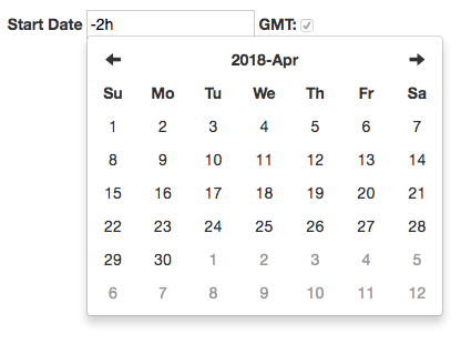
This tag provides an input control to capture arbitrary text data that can be used to parameterize your dashboard.
- name - The name of the variable to store the control value. This is the name that will be used in the parameterized portions of you dashboard.
- label - The descriptive label to be rendered alongside the control.
- default - The default value to use.
- id - The custom id for this element.
- class - The custom CSS class for this element. (requires a <style></style> in your custom markup with your class name and style properties)
- style - The custom CSS as 'inline' styles on the element.
- size - The HTML attribute to set the width of the input element.
<!-- default markup -->
<ag-text name='host' label='Hostname' default='myhost.mycompany.com'></ag-text>
<!-- with all options -->
<ag-text id='someId' class='someClass' style='padding-top:1px;' size='45' name='host' label='Hostname' default='myhost.mycompany.com'></ag-text>
This tag provides a custom JavaScript XHR request specifically for querying time series data from Argus API end points. Options include ability to provide success and error callback functions and data result can be easily accessed with custom JavaScript functionality. Without using this directive, users have to manually set up the accessToken to make http request in their own <script> tag.
- url - The url for retrieving data (Only from web service endpoint you defined in your Argus config file).
Within the <ag-request> : put your success call back function in <success> and error handling callback function in <error>
<script>
   function processData(data){
     ...
   }
</script>
<ag-request url="https://someurl">
    <success>
        function(data){
          processData(data);
          ...
        }
        //or just simply put processData in this tag
    </success>
    <error>
       function(error){
          ...
       }
       //this tag is not required
    </error>
</ag-request>This tag provides a submit button that when clicked will re-render the dashboard using the current values of any input controls.
- id - The custom id for this element.
- class - The custom CSS class for this element. (requires a <style></style> in your custom markup with your class name and style properties)
- style - The custom CSS as 'inline' styles on the element.
<!-- defaults markup -->
<ag-submit></ag-submit>
<!-- with all options -->
<ag-submit id='someId' class='someClass' style='background-color:green;'></ag-submit>This control renders a chart containing data for all nested ag-option, ag-metric and ag-tag elements.
- name - The identifier for the chart which must be unique from all other ag-chart elements.
- type - The type of chart to render, which can be 'line', 'area', 'stackarea', 'bar', stackbar', 'scatter' for scatter plot or 'heatmap'. Line chart is used by default.
- smallchart - If set to true, will render as a minimalistic spark line chart. DO NOT enclose value in quotes!
<ag-chart name='myChart'>
  <!-- One or more nested ag-option, ag-metric or ag-flags elements -->
</ag-chart>
<!-- use scatter plot -->
<ag-chart name='myChart' type='scatter'>
<!-- One or more nested ag-option, ag-metric or ag-flags elements -->
</ag-chart><!-- with smallchart attribute -->
<ag-chart name='myChart' smallchart=true>
<!-- One or more nested ag-option, ag-metric or ag-flags elements -->
</ag-chart>Here are images for some of the supported chart types
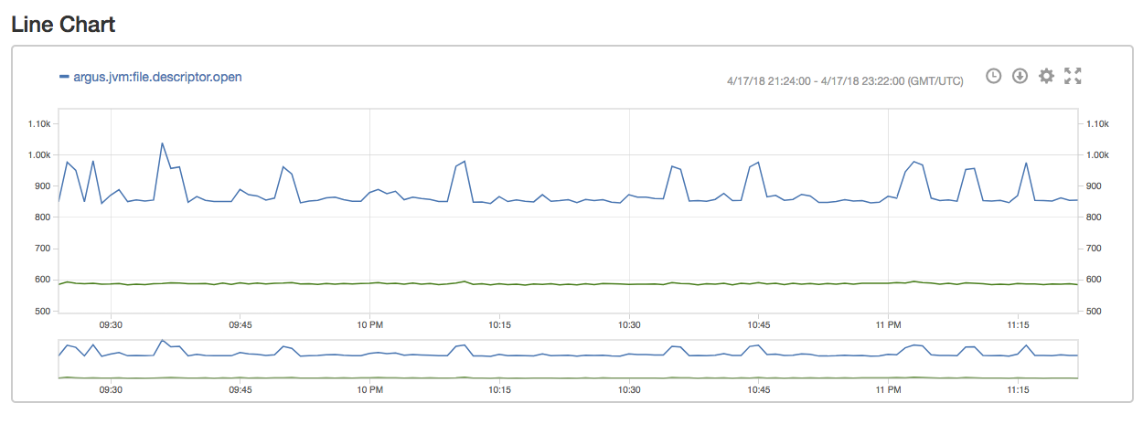
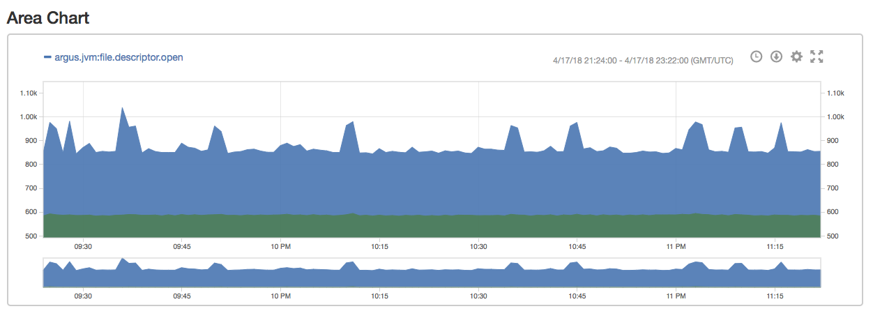
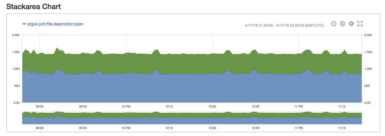
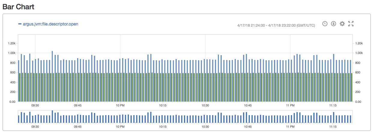
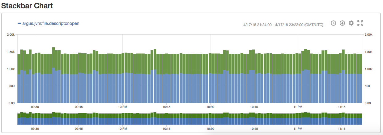
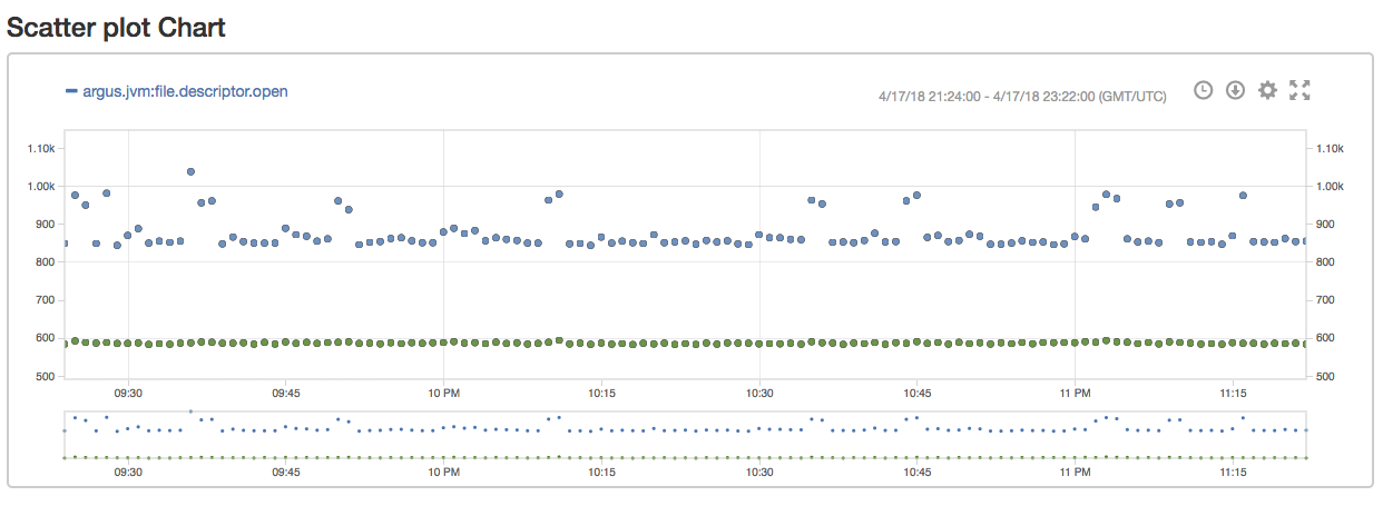
For heatmap, there are parameters you can config both in ag-option and the option modal. The latter will overwrite the former. <ag-flags> or annotation is not supported in heatmap right now.
- aggregateType - How you aggregate the data (avg/sum).
- intervalInMinutes - Time range for a bucket (in minutes). Aggregate data by the aggregateType within the bucket. If not defined, the default value is 30.
- bucketMin - You can explicitly define the minimum number for y domain. If not defined, the default value is the actual minimum value of the aggregated data.
- step - Value range of data in a bucket. If not defined, the default value is calculated by the y domain and numOfBucket.
- numOfBucket - How many buckets on y axis. If not defined, the default value is 5.
<ag-chart name='Chart' type="heatmap">
    <ag-option name='title.text' value='title'></ag-option>
    <ag-option name='intervalInMinutes' value='30'></ag-option>
    <ag-option name='aggregateType' value='avg'></ag-option>
    <ag-option name='bucketMin' value='0'></ag-option>
    <ag-option name='step' value='2000000000'></ag-option>
    <ag-option name='numOfBucket' value='10'></ag-option>
    <ag-metric>$start$:$end$:$scope$:$metric${$tags$}:$aggregator$</ag-metric>
</ag-chart>
This control sets specific chart options to control chart rendering.
- name - The dot delimited path identifier to the option for which the value is be set.
- value - The value of the option being set.
List of additional options supported:
- xAxis.title.text
- yAxis.title.text
<ag-option name="xAxis.title.text" value="X-axis title"></ag-option>
<ag-option name="yAxis.title.text" value="Y-axis title"></ag-option>- yAxis.min
- yAxis.max
<ag-option name="yAxis.min" value="0"></ag-option>
<ag-option name="yAxis.max" value="1250"></ag-option>TIP: Normally, Argus autoscales the y axis based on the values present. Setting the min and max values allows you to control the scaling.
- yAxis.type (default axis type is linear)
<ag-option name='yAxis.type' value='power'></ag-option>
<ag-option name='yAxis.exponent' value='2'></ag-option>
<!-- default exponent for power scale is 10 --><ag-option name='yAxis.type' value='log'></ag-option>
<ag-option name='yAxis.base' value='2'></ag-option>
<!-- default base for log scale is 10 -->NOTE: If your data contains 0, do not use log scale.
- chart.width
- chart.height
<ag-option name="chart.width" value="50%"></ag-option>
<ag-option name="chart.height" value="625"></ag-option>NOTE: Don't use percentages as values for 'chart.height' because the CSS across browsers won't be consistent.
- title.text
- title.style.color
<ag-option name="title.text" value="Chart Title"></ag-option>
<ag-option name="title.style.color" value="#F00"></ag-option>
Used in an <ag-chart></ag-chart>
<ag-chart name='myChart'>
  <ag-option name='title.text' value='Chart Title'></ag-option>
  <!-- other ag-option, ag-metric or ag-flags elements -->
</ag-chart>
Used in an <ag-table></ag-table>
<ag-table name='myTable'>
  <ag-option name='title.text' value='Table Title'></ag-option>
  <!-- other ag-option or ag-metric elements -->
</ag-table>
In addition to ag-option, there are many other chart settings/opitons that can be configured in the UI. However, those settings are only stored in the browser.
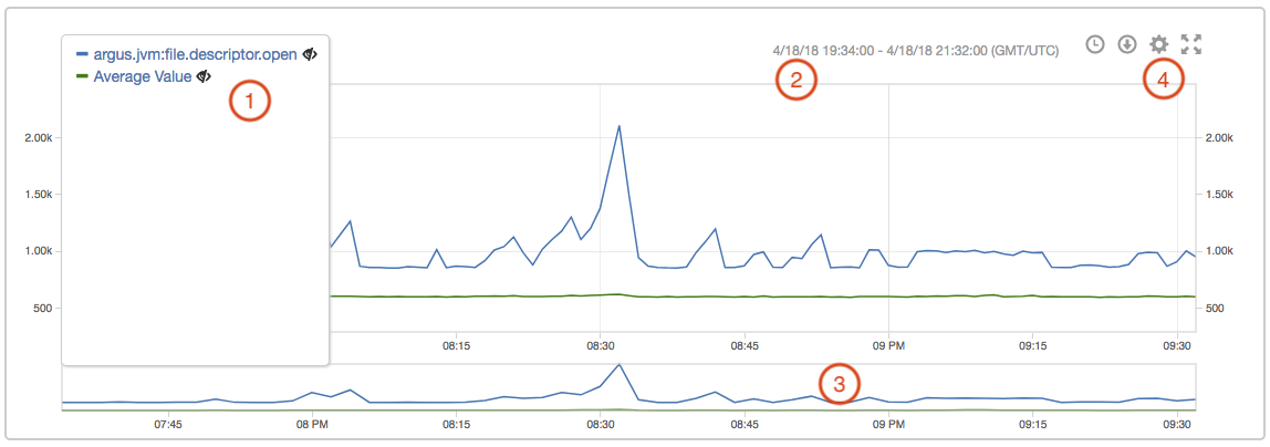
- Legend: it displays all the series. Click a series' name can hide that series and click the eye icon can hide all other series.
- Time range indicator: it shows the time range of the current chart and time zone. It updates while using brush.
- Brush: it allows a user to zoom on a particular part of the graph. Click empty area to reset the brush.
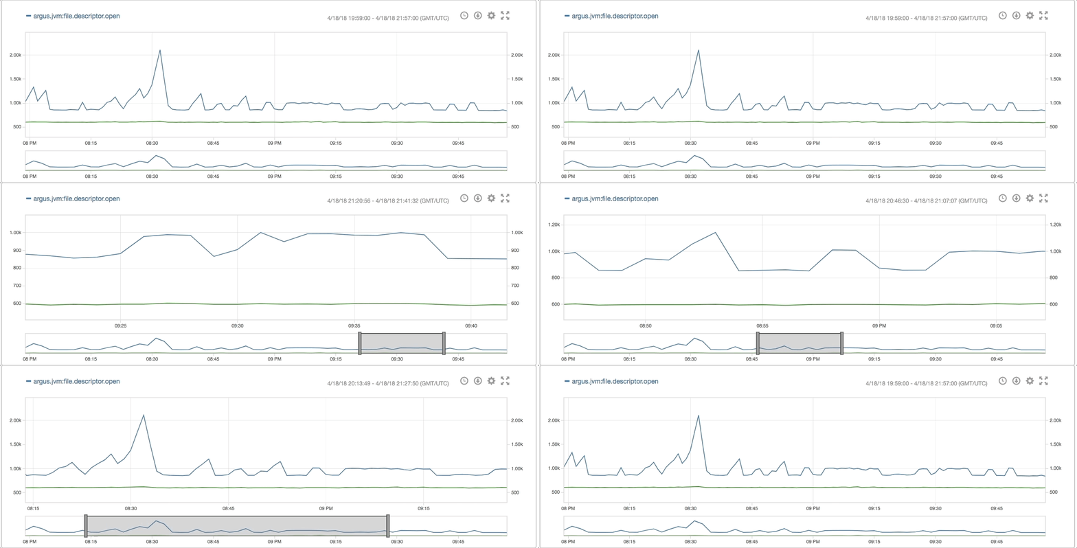
- Additional chart configurations
- The clock icon allows a user to set the brush to a particular length (1h, 1d, 1w, 1m, 1y)
- The download icon allows a user to download the data of all series in either CSV or JSON format
- The fullscreen icon toggle the fullscreen mode for the chart
- The gear icon toggle a modal to set addition chart options (this is stored in local storage)
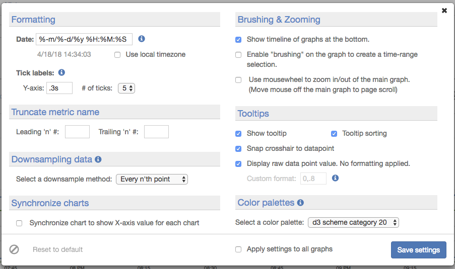
This element specifies the metric query with which to populate the parent element with.
- name - The identifier of the element which must be unique from other sibling ag-metric elements.
- seriesname - Optional attribute that sets the series name. This name is applied to all series returned by the query so best to use it for queries that are known to return a single time series.
- seriescolor - Optional attribute that sets the series color. This color is applied to all series returned by the query so best to use it for queries that are known to return a single time series. Can be a symbolic color name such as 'green', 'blue' or can be a hex RGB value such as '#EEDD11'.
-
CONTENT - The body content of the element specifies the metric query with which to populate the parent element with. This content can contain parameter placeholders of the form
$<parameterName>$. Such placeholders will be replaced with the corresponding control values. - extra-yAxis - Optional attribute that assigns graph of this metric to a different yAxis domain. If undefined, the metric is rendered in main y axis. Extra y axes will align to the right of the chart area. Metrics with same attribute value are rendered under the same y Axis.
<ag-chart name='myChart'>
  <ag-metric name='myMetric' extra-yAxis="yAxis2">
    SUM($start$:$end$:myScope:myMetric:min)
  </ag-metric>
  <!-- additional ag-option, ag-metric, ag-flags elements -->
</ag-chart><ag-table name='myTable'>
<ag-metric name='myMetric'
SUM($start$:$end$:myScope:myMetric:min)
</ag-metric>
<!-- additional ag-option or ag-metric elements -->
</ag-table>This element specifies the annotation query with which to populate the parent element with. ag-flags can create annotation on the chart. Clicking on the annotation toggles lock on annotation label.
- name - The identifier of the element which must be unique from other sibling ag-flags elements.
-
CONTENT - The body content of the element specifies the annotation query with which to populate the parent element with. This content can contain parameter placeholders of the form
$<parameterName>$. Such placeholders will be replaced with the corresponding control values.
<ag-chart name='myChart'>
  <ag-flags name='myFlags'
    $start$:$end$:myScope:myMetric:myType:aUser
  </ag-flags>
  <!-- additional ag-option, ag-metric, ag-flags elements -->
</ag-chart>
This element defines a stoplight indicator visual element that renders red, orange or green based on the most recent datapoint of the nested ag-metric element. For values above the 'hi' attribute, the component will render green. For values below the 'lo' attribute, the component will render red. For all other values, the component will render orange. Since only the most recent datapoint is considered, queries that return a single datapoint should be used. Downsampling is a common way to achieve this.
- name - The identifier for the indicator element which must be unique from all other indicator identifiers.
- hi - The value for which the element will show <color='green'>GREEN status if the most recent datapoint value of the nested ag-metric element is above this value.
- lo - The value for which the element will show <color='red'>RED status if the most recent datapoint value of the nested ag-metric element is below this value.
- shownum - Set to 'true', to show a number of the value of the indicator. (optional)
- showlight - Set to 'true', to show "both" the light value next to the number value. (optional)
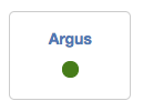
The ag-status-indicator requires a parent element with ONE of the following:
- use the css class 'rowIndicator', per the HTML example below
- use Bootstrap classes, e.g. 'col-md-4', to create columns place elements rows
- use a div with style='position:relative;'
Otherwise, your indicator will show at the top of the screen.
<!-- parent element required -->
<div class='rowIndicator'>
  <ag-status-indicator name='myIndicator' hi='99.9' lo='99.0'>
    <!-- a nested ag-metric element -->
  </ag-status-indicator>

  <!-- display number value instead of light value -->
  <ag-status-indicator name='myIndicator2' hi='0.99' lo='0.90' shownum=true>

  <!-- display number value AND light value -->
  <ag-status-indicator name='myIndicator3' hi='0.99' lo='0.90' shownum=true showlight=true>
</div>This element renders a table containing data for all nested ag-option and ag-metric. You can set the title of the table using the "title.text" attribute in ag-option. The ag-table provides features including pagination, setting number of items shown per page, and filter by search text (datetime, dashboard Id or name, etc.)
<ag-table name='example'>
  <ag-option name='title.text' value='ag-table example'></ag-option>
  <ag-option name="itemsPerPage">20</ag-option>
  <ag-option name="fillLastPage">true</ag-option>
  <ag-metric name='Metric Data'>
    $start$:$end$:myScope:myMetric:min
  </ag-metric>
</ag-table>This defines a set of options which you use to create a dropdown element for the dashboard.
- name - The name of the variable to store the control value. This is the name that is used in the parameterized portions of your dashboard.
- label - The descriptive label to be rendered alongside the control.
Within the <ag-select> : define your option using <option>, the value can be set in the attribute.
<ag-select name="scope" label="The Scope">
    <option value="A">Scope A</option>
    <option value="B">Scope B</option>
    <option value="C">Scope C</option>
</ag-select>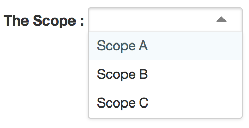
To set a default value for the menu, use the default attribute:
<ag-select name="scope" label="The Scope" default="D">
    ...
</ag-select>This defines an input with autocomplete feature for scope, metric, namespace, tag key, or tag value. Autocomplete uses the discovery API to generate results.
- name - The name or type of this query variable. For now, only supports "scope", "metric", "namespace", "tagk", "tagv".
- label - The descriptive label to be rendered alongside the control.
- default - The default value to use.
- id - The custom id for this element.
- class - The custom CSS class for this element. (requires a <style></style> in your custom markup with your class name and style properties)
- style - The custom CSS as 'inline' styles on the element.
- size - The HTML attribute to set the width of the input element.
- placeholder - The HTML attribute to set the placeholder for the input.
<ag-query-variable label="Scope name" name="scope" placeholder="scope" default="default"/>
<ag-query-variable label="Metric name" name="metric" default="default"/>
<ag-query-variable label="Tag Key" name="tagk" default="host"/>
<ag-query-variable label="Tag Value" name="tagv" default="*"/>
<ag-query-variable label="Tag Value" name="namespace"/>You must be logged in as a user with appropriate permissions to delete a dashboard. Select the dashboard from the dashboard list, and click Delete.
