- Typescript only Project. We don't have a plan to support Javascript
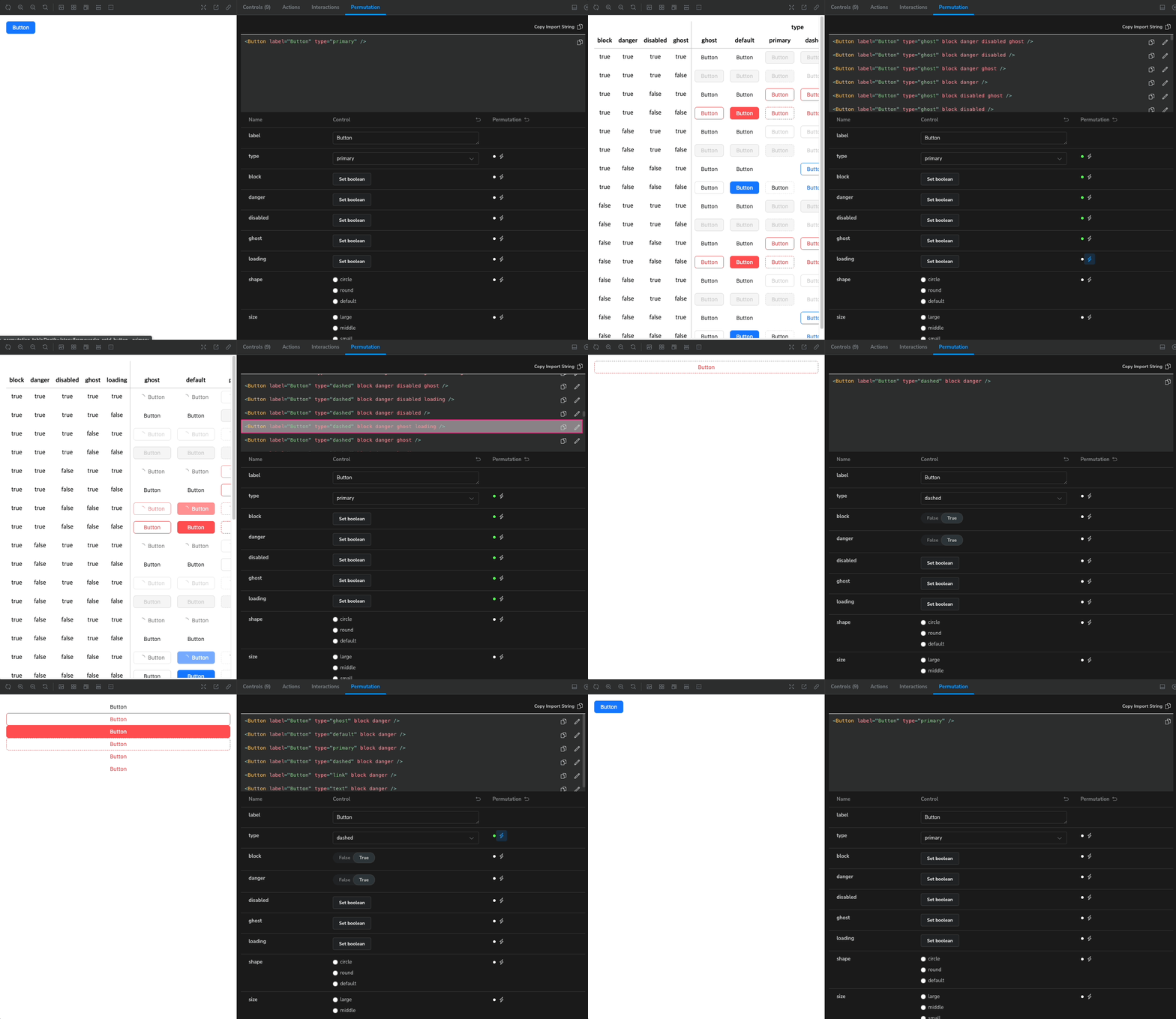
This project is an addon that provides additional functionality to Storybook. In a separate panel, you can see the various aspects of the component as a table.
This project was highly inspired by Datadog's design system, DRUID, and we wanted to use the Component Permutation feature from DRUID in Storybook.
-
Argument Control: Manipulate the properties of your component directly. You can see what your component looks like in context. -
Permutation: Provide a table of different views with combinations of properties. Compare and analyze the results of combinations at a glance.
yarn add sb-addon-permutation-table
Storybook >= 7.xnode >= 16.x
sb-addon-permutation provides a quick glance of complex, multi-property component views. Developers will be able to debug and test components efficiently through the showcase provided.
Add addon code in .stories/main.ts like below.
import type { StorybookConfig } from "@storybook/react-vite";
const config: StorybookConfig = {
  stories: ["../src/**/*.mdx", "../src/**/*.stories.@(js|jsx|ts|tsx)"],
  addons: ["sb-addon-permutation-table"],
  framework: {
    name: "@storybook/react-vite",
    options: {},
  },
  docs: {
    autodocs: "tag",
  },
};

export default config;
After that, you'll need to pass arguments to each story to use the addon's features.
For convenience, you can use the PermutationMeta type in your stories.
// stories/Component.stories.(ts|tsx)

import React from "react";
import { PermutationMeta } from "sb-addon-permutation-table";
import YourComponent from "YourComponent";

const meta: PermutationMeta<typeof YourComponent> = {
  //...
  parameters: {
    storySource: {
      source: <YourComponent />, // type what your component looks like
      importPath: "import YourComponent from 'yourpackage", // import path of packaged component
    },
    permutation: {
      scope: {
        YourComponent, // add component here
      },
    },
  },
};
The addon will automatically use your component's type and make it available in the Permutation Panel.
If you have a property that you don't want to use Permutation for, you can pass the name of that property to deactivate.
const meta: PermutationMeta<typeof YourComponent> = {
  //...
  parameters: {
    storySource: {
      source: <YourComponent />, // type what your component looks like
      importPath: "import YourComponent from 'yourpackage", // import path of packaged component
    },
    permutation: {
      scope: {
        YourComponent, // add component here
      },
      deactivate: ["foo", "bar"], // now property "foo" and "bar" disabled.
    },
  },
};
You can also apply them individually on a story by story basis.
export const Primary: Story = {
  args: {
    primary: true,
    label:'Hello World'
  },
};

export const PermutationDisabled: Story = {
  args:{
    label:'Hello World'
  }
  parameters: {
    permutation: {
      deactivate: ["primary", "size"],
    },
  },
};react-runner : Runs React code, used for Editor View
MIT


