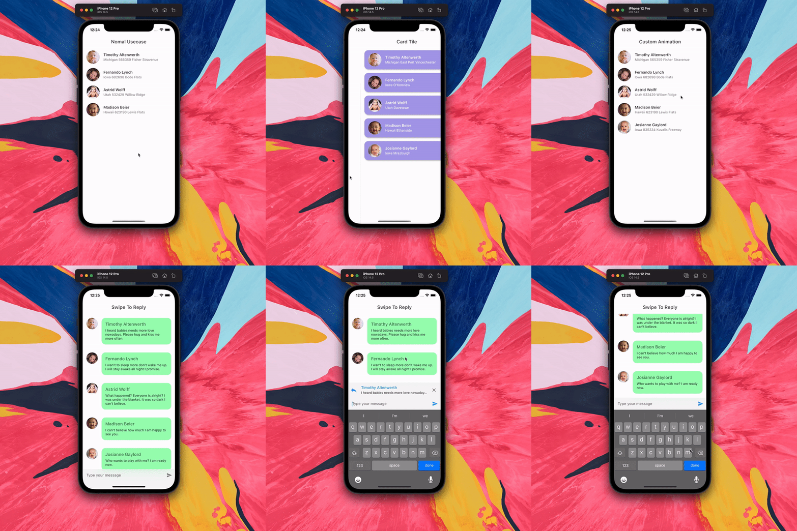
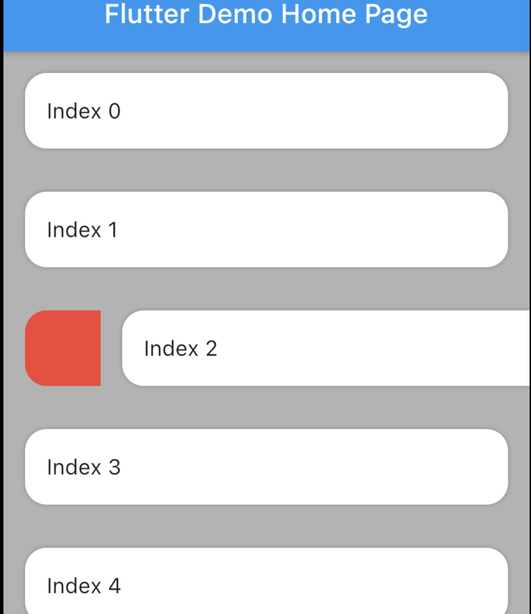
The package is fork of Dismissible. Without any vertical, up and down swipe.
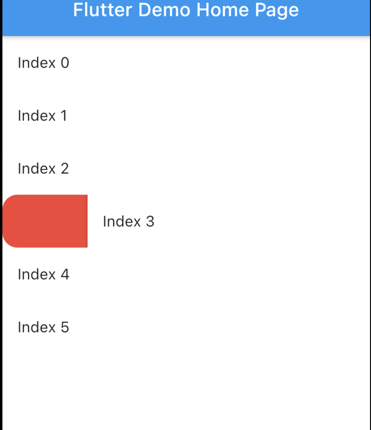
- The Dismissible widget doesn't allow animated rounded corner and elevation similar to google Gmail, Telegram, Messages (these are android apps) if you swipe you will notice. Here is the result with Dismissible.
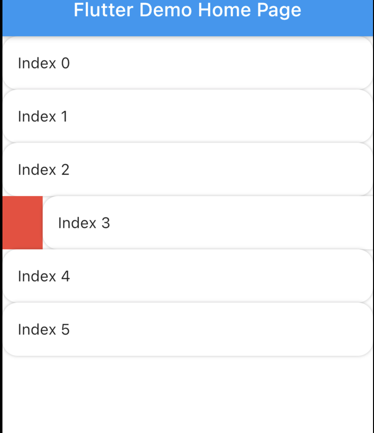
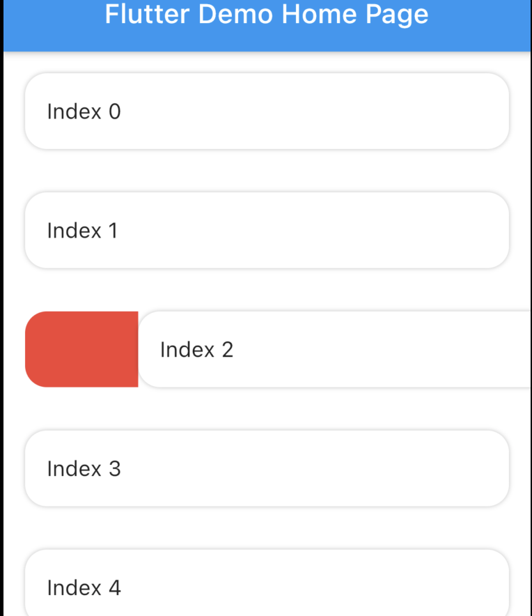
- The Dismissible widget can't make rounded Card there is always some UI issue. As a UI designer I can't live with this. Here is the result with Dismissible.
-
I wanted to animated the background as I swipe not just elevation or rounded corner which is not possible.
-
Finally in some situation I just don't wanna dismiss. I wanna swipe to tigger some action which not possible. Telegram has somthing similar where user can swipe to reply, I love this UX.
- Don't call
setState()frombackgroundBuilder. - Set the
Scaffold's (or whatever background widget you are using)backgroundColorandSwipeableTile'scolorsame.
import 'package:swipeable_tile/swipeable_tile.dart';SwipeableTileThis is just basic tile when you swipe there will be a, you can remove it by settingisEelevatedto false. The corner will be rounded when dragged.
SwipeableTile(
                  color: Colors.white,
                  swipeThreshold: 0.2,
                  direction: SwipeDirection.horizontal,
                  onSwiped: (direction) {// Here call setState to update state
                  },
                  backgroundBuilder: (context, direction, progress) {
                    if (direction == SwipeDirection.endToStart) {
                      // return your widget
                    } else if (direction == SwipeDirection.startToEnd) {
                      // return your widget
                    }
                    return Container();
                  },
                  key: UniqueKey(),
                  child: // Here Tile which will be shown at the top
                ),
SwipeableTile.cardThis will make the tile look like card with rounded corner (will also be applied to the background) which will not animate unlikeSwipeableTile. You also have to set the padding which will wrap around the tile as well background.
SwipeableTile.card(
            color: Color(0xFFab9ee8),
            shadow: BoxShadow(
              color: Colors.black.withOpacity(0.35),
              blurRadius: 4,
              offset: Offset(2, 2),
            ),
            horizontalPadding: 16,
            verticalPadding: 8,
            direction: SwipeDirection.horizontal,
            onSwiped: (direction) {
             // Here call setState to update state
            },
            backgroundBuilder: (context, direction, progress) {
                // You can animate background using the progress
              return AnimatedBuilder(
                animation: progress,
                builder: (context, child) {
                  return AnimatedContainer(
                    duration: const Duration(milliseconds: 400),
                    color: progress.value > 0.4
                        ? Color(0xFFed7474)
                        : Color(0xFFeded98),
                  );
                },
              );
            },
            key: UniqueKey(),
            child: Padding(
              padding: const EdgeInsets.symmetric(vertical: 4.0),
              child: // Here Tile which will be shown at the top
            ),
),-
SwipeableTile.swipeToTiggerThis is exactly the same asSwipeableTilebut instead of dismiss it will return back to initial position when maximum drag reachesswipeThreshold -
SwipeableTile.swipeToTiggerCardThis is exactly the same asSwipeableTile.cardbut instead of dismiss it will return back to initial position when maximum drag reachesswipeThreshold
You can build the background dynamically and animate them using backgroundBuilder. Use direction parameter to check swipe direction and show different widget.
backgroundBuilder: (context, direction, progress) {
       if (direction == SwipeDirection.endToStart) {
           return Container(color: Colors.red);
       } else if (direction == SwipeDirection.startToEnd) {
           return Container(color: Colors.blue);
       }
       return Container();
   },
And the progress is basically the same animation controller responsible for tile slide animation. You can use this controller and animate the background.
To tigger vibration you have to check when tile is dragged certain animation controller value. And I used vibration package for vibration and worked batter than HapticFeedback
   backgroundBuilder: (context, direction, progress) {
        bool vibrated = false;
        return AnimatedBuilder(
            animation: progress,
            builder: (context, child) {
            if (progress.value > 0.2 && !vibrated) {
                Vibration.vibrate(duration: 40);
                vibrated = true;
            } else if (progress.value < 0.2) {
                vibrated = false;
            }
        // return your background
            },
        );
    },
swipeThreshold defines how far you can drag and will consider as dismiss. In case of swipe to tigger this will define maximun drag limit.
If you don't wanna swipe to dismiss instead you wanna slide or drag to a certain percentage to tigger something like, make done a task or rescheduled (show date picker) or add item to cart, you don't wanna remove from the list but still wanna do it without any extra button. And of course telegram swipe.
It's not possible to create the exact same effect like telegram. In Telegram when user swipes or drags after a certain percent (not the maximum position still draggable little) the icon appears with vibration, at this point if the user leaves then it will select that message and the tile will return back to initial position. But if the user drag back then the icon disappers (with vibration) leaving at this point will not cause any message select. It's possible to do from backgroundBuilder using progress parameter but to select exact message (or tile) requires calling setState() which is not possible from backgroundBuilder however you can call setState() from onSwiped callback which will invoke when the tile return to initial position.
If you don't care about exact telegram UI & UX then vibrate & animate the icon when it's dragged maximum by checking progress.isCompleted or you can check animation value. Then call setState() from onSwiped User will not notice unless you set movementDuration to longer time and swipeThreshold to 0.4 (which is default). Check the example app how it's implemented.


